


 Steinel Logo PNG
The Steinel logo is as progressive as the company’s products. The minimalist emblem concentrates the sun’s energy, conveyed through a simple geometric shape within the printed letters. The logo reflects the joy of using innovative lighting devices.
Steinel was founded in 1959 in Herzebrock-Clarholz, Germany, by engineer and businessman Heinrich Wolfgang Steinel. The company first produced ignition coils and electrical transformers for the automotive sector, responding to the growth of car production in postwar Germany. During the 1960s, it expanded into electrical components for household appliances and began working with larger consumer-electronics manufacturers.
A new product direction appeared in 1968, when Steinel introduced its first soldering iron. The device moved the company into soldering and heat-processing tools. In 1976, Steinel released the first electronic heat gun with adjustable temperature, widening the use of hot-air tools in repair work, construction, and industrial tasks.
In the 1980s, the company entered the sensor technology market. In 1987, it introduced its first infrared motion detector for automatic lighting control. In 1989, Steinel opened its first foreign branch in Switzerland. The 1990s brought more sensor-based products, including an outdoor sensor-controlled light in 1992 and a new production facility in the Czech Republic in 1995, which increased output for the European market.
During the 2000s and 2010s, Steinel expanded across tools, lighting, and building automation. In 2003, it launched professional glue guns. In 2005, it introduced a sensor light with active infrared detection, and in 2008 it entered the LED sensor lighting market. Steinel Professional heat tools followed in 2010. In 2013, the company presented True Presence technology, designed to detect people indoors even without visible movement. In 2015, it released the first cordless rechargeable heat gun.
Meaning and History
What is Steinel?
It is a German company specializing in designing and manufacturing lighting solutions, sensors, and thermal tools. Known for quality and technologically advanced products, it offers a range of motion sensors, occupancy sensors, and automated lighting systems designed to provide energy efficiency and convenience in residential, commercial, and industrial spaces. The brand manufactures heat guns and hot air tools for various applications, including crafting, construction, and automotive. The company is known for its quality, offering efficient solutions that enhance functionality and energy efficiency.
Old
The more complex a company’s technologies, the simpler its visual identity. This principle applies to the Steinel logo, which is extremely simple yet conveys numerous meanings that reflect the manufacturer’s investment in its identity and each device. Its uniqueness sharply distinguishes it from competitors, drawing attention with its clarity, freshness, and originality.
The emblem is text-based but instantly recognizable by the single symbol in the center, which has become the calling card of the German lighting device brand. The striking spot in the middle represents:
- The light of a bulb;
- A bright sun;
- A full moon;
- A light fixture.
The dark orange circle within the black ring symbolizes anything that is a source of light, both during the day and at night. At the same time, it is simply a stylized dot over the “i” in the word “Steinel.” The designers shortened the stroke to fit it harmoniously next to the lower stroke. The dot encroaches not only on the stem of the “i” but also on the upper parts of the neighboring letters. This artistic technique helped to better express the idea of illuminating the surrounding space without harming the readability of the text.
The font chosen for the name is outlined, so light elements dominate over dark ones. The result is white letters in black frames. This makes them look more striking and better represents the concept of a company specializing in light fixtures and related products. The circle is colored orange, breaking up the monochrome and adding a touch of brightness to the logo, drawing attention to the illusion of light. Black and white symbolize stability and professionalism, while orange represents energy and friendliness. Together, they evoke a sense of joy, progress, and novelty.
New
The Steinel logo’s transformation added a fresh touch. The modern format allowed the brand to stand out in its niche and shine with a new design, greatly enhancing the lighting equipment manufacturer’s image and creating a more elevated mood. With just a few changes, the emblem became even simpler, more positive, and more conceptual.
- Uppercase letters are a thing of the past, replaced by lowercase glyphs that are neat and thin.
- Many rounded shapes now contrast with the sharp strokes and angles that predominated before.
- The circle has split: now, not one but two elements symbolize light sources.
- The geometric shapes are separated from the text; they are not combined, so they stand out clearly.
On the right side, there are two large circles and one small circle. Colored dark orange, they create a positive impression. Their size difference is so significant that one seems like a natural light source (the sun or the moon), while the other appears artificial (a lamp or a lantern).
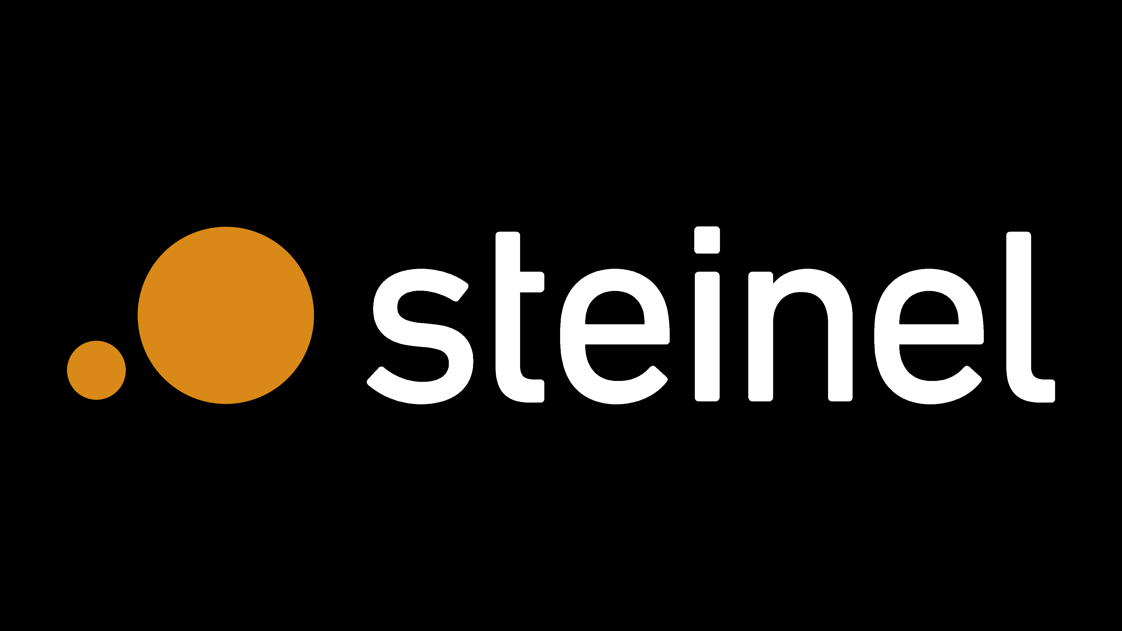
The fonts are complete opposites: previously, the letters were uppercase, grotesque, extra-bold, and monolithic; now, they are lowercase, thin, short, elegant, and light, making the emblem simple and airy. Above the “i,” the large circle is replaced by a tiny square.
The company retained its signature color palette, dominated by orange and black, in which the name is written. Visually, this combination is advantageous because it is familiar (natural) and professional (reminiscent of sunlight during the day and moonlight at night). This turned an ordinary sign into a thematic element, perfect for a manufacturer of lamps and light fixtures. The light, informal font adds friendliness and positivity.