


 Naked Juice Logo PNG
The Naked Juice logo is bright, beautiful, and easy to read. However, this is only one of its merits. The developers put a lot of effort into creating a modern identity that engages in an open dialogue with the customer.
Each element of the logo embodies originality and conveys unique content. For instance, the colorful, contrasting green leaf, although small, symbolizes the product’s naturalness and environmental friendliness.
Naked Juice knows the quality of its ingredients in juices and drinks, and uses its identity to remind customers of this. Modern graphic sketches make the leaf look more realistic, enhancing its appearance.
The white capital letters, applied sequentially and in a single line, emphasize simplicity and grandeur. They stand out against the blue background and are smooth without complex textures.
Naked Juice was founded in 1983 in Santa Monica, California, by Jimmy Rosenberg, who began selling fresh juices from a van on local beaches. The brand name reflected the original idea of drinks made without added sugar or preservatives. By the late 1980s, the company had moved beyond beach sales. It reached farmers’ markets and small health-food stores across Southern California.
During the 1990s, Naked Juice expanded its line of fruit and vegetable blends, using recipes aimed at buyers interested in natural nutrition. Green Machine became one of its best-known smoothies, combining green fruits and vegetables in a format suited to the health-food market. In 2000, the company opened a larger production facility in Azusa, California, which allowed it to increase output and expand its national distribution.
A major ownership change occurred in 2006, when PepsiCo acquired the business, providing the brand with broader retail access and marketing support. After the deal, Protein Zone appeared in 2007 for active consumers, followed by Naked Coconut Water in 2009. In 2012, the line added lower-calorie smoothies. In 2013, the company settled a lawsuit over “all natural” claims for $9 million and stopped using the phrase on packaging.
From 2015 onward, the brand continued to add new formats. Naked Pressed introduced cold-pressed juices, Bright Beets arrived in 2016, and probiotic smoothies followed in 2017. The company moved toward recycled-plastic bottles in 2018, added Light smoothies in 2019, and launched Plus functional drinks in 2020, featuring collagen, vitamin D, and antioxidants. Later updates included digital nutrition campaigns in 2021, iced fruit juices in 2022, and plant-based protein smoothies in 2023.
Meaning and History
What is Naked Juice?
It is a brand that specializes in producing a variety of fruit and vegetable juices and smoothies. The company was founded in Santa Monica, California, and is currently owned by PepsiCo. It is known for its desire to create beverages from natural ingredients without added sugar, preservatives, or artificial flavors. The brand offers a wide range of products,s including cold-pressed juices, protein smoothies, and probiotic drinks. The company emphasizes health and well-being, offering nutrient-rich products that support a balanced lifestyle. The products are widely available in supermarkets, health food stores, and online retailers.
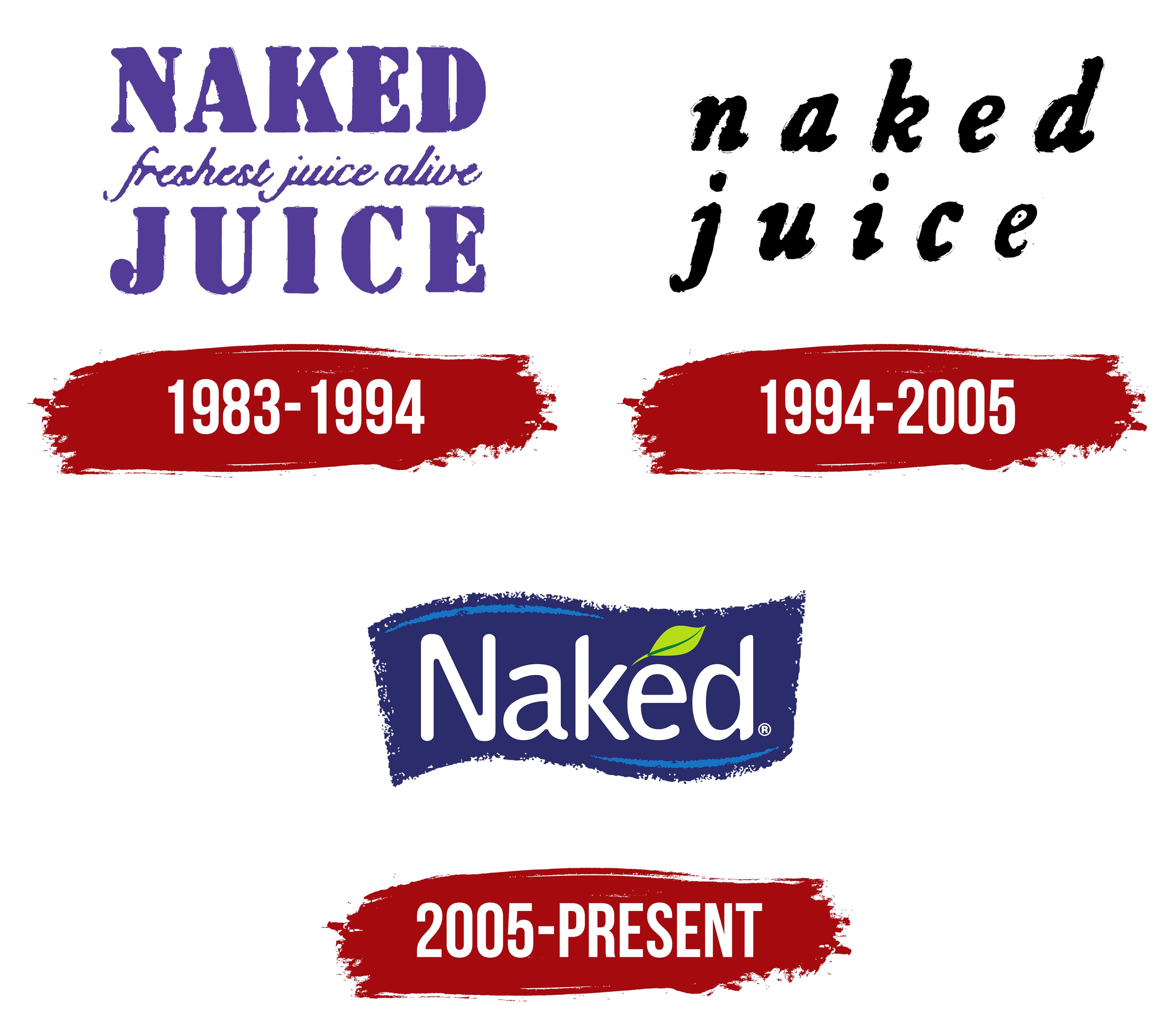
1983 – 1994
In 1983, a company emerged that offered real, freshly squeezed juice capable of revolutionizing the food industry. The brand’s innovative approach is reflected in its logo.
The name “Naked Juice” is printed in capital letters to emphasize its grandeur and uniqueness. The two words are placed on different horizontal planes, showcasing an unconventional approach to product production. The purple letters on a white background clarify, highlighting that the brand inspires love at first sip.
The logo also features the phrase “the freshest juice of all,” underscoring the brand’s commitment to customer health and well-being. These three words, written in cursive on a single line, serve as the primary informational block of the identity, indicating the product’s quality and freshness.
1994 – 2005
A creative approach to identity doesn’t always involve bright colors and accents. Classic motifs are often used as a foundation. This concept is evident in the brand identity of “Naked Juice,” known for its delicious, healthy juices.
In 1994, a simple but striking logo made a strong visual impression. It was presented without special effects or exaggerations, emphasizing its restraint and elegance.
The logo consists of two words and ten letters, without drawings or patterns. The text, written in cursive with uniform letters, gracefully forms the name “Naked Juice” on a white background. Capital letters are not used.
The logo’s design reflects the product’s simplicity, clarity, naturalness, and accessibility. Its lightness and noticeable dynamism attract attention, inviting people to try the delicious juice.
2005 – today
In 2005, elegance and restraint regained vibrancy, aligning with modern trends. Due to technical innovations and new resources, simplicity ceased to impress consumers. Black-and-white letters took on new shapes, and vibrant colored elements added expressiveness.
The color scheme underwent a radical change, new fonts were introduced, and graphic elements were distributed in line with the company’s overall philosophy and image. Dynamism prevailed, leaving static design behind. The new logo conveyed a wealth of information, focusing on the essentials.
An interesting innovation was the background, which had not been used before. It features a geometric shape resembling a wave or a broad brushstroke with blurred edges, creating a sense of freedom and infinity. The blue background symbolizes a water connection.
Against a blue background, white letters are arranged in a graceful, beautiful sequence, like young ladies. The symbolism of purity and freshness is predominant. To enhance readability, strokes were added to the upper-left and lower-right corners of the letters, creating emphasis. A green leaf symbolizes new life and natural beauty.