The National Childbirth Trust updated its brand for the first time in almost a decade. NCT offers more than classes for expectant parents. The organization helps families during pregnancy, supports them after the birth of a child, develops parent communities, and takes part in public projects related to maternity and parenting.
The new platform received the line “For pregnancy, parents and progress.” It brought the organization’s different areas of work into a single system. It served as the basis for the change in visual identity.
The main change is tied to the logo. Studio Texture turned to NCT’s archives and reworked one of the organization’s early marks. In the new version, the letter “c” includes the image of an adult and a child. Three dots above the name once expressed a similar idea. Now the meaning is built into the name.
The new emblem maintains a connection to the past while more accurately reflecting modern parenting. The organization speaks to different families, stories, and paths that parents go through.
The rebrand is tied to changes in how the organization is perceived. Research involving 2,000 parents showed that many see the organization primarily as a provider of prenatal classes. The new brand presents its work more broadly and explains its support for families at different stages.
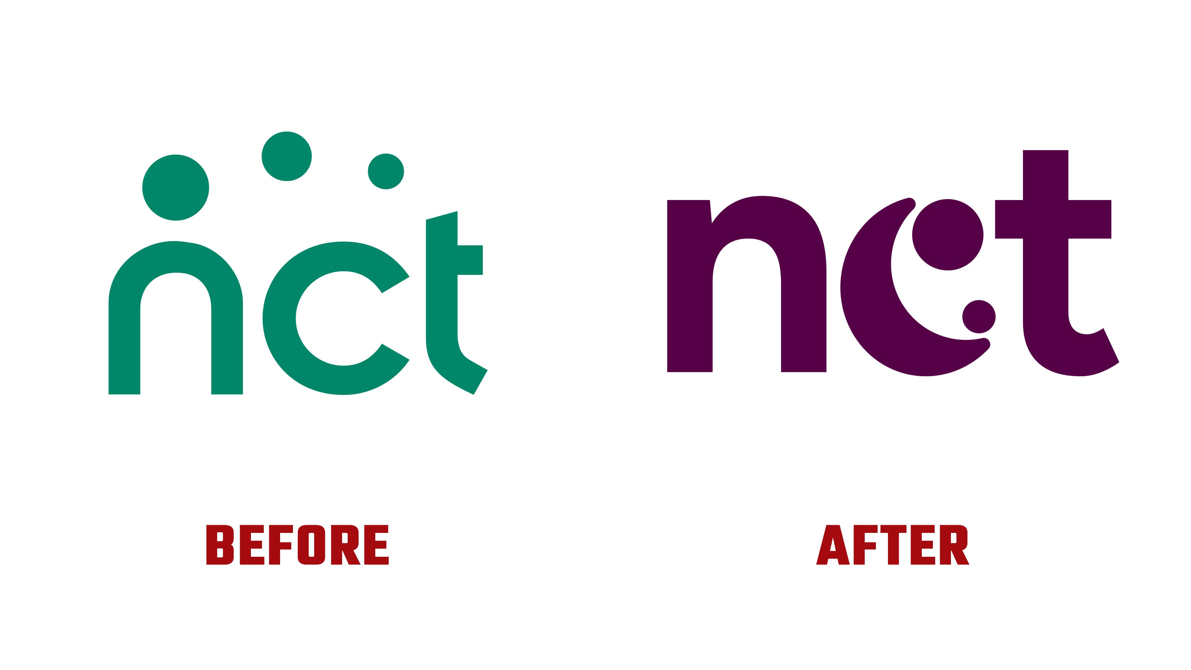
Compared with the previous version, the mark became more compact and more unified. The old logo was built on soft lowercase lettering and three dots above the name. In the new version, the adult and child figures are built into the letter “c,” making the connection between the mark and the brand idea tighter. The color also changed. A rich purple tone replaced the turquoise-green shade, giving it a more current feel.
The logo complements the idea of “Your Path,” dedicated to each person’s path to parenthood. In the identity, this theme appears through brush strokes and free forms. It recalls the care, closeness, and support at the heart of the organization’s work.
The update is connected with the brand’s 70th anniversary and the For Every Parent program. The new logo helps the organization speak to a broad audience and present itself as a partner for parents from pregnancy through the early years of a child’s life.