 Naturgy Energy Logo PNG
Gas, electricity, and heat create the familiar rhythm of home life, from cooking to lighting and heating. Behind these processes is an energy company that manages the generation, distribution, and delivery of resources to homes and businesses. The Naturgy Energy logo represents an energy provider that supplies gas and electricity across various regions.
Naturgy Energy Group dates back to 1843. That year, in Barcelona, the company Sociedad Catalana para el Alumbrado por Gas was founded. Its purpose was to produce lighting gas. The organization built the city’s first gas plant and provided street lighting. Later, it expanded the network and connected it to residential buildings.
In 1912, the company changed its name to Catalana de Gas y Electricidad. It added an electricity supply to its services. In the 1960s, Spain began importing natural gas from Algeria. After that, the company abandoned coal and switched to natural gas. In 1991, it merged with regional operators. As a result, it formed a new structure, Gas Natural SDG. It became the country’s largest gas distributor.
In the 1990s, Gas Natural entered the Latin American markets. It acquired companies in Colombia, Argentina, and Brazil. In 2003, the organization purchased the energy company Union Fenosa for 16.8 billion euros. This turned Gas Natural into an integrated gas-and-electricity corporation.
In 2009, it was decided to combine all brands under the name Gas Natural Fenosa. The company developed energy production at gas and hydroelectric plants while modernizing distribution networks. In 2014, the Chilean company CGE acquired the company for $3.3 billion. In 2016, it sold assets in Central America.
In 2018, the company received a new name, Naturgy Energy Group. This reflected the international nature of its operations. By that time, the organization served about 28 million customers in Spain and Latin America.
In the 2020s, Naturgy optimized its assets. The company sold CGE and focused on key markets. In 2022, rising gas prices in Europe became a serious challenge. This required adjustments to its tariff policy.
Naturgy manages an integrated energy business. It includes gas distribution, gas-fired electricity generation, hydro and renewable power, and power supply to more than 19 million customers in Spain and abroad.
Meaning and History
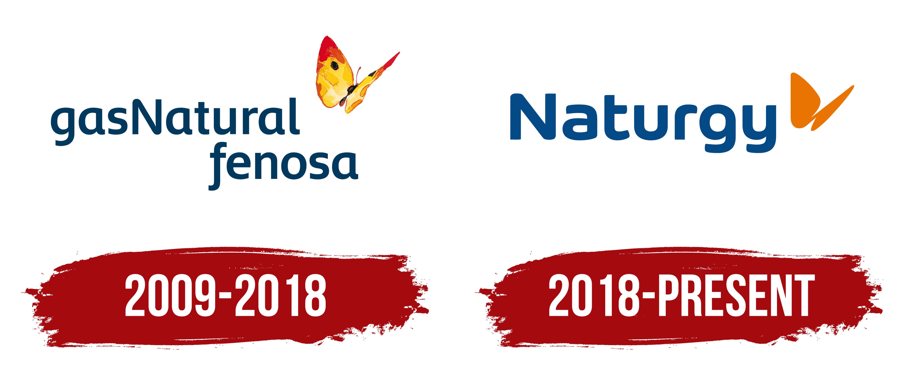
What is Naturgy Energy?
An energy group operating across Europe and Latin America, combining activities in the extraction, transportation, and sale of natural gas, as well as the production and supply of electricity. The company operates in two key areas: gas and energy. Its operations cover processes from liquefaction and storage to distribution and sales, as well as electricity generation from traditional and renewable sources. Its structure includes power plants, gas pipeline networks, and LNG terminals that supply fuel internationally.
2009 – 2018
The history of Gas Natural Fenosa, the predecessor of Naturgy Energy Group, began with gas lighting in Barcelona. In 1843, Sociedad Catalana para el Alumbrado por Gas became Spain’s first gas company. As the business developed, its names and emblems changed. A letter monogram gave way to geometric shapes, followed by a colorful butterfly. The butterfly remained after the merger with the electricity business Unión Fenosa.
In 1912, the business adopted the name Catalana de Gas y Electricidad. It superimposed its initials to create a monogram for business documents, equipment, and employee uniforms. The company added laurel branches and the founding date for its 1943 centennial. The anniversary version even appeared on cast-iron gas utility manhole covers. It remained the corporate emblem until 1987.
The shortened name, Catalana de Gas, came with a new logo of 2 overlapping diamonds. Light and dark shades of blue helped distinguish the shapes. The update coincided with the company’s modernization and service expansion. In 1991, Catalana de Gas merged with Gas Madrid and related gas operations. In 1992, the company adopted the name Gas Natural, identifying its primary energy product and providing a name suitable for operations beyond Catalonia.
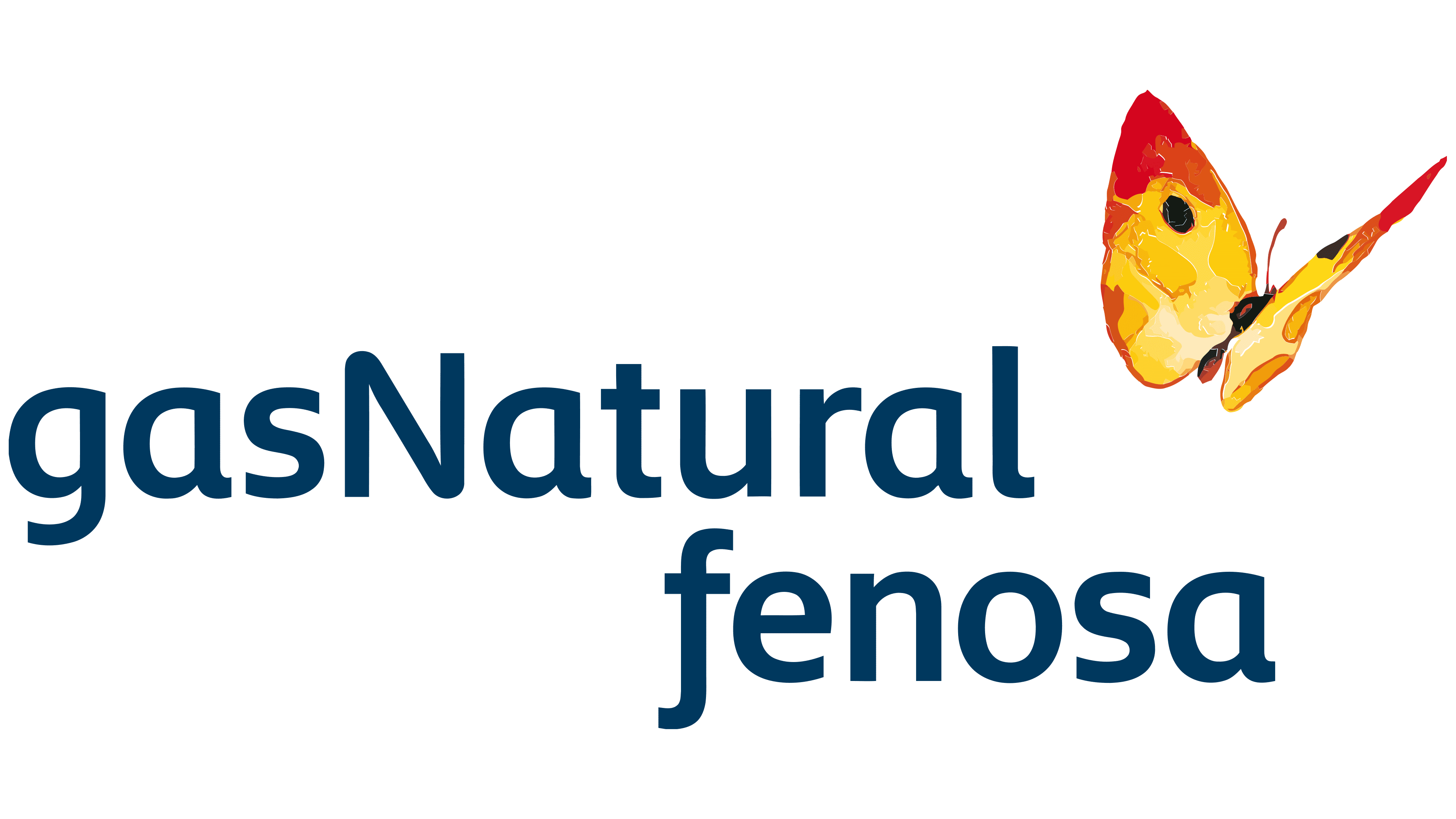
The butterfly appeared alongside the new name. Its wings featured yellow, orange, and red patches with small black areas. The painterly style connected the brand with nature and energy conservation programs. Dark blue “gasNatural” lettering appeared beside it. Writing the name as a single unit joined the 2 words. At the same time, the uppercase “N” marked the beginning of “Natural” after the lowercase “gas.”
By 2008, Spanish audiences knew the butterfly. A Synovate study ranked it first in recognition among symbols in Spain’s energy industry. The image’s association with Gas Natural helped keep it after the acquisition of Unión Fenosa. The legal merger was completed on September 1, 2009. The company developed a shared brand for its gas and electricity businesses, referencing both previous names.
Gas Natural Fenosa introduced its logo on April 20, 2010. Saffron designed it. Landor consulted on and developed the brand positioning. The name combined Gas Natural and Fenosa, while the butterfly became the group’s shared emblem.
The lettering was divided into 2 lines. The upper “gasNatural” line began at the left edge, while “fenosa” below was shifted to the right. The uppercase “N” continued to separate the words in the first line, and “fenosa” was set in lowercase. A sans-serif lettering style with rounded forms was developed for the name. A shared dark blue color connected the lines. At the same time, their arrangement allowed Fenosa to be added to the existing Gas Natural wordmark.
The butterfly was positioned at a slight angle above the right-hand portion of the name. Its asymmetrical wings and delicate body outline resembled a watercolor illustration. Color appeared in patches with soft edges and visible brushstroke texture. Yellow areas transitioned into orange and red, with small black sections completing the image. The painterly wings appeared beside the letters’ uniform dark blue fill.
In the combined brand’s interpretation, the butterfly conveyed freshness, freedom, and continual change. It preserved the connection to Gas Natural’s history, while the word Fenosa represented the group’s electricity business.
In 2015, Brand Union, part of WPP, expanded the visual identity system through the Embetterment project. The 2010 logo was retained. The butterfly’s wing shape became the basis for additional imagery, and materials from different divisions were brought under shared guidelines.
2018 – today
In 2018, Gas Natural Fenosa changed its name to Naturgy. The word “gas” in the previous name associated the group primarily with gas. However, the company was already involved in electricity, renewable energy, and energy services. The name change accompanied digitalization, international expansion, and the launch of a plan covering 2018 through 2022. The company presented the new brand on June 27 at the general shareholders’ meeting, during its 175th anniversary year.
The name Naturgy combined the English words “nature” and “energy,” conveying the idea of “nature’s energy.” Its sound preserved a connection to “Natural” in the previous name. The short form was intended for use in national markets under a shared international brand. The legal name changed from Gas Natural SDG to Naturgy Energy Group, S.A.
Interbrand Europe carried out the project. Andreas Rotzler, Interbrand CEE’s creative director, led the creative work. The team sought to present a global energy company with digital services and approachable customer communication. The butterfly, redesigned for the new logo, preserved its connection to 175 years of history.
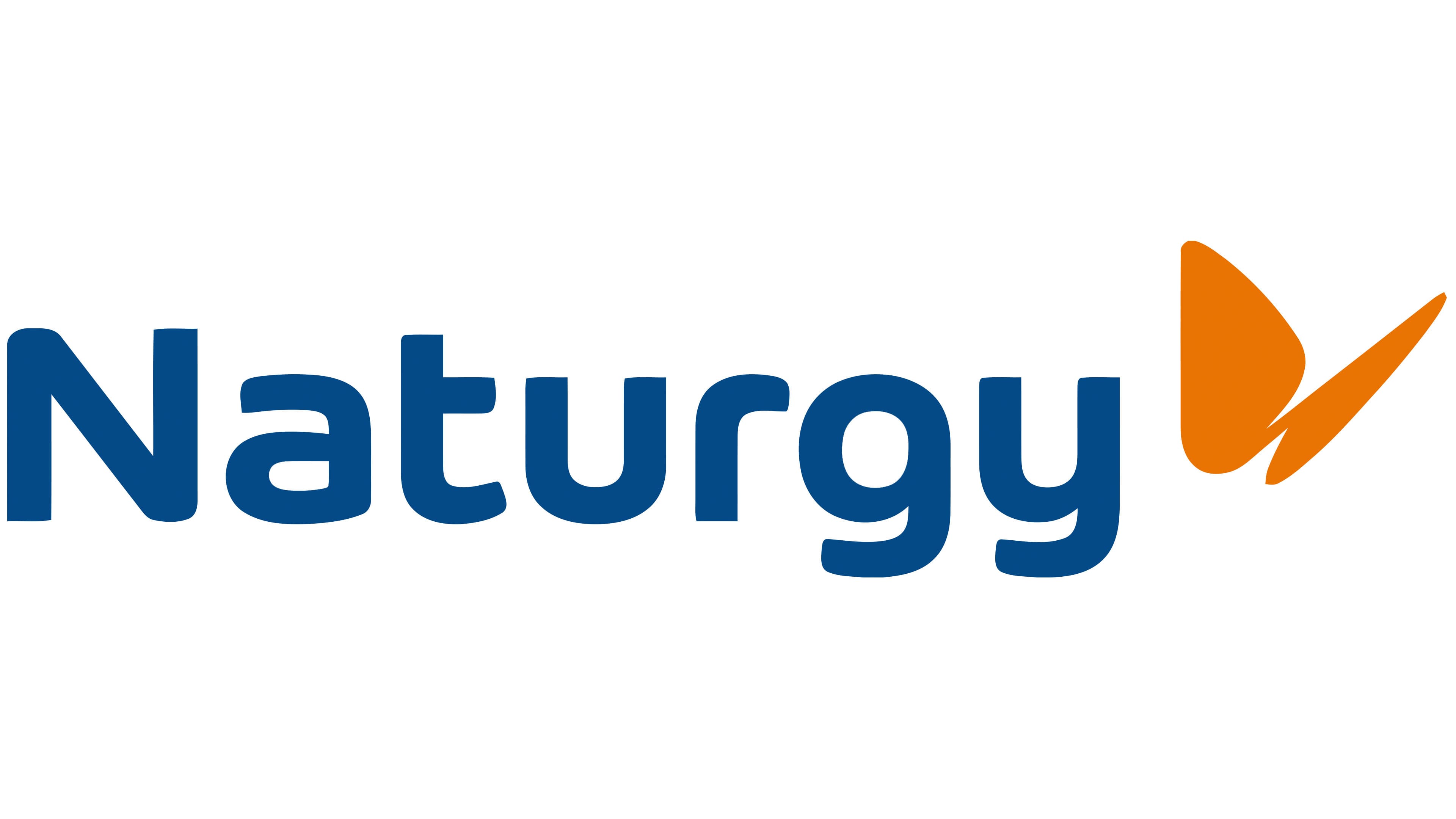
The multicolored illustration became a flat orange emblem consisting of 2 asymmetrical wings. The upper wing became large and rounded, while the lower wing took the form of a narrow diagonal stroke with a pointed end. A simplified silhouette replaced the detailed insect depiction. Two solid shapes replaced the body, black outlines, brushstroke texture, and transitions between yellow, red, and orange. The single-color image suited digital applications and small-scale reproduction.
In the 2018 version, the butterfly was placed to the right of Naturgy. Its elongated lower section points upward from the final “y,” while the rounded wing rises above the end of the word. The close placement joins the image and lettering in a shared horizontal arrangement. The gentle curve of the upper wing is paired with the pointed end of the lower one.
A custom sans-serif typeface was developed for Naturgy. The name begins with an uppercase “N,” followed by lowercase letters. Rounded stroke endings and the soft contours of the “g,” “r,” and “y” echo the curves of the wings. The lettering retained Gas Natural Fenosa’s blue. Orange brought the butterfly’s previous warm colors together in a single shade, maintaining a color connection with the preceding logo.
Signes and the Interbrand team handled the branding of the Barcelona headquarters. Two illuminated orange butterflies were installed at the top of the 20-story tower, and three-dimensional Naturgy lettering was mounted on the main facade. Large facade versions paired the blue name with a separate orange emblem on the right. The update covered the reception area, press room, meeting rooms, and other interior spaces.