 Meralco Logo PNG
Electricity powers homes, offices, and urban infrastructure, supporting daily operations in the metropolis. Power grids connect energy sources to consumers and require constant monitoring. The Meralco logo is associated with an energy company that supplies electricity to the Philippine capital region and manages the distribution system.
The Manila Electric Company, or Meralco, was founded on March 24, 1903, by American entrepreneur Charles M. Swift. He received a franchise to supply electricity and establish a tram system in Manila. Its predecessor, La Electricista, began operating in 1894. This company first illuminated the city’s streets on January 17, 1895. Meralco combined local experience with American investment. Over time, it became the capital’s leading electricity supplier and the first mass-transit operator.
During World War II, the company’s infrastructure was almost destroyed. After 1948, it focused on electricity supply. In 1961, Filipino businessman Eugenio Lopez Sr. acquired the company from its American owners and began the process of Filipino ownership. Under his leadership, the company became the country’s largest private corporation. It established one of the lowest electricity rates in Asia.
In 1973, during Ferdinand Marcos’s presidency, the state took control of Meralco. After 1986, the Lopez family regained ownership and returned the company to the Philippine Stock Exchange. In 1995, the subsidiary Meralco PowerGen Corporation was established to handle power generation.
Since 2005, Manuel V. Pangilinan has led the company’s strategic development. In the 2010s, Meralco invested in modernizing its network and developing energy infrastructure. In 2023, its subsidiary Meralco Renewable Energy Corporation acquired a controlling stake in SP New Energy Corporation, strengthening its position in solar energy.
In 2024, Meralco PowerGen signed a 3.3-billion-dollar deal with partners Therma Natgas Power and San Miguel Global Power Holdings.
The company’s distribution franchise was extended until 2053. In the same year, Meralco acquired a 60 percent stake in Chromite Gas Holdings Inc. and added 2.6 gigawatts of generating capacity. S&P Global raised the company’s outlook to “positive.” The agency noted the company’s strengthened position as a key electricity supplier in the Philippines.
Meaning and History
What is Meralco?
A Detroit entrepreneur founded the Philippines’ largest private electric power distribution company to serve Manila’s tramway network. It now supplies electricity to the metropolitan region, covering 39 cities and 72 municipalities, serving about 4 million customers. It built the country’s first hydroelectric power plant, Botocan, with a capacity of 23 megawatts, and later moved into energy distribution and purchasing from the state-owned National Power Corporation and private producers.
1920 – 1925
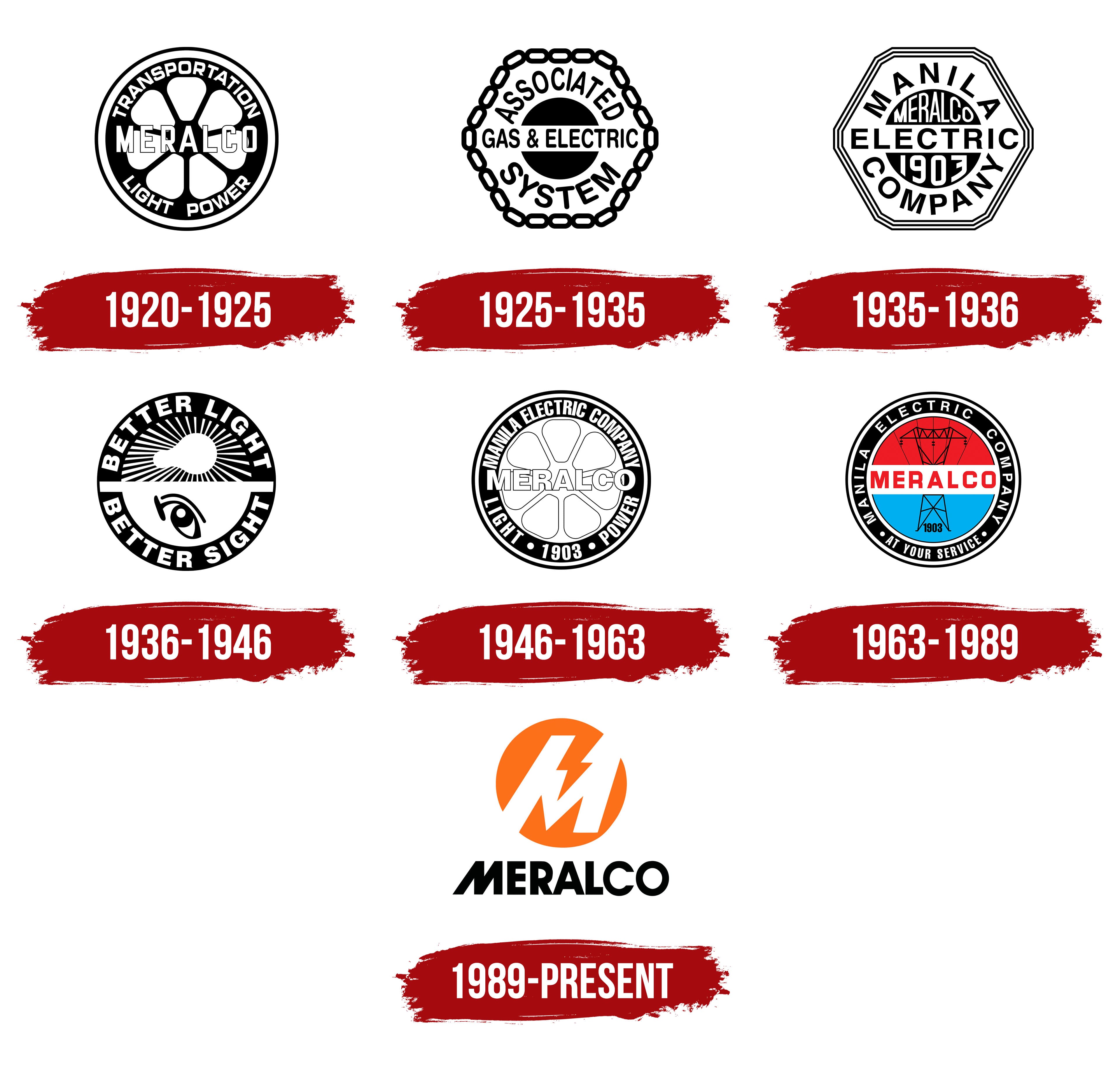
Meralco’s early logo combined a wheel with wording about transportation, lighting, and electric power. These elements reflected the company’s original responsibilities. On March 24, 1903, Manila’s municipal authorities accepted a proposal from American businessman Charles M. Swift. They granted him the right to establish an electric streetcar network and an electric power system. Meralco, or Manila Electric Company, traces its history to 1903 and supplies electricity to Manila and neighboring areas of the Philippines.
The original name, Manila Electric Railroad and Light Company, described its electric railway and lighting operations. Parts of the English name were combined to create Meralco, a shorter name for everyday use. After a 1919 reorganization, the business became Manila Electric Company. By then, Meralco was firmly associated with the company, so the familiar abbreviation remained. It preserved a connection to the former full name and the railway business.
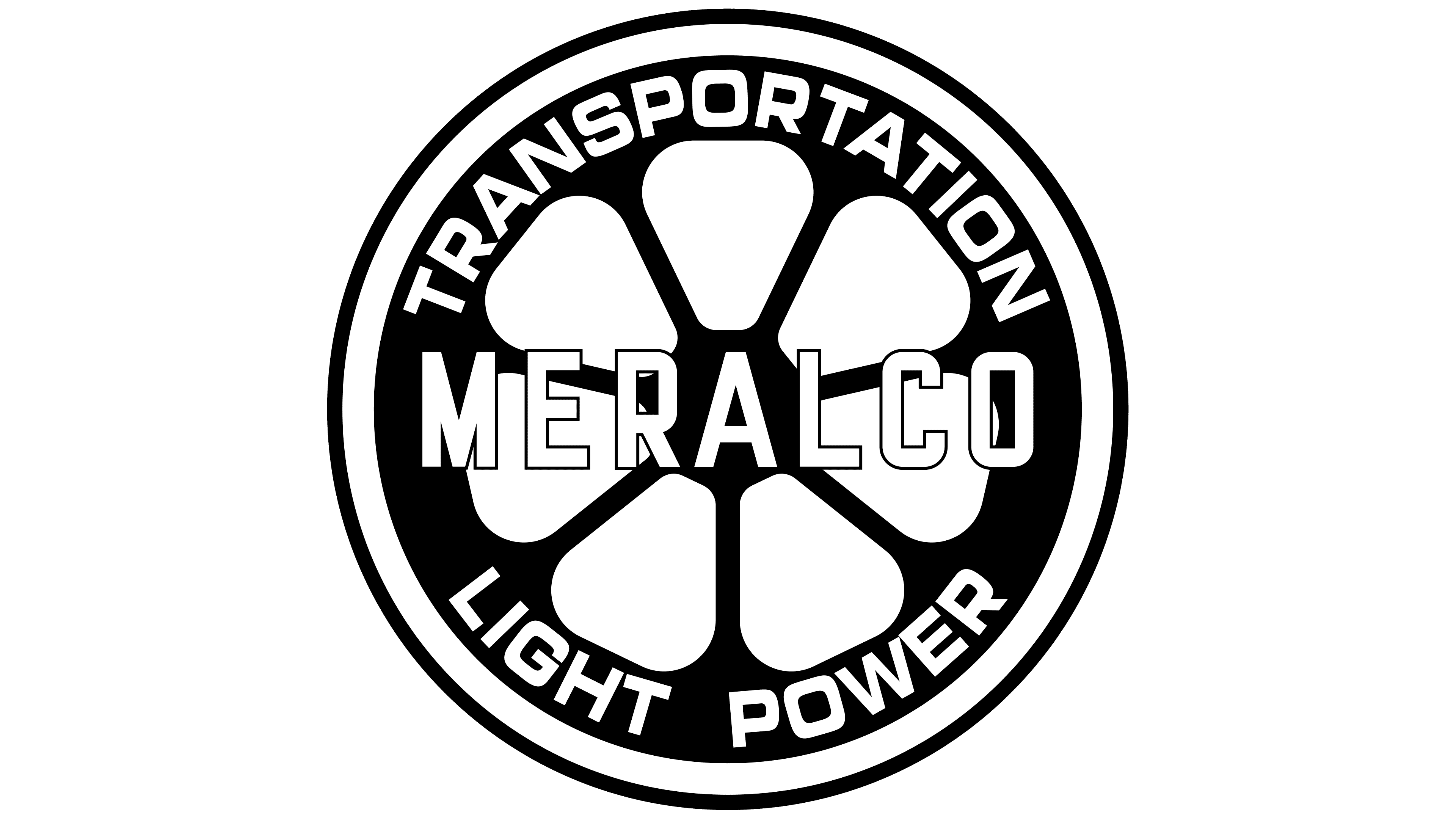
In the 1920s, a circular black-and-white wheel emblem reflected the link between electricity and transportation. A double outline formed the outer rim, while light sections alternated with thick black spokes inside. The shapes radiating from the center resembled petals, and the overall design suggested a wheel or a cross-section of a rotor or turbine. MERALCO ran horizontally through the center of the circle, covering part of the interior pattern. A thin black outline separated the narrow white capital letters from the alternating light and dark areas. Vertical strokes dominated the sans-serif lettering, whose shapes resembled typefaces such as Eurostile or Microgramma.
TRANSPORTATION appeared in white along the upper arc of the ring, with LIGHT POWER along the lower arc. The capital letters rotated to follow the curve. The upper wording identified the transportation business, while the lower wording referred to lighting and electricity. The ring of services surrounded the wheel, and the name across its center brought the operations together under Meralco.
1925 – 1935
A 1925 ownership change changed the name on Meralco’s emblem. The Philippine company became part of the American Associated Gas and Electric group, and ASSOCIATED GAS & ELECTRIC SYSTEM replaced its name. An emblem representing the combined utility system replaced the wheel and its individual service descriptions. The design reflected Meralco’s transfer to the American group.
A closed chain following a polygonal shape formed the logo’s outer border. Its elongated links had matching proportions, rectangular outlines with rounded corners, and open centers. Closely connected, they formed a symmetrical ring. Inside, a black disk was divided horizontally by a white band. GAS & ELECTRIC ran through the middle as the emblem’s main wording.
The American system’s name was divided into three parts. ASSOCIATED followed the upper arc between the chain and the disk, SYSTEM occupied the corresponding position below, and GAS & ELECTRIC remained on the white band. The upper and lower lettering followed the curve of the circle. All the wording used uppercase sans-serif letters resembling DIN or Franklin Gothic. The ampersand between GAS and ELECTRIC matched the lettering. The black-and-white treatment united the chain, disk, and text.
1935 – 1936
The emblem returned to its full name, Manila Electric Company, in a 1930 version. It appeared alongside the familiar abbreviation MERALCO and the company’s founding year, 1903. The two name forms occupied different areas within the same frame. The full name took up most of the space. At the same time, the abbreviation and year connected the new design to the company’s history.
The logo was built around a hexagonal frame with clipped corners. Three thin parallel lines followed the outer contour, each set slightly farther inward. MANILA appeared at the top and COMPANY at the bottom. Both lines curved along an arc. The geometric sans-serif capitals changed angle to follow the curve. The upper lettering had wider spacing.
A light band with the large black word ELECTRIC crossed the emblem’s center. The horizontal line divided the dark circle behind it into two semicircular sections. Narrow white MERALCO lettering filled the upper section, with the white numerals 1903 below. ELECTRIC used sans-serif capitals resembling Futura or Franklin Gothic. Differences in size and placement organized the information within the frame. Manila Electric Company read from top to bottom. At the same time, the abbreviation and date occupied the remaining portions of the circle above and below the central band.
1936 – 1946
In 1936, Meralco dedicated its emblem to the benefits of good lighting. The phrase BETTER LIGHT BETTER SIGHT replaced the company name. Images of a light bulb and a human eye accompanied the wording. Their placement linked the light source to vision and reinforced the message.
A heavy dark rim surrounded the circular black-and-white emblem. BETTER LIGHT followed the upper arc, with BETTER SIGHT along the lower arc. The white sans-serif capitals were wider than the lettering on the early wheel logo. Their heavy weight resembled Impact or Franklin Gothic Heavy. Both parts of the phrase received the same treatment, with the letters following the circle’s curve.
A horizontal line divided the interior. Above it, an incandescent light bulb with a rounded white outline faced right. Numerous thin white rays spread from the bulb across the black background. An eye occupied the lower half. It consisted of a black oval and rounded white shapes representing the pupil and a highlight. A curved eyebrow and an arc representing the upper eyelid appeared above it. The bulb sat beneath the light words, and the eye sat above the sight words. Each image corresponded to its part of the message.
1946 – 1963
Meralco’s postwar emblem returned the wheel with revised wording about the company’s operations. After the streetcar network was destroyed, the company focused on restoring electricity service and sold its bus business in 1948. Supplying electricity became its primary business. TRANSPORTATION disappeared from the rim, while references to lighting and power remained.
The logo’s structure returned to that of the early emblem. A six-spoke wheel sat inside a circular rim, with MERALCO across the center. Light lettering with a thin dark outline overlapped the wheel. The outer black ring provided a background for white wording surrounding the company’s abbreviated name.
The full name MANILA ELECTRIC COMPANY now followed the upper arc. LIGHT and POWER appeared at the bottom, separated by the founding year, 1903. Small round dots separated the words and date. The lettering used Impact and Helvetica. The revised wording around the rim connected the familiar wheel with Meralco’s postwar operations, the restoration of electricity service, and its shift from transportation to electric power.
1963 – 1989
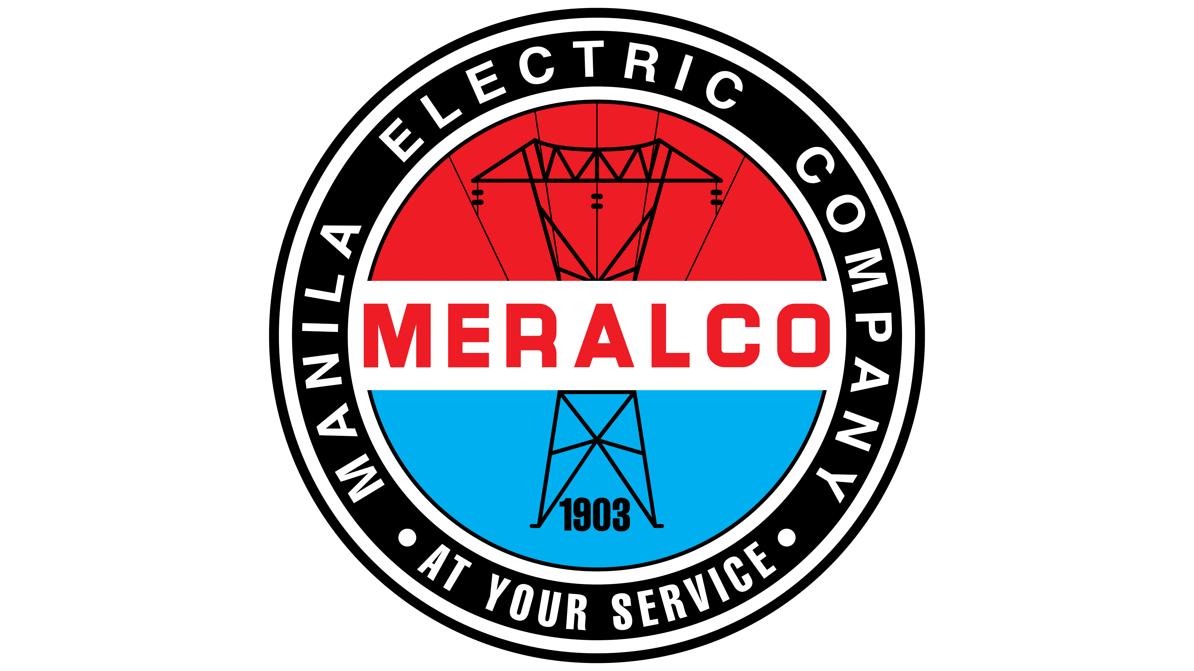
The wheel returned in Meralco’s postwar emblem with revised wording about the company’s operations. After the streetcar network was destroyed, the company focused on restoring electricity service and sold its bus business in 1948. Electricity replaced transportation as its primary business. TRANSPORTATION disappeared from the rim, while references to lighting and power remained.
The logo’s structure returned to that of the early emblem. A six-spoke wheel sat inside a circular rim, with MERALCO across the center. Light lettering with a thin dark outline overlapped the wheel. The outer black ring provided a background for white wording surrounding the company’s abbreviated name.
The full name MANILA ELECTRIC COMPANY now followed the upper arc. LIGHT and POWER appeared at the bottom, separated by the founding year, 1903. Small round dots separated the words and date. The typography used Impact and Helvetica. The updated wording around the rim connected the familiar wheel with Meralco’s postwar operations, the restoration of electricity service, and its shift from transportation to electric power.
1989 – today
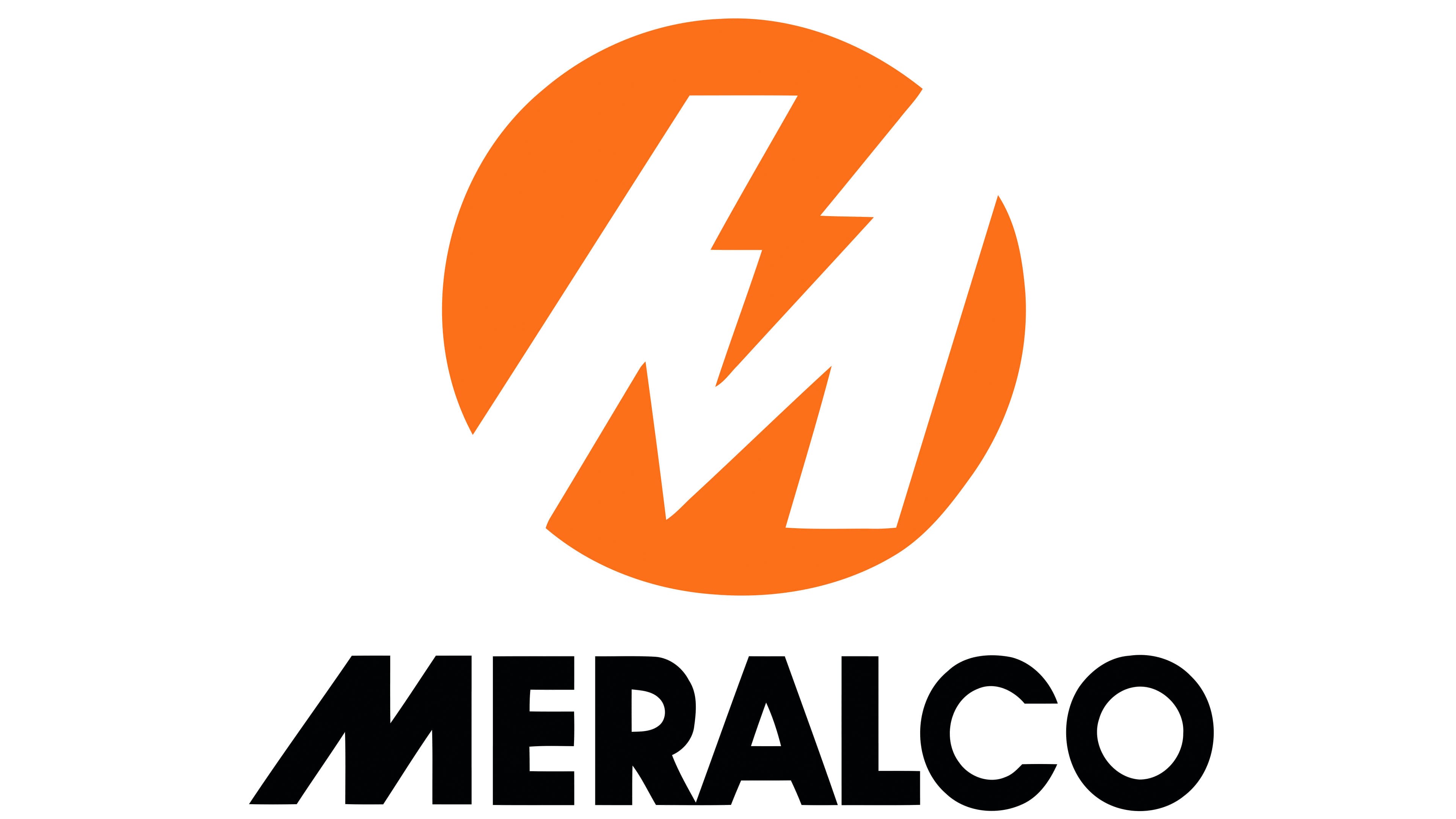
On March 18, 1989, Meralco introduced a logo by Design Systemat, tying the update to a stronger focus on customer care. The electricity provider serving Metro Manila and surrounding areas replaced its seal, full name, date, and motto with an orange circle containing a white “M” and a lightning bolt. Meralco is an abbreviation of Manila Electric Railroad and Light Company. Its initial became the basis of the new emblem.
The white “M” inside the circle was set at a 60° angle. A zigzag lightning bolt runs between its sections, combining the letter with a symbol of electricity and power. The slant symbolized the company’s growth and ability to adapt to change. The circle represented around-the-clock service and comprehensive coverage of electricity supply needs. The three interconnected shapes conveyed the meaning previously expressed in the explanatory wording.
MERALCO moved outside the emblem. In the vertical version, large black lettering sits beneath the circle. It uses a modified ITC Avant Garde Bold in uppercase sans-serif. The initial “M” differs from the other letters with slanted strokes that echo the symbol above it. The orange circle, white interior, and black name form the logo’s primary color scheme.
The emblem identifies businesses as members of the Meralco group, while orange connects their activities. When Meralco Power Academy updated its brand in 2024, the educational division retained the parent company’s symbol beside the academy’s name. Along with the symbol, the academy’s brand carried over the group’s shared design features.