Flight and movement are read in the company logo. The Nerf logo is like a bullet or a ball flying towards a target. They point to toys for mobile entertainment that will help children throw out the accumulated energy. Complements the emblem with a message of joy and games.
Nerf: Brand overview
| Founded: | 1969 |
| Founder: | Hasbro |
| Headquarters: | United States |
| Website: | nerf.com |
Meaning and History
The Nerf brand name was taken from racing jargon. In drag racers, this word means special crossbars covered with polyurethane foam and designed to protect vehicles. They were attached to the front of the trucks, which propelled the racers to the starting position.
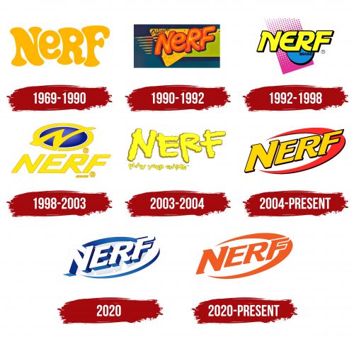
The designers used the original company name to design an entire series of logos. The first appeared in 1969, and the last in 2020. During this time, the inscription acquired a modern look with a 3D design and a gradient.
What is Nerf?
Nerf is an American toy brand known for its foam dart blasters and water guns. It is owned by the Hasbro company but was created in 1969 by another company, Parker Brothers. Initially, the brand produced indoor-safe balls but later expanded to include foam-based weaponry with safe ammunition made of polyurethane foam.
1969 – 1990
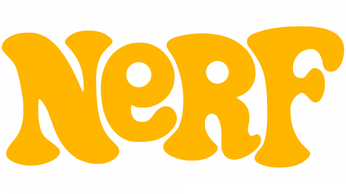
From its inception until 1990, the toy manufacturer had a yellow wordmark with no additional elements. The short “NERF” lettering looked unusual thanks to the stylized font in which the letters had a fantasy design. Uppercase “N,” “R,” and “F” were combined with lowercase “E” to make the logo even more informal. Strong asymmetry, rounded corners, and wide lines emphasized the brand’s playfulness.
This symbol began to be used in 1969 when Reyn Guyer invented a safe polyurethane foam ball that could not break anything. Parker Brothers began selling it in 1970, advertising it as an indoor ball.
1990 – 1992
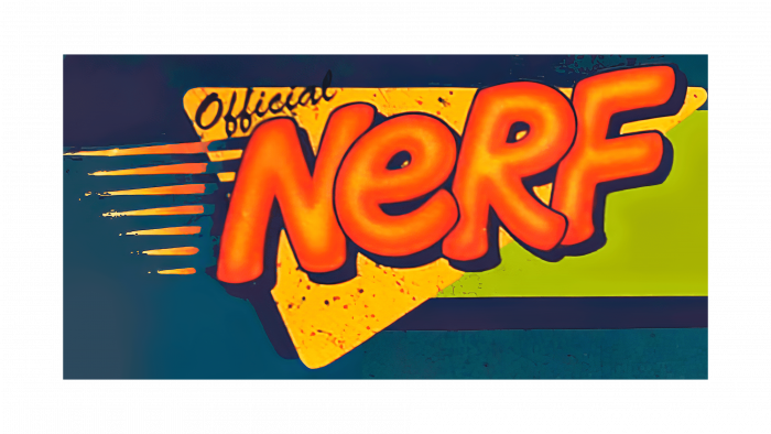
In the early 1990s, the brand had a new name. It had a more complex structure than the previous one. The word “NERF” was dyed orange, but the inside retained a little yellow in the form of thin strips. Dark blue outlines of varying widths appeared along the edges. The letters crawled over each other and were lined up diagonally, so the “N” was lower than the “F.” The font remains round, although the shape of the glyphs has changed noticeably.
Additional geometric shapes have been added in the background: a yellow triangle and a light green rectangle. To the left of the brand name were seven orange-yellow lines that emphasized the energy of movement. The word “Official” was inscribed above the speed lines and partly above the letter “N.” The designers used a black font to imitate sloppy handwriting. All elements were on a turquoise background with a gradient.
1992 – 1998
In 1992, Nerf launched its first dart blaster. An identity update marked this event. Metamorphoses occurred with the brand name again: the letters were repainted yellow, separated (except for “ER”), tilted to the right, and aligned horizontally. The typeface lost its streamlined shape because the designers opted for a typeface with short, rectangular serifs. The dark outline of the lettering was combined with the black word “BRAND,” which was located just below.
Symbolic elements have replaced the nonsensical set of geometric shapes. The blue circle represented the first Nerf toy, a polyurethane foam ball. The dark pink rectangle with artistic perforation depicted a flying dart fired from a blaster.
1998 – 2003
As a result of another redesign, the pink rectangle disappeared, and the blue circle turned into an oval and was moved up. It seemed convex due to the smooth transition of shades – from the light center to the dark edges. The creators of the logo used a radial gradient, and it was the only bright spot in the graphic composition. The remaining elements – a gold-tone ring with a stylized letter “N” and the inscription “NERF BRAND” in the same color – looked monotonous. A new font for the company name was bold, sans serif, with rounded corners and a pronounced slant to the right.
2003 – 2004
In 2003, the N-Strike Elite series of blasters debuted. The logo changed around the same time: as it was simplified, it lost the blue oval in the ring and began to consist only of inscriptions. The letters in “NERF” were like fluffy yellow clouds flying in different directions. And below, instead of the usual “BRAND,” there was an advertising phrase “PLAY YOUR GAME.” It was also yellow and cloudy, but the designers used a small print to emphasize the brand name.
2004 – today
The release of the new Dart Tag line coincides with the emergence of the new Nerf brand name. As before, there was a brand name. It sits in the middle and is slightly beveled diagonally, reminiscent of the 1990-1992 version. The yellow-orange lettering is a tribute to the original 1969 design. The thin black outline looks identical to the 1992-1998 logo. From the graphic symbol 1998-2003, an oval ring was taken, which looks like a red half-ring in the modern interpretation. It is located behind the word “NERF” and is slightly raised upward, making it look like a flying boomerang.
2020
The company adopted a new logo with a 3D effect to refine its visual style. It is similar to the previous version, but the brand name and the surrounding arc are painted silver with a transition of shades. All paths are blue, also with a gradient. The letters and the boomerang cast translucent light gray shadows, further enhancing the three-dimensional design.
2020 – today
Nerf: Interesting Facts
Nerf, known for its foam toys and games, has made a significant mark since its inception by Parker Brothers in the late 1960s. Now under Hasbro, it started with a foam ball in 1969, marketed as safe for indoor use. Nerf has evolved considerably.
- Start: Introduced as the first “indoor ball” in 1969, Nerf was designed for safe play inside homes without the risk of damage or injury.
- Growth into Blasters: In the 1980s and 1990s, Nerf expanded to include foam dart, arrow, and ball blasters, with the first blaster, “Blast-a-Ball,” launching in 1989.
- N-Strike Series: Launched in 2003, the N-Strike line became iconic, introducing a tactical play style that captivated fans.
- Performance-Focused Lines: Nerf introduced lines like Rival for enhanced performance and competition, targeting an older audience with high-impact foam balls.
- World Records: The brand and its community have set records for the largest Nerf battle, longest dart shot, and largest collection of Nerf blasters.
- Expansion into Digital: Nerf has ventured into video games and collaborations with franchises like “Fortnite” and “Overwatch,” bringing its action-packed experience to digital platforms.
- Eco-friendly Initiatives: In response to environmental concerns, Nerf is working on becoming more sustainable, including eliminating single-use plastic packaging.
- Community Engagement: The Nerf community actively customizes blasters, organizes events, and shares tips and strategies online.
- Wide Product Range: Beyond blasters, Nerf offers sports equipment and super soakers, emphasizing safe, active play.
- Global Reach: As a global phenomenon, Nerf’s products are sold worldwide, appealing to all ages and promoting active play and social interaction.
Nerf’s success lies in its innovation and ability to adapt to new play trends, technology, and consumer needs, growing from a simple foam ball to a globally beloved brand.
Font and Colors
The wordmark Nerf became more modern every year until it became a laconic inscription inside the ring. The old “playful” design is no longer relevant because the manufacturer has ceased to focus only on small children. Judging by the serious logo, he tried to broaden the target audience so that adults would buy dart blasters.
As is known, the font of the word “NERF” is bold, oblique, and with short triangular serifs. In appearance, it has a lot in common with Crillee Italic, which applies to both logos currently in use. They share typography but different color schemes. In the first version, yellow is combined with red and black. In the second case, the designers made the main color silver, complementing it with several shades of blue and adding light gray shadows.
