


 Netherlands National Football Team Logo PNG
The Netherlands National Football Team logo resembles a fierce beast ready to leap. The emblem evokes associations with excellent athletic training, fearlessness, skill, and readiness to compete for a place among the world’s best teams.
The Royal Dutch Football Association, KNVB, was founded in 1889, giving the Netherlands an early football structure. The national team played its first official match in 1905 and beat Belgium 4-1. In the early 20th century, the Dutch side won Olympic bronze medals in 1908, 1912, and 1920. Its World Cup debut came in 1934, followed by a round-of-16 appearance in 1938.
The 1970s became the main turning point for Dutch football. Under Rinus Michels, the team introduced “total football,” a system based on flexible roles, pressure, and quick transitions. With Johan Cruyff, Johan Neeskens, and Ruud Krol, the Netherlands reached the World Cup finals in 1974 and 1978, losing to West Germany and Argentina.
After a decline, the Netherlands returned to the UEFA European Championship in 1988 in West Germany. Ruud Gullit, Marco van Basten, and Frank Rijkaard led the team to a 2-0 final win over the Soviet Union, giving the country its first major European title. In the 1990s and 2000s, the Dutch reached European semifinals in 1992 and 2000, and finished third at the 1998 World Cup. Dennis Bergkamp became one of the key figures of that period.
In 2010, the Netherlands reached the World Cup final in South Africa, losing 1-0 to Spain after extra time, with Wesley Sneijder, Arjen Robben, and Robin van Persie leading the attack. In 2014, the team finished third in Brazil after beating the hosts 3-0. Later, it missed Euro 2016 and the 2018 World Cup, reached the Euro 2020 round of 16, and made the 2022 World Cup quarterfinal. Frenkie de Jong, Matthijs de Ligt, and Memphis Depay represent the newer generation.
Meaning and History
What is the Netherlands National Football Team?
The Netherlands National Football Team, known as Oranje due to their distinctive orange jerseys, represents the Netherlands in international football competitions. Managed by the Royal Dutch Football Association (KNVB), the team has a rich history and is celebrated for its innovative style of play, often referred to as “Total Football.” This approach emphasizes fluid movement and versatility among players. The Netherlands has consistently been a strong contender in major tournaments, producing many world-class players who have left a significant mark on the sport. The team’s passionate supporters and commitment to attacking football make them a prominent and respected force in global football.
1930s – 1950s
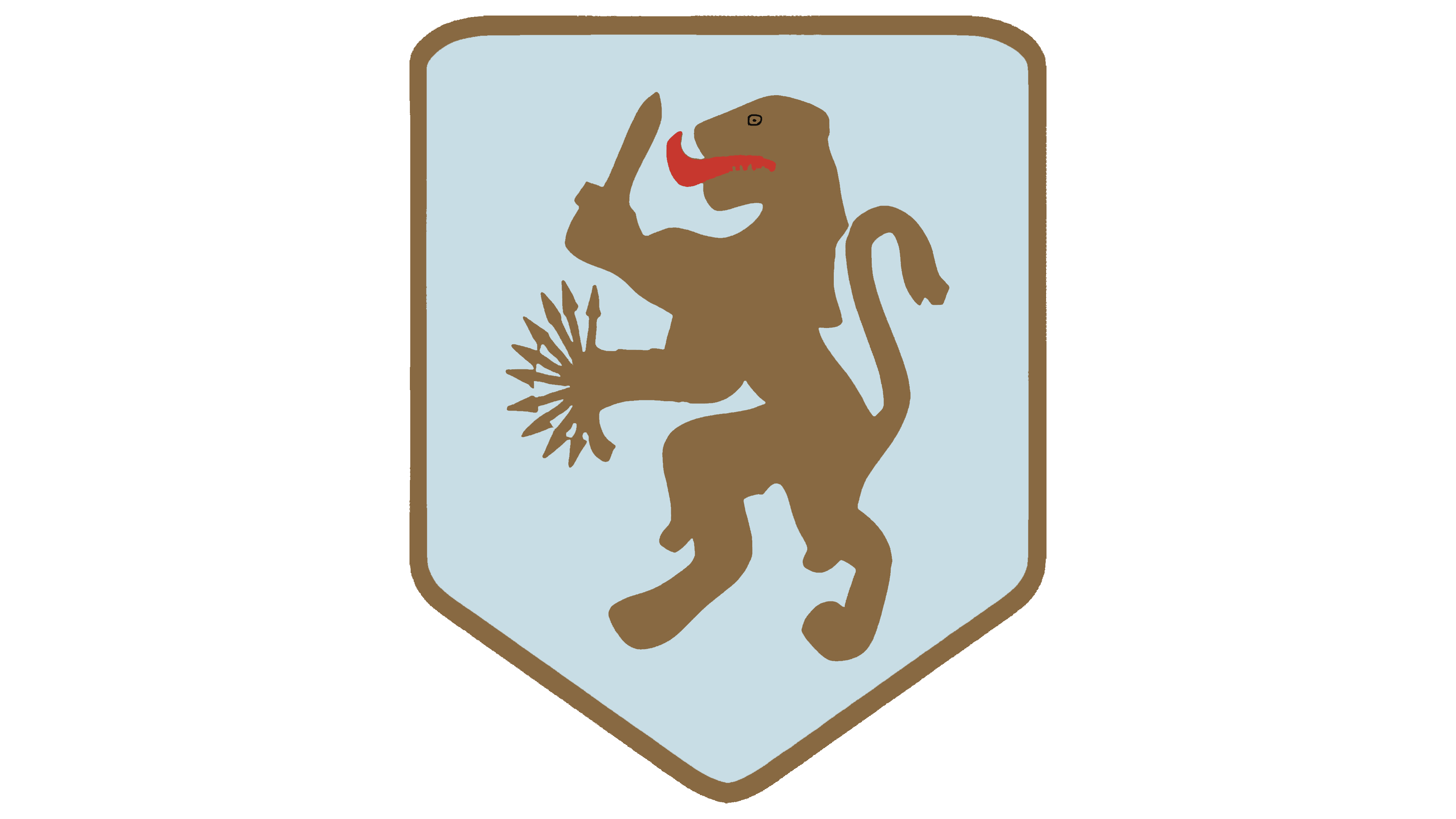
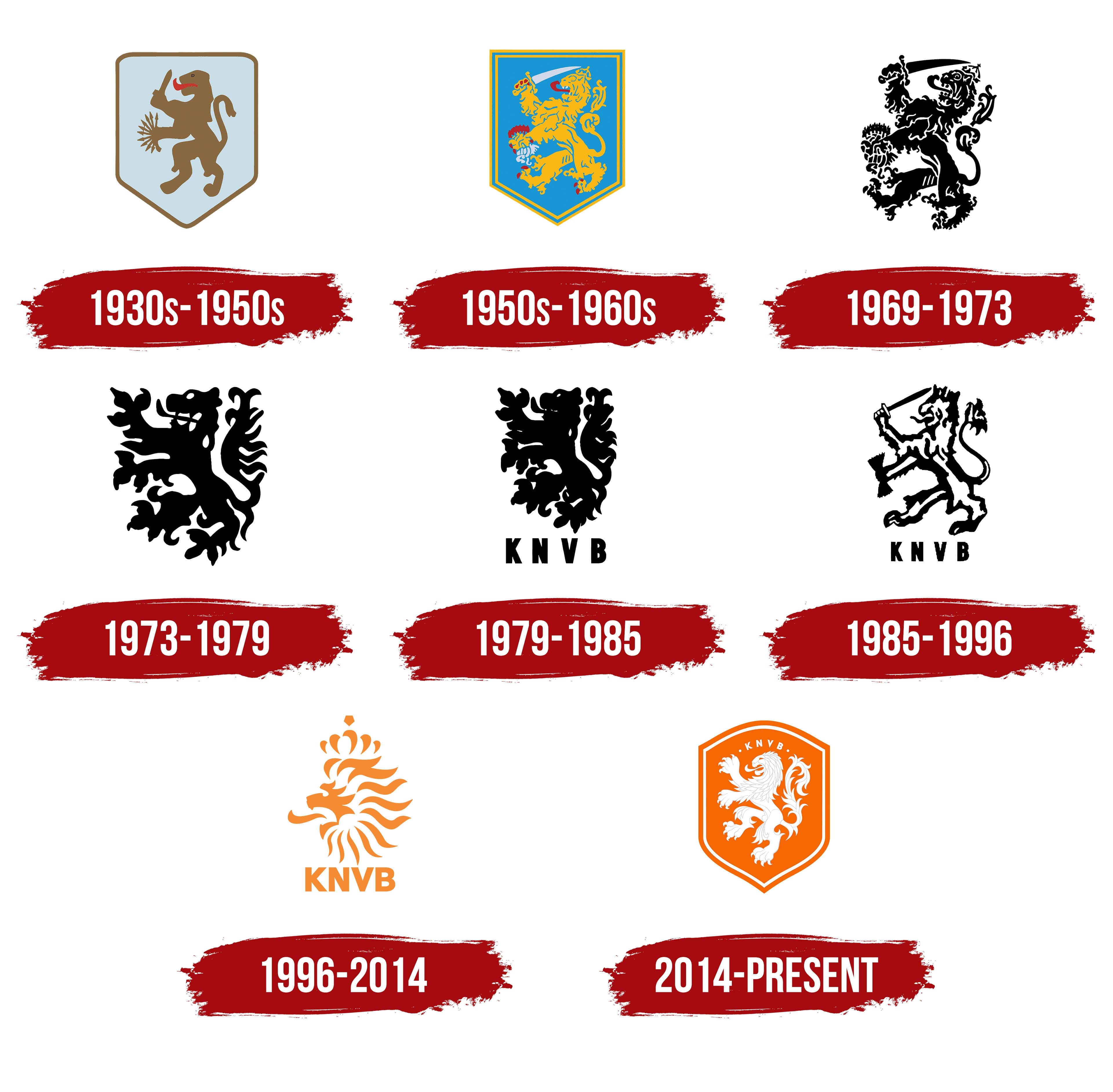
The Dutch lion forms the basis of the sports logo. This animal symbol differs from the heraldic version. Its sleek body gives the figure a streamlined and more athletic appearance. Arrows in one paw and a sword in the other indicate the team is a formidable and dangerous opponent. The shield’s golden coloring and outline convey regal majesty, the lion’s nobility, and the team’s ambition for top positions in competitions. The blue color, instead of the azure from the national coat of arms, adds a touch of lightness to the emblem.
1950s – 1960s
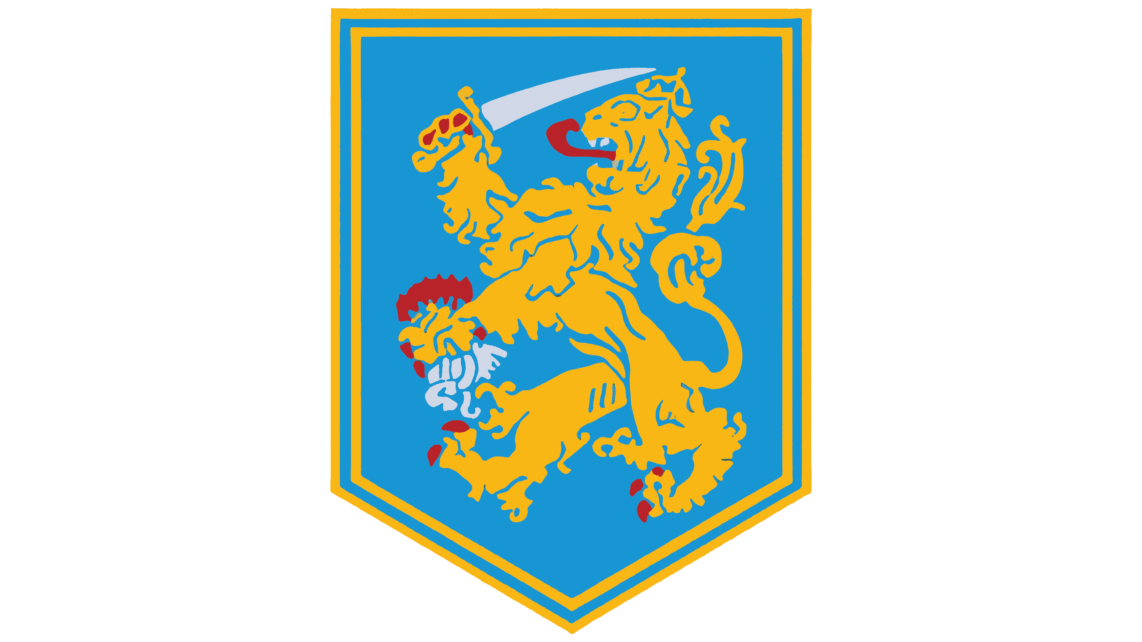
The logo from the 1950s is much closer to the national symbol. The lion’s silky mane, detailed strands, and fur curls give the team’s totem a more elegant and majestic appearance. The red claws draw attention as if stained with blood, evoking a sense of warlike readiness and danger. The team members are prepared for serious battles and will fight for their position and victory. The double yellow border of the shield signifies composure and inner strength.
1969 – 1973
The team’s logo was redesigned to feature a black imprint of a lion, devoid of any background or colorful details. This minimalist theme emphasizes the primary goal of victory. The monochrome and dark shades give the image a fierce and serious tone. The lion is shown snarling and roaring, baring its teeth to intimidate opponents. The emblem conveys a sense of power and invincibility, presenting a formidable and unbeatable presence.
1973 – 1979
The totem lost its crown, sword, and arrows, giving the emblem an element of wild and untamed strength. The black mane and outstretched clawed paws emphasized the animalistic power and might. The logo embodied the team’s unique approach to the game. The emblem conveyed a readiness to lead, highlighting the team’s distinctive style and fierce determination. This design choice underscored their commitment to excellence and ambition to dominate the field.
1979 – 1985
The lion appears more compact and peaceful, with the snarl and fierce roar removed. However, the totem still impresses with its strength and nobility. The image below is the abbreviation for the football association: KNVB (Koninklijke Nederlandse Voetbalbond). The design maintains the lion’s regal, powerful presence while presenting a calmer demeanor, symbolizing a balanced approach that combines strength and grace.
1985 – 1996
A new interpretation of the royal logo emerged in the mid-80s. The reintroduction of the crown, sword, and arrows transformed the totem into a vivid historical symbol of the Netherlands. The emblem represented the monarchy, the unity of the state, and the nation’s greatness. This design choice reflects the team’s deep reverence for their homeland and pride in their country. The emblem highlights the connection between the team’s identity and the rich heritage of the Netherlands, showcasing a profound sense of national pride and unity.
1996 – 2014
The 1996 logo resembles bright tongues of flame that twist, blaze, and remain elusive. The emblem features only the lion’s head. The mane, crown, and face are composed of individual orange lines. The tongues of flame represent the team members, who create a beautiful pattern through their interaction in the game. The emblem is full of dynamism and warmth, with a color scheme that evokes the sun.
2014 – today
The modern emblem combines a sports theme with the team’s national identity. Warm shades are full of energy and optimism. The white royal lion impresses with nobility and confidence. The finely detailed elements highlight the virtuosity and skill of the football players. The letters KNVB at the top, in the shape of a rainbow, emphasize the association’s support and care for the team.