


 New Balance Logo PNG
Harmony and balance are the emblem’s main commandments. The New Balance logo is balanced because it is moderate in all aspects. One half is complete, the other fragmentary, forming a harmonious unity. This demonstrates the brand’s ability to adapt perfectly to the fashion world.
New Balance began in 1906 in Boston, when Irish immigrant William J. Riley founded the New Balance Arch Support Company. He developed arch supports based on a three-point balance concept, inspired by a chicken’s foot. Early clients included workers who spent long hours on their feet.
In 1927, Riley hired Arthur Hall, who became a partner in 1934 and expanded sales. By the 1950s, the company added custom athletic shoes. In 1956, Hall sold the business to Eleanor and Paul Kidd. In 1960, they introduced Trackster, a running shoe with a rippled sole and multiple width options, unlike competitors such as Nike and Adidas.
In 1972, Jim Davis acquired the company during the Boston Marathon. At the time, production was limited to a few dozen pairs per day. Growth followed the running boom of the 1970s.
In 1976, model 320 was named Runner’s World’s best running shoe and introduced the “N” logo. Sales rose from $100,000 to $60 million within a decade. In 1982, the company opened a UK factory to serve Europe, while part of production remained in the US.
Sales reached $100 million in 1991 and $550 million by 1997. In 2001, the company acquired PF Flyers and released model 991, which Steve Jobs wore. Later acquisitions included Warrior Lacrosse in 2004.
In the 2010s, New Balance gained traction in streetwear through collaborations with brands like Aime Leon Dore, Stüssy, and Junya Watanabe. Revenue exceeded $65 billion in 2023 and $78 billion in 2024, and the Davis family still privately owns the company.
Meaning and History
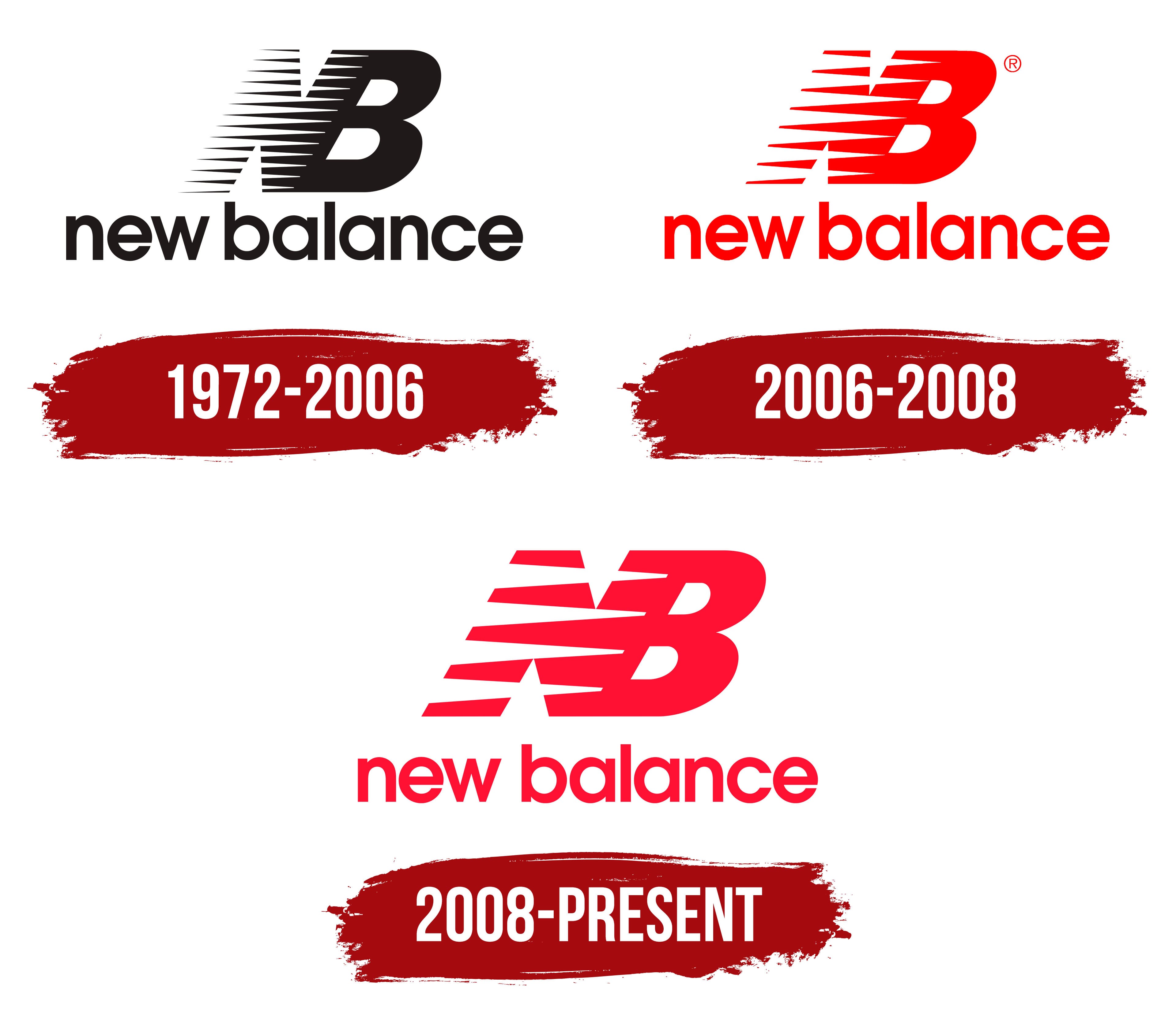
The brand’s emblem, like the athletic footwear it represents, seems timeless. Moreover, the logo has maintained its basic structure, shape, and appearance for almost half a century. The brand dates back to 1906, when it was first named the New Balance Arch Support Company. The footwear design is based on flexible arch-support technology, which ensures comfort and balance while running. The company first conveyed this through its name and later through its symbolism.
What is New Balance?
This company produces athletic footwear and apparel with its unique manufacturing strategy. It maintains the tradition of producing some products in the USA and the UK, which is rare in the modern industry. Its unique model-numbering system makes each pair’s functionality clear. A wide range of easy-to-understand sizes and widths ensures the shoes fit any foot shape. The product lineup includes running, walking, tennis, and casual wear models while maintaining a recognizable style with the “N” symbol on the side. This approach has made the company popular among professional athletes and streetwear enthusiasts.
1972 – 2006
Until 1972, the trademark had no permanent logo; it was introduced much later. The graphic includes an abbreviation – a shortening of the company’s name, New Balance. Terry Heckler designed the logo.
The designer based it on dynamics, embodied in 12-speed signs applied to the letter “N.” Black-and-white stripes alternate, creating a stylish interlacing of slits. The “B” does not. It consists of a solid black marker. Both letters are uppercase and tilted to the right, conveying movement and a sense of running.
Half of the text reads “New Balance,” which uses only lowercase letters. They are smooth, streamlined, and sans serif. The inscription sits on a single line under the graphic element.
2006 – 2008
In 2006, the company underwent a minor redesign. As a result, the emblem received fewer speed signs (reduced from twelve to six) and a rich red color. This emphasized energy, brightness, and the emotional and physical surge provided by this brand’s specialized sneakers.
2008 – today
In this version, the number of marks changed again; there were now four. The color also changed: the logo acquired a scarlet hue, close to light raspberry. Otherwise, everything remained the same as in the initial variation.
Font and Colors

The brand name’s symbolism is simple: it has no extra elements. The visual series is designed to serve as an integral informational and marketing tool.
Terry Heckler, a talented artist-designer and the creator of brands such as Starbucks, Rainier Beer, K2, Cinnabon, Panera Bread, and others, developed the original version. Moreover, he conveyed the most important information through letters and lines: purposeful forward movement and balance, using the latest technologies. The logo is formed by the tilt of the abbreviation and special signs, the so-called speed tracks, which have been reduced over time.
The logo’s font resembles ITC Avant Garde Gothic Demibold. Herb Lubalin created it for Avant Garde magazine.
New Balance’s color palette has changed with each brand redesign, but has always included white, red, and black. The debut version was monochrome; the modern one is more varied, featuring black-and-white and red-and-white.

nb shoes logo
FAQ
What does the New Balance logo mean?
The “NB” monogram, intersected by numerous lines, represents the New Balance brand and symbolizes high speed. The letters are tilted to the right to create a sense of forward movement, and the speed lines add energy.
How do I know if my New Balance is fake?
You can spot a counterfeit by an incorrect logo on the sole, box, insole, or heel. The information on the labels under the shoe’s tongue and the packaging should match, including the barcode number.
Does Adidas own New Balance?
New Balance is privately owned and is not owned by Adidas.
Who created the New Balance logo?
Commercial designer Terry Heckler created the very first version of the logo in 1972. Since then, the design has changed several times, and other specialists have worked on it.