


![]() Nick Jr. Logo PNG
Nick Jr. Logo PNG
The Nick Jr logo evokes warmth and joy, recalling carefree childhood moments. Its shapes and colors create an atmosphere of playfulness and friendliness, conveying a lighthearted, fun approach to learning through communication and creativity.
Nick Jr. began inside Nickelodeon rather than as a separate channel. Its origins go back to 1977, when educator Vivian Horner launched Pinwheel on the QUBE cable system in Ohio. The program mixed puppets, live-action segments, European and Canadian cartoons, and educational storytelling. When Nickelodeon became a national cable channel in 1979, Pinwheel became one of its main daytime programs.
During the 1980s, Nickelodeon used its morning schedule for preschool content with minimal advertising. After the channel’s 1984 rebrand and the launch of Nick at Nite, the preschool block continued expanding. On January 4, 1988, it officially adopted the name Nick Jr. at the premiere of The World of David the Gnome. The brand was later shortened to Nick Jr. and adopted its orange-and-blue logo.
In the 1990s, Nick Jr. began producing original programming. Eureeka’s Castle replaced Pinwheel after 1990, while the 1993 rebrand introduced the slogan “Grow, Learn, and Play” and the animated host Face. Gullah Gullah Island and Allegra’s Window boosted ratings in 1994. Blue’s Clues arrived in 1996, followed by Dora the Explorer in 2000, helping Nick Jr. compete with Disney Channel’s preschool programming.
Nick Jr. later expanded through Nick Jr. on CBS and the Noggin block owned by Viacom. On September 28, 2009, it became a standalone 24-hour television channel after replacing Noggin. In 2012, the rebrand removed the remaining Noggin identity, including Moose and Zee.
Meaning and History
![]()
Nickelodeon previously aired a preschool programming block. By 1987, the content had grown so much that the project managers separated it into a brand, Nick Jr. A year later, it was renamed Nick Jr. The rebranding was completed in mid-1989 and led to the emergence of an entire identity system, in which the orange-and-blue logo with an inscription occupied the central position.
However, the word mark appeared very rarely on screen. Designers have developed many icons of different shapes, including rockets, mushrooms, elephants, flowers, snails, and other figures associated with cartoon characters. A common configuration united them: there was always a large orange element on the left and a small, light blue one on the right. One part had the inscription “NICK,” and the other “JR.” The typography was the same in all cases.
The conglomerate ViacomCBS Inc., which owns all the brands, considered Nick Jr. a worthy replacement for the Noggin TV network. The logo also reflects Nickelodeon’s corporate identity, but the designers sought to give it its own identity.
What is Nick Jr?
It is an entertainment and educational programming block for preschoolers owned by Nickelodeon. It began broadcasting in 1988, and in 2009, a standalone children’s channel based on it was launched. To avoid confusion, it is referred to on-air as Nick Jr. Channel. The channel features a variety of shows, such as Santiago of the Seas, Peppa Pig, Bubble Guppies, and The Adventures of Paddington.
1988 (pre-launch)
![]()
On January 4, 1988, Nickelodeon introduced a children’s programming block called Nick Junior, and one of its earliest symbols was a bright orange circle with white lettering inside. The logo looked like a sticker on the screen, so the text was arranged diagonally in two lines, with “NICK” on top and “JUNIOR” below.
The lettering was positioned to fit tightly inside the circle, with no gaps or spaces. The typeface was Balloon Extra Bold. The letters appeared heavy and rounded. Each character showed a slight variation in size, giving the word a playful, relaxed feel, well-suited to the channel’s young audience.
The orange background echoed the Nickelodeon logo’s primary color, highlighting the connection between the blocks while still emphasizing their independent identities. The bright color stood out on screen and was easy for children to perceive. Against this background, the white letters appeared friendly.
1988 – 2009
![]()
By the fall of 1988, the Nickelodeon children’s block shortened its name to the compact “Nick Jr.” and updated its logo. Starting on September 5, viewers saw a new design where the bright orange word “NICK” appeared alongside the blue “JR.” The color combination became a defining feature of the emblem and the channel’s visual style.
Both words were set in uppercase letters using the Balloon Extra Bold typeface. It is rounded, friendly, and slightly cartoon-like. The characters are soft and smooth, with a touch of asymmetry, as if hand-drawn. The initial letters “N” and “J” are slightly taller than the others.
The rich orange of the first word recalled the shade used in the Nickelodeon logo, linking it to the main media network. The blue tone of “JR.” added contrast and drew attention to the channel’s younger audience.
A slight rightward tilt gave the letters an added sense of lightness. The channel gained a visual identity that reflected a spirit of childlike spontaneity and optimism.
1988 – 1993
![]()
In the history of the Nick Jr. television channel, there was a period when an unusual emblem appeared featuring two silhouettes resembling stylized human figures. Viewers remembered it as a lively, memorable image of a parent and a child, connected by a firm handshake.
Both figures are drawn in an extremely simple manner. They have round heads and bodies built from straight lines. The left figure is larger and bright orange, representing an adult. Across its chest, the word “NICK” is written in large white letters. The smaller figure on the right is colored blue and has one arm slightly raised, giving the entire composition a sense of lightness and ease. On the chest of the blue figure is the inscription “JR.” executed in the same way.
The color combination and the simplicity of the forms point to the channel’s family-oriented nature. The two figures are holding hands, emphasizing the importance of the connection between adults and children. The lettering uses the Balloon Extra Bold typeface and appears friendly. In style, the font is also similar to others, such as Comic Sans or Blippo, but in Balloon Extra Bold, the characters feel lighter and freer.
Children and adults perceived the channel as a space that brought together different generations. The clear imagery and easy readability made the logo a recognizable part of the channel’s visual identity.
1993 – 2009
![]()
At one stage in the development of the Nick Jr. brand, viewers saw a completely new image replacing the familiar human figures, combining two stylized animal shapes. Instead of the silhouettes of an adult and a child, rounded creatures appeared, resembling playful hippos or piglets.
Both figures are positioned side by side. The larger one is colored a bright, sunny orange. It appears to lean gently against the smaller blue pig. Their bodies are simple, with small legs and curled tails. Each animal has a defined face with ears, which makes the silhouettes look friendly and cozy.
The orange figure reads “NICK,” while the blue one reads “JR.” The inscriptions are large, white, and set in uppercase letters. The typeface remains the same, Balloon Extra Bold. It is soft and light, resembling a childlike writing style while retaining clear outlines. In style and form, the font is close to other well-known cartoon typefaces such as Blippo.
The figures are arranged to suggest gentle contact with one another, conveying interaction between an older and a younger character. This continues the theme of closeness and friendship that has long been central to Nick Jr.’s image. The logo’s color and form shaped the brand as open, positive, and focused on a young audience.
2003 – 2009
![]()
In 2003, the children’s television channel Nick Jr., part of the Nickelodeon family, updated its logo and simplified its visual style. The channel, known for educational programs and cartoons for very young viewers, introduced a refreshed look that was easy for even the smallest children to understand.
The logo was formed by two circles placed close together. Instead of the previous figures and animals, a minimalist composition based on simple shapes was introduced. The larger circle on the left is filled with a bright, lively orange, with the word NICK written inside in white uppercase letters. The smaller circle on the right is light blue and calm, with the letters JR in centered white uppercase.
The circles slightly touch, creating a subtle sense of unity and contact. The color orange is associated with energy, while blue conveys a sense of calm and friendliness. Their combination suggests that the channel is aimed at active, curious, and sensitive children who perceive the world.
2007 – 2009
![]()
At a certain stage in its history, the Nick Jr. television channel introduced an unusual version of its logo. The main focus of the new image became a pair of anthropomorphic three-dimensional characters resembling soft toys. Instead of flat silhouettes, viewers saw bright orange-and-blue characters with long rabbit ears, round, smiling faces, and plush-like bodies.
The figures are rendered in rich colors. On the left stands the larger orange character, on the right its smaller blue companion. Their appearances are anthropomorphized. Rounded body shapes, short arms, and short legs emphasize the toy-like nature of the characters. The surface looks soft and textured, suggesting the figures could be touched and the fabric felt.
White lettering was placed on the chest of each character. The orange character carries the word NICK, while the blue character shows the word JR. The typeface remained unchanged, Balloon Extra Bold. The letters are dense yet rounded, reinforcing the image’s overall softness.
A distinctive feature of the design was an additional detail: full skirts matching the characters’ body colors, orange on the left and blue on the right. Light and shadow, material shine, and fabric folds add realism to the figures, bringing them closer to familiar children’s toys.
The characters stand side by side, lightly touching each other. Their placement continues the adult child pairing theme that has been part of the channel’s identity since 1988. The overall mood of the logo is light and warm, reflecting Nick Jr.’s focus on its youngest audience and the emotional comfort it provides to young viewers.
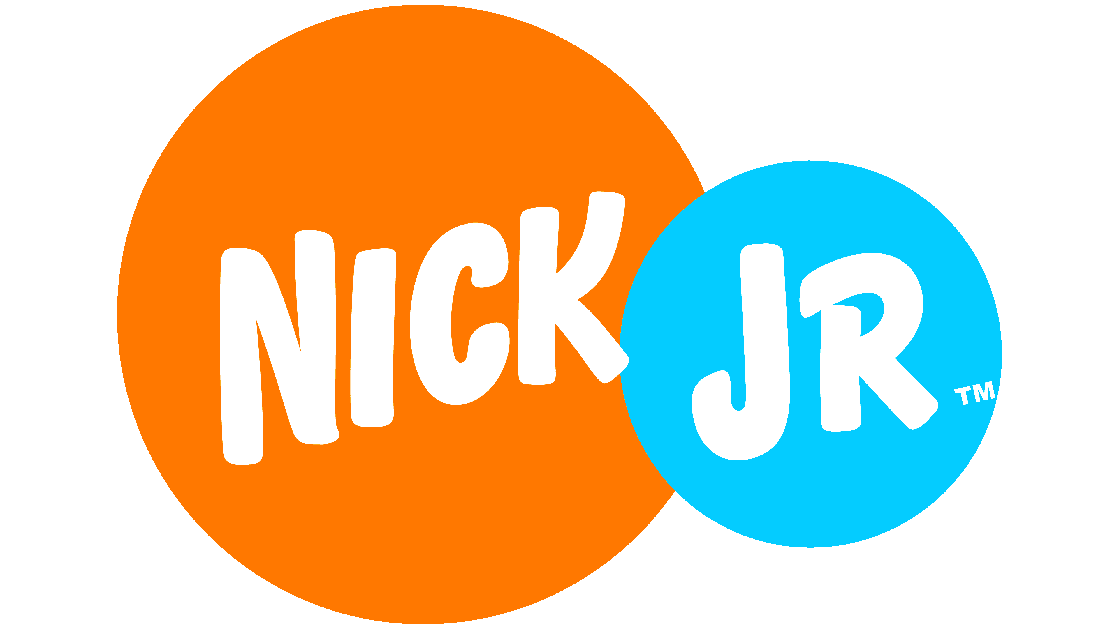
2009 – today
![]()
In September 2009, the Nick Jr. television channel was transformed along with other Nickelodeon projects. At the same time, the Noggin channel rebranded as a full Nick Jr. brand, with a new look designed by Eric Zim.
The channel took its name from the popular preschool programming block. The channel’s visual style is now closely connected to the updated image of the parent brand. The first part of the wordmark, “nick,” matches the beginning of the Nickelodeon logo. The letters are lowercase and set in a rich orange color. The second part of the name, “jr,” is colored in a light turquoise shade and ends with a round, bright dot resembling a child’s ball.
Both parts of the wordmark use the same typeface. The letters are lowercase, sans serif, rounded, and wide at the base. The letterforms appear solid, and the wordmark reads as calm and easy. The color combination separates the two parts of the name, making it memorable even for very young viewers.
The design’s simplicity and directness are aimed primarily at children. The updated Nick Jr. preserved continuity with Nickelodeon while strengthening its own identity, becoming even brighter and more friendly in perception.
Font and Colors

The core of Nick Jr.’s visual system is the logo with the brand name. It is designed in a playful style to attract children’s attention. The “i” looks most unusual: its vertical part merges with the point. At the same time, a thin line stretches between the two parts of the letter, as if they used to be one whole but have begun to separate.
Nickelodeon and Nick Jr.’s typography align because their logos were created simultaneously. A common custom font unites them with a rounded shape. Initially, the design had no analogs, but in 2016, the Litebulb Bold typeface was developed based on it.
The color palette contains only two shades: orange (PMS Orange 021) and light blue (PMS 306). They divide the inscription into two parts and do not mix.