


 Dora the Explorer Logo PNG
The “Dora the Explorer” logo embodies the spirit of adventure and exploration, immersing viewers in an exciting world full of mysteries and discoveries. The bright, dynamic elements of the logo emphasize the show’s creativity and energy. The emblem grabs attention with its visual design and symbolizes the program’s educational goals. The vibrant colors and playful font convey a sense of childlike innocence while also hinting at logic, exploration, and the accumulation of useful knowledge children gain while watching.
Dora the Explorer began in 1999, when Chris Gifford, Valerie Walsh, and Eric Weiner developed an educational preschool show built around problem-solving and basic Spanish. The main character was first planned as a rabbit. Still, after advice from child-development experts, the team created Dora, a seven-year-old Latina girl who could speak directly to young viewers and guide them through each adventure.
The animated series premiered on Nickelodeon on August 14, 2000. Its interactive format asked children to answer questions, repeat words, and help solve tasks during the story. The first season led to rapid franchise growth, with toys, books, and clothing released in 2001. In 2002, the show received a Peabody Award for its educational value, and in 2003 the first video game, Dora the Explorer: Barnyard Buddies, appeared on Game Boy Advance.
The franchise expanded again in 2005 with Go, Diego, Go!, a spin-off centered on Dora’s cousin. In 2008, the original series reached its 100th episode, and a Dora magazine was launched the same year. A new version, Dora and Friends: Into the City!, premiered in 2012, presenting Dora as a 10-year-old living in an urban setting while keeping the educational structure of the earlier series.
A live-action feature had been discussed since 2009, and Dora and the Lost City of Gold was released in 2019, earning over $120 million worldwide. In 2020, the franchise marked its 20th anniversary with special programming and merchandise. In 2021, Paramount and the channel team announced new animated projects. By 2023, Dora remained active in more than 150 countries through television, digital content, apps, and educational products.
Meaning and History
What is Dora the Explorer?
This innovative animated series has transformed the approach to interactive children’s television. The show follows the adventures of a young Latina girl eager for discovery and knowledge. With the help of her trusty backpack and map, she embarks on journeys that blend learning and entertainment, helping viewers develop problem-solving skills, basic Spanish skills, and cultural awareness. A unique feature of the series is its direct engagement with children, encouraging them to join the adventures, answer questions, and complete tasks alongside the characters. The show features a colorful ensemble of characters, including the monkey Boots and the fox Swiper, who help the series promote multicultural understanding and bilingualism. This vibrant and creative world quickly became beloved by young children, making the series an important part of children’s educational television.
1999
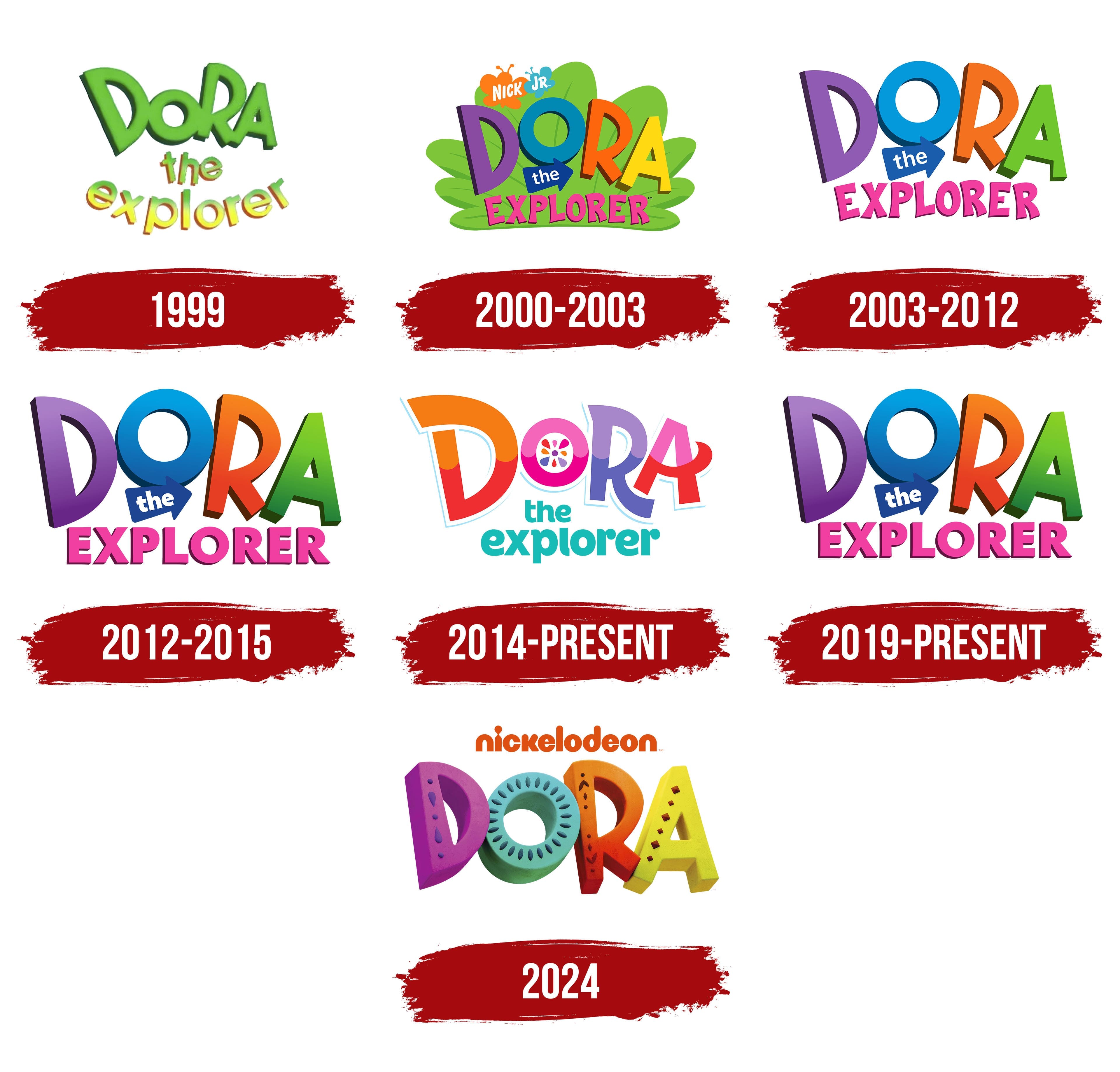
The pilot version of the logo was created before the series launch and reflects the theme of nature, as all the characters’ adventures take place in open spaces. Green and yellow shades were chosen to represent the natural world. The main character’s name, “Dora,” is written in large, slightly curved letters of varying heights, creating a sense of movement and adventure. The word “Explorer” is colored in gradient tones and smoothly curves at the bottom, completing the composition. Together, these elements form the visual image of a safe and exciting world that Dora and her loyal friend, the monkey Boots, explore. The variation in letter sizes emphasizes that the story can captivate children of different ages.
2000 – 2003
By the time the series was released, the logo had become brighter and more expressive. All the text is now set against a large green leaf, symbolizing nature and emphasizing that the cartoon’s events take place in tropical jungles. The main character’s name, “Dora,” is designed in a cartoonish style, with colorful letters of roughly the same size. The bright colors of the letters highlight the variety of adventures and educational topics explored in each episode. Playfully, children are introduced to basics: numbers, shapes, colors, and phrases in Spanish. The word “Explorer” is written in pink, emphasizing the main character, a girl. In the top corner of the logo, the symbol of the morning program block Nick Jr. is placed, where the premiere of “Dora the Explorer” took place.
2003 – 2012
The third season’s release noticeably simplified the logo, yet it retained key elements that conveyed the series’ essence. All additional details were removed, leaving only the title in its original style. The article “the” was placed inside a blue arrow, adding dynamism and drawing attention to each episode’s constant movement. This movement reflects the series’ adventurous nature, in which each episode becomes an exciting journey involving tasks, finding the right place, or activating a specific object. The arrow serves as an important interactive element, acting as a pointer and symbolizing the help that viewers and characters provide one another.
2012 – 2015
The logo underwent minor changes. The letters of the main character’s name were given dark shadows at the bottom, adding additional volume. The word “Explorer” is rendered in a straighter and more formal font. These changes were introduced in the seventh season when the cartoon was first broadcast on High Definition Television, which required more detailed imagery. In the new design, all shadows and outlines are carefully drawn, creating a sense of depth and clarity.
The change in the font of the word “Explorer” symbolizes Dora’s gradual maturation, reflecting the character’s natural development. The blue arrow, an important logo element, also became darker and sharper. This detail underscores the importance of navigation, one of the series’ key themes. Before every journey, Dora always identifies significant landmarks that help her and the viewers move in the right direction.
2014 – today
The emblem debuted with the release of the sequel series “Dora and Friends: Into the City!” and, along with it, the style of the main character’s name changed. The logo reflects Dora’s gradual growth into a schoolgirl. This is evident in the letters, where the curved glyphs resemble neatly arranged curls, adding softness and dynamism to the design.
The letters are split in half, with their lower portions shaded in darker tones, giving the entire logo more volume and depth. The color palette was also updated, replacing the previous shades with blue, red, and orange hues to symbolize new adventures.
The word “Explorer” is now set in a soft lowercase font in sea-green, with rounded droplets at the ends of the letters, creating a playful mood. This shade echoes the color of the beads on Dora’s magical bracelet, which she uses throughout the series.
The letter “O” stands out with a flower, referencing the bracelet, where items hang from the charm and can be used as needed. The flower also resembles the pattern on the heroine’s dress, enhancing the visual connection to her character’s details.
2019 – today
The logo of Dora the Explorer, used in 2019 for the release of the feature film Dora and the Lost City of Gold, was based on the 2012 version. It returns to the classic style of the show’s early episodes. The emblem appears bright and attractive, perfectly matching the target audience of children.
The title is rendered in large, multicolored letters: purple, blue, orange, and green. Each color symbolizes a different aspect of Dora’s adventures. Purple indicates the mystery of new places, blue represents calmness and knowledge, orange reflects energy and enthusiasm, and green is associated with nature, travel, and exploration. The word EXPLORER is placed beneath the title in bright pink letters, adding playfulness and dynamism to the visual mark.
The logo includes an arrow symbol pointing to the word “the.” This element adds a sense of movement, emphasizing the show’s exploration and adventure theme. The arrow points forward, inviting the viewer to actively participate in the heroine’s adventures.
The font is notable for its boldness, creating a three-dimensional effect and depth, symbolizing the wide and engaging world waiting to be explored. The letters are slanted, adding a sense of motion and fun, highlighting that this is a children’s show and a true adventure for young viewers.
The return to the classic emblem style respects the show’s roots while presenting an updated, more dynamic visual that aligns with the spirit of the new feature film.
2024
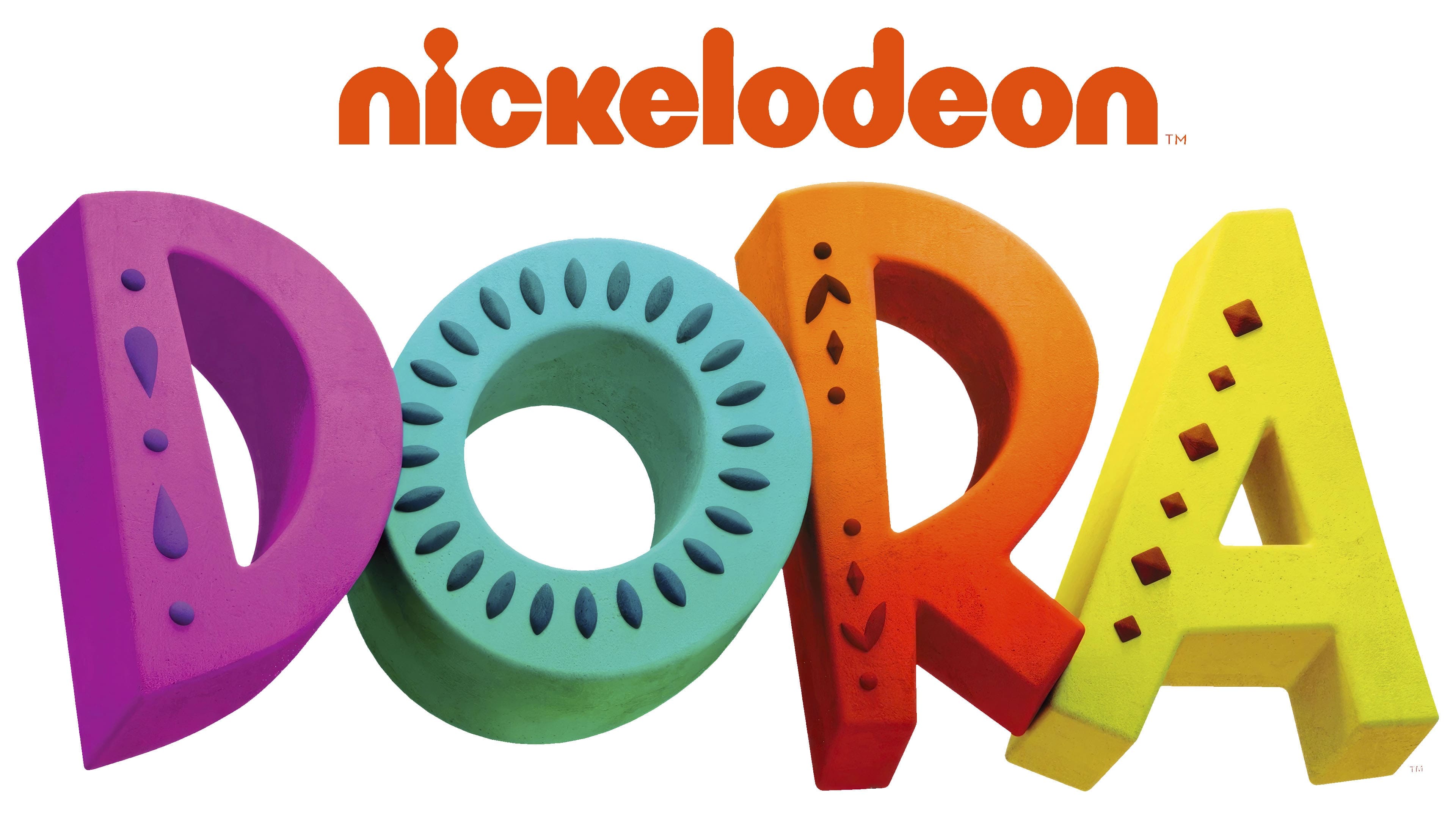
The new logo for the series Dora: Say Hola to Adventure, a reboot of the classic Dora cartoon, stands out with its brightness and deep symbolism. The letters in the word DORA are designed in a three-dimensional style, each crafted as a unique jewel-like element. This approach symbolizes adventure and treasure-hunting, a central theme of the show.
Each letter has individual elements: droplets on the letter “D,” patterns on the “O” and “R,” and geometric shapes on the “A.” These details evoke ancient artifacts that Dora finds during her travels. They add a sense of mystery and emphasize the abundance of cultural discoveries in each cartoon episode. The stylized elements give the lettering a feminine touch, highlighting the bold, confident character of the main heroine while maintaining a playful, childlike quality.
The visual mark’s color palette repeats the palette used in the original 2000s show: purple, blue, orange, and yellow, bright, vibrant colors that attract attention and underscore the series’ energy and excitement. The return to this palette also symbolizes respect for the show’s legacy, maintaining a connection to the original.
The Nickelodeon logo, placed above the lettering, highlights the channel’s role in popularizing the character. Thanks to Nickelodeon, Dora became an iconic figure among children worldwide, and the inclusion of this logo is a tribute and a reminder of the show’s long and successful history.
With its bright colors and carefully thought-out details, this new emblem reflects the spirit of adventure and the character’s evolution, bringing viewers back to the show’s roots with a new, more modern approach.