![]() Catwoman Logo PNG
Catwoman Logo PNG
The Catwoman logo embodies the spirit of a heroine who always follows her own path, striking a balance between independence and danger. Her image combines elegance, predatory instinct, and unpredictability, making her a mysterious and captivating figure in any story.
Catwoman first appeared as “The Cat” in Batman #1 (1940), created by Bill Finger and Bob Kane for DC Comics. Originally introduced as Selina Kyle, a jewel thief disguised as an elderly woman, she soon became closely linked with Batman as an adversary with complicated motives.
By 1942, her identity evolved with the debut of a feline-inspired costume. However, her popularity declined during the 1950s due to strict censorship by the Comics Code Authority. Catwoman’s revival came in the 1960s with portrayals by Julie Newmar and Eartha Kitt in the Batman TV series, restoring her cultural prominence.
The 1970s and 1980s added depth to Selina Kyle’s character, shifting her role from mere villainy to that of a complex anti-hero. Michelle Pfeiffer’s memorable performance in Batman Returns (1992) had a significant impact on her image.
From 2002 to 2008, Catwoman starred in her own comic series, allowing for a deeper exploration of her personal conflicts. A 2004 standalone film starring Halle Berry notably departed from DC Comics’ original depiction. Anne Hathaway brought a more grounded portrayal to Selina Kyle in The Dark Knight Rises (2012).
In 2022, Zoë Kravitz portrayed her in The Batman, reintroducing Catwoman to modern audiences. As of 2024, Catwoman remains a central character in DC Comics, frequently appearing across comics and media, demonstrating ongoing adaptability and influence.
Meaning and History
![]()
What is Catwoman?
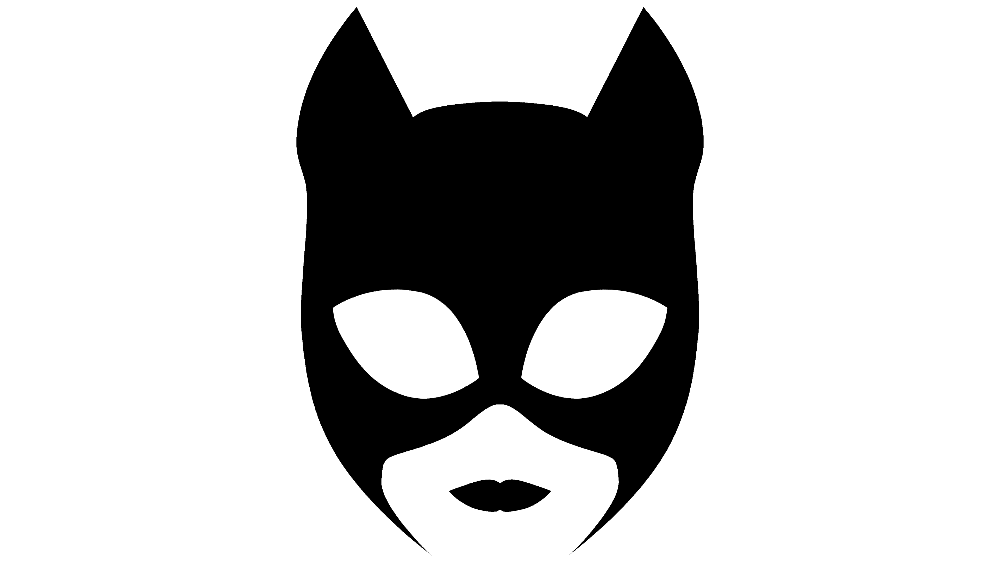
This comic book character is renowned for her cunning, agility, and ability to escape even the most challenging situations. She is a skilled thief and a protector of the weak who follows her rules, refusing to conform to the law or the criminal underworld. Her signature look features an elegant suit adorned with cat ears and claws, and a complicated relationship with the city’s legendary protector. Catwoman has become an integral part of pop culture, appearing in films, TV series, and video games, remaining one of the most charismatic figures in her universe.
Old
![]()
The development of the visual identity for the Catwoman film, starring Halle Berry, was carried out within Warner Bros., in collaboration with DC Entertainment. The team worked to create a symbol that would reflect the heroine’s aggressive, predatory nature, emphasize her connection to the feline world, and convey the aesthetics of an anti-heroine who stands in opposition to familiar DC comic characters.
The Catwoman logo design was based on a single expressive mark. Three torn lines form the letter “W.” They resemble the claw marks of a panther, placing the viewer in the context of wildness and independence. The symbol is read as a metaphor of strength, danger, and aggression. It emphasizes the transformation of the character’s storyline from an ordinary woman to a warrior heroine.
For the “claw” strokes, red was applied to express passion, cruelty, and unpredictability. It contrasts with dark backgrounds, making the mark appear as a warning and creating emotional tension. The limited color system does not weaken the composition; on the contrary, it makes the accent harsher and more concentrated.
Typography played a secondary role and did not seek to compete with the symbol. The font belonged to the category of sans-serif grotesques, closely resembling Gotham or Helvetica Neue in form. Its geometry was minimalist, and its neutrality kept the composition balanced while leaving the leading role to the “W” symbol.
The aggressive graphic style and torn contours matched the film’s overall artistic direction. However, due to the negative reception of the picture among audiences and critics, Warner Bros. and DC later abandoned this approach in projects featuring the Catwoman heroine.
New
![]()
In the updated version of the Catwoman logo, the key focus was on integrating a new symbol into the word’s structure. The inscription is stretched horizontally, and the lower line of the composition is slightly concave. The construction’s concavity elongates the outer letters “C” and “N”, creating a more compact and refined appearance for the central symbols.
The typographic base relies on a strict, geometric sans-serif. The letter lines are thin, and the strokes are evenly thick. Smooth curves and elongated proportions make the inscription’s silhouette elegant while conveying a hidden energy that echoes the heroine’s image, combining grace and strength.
![]()
Inside the letter “O” in the center of the word, a new symbol appeared. It is a diamond enclosed in a circle. The symbol works as a semantic accent. It refers to the image of Catwoman as a skillful thief associated with jewels and luxury.
The coloring is kept in a monochrome palette. The main black shade emphasizes the restraint and rigor of the composition. The use of a single color creates a sense of premium quality and enhances the atmosphere of mystery surrounding the character.
The inclusion of the diamond in the inscription’s structure links the visual concept to the heroine’s character and her storyline. It reflects Catwoman’s features as a symbol of seduction, luxury, and hidden strength.