


![]() Olive Garden Logo PNG
Olive Garden Logo PNG
The Olive Garden logo looks hospitable and evokes light, fragrant olive oil, pasta, and other Italian dishes. The emblem invites you to sit in the restaurant’s cozy shade and have a bite to eat.
Olive Garden began in 1982 in Orlando, Florida, as a casual American-Italian concept developed by Joe Lee. The goal was to make Italian-style dining feel familiar and accessible, closer to a family meal than a formal restaurant. The menu focused on pasta, soups, salads, steaks, and breadsticks, which later became one of the chain’s main identifiers.
During the 1980s and 1990s, Olive Garden expanded quickly across the United States. Dishes such as Zuppa Toscana, Fettuccine Alfredo, and unlimited breadsticks helped define its version of Italian-American dining. The advertising line “When you’re here, you’re family” became closely tied to the brand and helped position the restaurant as a place for birthdays, group dinners, and family gatherings.
In 1995, Olive Garden became part of Darden Restaurants, which gave the chain a stronger corporate base in casual dining. In the 2010s, the company updated its restaurants and adjusted the menu to changing tastes. In 2014, it added lighter dishes while keeping the value offers that customers already associated with the brand, including unlimited salad, soup, and breadsticks.
The 2020 pandemic forced Olive Garden to shift more attention to takeout, family-style meals, contactless pickup, and delivery. After restrictions eased, dining rooms reopened with a focus on safety and guest service. Today, Olive Garden operates more than 900 restaurants in the United States and abroad, including Canada, Mexico, Brazil, Kuwait, Ecuador, Slovakia, the Philippines, and other markets.
Meaning and History
![]()
Olive Garden was originally a division of General Mills. Its first location opened in Orlando in 1982. By 1989, it was already a chain with 145 catering establishments. This made it the fastest-growing of all the sub-brands, which is why it was eventually spun off as a brand in its own right. The company’s popularity increased month over month, and its sales volume gradually reached levels comparable to those of a competing chain, Red Lobster. Thus, it has become a leader among US full-service restaurant chains. Italian cuisine has always remained her basic specialty.
After several years of decline at the beginning of the millennium (the 2000s), Olive Garden has recovered. She opened new locations, teamed up with another division, arranged promotions with great deals, actively advertised herself, and, as a result, regained her former popularity. They began visiting her more often, getting to know her better, and even mentioning her on the music track (performed by Taylor Swift).
As for the identity, the restaurateurs used the old sign, which was approved when food outlets were first emerging. For a redesign, they change its style while maintaining the familiar structure. In general, the brand has four logos.
What is Olive Garden?
Olive Garden is one of the most successful brands in the food service industry. It originated in 1982 as a division of General Mills and has been part of Darden Restaurants, Inc. since 1995. It is now a popular U.S. restaurant chain serving casual Italian dishes adapted to American cuisine. It is famous not only for its logo but also for warm grissini, different types of pasta, numerous salads, soups, and steaks.
1982 – 1989
![]()
The company’s work started with a text logo. It was semi-coherent handwritten lettering, with only the first letters of the words “Olive” and “Garden” at a minimum distance from each other. The rest had tight but smooth transitions. The article “the” was at the top, and the restaurant chain’s main name was at the bottom. The symbols were thick and careless as if written in a fit of emotion; however, as befits a purely Italian manner.
1989 – 1998
![]()
The next logo remained similar to the individual flourish but was recolored from green to black. At the bottom, the developers added a clarification this time: “Italian Restaurant” to indicate the status of a catering establishment. The designers divided the phrase into two parts, placing one under the inscription “Olive” and the second under “Garden.” The letters in the new text were small, in capitals, and set in block serif type.
1998 – 2014
![]()
In 1998, the company changed its name slightly, removing the article “the.” Of course, this was reflected in the emblem, but not dramatically, since it still had two lines left, occupied by the phrase “Olive Garden,” divided into two parts. The style of the inscription has also been preserved, imitating careless handwriting in a small italic. At the same time, the authors corrected the capital “O” and lowercase “v,” painted the name in olive color, removed the serifs from “Italian Restaurant,” and drew a grape brush. It was supposed to symbolize Italy (a wine-producing country). The cluster was in the upper-right corner and was decorated with a vine featuring miniature carved leaves.
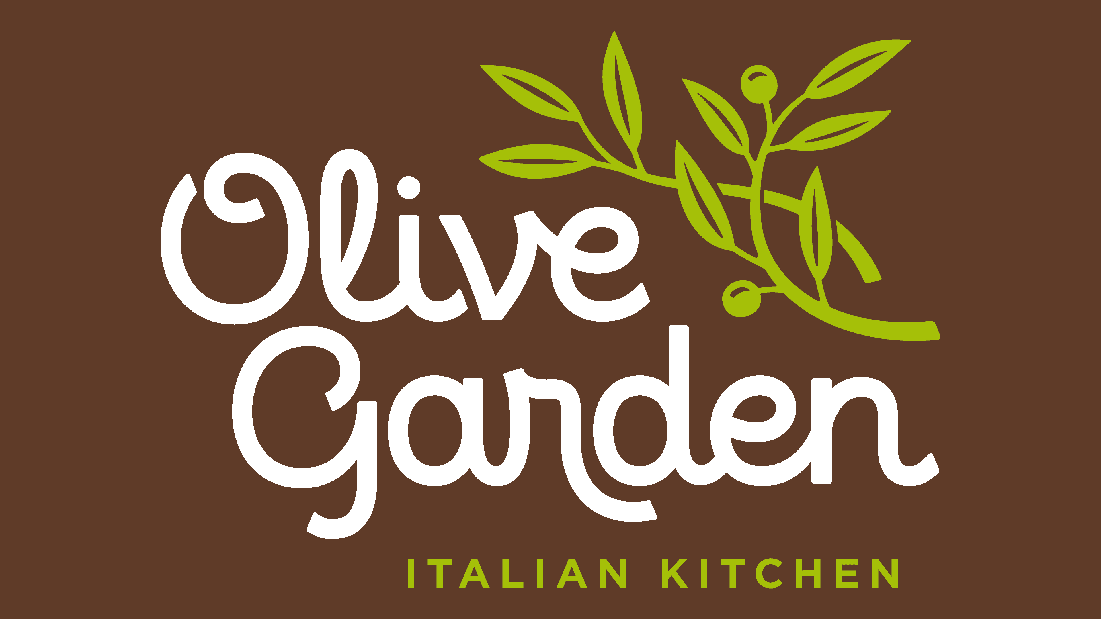
2014 – today
![]()
The current version of the logo has been completely changed both in style and the number of elements. The emblem now contains two branches of an olive tree, with intertwined fruit, to the right of the word “Olive.” Below is the second part of the company name, “Garden.” Below is the phrase “Italian Kitchen,” which clarifies the restaurant chain’s menu. Designers lightened the green, rounded the font, and straightened it.
Font and Colors

The history of modifications to the Olive Garden logo is, in fact, a refinement of the visual range it presents. In the course of evolution, the elements evolved towards the Italian theme: at first, it was emphasized by the “emotional” handwriting, then by a grape brush, and finally by an olive branch. Everything was done to accurately convey the network’s name, as it was criticized for the artificial atmosphere of the Italian spirit. The basis for the updated identification mark was the graphic work of the Lippincott studio, which created logos for several well-known brands: Coca-Cola, Pizza Hut, Dell, Walmart, Delta Air Lines, Sprint, and others.
The emblem currently uses the Eldwin typeface from The Northern Block. In early versions, the inscription was made in an individual font, soft italics, imitating handwriting.
The original palette reflects the color indicated in the brand name – olive. At different times, it was either dark or light. The logos also feature black, purple, and white.
FAQ
What font is the Olive Garden logo?
The logo uses a font similar to Pacifico, chosen for its friendly and welcoming vibe. This font is part of Olive Garden’s larger plan to make customers feel at home, showing the restaurant as a place for families to enjoy good Italian food in a cozy setting. The handwritten style of the font adds to the relaxed, informal atmosphere that the restaurant aims for. This font choice is important to Olive Garden’s image. It tells customers they’re in for a pleasant dining experience, like eating in the Italian countryside.
Choosing an informal and fun font helps Olive Garden stand out as a welcoming place for delicious Italian meals and memorable times with loved ones. This careful font selection plays a big part in making Olive Garden a favored choice for casual dining, highlighting the brand’s focus on hospitality and the joy of eating together.
Is Olive Garden food from Italy?
Olive Garden is a popular restaurant chain in the United States that serves Italian-American cuisine. While it offers dishes inspired by traditional Italian recipes, the ingredients aren’t imported from Italy. Instead, Olive Garden blends American tastes with Italian cooking styles, creating appealing meals for a wide audience. This mix has made it a favorite spot for Italian-flavored dishes in a welcoming, family-friendly setting.
Owned by Darden Restaurants, Inc. and based in Orange County, Florida, Olive Garden’s menu features well-loved Italian dishes such as pasta, breadsticks, and salads. Some of these dishes have been tweaked to better suit American preferences. This combination of American and Italian influences has helped establish Olive Garden as a go-to place for enjoyable dining experiences. Although some ingredients reflect the influence of Italian regions, all the food is prepared and served in the U.S., making Olive Garden’s offerings Italian-American rather than traditionally Italian.
What is the meaning of the Olive Garden Logo?
The logo, featuring green olive branches with ripe olives, symbolizes the restaurant’s connection to Italian cuisine and its welcoming atmosphere. Olives, essential to Italian cooking, reflect the authentic tastes Olive Garden aims to offer. This imagery, iconic of the Mediterranean, also represents peace and goodwill, fitting Olive Garden’s aim to be a place for gatherings.
The green color of the olive branches emphasizes freshness and quality, aligning with Olive Garden’s commitment to using high-quality ingredients. This logo tells a story of Olive Garden’s Italian heritage, focuses on quality, and is dedicated to creating a friendly, family-like dining experience. Olive Garden’s logo effectively communicates its mission to bring Italian flavors to its customers in a warm, inviting setting.
What does the logo symbolize, the Olive Garden Logo?
The logo symbolizes the restaurant’s fresh start and deeply connects with the traditions of Italian cuisine and the natural beauty of the Mediterranean. Central to the logo are olive tree branches, emphasizing the olive’s crucial role in Italian food and culture. The olive symbolizes peace, longevity, and prosperity, values that Olive Garden wants to share with its customers.
The logo’s design, with its elegant, curling letters, resembles young plants growing, linking to themes of freshness, growth, and the lively essence of the Mediterranean. This choice reflects Olive Garden’s goal of offering fresh, high-quality dishes.
Why are there grapes on the Olive Garden logo?
From 1998 to 2014, the logo included a bunch of grapes, which might have seemed out of place to some. This design choice was deliberate, meant to showcase Olive Garden’s strong ties to Italian culture and food. Italy is famous for its vineyards and winemaking tradition, key elements of Italian dining. By adding grapes to its logo, Olive Garden sought to highlight its commitment to offering authentic Italian flavors and traditions in America. The grapes next to the ‘Olive Garden’ name made the logo stand out, even if it seemed unusual. This was a thoughtful move to make the logo both eye-catching and unforgettable.
Why did Olive Garden change its logo?
In 2015, Olive Garden underwent a significant rebranding, including a new logo, to update its image and remove past issues that might have hurt its reputation. The main reason for this change was to make Olive Garden appealing again and boost sales, following a more than 10% drop in customer visits. The new logo aimed to mark a fresh start for the restaurant, drawing people back in. This effort was about making Olive Garden competitive again and securing its place in the fast-paced restaurant world.
What is the slogan for Olive Garden?
For fifteen years, Olive Garden embraced the heartwarming slogan “When You’re Here, You’re Family.” This slogan effectively communicated the restaurant’s commitment to creating a warm, welcoming dining environment where customers are treated with the care and affection usually reserved for family members. It highlighted Olive Garden’s aim to make every guest feel at home, underscoring the importance of hospitality and a friendly atmosphere in their establishments.
In 2012, Olive Garden adopted a new slogan, transitioning to “Go Olive Garden.” This change aimed to refresh the brand’s image and perhaps connect with customers in a new way. Despite this shift in messaging, the slogan change did not accompany a change in the restaurant’s logo. The new motto invited customers to choose Olive Garden as their go-to dining option, emphasizing the action of visiting and experiencing what it offers. It’s worth noting that the original slogan’s sentiment of warmth and family-like hospitality remains a core part of Olive Garden’s brand identity, even as it evolves to meet changing market dynamics and customer preferences.
Who designed the Olive Garden logo?
The restaurant’s design team created the new logo in collaboration with Lippincott, a well-known design firm based in New York. Lippincott has been around since 1943 and was founded by J. Gordon Lippincott and Donald R. Dohner, both teachers. They’re known for helping brands look good and stand out.
Working with Lippincott, Olive Garden wanted to update its logo to keep up with the times and stay interesting to customers. This team-up combined Olive Garden’s ideas with Lippincott’s experience to create a logo that reflects what Olive Garden stands for: its values, tradition, and plans for the future.
The new logo is designed to keep Olive Garden looking fresh and appealing in a highly competitive market. By choosing Lippincott, Olive Garden leveraged its long history of making brands look their best. This new logo shows how Olive Garden and Lippincott worked well together. They’ve updated Olive Garden’s image, ensuring the restaurant remains a favorite.