


 O’Neill Logo PNG
The O’Neill logo embodies strength, resilience, and fearlessness, reflecting the essence of a brand dedicated to producing clothing and accessories for active lifestyles. The brand’s identity is associated with sports and a timeless spirit of movement, exploration, and travel embedded in its symbolism.
The emblem is not saturated with bright colors, which aligns with current trends in modern branding. In keeping with brand principles, the visual mark remains elegant and stylish. At the same time, it conveys elements of dynamism and simplicity, while the multi-dimensional meanings add a particular depth to the identity. Originality and individuality take center stage, serving as the foundation of the entire concept.
The brand has made every effort to ensure the identity preserves tradition, evokes positive emotions, and leaves a unique visual impression. The monochrome original logo accurately conveys all these qualities and represents a true brand symbol.
O’Neill began in San Francisco in 1952, when surfer Jack O’Neill opened a surfboard shop and started making neoprene wetsuits for the cold waters of Northern California. The suits let surfers remain in the water longer. In 1959, he moved his family and business to Santa Cruz, where a second shop placed the company inside a growing surf community.
During the 1960s, the company refined its wetsuits and added beachwear and surf accessories. International expansion followed in the 1970s, with distribution and stores in European markets including France and Spain. After losing an eye while surfing in 1980, Jack began wearing the black eye patch later associated with his public image. Jackets, shorts and T-shirts widened the range during the 1980s.
In the 1990s, O’Neill entered markets in South America and Asia, sponsored professional surfers and supported competitions. A website and social-media activity followed in the early 2000s. O’Neill Blue launched in 2007 with technical clothing for water sports, while a new high-performance wetsuit line arrived in 2012. Sunglasses were added in 2015.
Jack left active management in 2011 and died on June 2, 2017, aged 94. A 2019 collection marked 60 years in Santa Cruz. By 2020, the company operated in more than 80 countries. During 2021 and 2022, it invested in e-commerce and digital marketing. In 2023, the range covered wetsuits, surf clothing, casual apparel and outdoor accessories, alongside athlete sponsorships and surfing events.
Meaning and History

What is O’Neill?
This is a renowned brand in the world of surfing, founded by Jack O’Neill, who invented the wetsuit. The brand has deep roots in surfing and water sports culture, offering a wide range of products from casual beachwear and winter sports gear to high-performance wetsuits and swimwear. The brand appeals to both seasoned surfers and those who simply enjoy the beach lifestyle, embodying the free-spirited and adventurous nature of surfing. The unique wave emblem has symbolized quality and authenticity within the surfing community.
Old
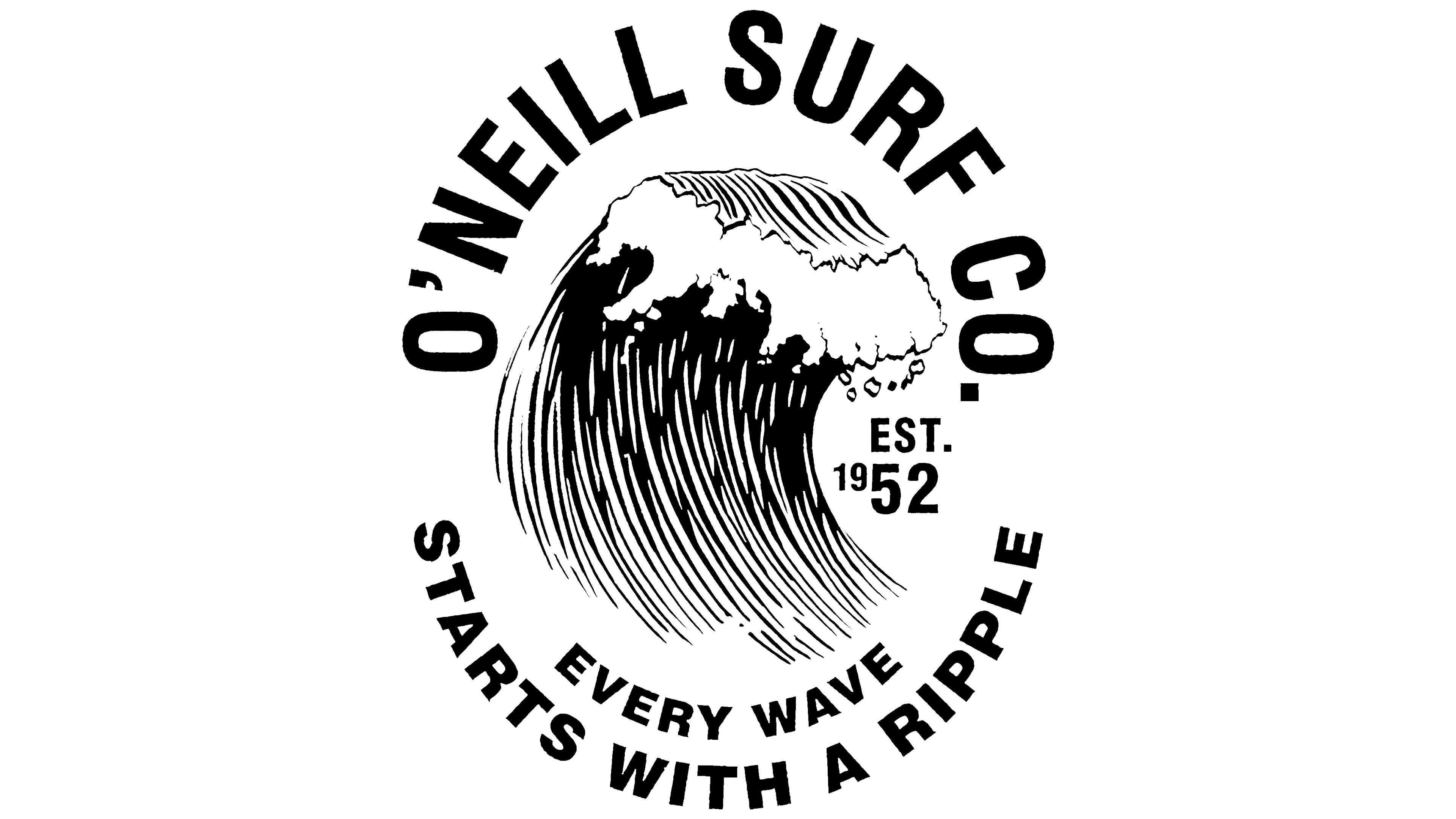
The first logo looked like an ancient seal, embodying the spirit and resilience of fearless surfers and snowboarders. Different sports disciplines were combined in a single image, symbolizing unity, shared goals, and the drive for victories and achievements. For its time, the logo was unique: it was rich in information while remaining appealing and memorable.
A wave took center stage in the identity, though many also saw it as a snowy mass descending from a mountain. This design evoked associations with active leisure, bringing to mind summer waves or winter slopes. A simple contour drawing hinted at the brand’s high-quality products, which had gained popularity for their reliability. Beneath the crest of the wave, numbers indicated the brand’s founding year, 1952.
Text elements were arranged along an invisible circle of the emblem. The brand name appeared at the top, while information blocks in a different font were placed at the bottom. The circular layout of the text held symbolic meaning, representing the brand’s infinite existence. However, since the circle was not fully closed, it also symbolized freedom, captured in the spirit of this sports logo.
2000 – 2010

By 2000, the brand’s identity had undergone updates. Some elements disappeared permanently, while others emerged and continued to be used for many years. The logo now conveyed a sense of complete freedom. The absence of frame outlines and fixed forms made it dynamic and open. It symbolized omnipotence and timelessness, encompassing both text and imagery.
For the developing brand, it was essential to reflect movement in the emblem. This became possible by arranging the name along an ascending line. Stylish graphic letters were placed diagonally, each rising higher than the last. Various associations arose with this design: the drive for success, conquering mountain peaks, or riding the world’s highest wave. The multi-faceted images perceived by the audience allowed each person to find their connection within the logo.
The bold black letters emphasized the brand’s scale and reliability. The brand name shone like a star, reflecting its position in the market. A charming wave design appeared on the lower right side. Its small size, precise lines, and refined graphics highlighted the brand’s unique products, aligning perfectly with its style and spirit.
2010 – 2020
After ten years, the brand identity changed. Monochrome and commitment to a classic style remained traditional elements, but fonts and proportions were completely updated. The emblem transformed, acquiring a unique and memorable look.
On a white background, black lettering stands out, and the large letters seem filled with inner strength. The brand name is centered in a rich black color. The slant of the letters is visible, and the letters themselves are uppercase and large, with dense, wide, and perfectly even elements. The apostrophe has become a small square, and certain vowels and consonants feature smooth curves that add visual harmony.
The image occupies the primary position at the top of the logo, with the brand name below it. On the third level, the word “blue” is distinctly readable. The tall, large letters are spaced double, further enhancing the sense of freedom and openness.
The emblem appears powerful and stylish, exuding a striking character. The O’Neill brand identity stands out among competitors, maintaining authenticity and reflecting the company’s unique spirit.
2020 – today
In 2020, the brand introduced a new identity filled with visual beauty and a special charm. The new logo’s brand name is crafted with unique originality, giving the word dynamism and expressiveness. Above the inscription is a recognizable design now consistently associated with the brand. Visually, the image appears slightly smaller in scale, yet it holds equal informational significance to the word.
The O’Neill logo is elegant and aligns with all current identity trends: concise, neat, and refined. The two-tone palette adds power while imparting a subtle sophistication.