


The inaugural Open House Istanbul gave residents access to buildings and spaces across the city that are usually difficult to enter. Held May 7-10, 2026, the festival featured an identity created by Istanbul-based studio Sömestr. The city’s architecture inspired the logo. Arches, openings, and columns became letterforms, connecting the event’s name to its venues.
The project offers free guided tours, walks, talks, and gatherings, supported by Mimarlık Eğitim Derneği, an architectural education association. It joined Open House Worldwide, an international network of over 60 organizations coordinated by the British charity Open City. The name “Open House” refers to the practice of opening buildings to the public, while “İstanbul” identifies the host city. The local team aims to introduce residents to the history of these buildings, their everyday uses, and the ways the past shapes contemporary Istanbul.
Sömestr developed the identity for people with varied interests and backgrounds, aiming to engage a broad local audience in architecture. Dilara Şebnem Esendemir handled creative direction and print materials, while Doğukan Karapınar developed the digital design and animation. The logo centers on curves, supports, and flared forms that resemble serifs.
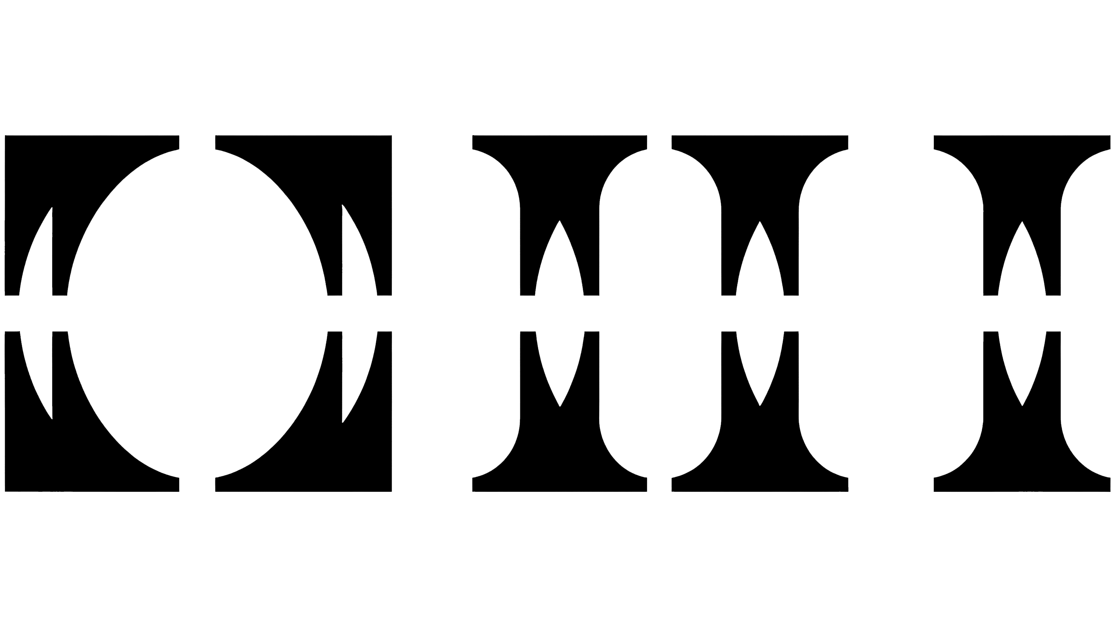
The “OHI” monogram combines the initials of Open House Istanbul. Its construction repeats a single shape with a square outer corner and a concave inner edge. By mirroring and joining these shapes, the designers created substantial bases, sculpted uprights, and arched openings. Together, the letters resemble a section of a building’s facade. A large oval counter defines the “O,” two supports form the “H,” and the “I” resembles a column that flares at the top and base. These architectural references connect the symbol to the city.
A narrow horizontal slit runs through the monogram. Additional breaks at the top and bottom of the “O” make it look like a stencil letter. The background color shows through these gaps, separating the symbol’s solid sections. The interplay of solid forms and openings recalls a building’s walls, windows, and passageways.
The full name appears to the right. In the primary version, “Open House” occupies the top line, with “İstanbul” below. The wordmark uses Crit Mono, a monospaced sans-serif typeface from Element Type. Each letter occupies the same horizontal space, and the lettering’s technical appearance evokes architectural practice and working notes. The wordmark spells out the initials and introduces the new festival to the public.
Doğukan Karapınar and İbrahim Kaçtıoğlu released Crit Mono in 2026. The typeface adapts the Crit sans-serif design to a monospaced format. The family includes 8 weights with matching italics, for 16 styles. Karapınar worked on both the typeface and the festival identity. Crit Mono appears in the logo, dates, addresses, and event program, giving the text a consistent appearance.
The designers drew their colors from contemporary urban life. Pinkish lilac and acid yellow-green, paired with black and white, offer an alternative to the familiar blue-and-turquoise combinations used in tourism branding. One version places the dark symbol against a pinkish-lilac field, while another sets the white logo against a bright background. The single-color treatment keeps the focus on the letterforms and their internal openings.
Arched motifs extend across posters, programs, and animation. They frame text and images as windows and passageways that recede into the distance. Posters pair the large monogram with building photographs and dates. Depending on the layout, the full name spans two or three lines. At the same time, the architectural forms adapt to different-sized materials.