OpenCoreOS is entering the banking infrastructure market with an image far from familiar fintech. The platform appeared in 2025. It was founded by specialists from the banking and technology sectors with experience at HSBC, McKinsey, and BIAN. The product helps financial organizations update their operating systems using AI, autonomous modules, and real-time operations. After an early temporary style, the brand received a full identity from the London studio Further, formerly known as DesignStudio.
The January 2026 launch required OpenCoreOS to have a logo connected to internal infrastructure rather than to the fashionable theme of artificial intelligence. The brand is built around the position “Unimaginable. Unbreakable.” The logo needed to convey the idea of a core, a system beneath the surface, and technology that supports complex financial processes.
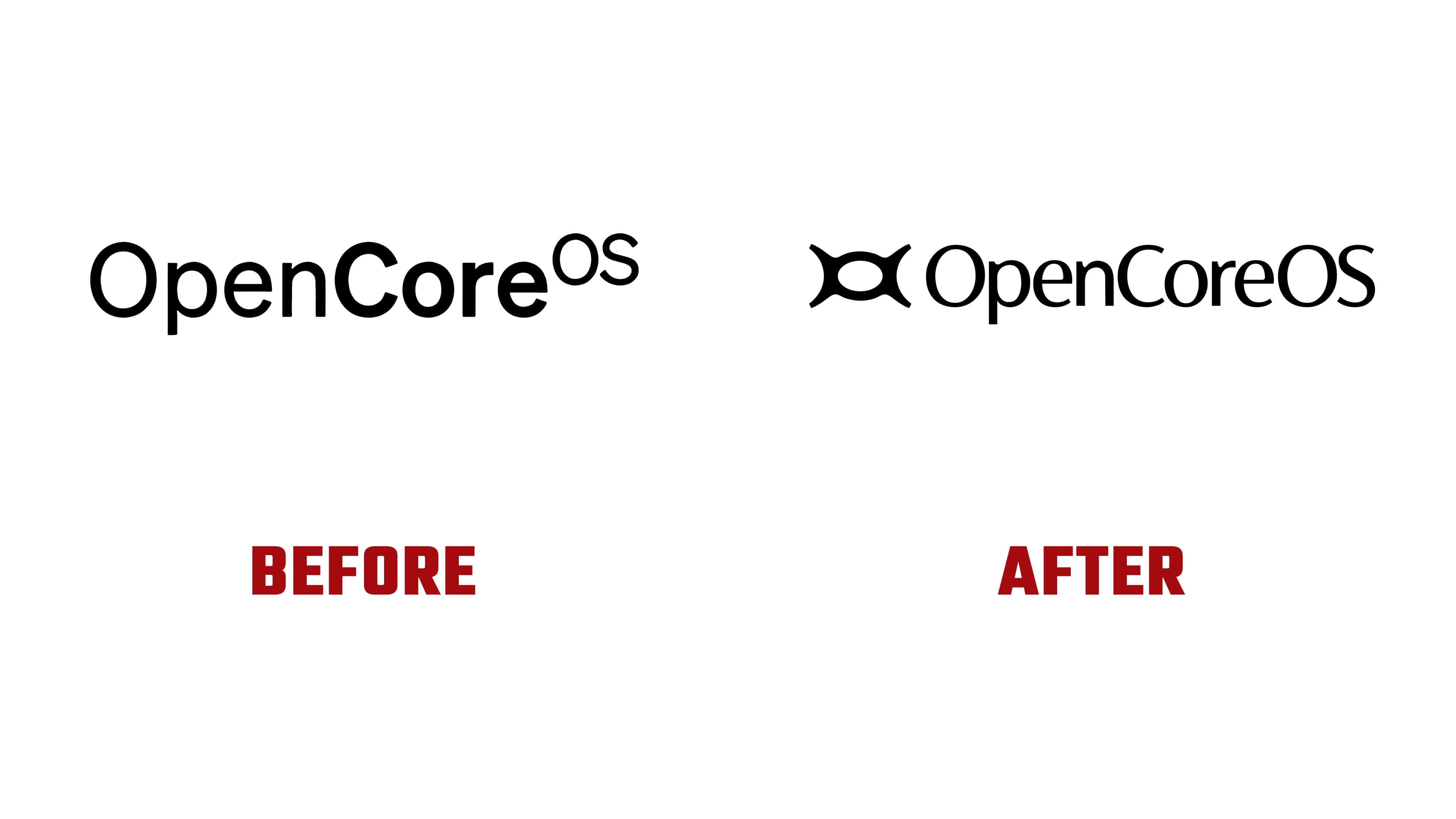
The OpenCoreOS symbol is built from the letters “O” and “C,” joined into one abstract form. It carries a sense of a module, a core, and an interface node. Soft curves combine with a dense, closed structure. As a result, the mark feels technological.
The mark has a second layer of perception. The form resembles an eye, a lens, or an aperture. For a brand associated with autonomous AI in banking operations, the image supports the theme of a system working beneath the product’s visible surface. The logo conveys control, computation, and the core around which a new financial architecture is built.

The wordmark supports the symbol through a humanist sans serif. The letters have rounded connections that echo the emblem’s form. The typeface softens the symbol’s technical nature and helps the long name look more cohesive. Together, the symbol and wordmark create the image of a platform where engineering disciplines are combined with flexibility.
The long name “OpenCoreOS” poses a separate challenge for logo use. For this reason, the system includes the abbreviation OCOS. It is more compact and more convenient for cases where the full name takes up too much space. The main symbol remains the brand’s anchor, setting the overall tone across all formats.
OpenCoreOS received a mark resembling a technological core. The logo combines the name, AI, banking infrastructure, and the concept of an autonomous system into a single image.