



Early video game screens inspired Overmind’s new identity. In 2026, New Genre’s London office developed a logo for the platform featuring pixelated lettering and an eye inside the “O.” By drawing on familiar imagery from the digital past, the studio aimed to build an emotional connection with developers.
Overmind creates tools for teams building AI-powered products. The platform helps users evaluate models, prepare data, and fine-tune models. Its founders approached New Genre as the product evolved. The identity needed to present the company as an established partner and earn the trust of developers, buyers, and investors in a crowded market for professional tools.
The team wanted a look that moved beyond familiar technology branding. The designers initially experimented with pixelated mycelium images before turning to the Atari 2600 and the glow of CRT screens. Memories of early digital worlds became the project’s foundation. Leon Brown, Natalia Kurzydlak, Archie Bowers, and Jack Cox worked on the identity.
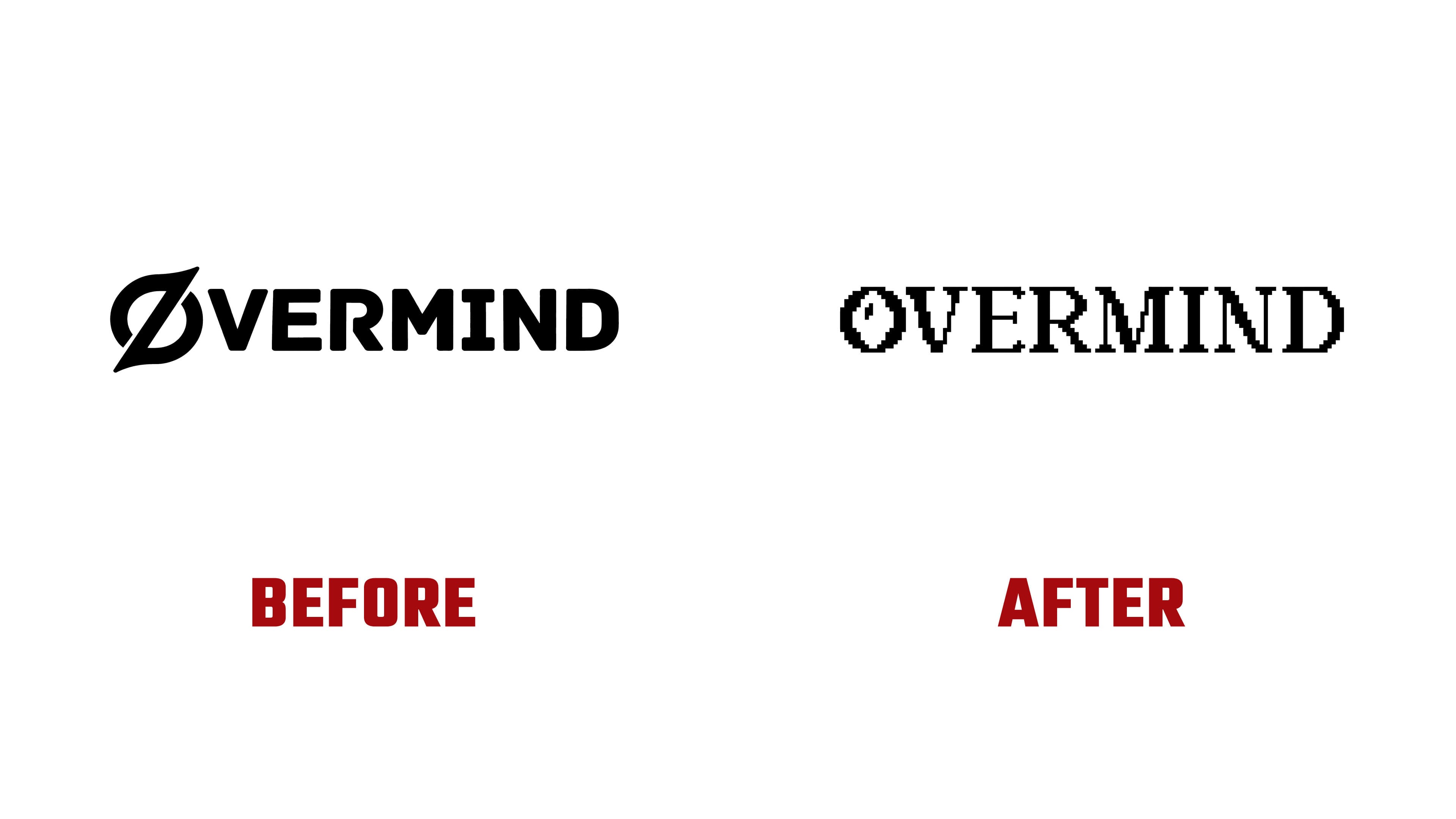
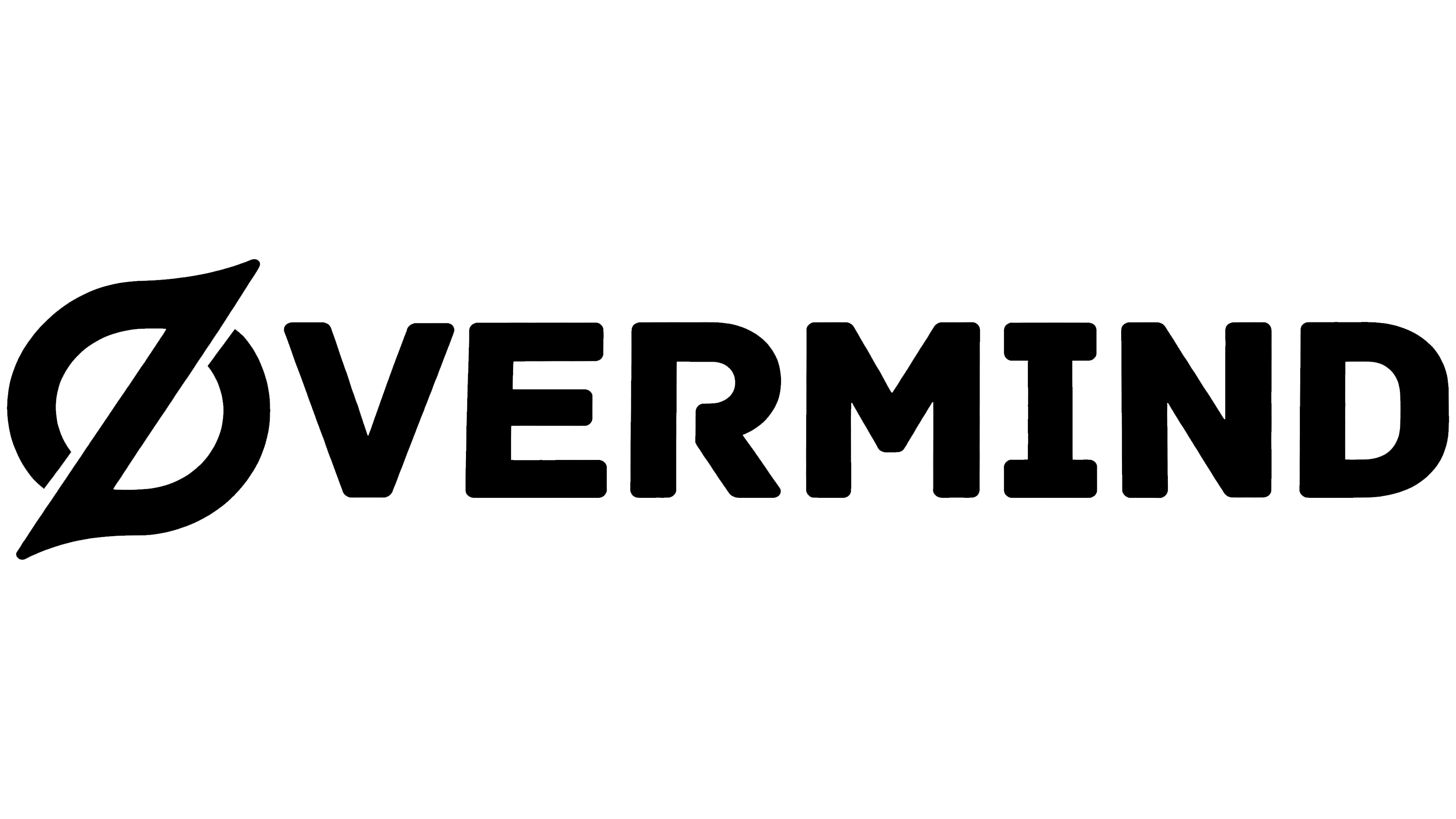
The redesign transformed the entire OVERMIND wordmark. The previous logo used tightly spaced uppercase sans-serif letters. A rounded symbol with a diagonal section replaced the initial “O.” Light and shadow made it look like three-dimensional metal. The new version retains the uppercase lettering but introduces serifs, heavy main strokes, and thin connecting strokes. Stepped contours replace smooth edges, recalling low-resolution screen imagery.
A pixel grid defines the letters’ curves, diagonals, and terminals. The diagonal strokes of the “V,” “M,” and “N” consist of short steps. In contrast, stepped outlines form the curved sections of the “R” and “D.” Subtle curves and variations in stroke thickness remain within this angular structure. In a side-by-side comparison, the new wordmark appears in white against black. A flat treatment replaces the three-dimensional metallic effect.
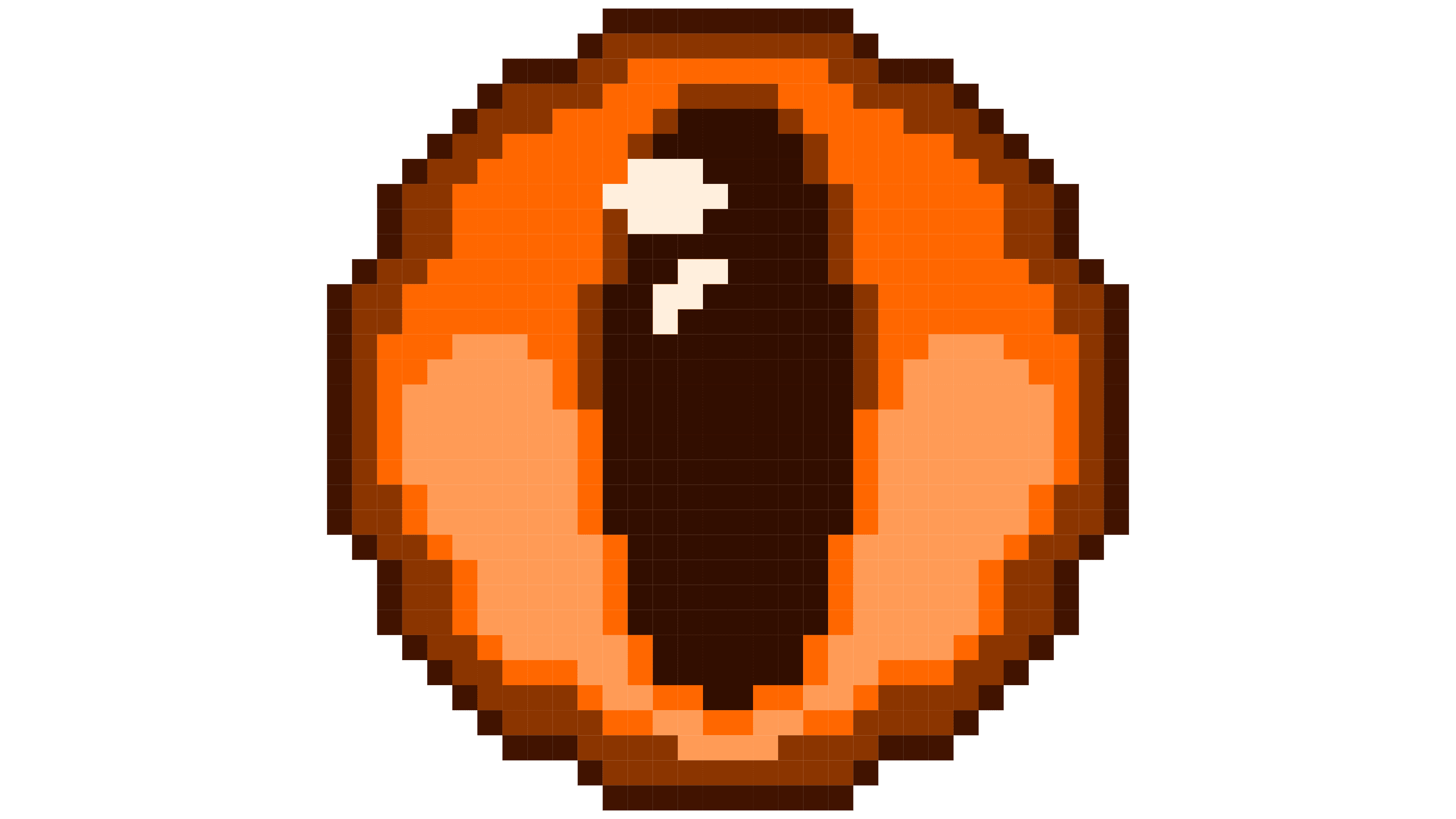
An eye with a vertical pupil and a small highlight is built into the initial “O.” It also serves as a standalone emblem and appears in orange in the website’s top bar. Its contours follow the same pixel grid as the lettering, connecting the compact icon to the full OVERMIND name.
On the website, dark backgrounds, orange accents, stepped frames, and horizontal scan lines extend the gaming theme. Clicks, menu navigation, and scrolling trigger sounds reminiscent of operating a physical game controller. New Genre drew on the sensory experience of older screens and controllers to shape both the page designs and the website’s interactions.