


 Pensacola Blue Wahoos Logo PNG
The Pensacola Blue Wahoos logo is associated with a baseball team that found its seaside home after much wandering. It reflects the city’s atmosphere, where baseball naturally integrates into coastal life and local culture.
The Pensacola Blue Wahoos baseball team’s history dates back to 1959 when the Charleston White Sox were founded in the South Atlantic League. The franchise relocated several times, adopting different names and moving to various cities across the USA. In the 1970s, it was known as the Columbus Astros, later becoming the Carolina Mudcats, winning Southern League championships in 1995 and 2003.
In 2010, businessman Quint Studer acquired the franchise and moved it to Pensacola, Florida. The team received the name Blue Wahoos following a local contest, and their home stadium opened in 2012. From their inaugural season, the Pensacola Blue Wahoos were affiliated with the Cincinnati Reds, developing future MLB players, including star shortstop Didi Gregorius.
In 2015, famous golfer and Pensacola native Bubba Watson became a co-owner, with NFL Hall of Famer Derrick Brooks joining in 2019.
Since 2021, the team has been affiliated with the Miami Marlins, winning the Southern League championship with them in 2022. Pensacola Blue Wahoos actively participate in the Copa de la Diversión program, playing as Pensacola Pok-Ta-Pok to attract Hispanic audiences.
Meaning and History
What is Pensacola Blue Wahoos?
It is a Double-A baseball team based in Florida that competes in the Southern League. Their home stadium is situated by a bay, offering spectators scenic views. The team is known for original themed events and has won five Southern League championships.
2012 – today
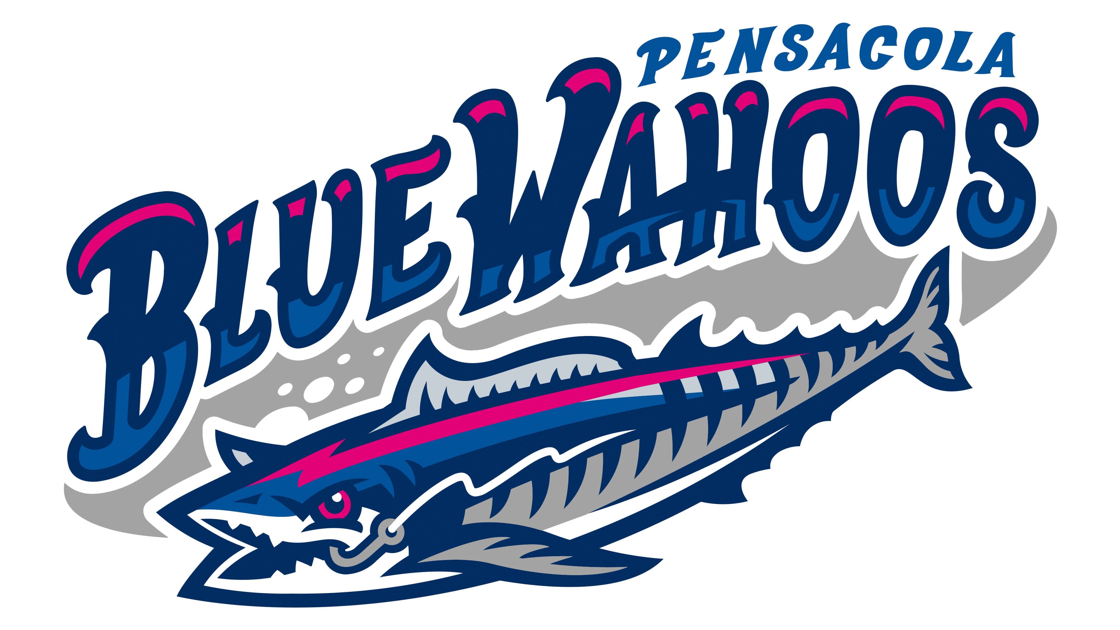
The identity of the Pensacola Blue Wahoos reflects the city’s connection to the sea and baseball. The club’s main symbol is a barracuda, an aggressive, fast-moving marine fish found in Florida’s coastal waters. The Brandiose studio, known for its work with Minor League Baseball teams, helped create the logo. The name was chosen by residents in an open vote, emphasizing the club’s connection to Pensacola’s history and the region’s maritime heritage.
In the original logo, the predatory barracuda is depicted mid-attack, its mouth open and filled with sharp teeth. In the corner of its mouth, a fishing hook with a torn line is visible, indicating the fish’s strength and aggressiveness. The color scheme is based on bright pink, dark blue, and silver tones. Around the fish are small details, such as bubbles and slight waves, that add depth and an underwater feel to the image.
The text is rendered in large, decorative letters styled as a handwritten typeface. The inscription “Blue Wahoos” is centered and visually integrated with the symbol. The letters are dimensional, with smooth forms that echo the contours of ocean waves. Their inner color gradually transitions from dark to lighter blue shades, while the upper parts are rendered in bright pink, reminiscent of sunlight reflections on water. The word “Pensacola” appears above in a smaller typeface, with a more restrained classic serif style.
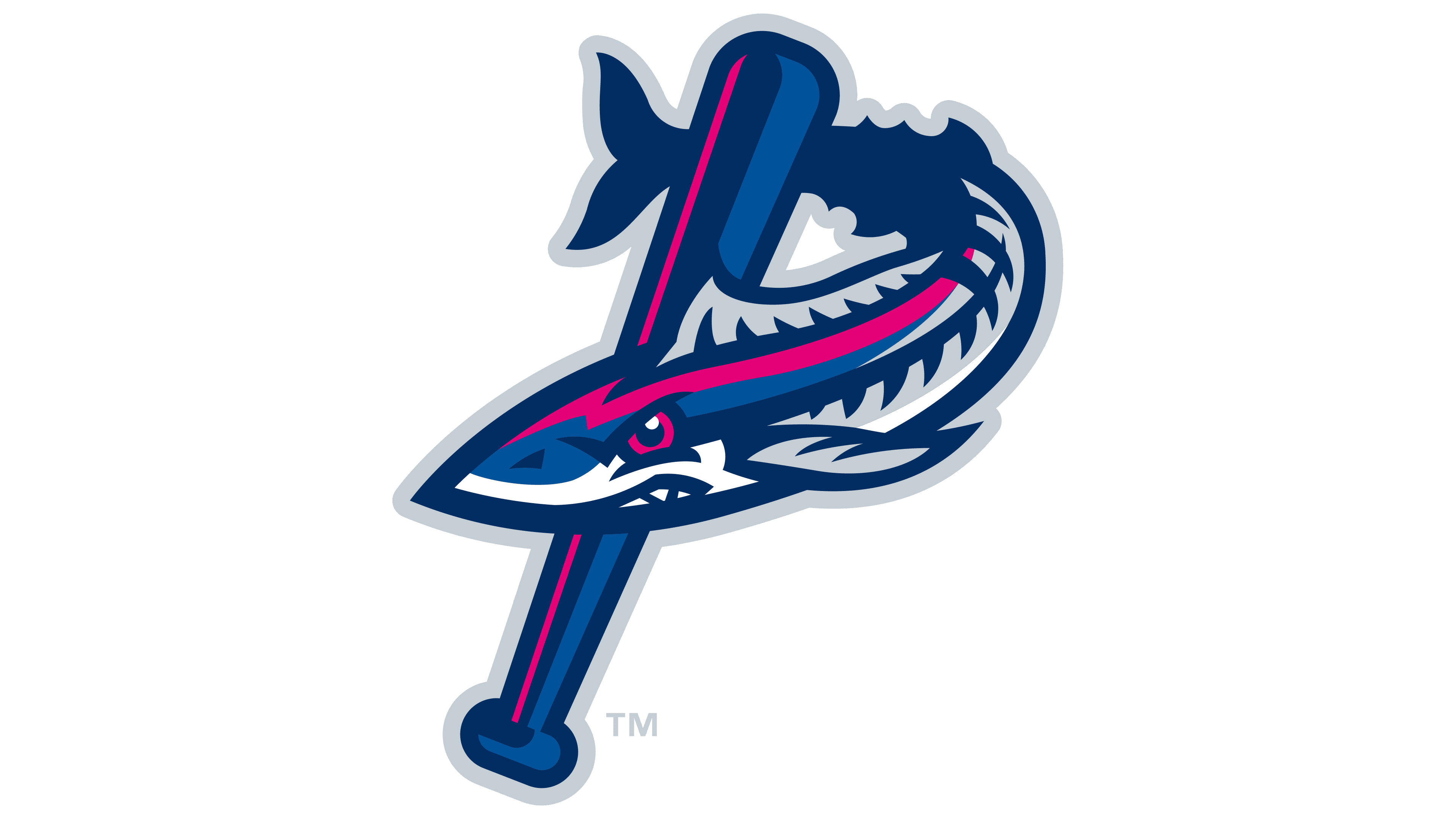
There is also an alternative logo version intended for merchandise and everyday items. In it, the fish image is presented less aggressively. The barracuda holds a baseball bat in its fins and forms the letter “P,” the first letter of the city name Pensacola. This version appears friendlier and emphasizes the team’s informal side, its involvement in community life, and the games’ entertainment format.
Font and Colors
The color palette centers on midnight blue, with strong contrast against lighter blue and bright pink. Midnight blue, paired with gray, balances brighter colors and creates a professional appearance.
The unique handwritten font features wave-like letters imitating sea waves or barracuda fins. The city name is set in a regular italic sans-serif font, contrasting with the main title.