The Perodua logo embodies the company’s engineering expertise and dedication to advanced technologies in the automotive industry. The elements of the emblem reflect the concept of high speed and progress, while the color scheme aims to evoke trust among car enthusiasts.
Perodua: Brand overview
In 1993, a significant milestone in Malaysia’s automotive history was marked by the founding of a new brand, heralding the nation’s second car manufacturer. By 1994, construction of their state-of-the-art manufacturing plant commenced in Sungai Choh, Rawang, setting the foundation for future endeavors.
That year also saw the brand forge a crucial technical collaboration with Daihatsu Motor Co., Ltd. This alliance opened the doors to cutting-edge Japanese technology, leading to the 1995 launch of the brand’s first Kancil vehicle. Modeled after the Daihatsu Mira, the Kancil quickly became a favorite among Malaysians for its affordability and efficiency.
In 1997, the brand broadened its horizons with the Rusa, a compact van designed to cater to families and businesses. The turn of the century brought the Kenari in 2001, a compact minivan celebrated for its practicality and versatility.
2002 marked the arrival of the Kelisa, set to replace the Kancil. The Kelisa stayed true to the brand’s commitment to producing economical and reliable vehicles. However, the real game-changer came in 2005 with the introduction of the Myvi. This model became a bestseller and was acclaimed for its spacious interior, fuel efficiency, and overall value.
In 2008, the brand launched the Viva, succeeding the Kelisa and continuing its legacy of success. The compact MPV segment saw a new entrant with the Alza in 2011, tailored to meet the needs of growing families.
Introduced in 2014, the Axia introduced a new level of affordability and low running costs, quickly gaining traction in the market. By 2016, the brand had ventured into the sedan segment with the second generation of the Bezza, focusing on efficiency and practicality.
The brand didn’t stop there. The third generation of the Myvi debuted in 2018, featuring advanced safety technologies and a modern design. The following year, in 2019, the company introduced its first SUV, the Aruz, appealing to a new customer segment.
By 2021, the brand continued to refresh its model lineup and expand its production capabilities, committed to delivering value-driven vehicles.
The successful collaboration with Daihatsu has enabled the brand to harness advanced Japanese technology and adapt it to meet local needs and preferences. This strategy has solidified the brand’s reputation as synonymous with reliability and affordability in the automotive world.
Meaning and History
What is Perodua?
It is a Malaysian manufacturer known for producing compact and affordable cars. The company specializes in producing practical, reliable and economical cars that meet the needs of a wide range of consumers. The brand is popular in Malaysia and other markets for its well-designed, affordable cars that offer good value for money. The brand’s lineup includes various models such as hatchbacks, sedans and SUVs designed to provide convenient transportation solutions.
1993 – 1998
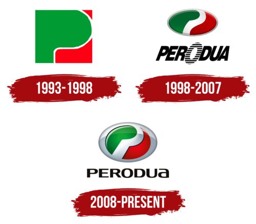
The Perodua logo has a thoughtful design that conveys the company’s identity. At first glance, it appears very simple, consisting of three geometric shapes forming a square. However, each detail has a hidden meaning.
- The green fragment resembles the letter “P,” the first letter of the brand’s name.
- The white stripe, formed by two red elements, resembles the number “2.”
“P” and “2” reflect the company’s full name, as “Perodua” is an abbreviation of “Perusahaan Otomobil Kedua,” which translates from Malaysian as “Second Automobile Manufacturer.” This is where the number “2” in the logo comes from. The choice of colors also has a hidden meaning.
- Green symbolizes nature and growth. It reflects the brand’s commitment to continuous development that is harmonious with the environment. In some countries, this color is associated with luck and harmony.
- Red embodies energy, strength, and passion. It emphasizes the dynamism of the cars. In a cultural context, red symbolizes happiness, especially in Asia, where Perodua operates.
The colorful elements are separated by an empty white space, which maintains balance between the letter “P” and the number “2,” making them more distinguishable. White is the color of purity and simplicity. It evokes a sense of order and harmony, making the emblem visually appealing.
The geometric shapes combine to form a perfectly even square, a shape associated with stability and reliability. These qualities instill trust in the company’s clients. Additionally, the square underscores the brand’s modern and professional image, showcasing its commitment to creating reliable cars.
1998 – 2007
The company timed the logo update with the debut of the Perodua Kembara SUV. The new logo features a complex structure with a colorful elliptical symbol and a black inscription with a stylized letter “O.” Let’s take a closer look at these elements.
- The ellipse includes a green element with a semicircular protrusion, a red wave, and a white stripe separating them. This references the previous emblem, which played on the brand name. The design is now more abstract but still hints at a stylized “P” and the number “2.”
- The company name is written in large black letters, vertically elongated and tilted to the right. This shape adds dynamism, essential to an automotive manufacturer’s identity. The bold, sans-serif font shows Perodua’s serious intentions.
- The wordmark features an oval replacing the letter “O.” It is lined with thin horizontal lines, evoking a sense of freedom, speed, and movement intensity. This element balances the large ellipse, creating harmony in the logo.
The designers experimented with texture, using a gradient covering the abstract emblem’s outer side, darkening its outline and the edges of the colorful geometric figures. This gradient transition makes the ellipse appear convex, like a button protruding from the surface.
The gradient adds shine and radiance to the logo, reminding us that the company produces stylish cars. This graphic technique also creates an aura of innovation and technology, highlighting Perodua’s commitment to progressive solutions.
2008 – today
The 2008 redesign completely changed the badge’s style, adding balance, purity, and minimalism. It has a more modern look compared to the previous version.
The logo developers changed the color scheme, making it rich, bright, and fresh. However, green and red still dominate, maintaining brand recognition. White was replaced with silver, giving the texture a shiny, metallic look reminiscent of the materials used in car manufacturing.
The gradient effect adds volume and depth to the emblem, making it three-dimensional. Smooth transitions of shades reflect the energy typical of an automotive brand. Highlights and shadows enhance the logo’s realism, demonstrating Perodua’s attention to detail.
The narrow ellipse transformed into a wide oval, giving it a complete and finished appearance. The new shape symbolizes continuity and smooth motion, a metaphor for moving cars and the rapidly developing company. The green element still resembles the letter “P,” and the adjacent curve resembles the number “2,” but they now appear more smooth and stylized. The gray border adds additional depth.
The ” PERODUA ” inscription conveys purity, simplicity, and openness. Designers gave the letter “O” a classic shape to avoid drawing too much attention. The wordmark stands as harmonious proof of the brand’s reliability and stability.
The bold, sans-serif font improves readability, and the black color adds a touch of business elegance to the automaker’s name. The contrasting stroke thickness, straight lines, and smooth curves reflect the company’s dynamism and high-speed vehicles.


