


![]() PGA Tour Logo PNG
PGA Tour Logo PNG
The PGA Tour logo reflects the core values of this sports organization, such as professionalism, dedication, and unity. It underscores the drive to achieve outstanding results and to perfect one’s skills. The emblem conveys the beauty and elegance of golf, as well as solidarity among golfers worldwide. It has become a symbol of inspiration for millions of fans of this captivating game.
PGA Tour grew out of a conflict inside the PGA of America, founded in 1916. For decades, the same organization represented club instructors and touring professionals, although their interests were moving apart. By the mid-1960s, about 225 tournament players made up less than four percent of the membership, while television money and prize funds were rising fast.
The break came in 1968, after PGA leaders made TV deals with Shell’s Wonderful World of Golf and World Series of Golf without consulting the touring players. Gardner Dickinson, backed by Jack Nicklaus and Arnold Palmer, helped form American Professional Golfers, Inc. Nicklaus explained the case for independence in Sports Illustrated, while the PGA of America threatened to ban members of the new group from its events.
In December 1968, both sides reached a compromise. The players dissolved APG, and a separate PGA Tournament Players Division was created with its own policy board. In January 1969, Joseph Dey, former head of the USGA, became the first commissioner. In 1974, Dean Beman replaced him, and in 1975 the organization adopted the name PGA Tour, separating its identity from the PGA of America.
Beman turned the tour into a stronger commercial entity, improving TV deals, creating a player pension plan, and developing future structures for the Korn Ferry Tour and PGA Tour Champions. Tiger Woods changed the business again after winning the 1997 Masters, raising ratings and sponsor interest. The FedEx Cup began in 2007, with Woods as its first winner. In 2018, the PGA Tour signed a $2 billion Discovery deal, while LIV Golf emerged in 2021 as its biggest modern rival.
Meaning and History
![]()
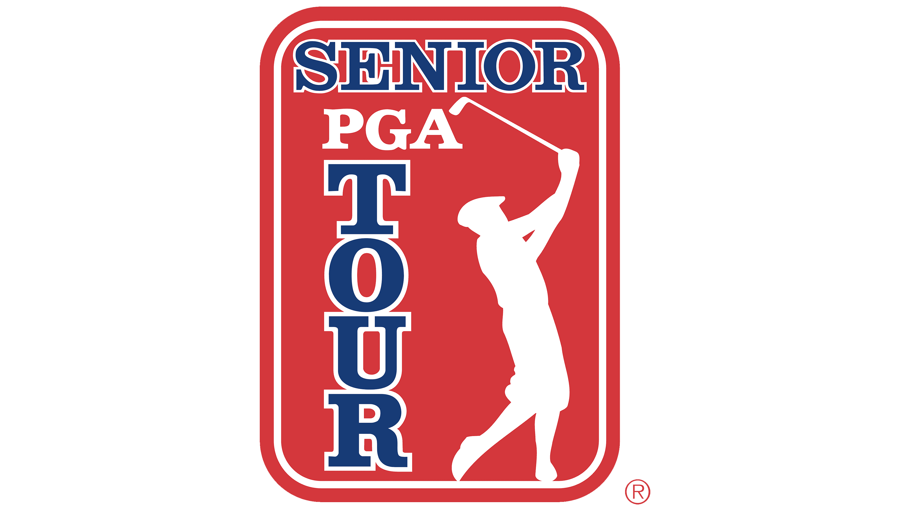
The PGA Tournament Players Division was founded in 1968 as part of the Professional Golfers’ Association of America. The logo of the time featured its name, split into three lines, inside a shield. In 1974, Deane R. Beman became the organization’s commissioner. He changed the name to the PGA Tour, so the emblem with the new inscription began to be used in the 1976 season. But it was still a heraldic shield, stylized as the U.S. flag with blue, red, and white elements.
Beman was dissatisfied that the symbol was not associated with golf and that it strikingly resembled the logos of the Amateur Athletic Union and the Union Pacific Railroad. He believed the PGA Tour lacked a clear brand, hindering its development. The commissioner wanted the emblem to show dynamism and tell a story. Art West, the marketing director, held the same view and insisted on changing the organization’s visual identity.
In 1979, they began to work together and even made preliminary sketches, but they did not achieve the desired result. Ultimately, Beman decided to seek help from his acquaintance, Esmond Cardon Walker. He was the head of The Walt Disney Company, so he managed an entire team of professional artists. Esmond tasked a creative group based in Orlando with creating the PGA Tour emblem, which was located in the basement of Disney World. At the same time, West hired the advertising company J. Walter Thompson to develop a concept.
As a result, they received more than 20 logo options from Disney and Thompson, after which they narrowed them to 12. The Guideline Research Corporation was hired to conduct market research to determine golf fans’ preferences. The favorite was the white silhouette of a man swinging a club against a blue rectangle – the work of The Walt Disney Company employees. But Beman did not like that the lower corners were not rounded, and the athlete’s legs extended beyond the base. He commissioned Floyd Benton to correct these details. Thus, the iconic symbol of the PGA Tour appeared.
What is PGA Tour?
The PGA Tour organizes golf competitions held throughout the year. The Presidents Cup, FedEx Cup, and Players Championship are the most famous. Most tournaments take place in the United States, but some are held in Latin America, Canada, and China.
2000 – today
![]()
The logo features the organization’s name in a bold, rectangular-serif font. The white abbreviation “PGA” is written in the upper corner, and under it is the red word “TOUR,” with its letters aligned in a column. Next to it is the silhouette of a golfer: he elegantly bent his knee, leaned forward, and raised the club above his head. According to Beman, this is not a movement process but the moment the athlete pauses before hitting the ball. The text and drawing are placed in a blue vertical rectangle with rounded corners.
Since the emblem appeared, many have asked who is depicted on it. Different assumptions were made, including those of Jack Nicklaus, Tom Weiskopf, Johnny Miller, Ben Hogan, and Jerry Pate. But Art West revealed the secret, and the answer disappointed everyone. The logo features a collective image: a fictional, anonymous golfer. However, it should be admitted that Ben Hogan was chosen as a model for the pose. Beman used his photo as a template to draw an approximate sketch of the logo and show it to the Disney artists to finish the job.
For decades, minimal changes have been made to the PGA Tour graphic sign. This timeless symbol represents athletes’ professionalism and skill and expresses a love for golf.
Font and Colors

The name of the sports organization is set in a font resembling Clarendon Bold. This high-contrast font with rectangular serifs is an excellent choice for accent elements and is highly readable. It has historical value and is associated with typographic traditions, as it was developed in the 19th century.
The current PGA Tour logo is painted in the same colors as the old shield-shaped logo: red, white, and blue. This combination was originally chosen to display patriotism and to reflect the U.S. flag.