


 Union Pacific Logo PNG
The Union Pacific logo represents great strength and a close connection to America. It embodies the unbreakable spirit that helped the company connect every corner of the vast continent through railroad arteries. The emblem reflects a serious approach to business and a high level of responsibility for passengers and cargo.
Union Pacific began with the Pacific Railway Act, which Congress passed and Abraham Lincoln signed in 1862. Union Pacific Railroad was incorporated in Omaha, Nebraska, on July 1, 1862, to build the western section of the first transcontinental railroad. Construction started in 1865, with Chinese and Irish immigrant workers facing severe weather and difficult terrain.
On May 10, 1869, Union Pacific and Central Pacific met at Promontory, Utah, where the Golden Spike ceremony marked completion of the route. In the following decades, Union Pacific expanded by building and buying lines, helping connect new territories as the American West settled. The company entered bankruptcy in 1893, then reorganized under Edward Henry Harriman, who modernized the network.
In the 20th century, Union Pacific supported national transport needs during both world wars. Competition from air and road transport in the 1950s and 1960s pushed the company to diversify. Union Pacific Corporation was created in 1969 as a holding company. Major deals followed, including Western Pacific and Missouri Pacific in 1980, Chicago and North Western in 1995, and Southern Pacific Rail Corporation in 1996.
In the 2000s and 2010s, the company invested in technology, infrastructure, intermodal freight, and fleet renewal. A new Mississippi River bridge in Iowa replaced the 1906 structure in 2008, and the Unified Plan 2020 appeared in 2018. From 2021 to 2024, Union Pacific upgraded locomotives, expanded PTC automation, tested alternative fuels, added intermodal terminals, and improved logistics planning with AI.
Meaning and History
What is Union Pacific?
It is a major American railroad company that operates the largest railroad network in the United States. It plays a critical role in transporting goods and commodities across the country, providing freight rail services that connect major markets in the West, Midwest, and Gulf Coast. The company operates more than 32,000 miles of track and serves a variety of industries, including agriculture, automotive, chemical, coal, consumer products, and intermodal transportation. It is known for its role in rail transportation security, making it a key player in the U.S. logistics and supply chain industry.
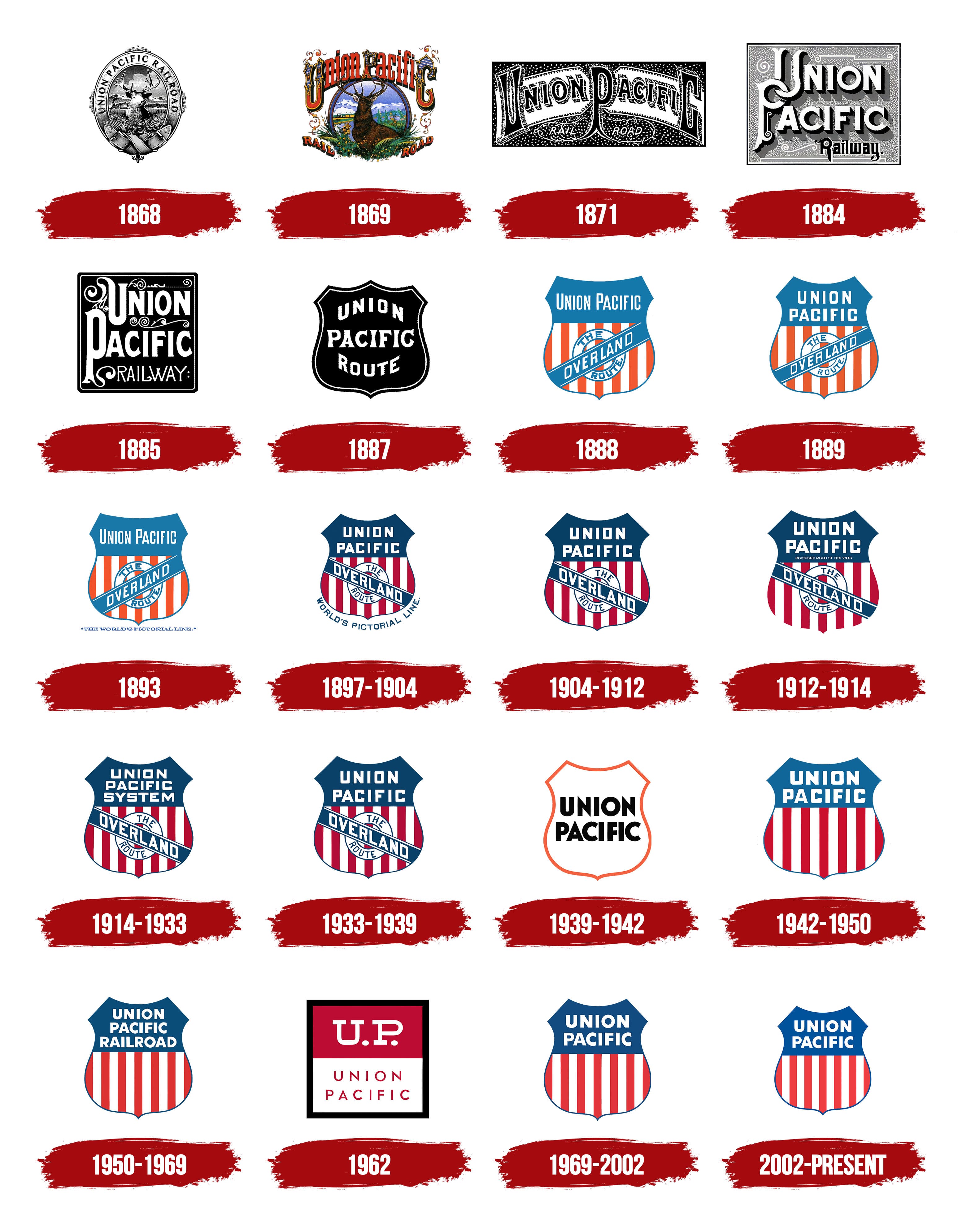
1868
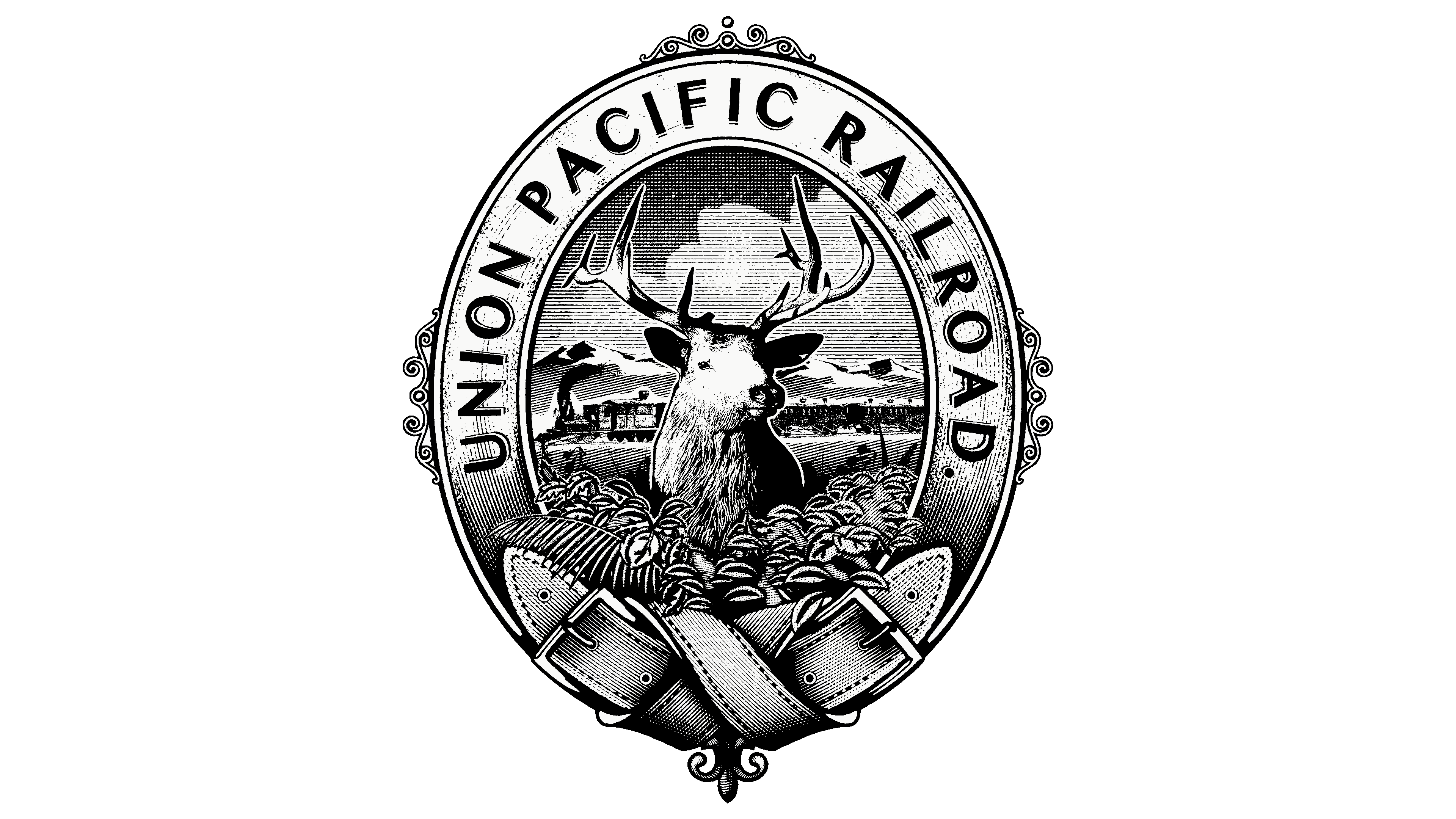
The deer is a symbol of pride for America and one of its emblems because it inhabits both continents and even controls untamed lands. It is found everywhere from the pampas to the highlands, paving its way with its powerful body. This means it is a strong animal, comparable to a locomotive. It is also resilient, with excellent adaptability to forested, mountainous, marshy, and other terrain, and it pioneers new territories. For this reason, the railroad company used its image in its first logo.
Moreover, it is a noble symbol: the deer is always majestic, calm, confident, wise, and proud. It is associated with light, renewal, creation, rebirth, and spirituality, as its antlers are said to resemble the sun’s rays in mythology. In folklore, it is considered a positive totem. It fits perfectly into the state’s world order, representing one of the most challenging industries associated with draft power, high speed, and long-lasting endurance.
Therefore, the central figure in the Union Pacific emblem is a composite image of all types of American deer. By doing this, the corporation shows a strong connection with America, emphasizes its authenticity, and conveys that it can reach any corner of the continent. The deer, with its beautiful, branching antlers, occupies the central part of the medallion, symbolizing the extensive railway network. Its pose exudes tremendous strength, and its gaze reflects self-confidence. The animal looks straight ahead, holding its head high. Its powerful torso is hidden behind tall grass, but you can still sense the creature’s physical strength.
In the background, a train pulls a string of cars, demonstrating its power and the remarkable beauty of uncharted lands. It takes pride in every corner of the country it travels through. The train moves against a backdrop of high mountains with snow-capped peaks, and above them, large, fluffy clouds race by, hinting at the comfortable conditions inside the train cars. Below the deer, two strong straps connect, symbolizing the reliability of railway junctions.
A company name inscription in a smooth, sans-serif font surrounds the logo’s vertical oval. The bold letters are spaced apart, making the inscription highly legible. The wide intra-letter spacing also contributes to the excellent readability of the text. Moreover, the glyphs have shadows that give them depth. The three-dimensional letters appear intriguing and draw attention, keeping the focus on the brand name.
Along the edges of the frame, you can also notice small, ornate retro-style patterns. They represent the time of the company’s founding, the mid-19th century, an era of monograms and medallions. It’s no coincidence that the emblem has this particular shape, an oval, elongated vertically, in the form of a cameo. This shows the logo has a clear concept and a strong connection to the railroad carrier.
1869
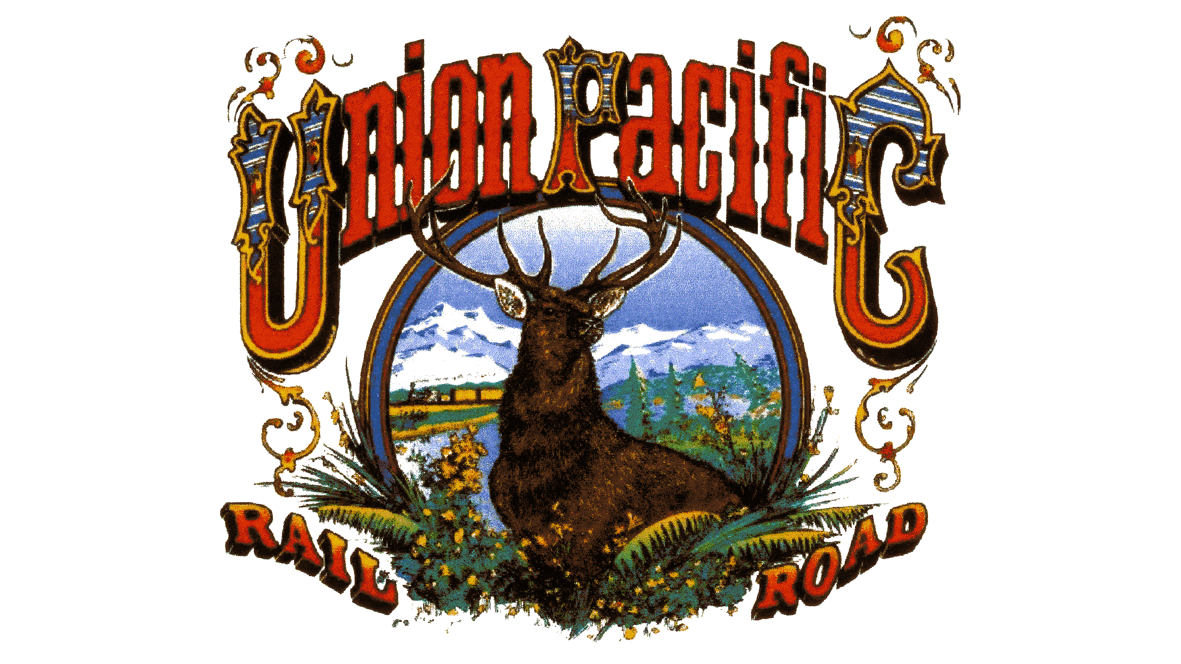
Monochrome gave way to color, so the Union Pacific logo is multi-colored. The artists worked to preserve color accuracy: the sky is blue, the snow on the mountain peaks is white, and the deer is dark brown. The train is also painted black, and smoke billows from its stack as it pulls yellow cars. There’s now a lot of greenery (grass, trees, ferns) and bright forest flowers. All the elements are compactly arranged in a small space, so the emblem resembles a painting more than an official visual identity object.
The logo has changed drastically: it now consists of a single circle with drawn elements and two inscriptions, one at the top and one at the bottom. They contain the main information:
- The company name (Union Pacific);
- A clarification of its activity (Railroad).
Both inscriptions are slightly curved and designed in a retro style. In the first line, the letters are mostly lowercase, except for three: “U,” “P,” and “C.” These are much larger than the rest because they begin and end the phrase. The designers used them to frame the words, creating beautifully adorned initials with intricate filigree ornaments and geometric patterns that match the theme.
In this case, these symbols are presented in Old English style, complemented by teardrop-shaped plant elements, and painted with blue, white, and red stripes to match the American flag. The letters between them are much simpler in style; they have straight edges, a geometric shape, and no sharp points, so they look like carved figures. A solid ridge connects them in the middle, making the inscription cohesive. The glyphs are colored red, a symbol of leadership and high energy.
The words in the second line are arranged diagonally, with the outer ends tilted upward. They are set in an extra-bold serif typeface with massive serifs and shadows, giving the inscriptions a 3D effect and making the letters appear volumetric. The words “Rail” and “Road” point in opposite directions, fitting perfectly into the composition of fern leaves parted by the powerful body of the deer. The animal stands at the center of the circle, framed by a double border. The deer holds its head high, with large, branching antlers, and gazes attentively into the distance as it explores new territory.
1871
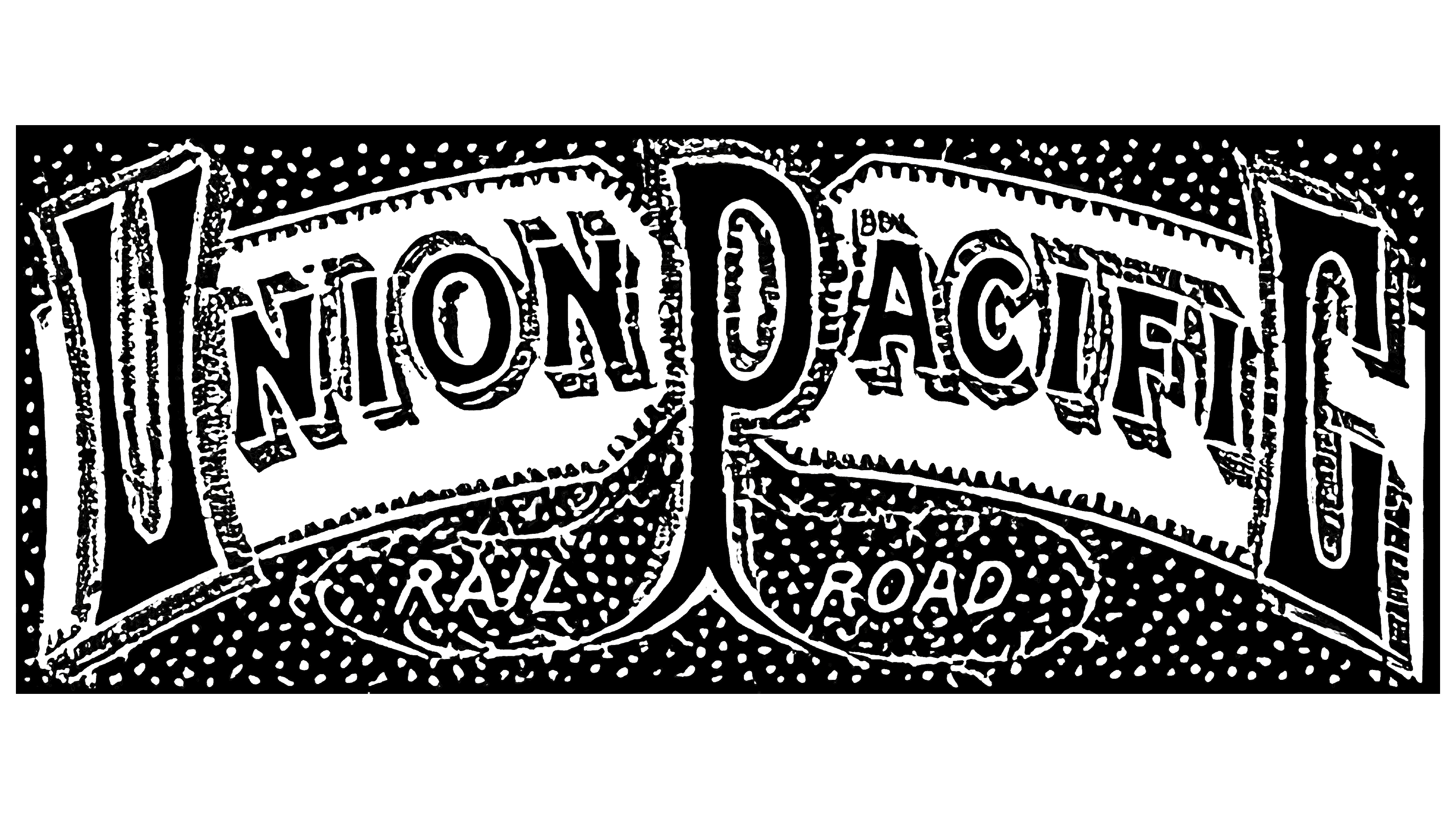
After the transition to TA Scott, Union Pacific’s visual identity changed drastically. The new owner abandoned the logo featuring a deer and a train against a mountain landscape. Romance, creativity, allusions, and a connection to authenticity were left behind. In their place came strictness, a business-like style, utilitarianism, and spectacle. So, what exactly changed?
- The emblem became classically rectangular. The horizontal geometric figure became the base for various graphic elements and inscriptions, which stood out against its background.
- The logo’s content lost realism and shifted to abstraction. Landscapes disappeared, leaving only a stylized inscription of an unusual design that filled the entire inner space.
- Tall glyphs replaced the Old English-style letters, with narrow middles and widened ends. The second line uses simple, thin, slanted sans-serif symbols.
- The retro style is gone, giving way to futurism, because the logo’s image is barely discernible, even in simple monochrome. At the same time, the logo has a lot of visual noise in the form of small white dots on a black background.
- Color also disappeared: the emblem became black and white. The background is dark, while all elements on it are light. The strips with the company name are colored white, which slightly lightens the otherwise oppressive atmosphere.
At the same time, the Union Pacific logo gained much more dynamism. For example, this is well demonstrated in the slanted glyphs, long winding lines, the arched inscription, the alternation of narrow and wide strokes, and the visual flickering of chaotic white dots that resemble falling snow.
Even though all the letters are now uppercase, the designers kept “U,” “P,” and “C” as the accent letters. They emphasized them by making them twice as large as the other symbols. As a result, the central glyph resembles a tree with roots, within which the second line is hidden – with the words “Rail” (on the left) and “Road” (on the right).
The company name is decorated with ornamental elements, so the characters look like Old English letters. This adds a touch of nobility to the emblem, which was lost along with the image of the deer. Additionally, the glyphs were given wide-hatched shadows, making them three-dimensional.
1884
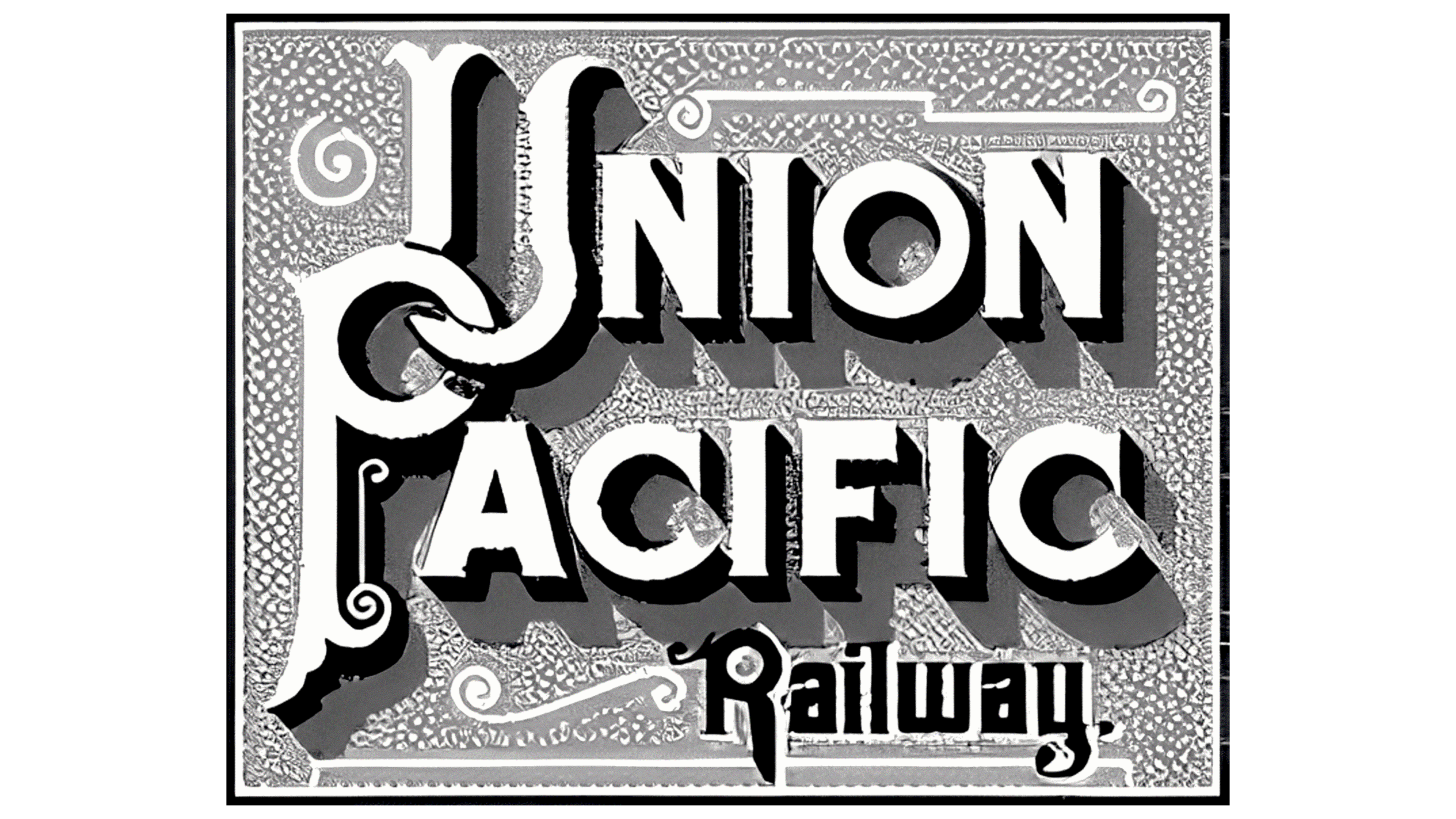
This Union Pacific logo is the most welcoming of all. It concentrates positive energy, calm light, confidence, and softness. This impression comes from a harmoniously chosen palette dominated by a pleasant gray shade. Many new features have appeared, ranging from the color to the composition.
The emblem now has a square shape with three-dimensional elements. The geometric figure is perfectly even, forming a clear internal space. It has a double black-and-white frame that evenly surrounds the square along the entire perimeter, demonstrating excellent conditions for transporting passengers and cargo, as well as the technical safety of train operations and security. This border perfectly isolates everything inside from external factors.
The emblem’s core is the name, evenly distributed across the logo and filling the entire area. The inscription is centered in two rows. The initial letters (“U” and “P”) are intertwined, resembling a monogram. However, they read not as ancient symbols, but as hand tools or keys linked together. Still, the abundance of flourishes, curls, and twisted thin lines hints at a mix of styles. They suggest a retro style, while its clear arrangement and strict geometry indicate an industrial style.
At that time, the company was in a transitional period, balancing old and new views in its work and identity, experimenting with options, and choosing the most suitable. This idea is prompted by the logo, which resembles a technical diagram or circuit board, where the medieval flourishes read as modern spirals.
The font chosen for the remaining letters (“nion” and “acific”) looks progressive. It includes extra-bold outline glyphs with shadows and small sharp serifs. As a result, the text became massive, now occupying almost all the internal space, and the shadows make it three-dimensional. Another inscription appeared at the bottom, black and barely noticeable. The word “Railway” is written in bold, glyphed letters with flourishes, clarifying the company’s field of activity. The curved ends of the “R” and “y” resemble heraldic elements.
The background is a light gray plate, as if embossed, because the previously unclear flakes of white “snow” have now become a harmonious roughness of the metal surface. The monochrome letters stand out clearly among the flourishes thanks to additional shadows painted in dark gray.
1885
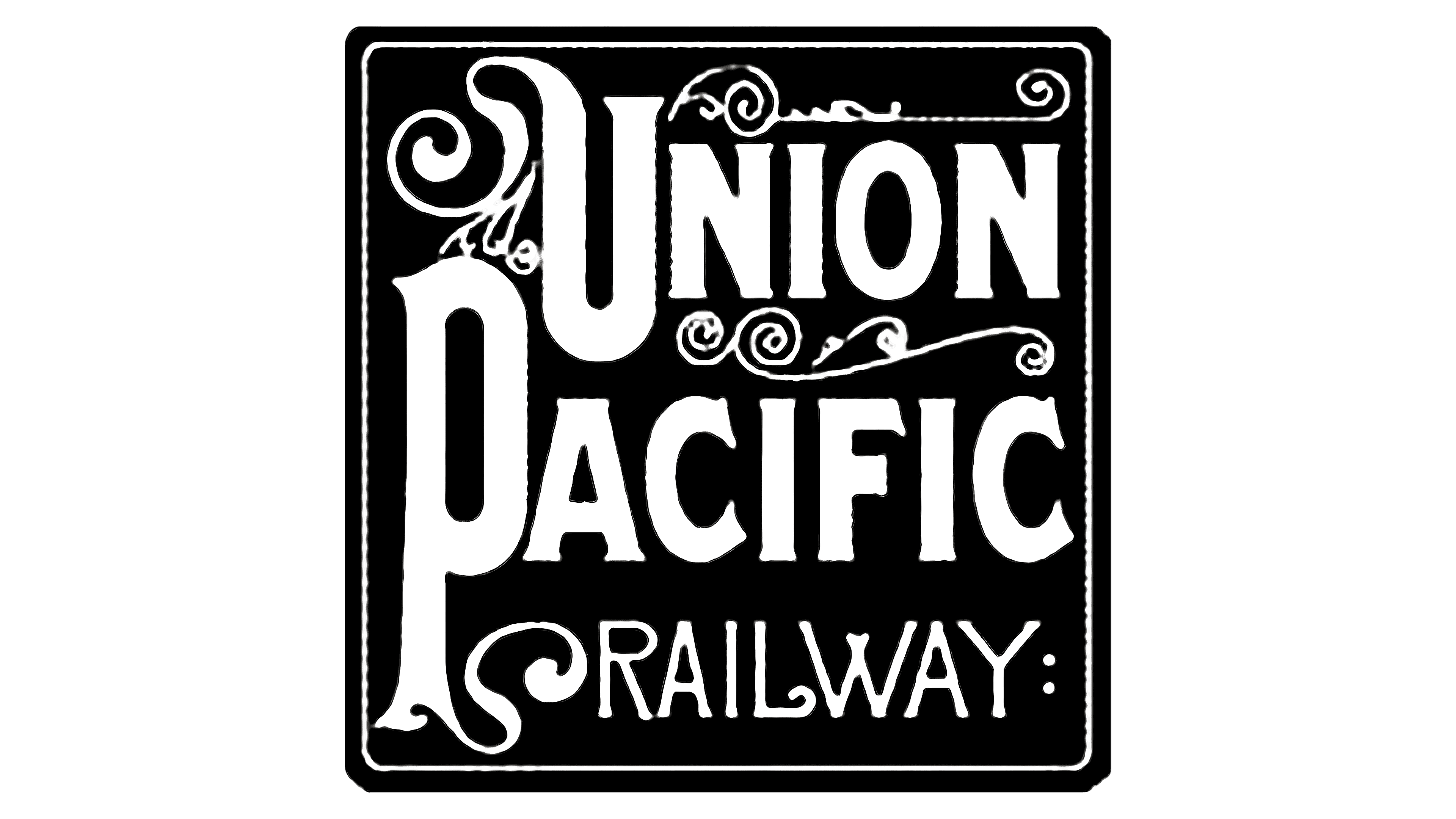
The Union Pacific logo of this era is characterized by its massiveness. Despite having the same details, it is a weighted version of the previous emblem. However, it is smaller, with a perfectly square shape containing graphic and text elements. The symbol’s style also shifted from industrial to antique.
The logo features a few graphic elements, including spirals and curls that form retro monograms now seen everywhere. They separate the lines and decorate the initials (capital letters at the beginning of words). Because of them, the “U” and “P” look elegant but outdated, like ornate glyphs from ancient books. The upper left edge of the “U” is elongated and curved, while the right lower part of the “P” stem winds.
More curls are located between the inscriptions. The word “Union” is particularly highlighted, set apart at the top and bottom by nearly identical monograms. Below the second line is the word “Railway,” modestly tucked in and set in a thin, grotesque font. Despite the narrow letters, it also has a retro style, with a rounded end on the “L” and crossed strokes on the “W.” A barely noticeable border frames the entire text section.
Overall, the emblem looks like a silent-film title card, closely mimicking their design with monograms and ornaments. The monochrome palette enhances this resemblance, with only two colors in this version: white (for inscriptions and decorations) and black (as the background). This contrast ensures good readability but diminishes the emblem’s design significance, as it conveys neither the company’s field of activity nor its authenticity or concept. Furthermore, the curls don’t pair well with the heavy letters or lighten them.
1887
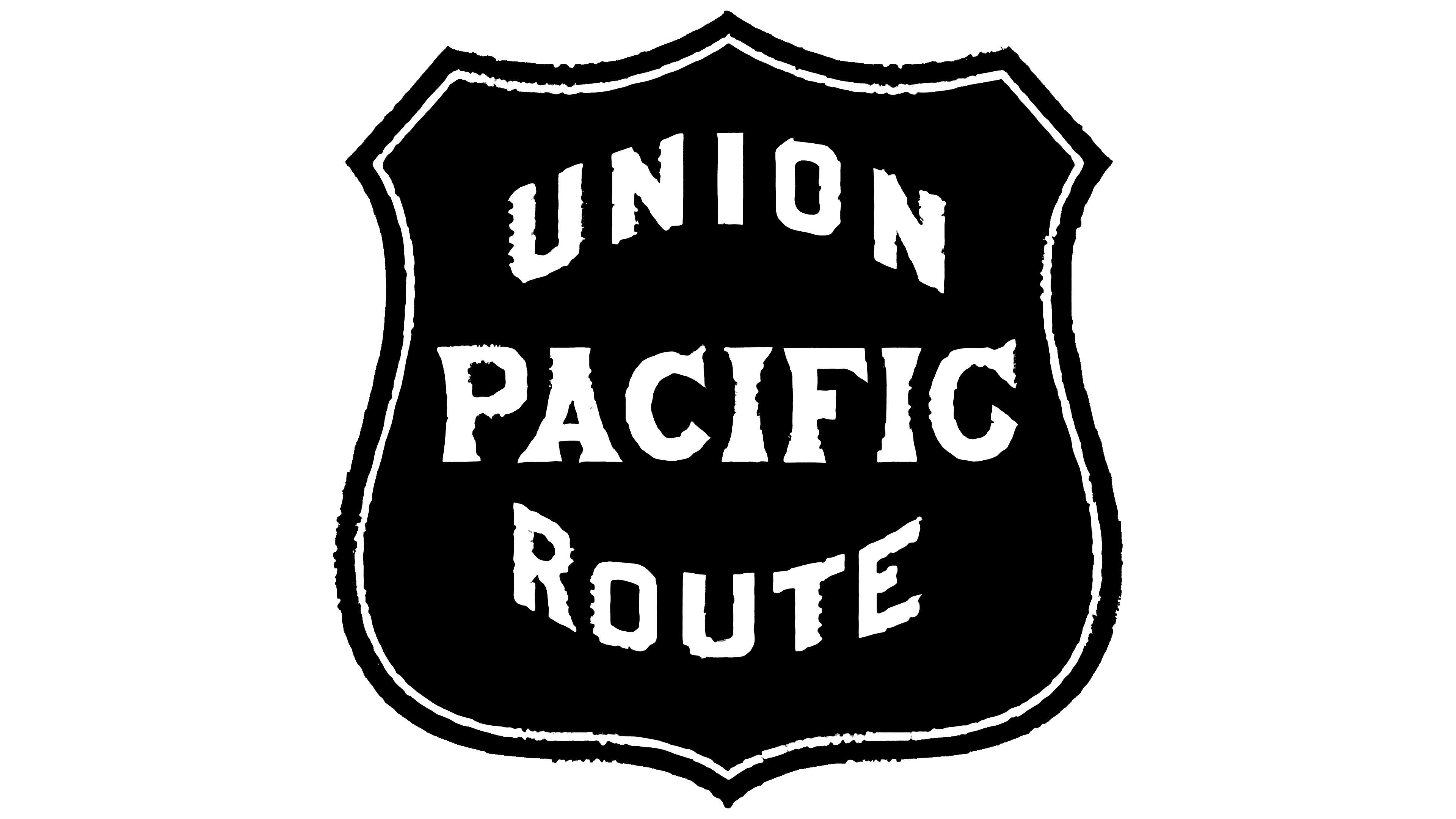
This period is significant in the history of the Union Pacific logo, as it marked the beginning of the “railroad chevron” era. It features a heraldic shield with six sharp points and two rounded bottom edges. Visually, it resembles the standard badge of American police officers, with a similar structure and a central inscription. From then on, the emblem remained largely unchanged for a long time, with only minor changes to color, size, or text.
The railroad company successfully redesigned it, as the regular logo became an individual mark for employees. Among its distinctive features:
- Monochrome (the restrained palette emphasizes the seriousness of the brand);
- Double border (black and white lines effectively highlight the center);
- Combination of fonts (different typefaces attract more attention);
- Uppercase (capital letters are visible and easy to read).
The emblem’s design is simple: flourishes and spirals that interfered with the text’s perception were removed. Now, all the inner space is dedicated to inscriptions. In the center is the word “Pacific,” set in an antique-style font. It is the focal point, the largest and slightly ornate, with letters that have both narrow and wide parts, adding dynamism to the visual identity.
The upper and lower lines are curved and mirror each other, so they appear to half-surround the center from either side. Both words are in a geometric sans-serif font. The glyphs are bold, with smooth edges and straight cuts at the ends of the strokes, reinforcing a professional and strict atmosphere. The black background with white lettering further supports this.
1888
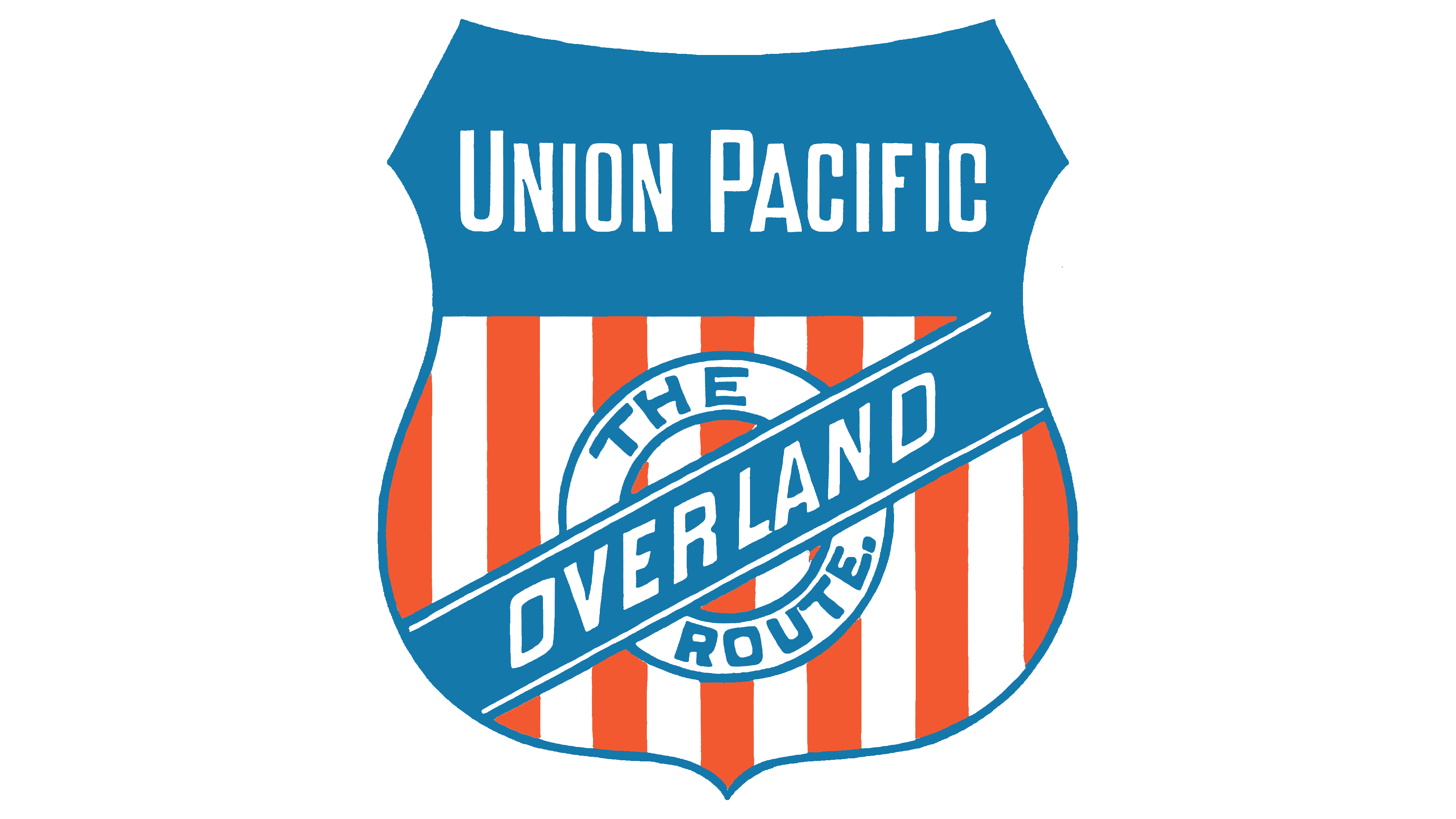
The logo was redesigned to add authenticity and emphasize the company’s connection to the country where it operates. As a result, it became distinctive, bright, and memorable. Several key details made it recognizable.
First, white and red stripes appeared alongside blue fields, like those on the USA’s national flag, but in a different shade: calm, pale, and closer to the color of the midday sky, scorched by the sun. Despite the shade differences, these colors are closely connected to the country through the Union Pacific trains that travel across it.
Second, the logo became even more reminiscent of a police badge. This approach to visual identity instills discipline and places the railroad company alongside important state institutions. Moreover, it looks excellent in a formal uniform, highlighting the seriousness of its services.
Third, the emblem is now divided into two zones. The brand name appears at the top, while the phrase “The Overland Route” appears at the bottom, hinting at the field of activity associated with the emblem’s owner.
Fourth, a diagonal stripe and a roundel appeared, combined into a unified composition. The circle serves as the background and occupies the center, while the wide line crosses the logo, resembling an honorary ribbon draped from right to left.
Through these innovations, the company underscores its significance in the country’s life, shows its origins, introduces its field of activity, and demonstrates safety and professionalism. This means that the modernized Union Pacific emblem perfectly aligns with the concept and evokes confidence, reliability, and calm.
1889
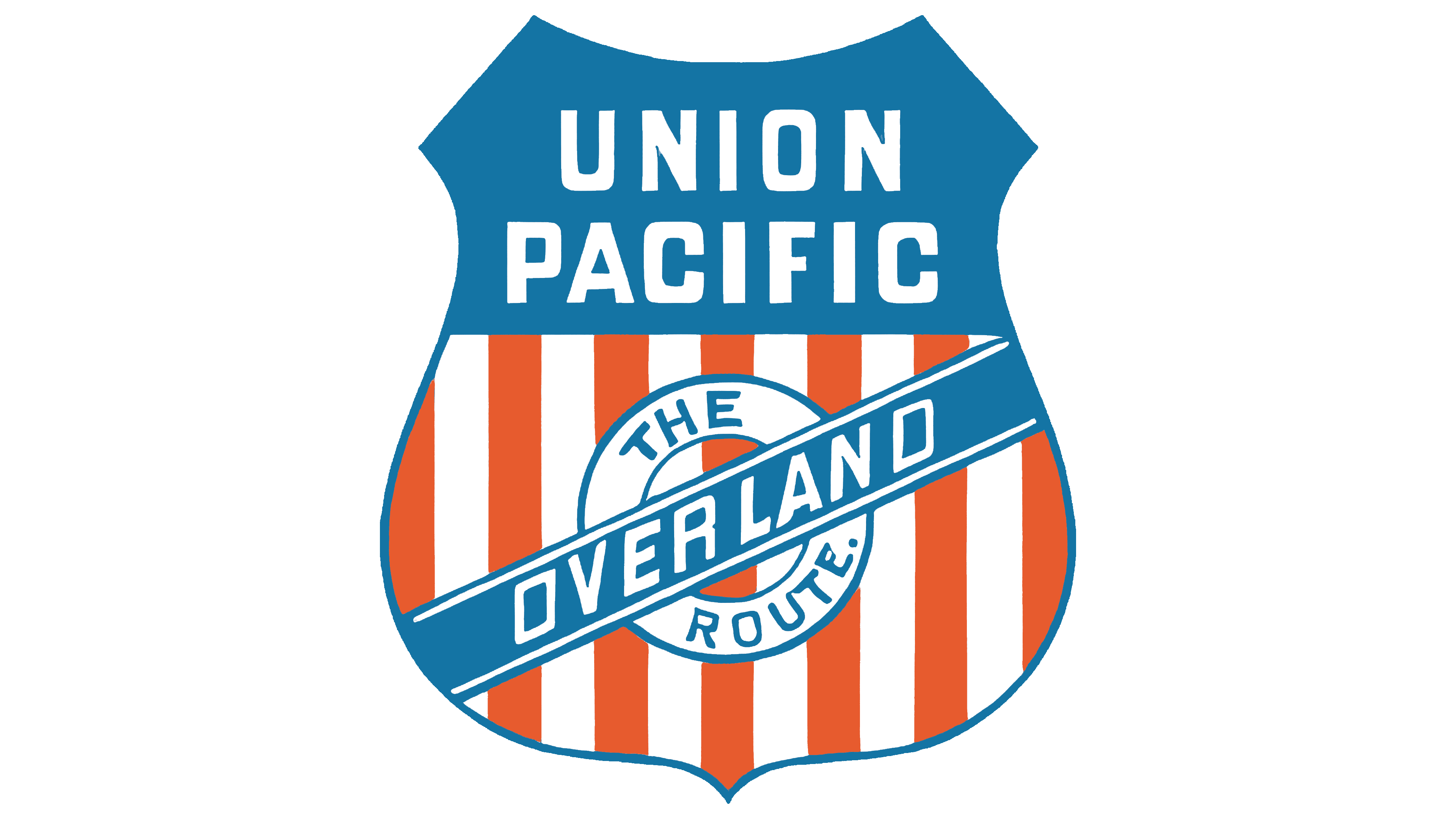
After a slight adjustment, the logo became more majestic and presentable. The changes turned it into a true “railroader’s badge” or a chevron on a uniform. The symbol gained individual features while maintaining a visual connection to the American flag, making it a recognizable global icon.
The most significant change affected the shape: now, the lower part of the Union Pacific emblem is larger than the upper part. It resembles a swollen sphere with a pointed bottom. However, the top half (with the blue background) balances the lower half well, creating the impression of a serious symbol with a harmonious design, as its foundation is a heraldic shield.
The lower inscription retains its old structure, only scaled down. The upper inscription, however, is now arranged in two levels, whereas before it occupied just one. This adjustment was necessary to make the name larger and clearer, as the letters were previously cramped and hard to read. In this version, the inscription is distinct. It uses a smooth sans-serif font. The bold letters stand upright and are spaced optimally.
1893
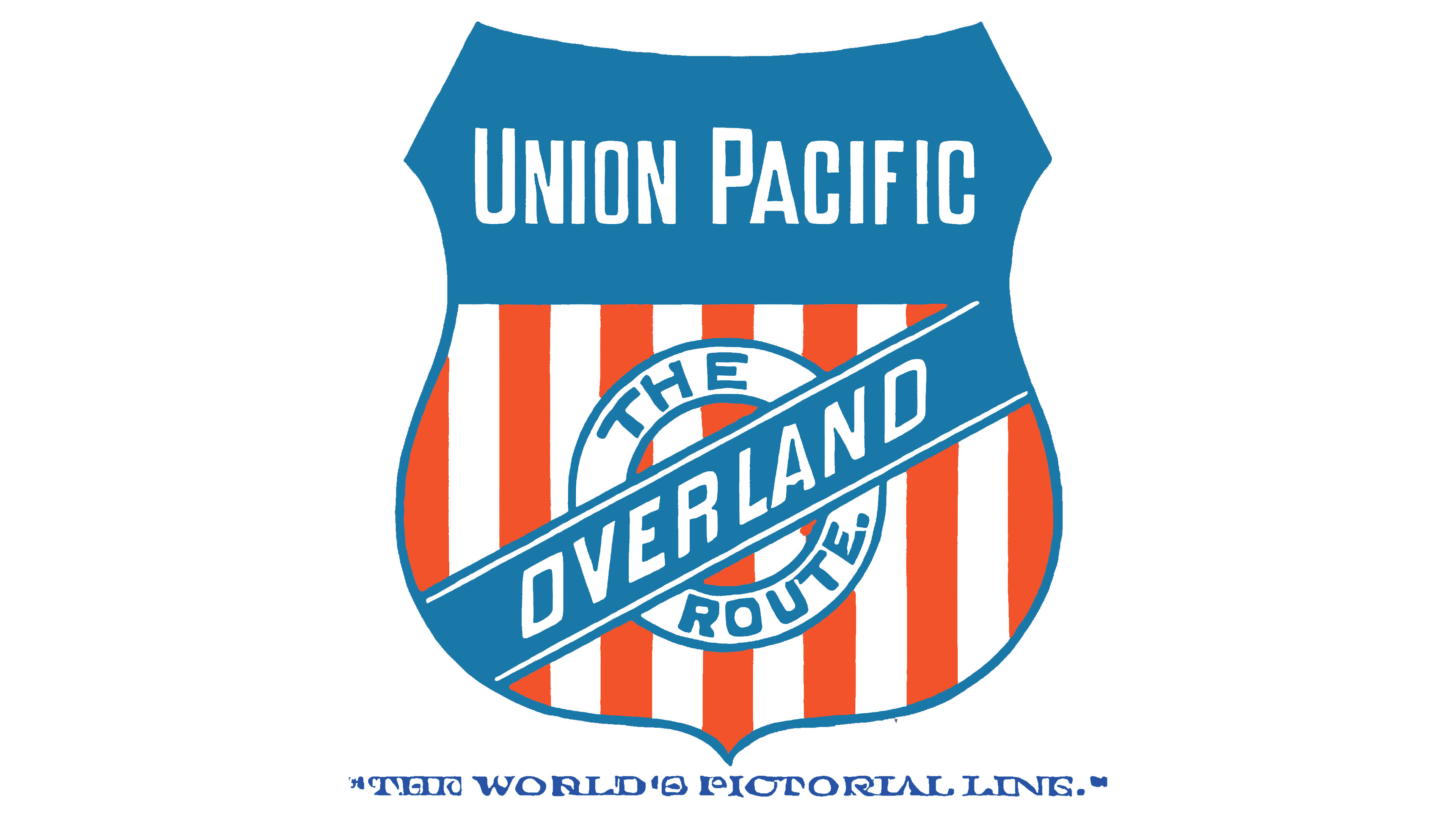
The railroad company returned to the old logo it used in 1881. This means they adopted the original version of the colorful symbol, resembling a chevron. Both versions are almost identical, as they have:
- An equal number of stripes (seven red and six white);
- The upper and lower sections are the same size (with the top being large again).
- The elements are arranged in the same way (there is a circle and a diagonal stripe).
- The same font is used (narrow, with tall letters);
- The brand name is positioned similarly (in a single line).
The key difference concerns just one factor, the motto. The railroad carrier’s financial situation became unstable, so it revised its identity to attract more passengers. To that end, the new head ordered the slogan “The World’s Pictorial Line” added to the emblem.
The inscription appears in a single line, subtly placed horizontally beneath the shield. It is rendered in an extravagant font that is not legible but makes a striking impression and draws attention. This typeface resembles a mix of Old English style and geometric forms. The letters feature many rounded shapes, alternating narrow and wide strokes, and spiraling elements, most notably in the “E” and “P.” These details allow the motto to blend harmoniously into the logo’s design.
1897 – 1904
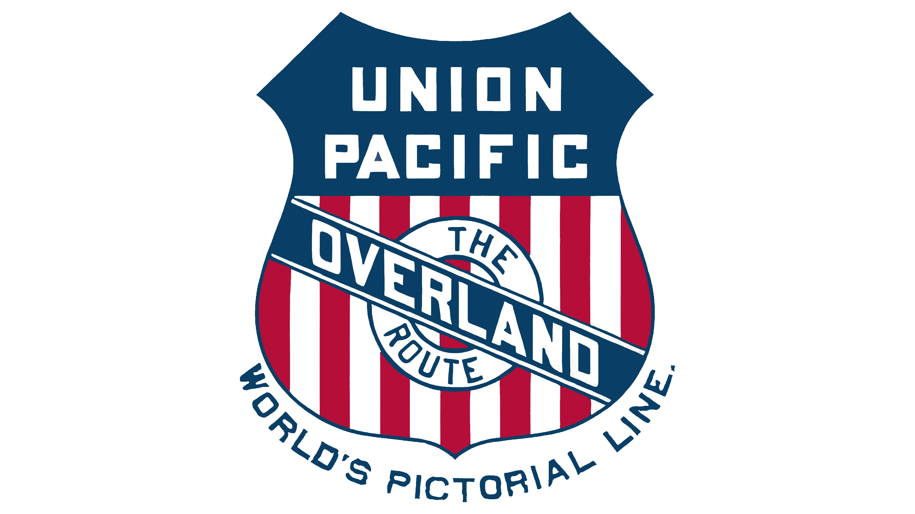
The next update to Union Pacific’s visual identity came with the change in company ownership after its bankruptcy. The new head decided to modify the logo so it wouldn’t replicate the previous version. However, modernization affected only a few aspects, without altering the emblem’s shape, color, or structure, keeping it recognizable and maintaining its familiar look. This worked in favor of the group of entrepreneurs who acquired it, as they didn’t have to start the business from scratch; there was an adequate foundation, including its identity.
Several important changes were made. The first concerned the tilt of the blue stripe located on the central circle. The designers shifted it from left to right, giving the logo a sinister appearance and earning it the nickname “Bend Sinister Shields.” The seal’s placement on the red-and-white striped background also changed: it was mirrored from the previous version, as seen in the shifted “The Route” inscription, which, by the way, no longer ends with a period.
The central part of the inscription “Overland” was also rotated downward. It is set in bold sans-serif font, making it easy to read despite the awkward angle. The shield’s ends became sharper, and the colors darkened, shifting the red closer to the crimson spectrum. The light sky-blue was replaced with a strict dark-blue hue.
The railroad company’s name once again occupied two levels in the upper half of the emblem. This improved readability, as it was set in a large font with a rectangular “O.” The letters have smooth, straight edges that resemble simple geometric shapes.
The slogan at the bottom of the shield was also updated. First, the parentheses and the article “The” were removed. As a result, the phrase “World’s Pictorial Line” appears larger and simpler. It now forms an inverted arch that partially surrounds the emblem.
1904 – 1912
During this period, the Union Pacific logo remained largely unchanged. The slogan “World’s Pictorial Line,” which aimed to dominate the railroad company’s visual identity and present it as a progressive carrier focused on passenger comfort, disappeared from the logo. However, the new management considered it unnecessary in the emblem, so they removed it to make the logo lighter and more straightforward.
As a result of this work, a logo emerged that repeated all the features of its predecessor:
- A diagonal stripe slanting to the right
- A central inscription with letters sloping downward
- A two-tiered name on a blue background
With the arched line gone, the emblem grew larger, marking the second major change in this version. The symbol’s authenticity was preserved through the red, white, and blue palette, reminiscent of the U.S. national flag.
1912 – 1914
In 1912, the Southern Pacific division split from the Union Pacific, prompting a logo redesign. Three significant changes occurred:
- The thin border around the entire shield disappeared (it became a solid dark blue frame).
- The two-level company name moved upward (it was enlarged to maintain good readability).
- In the upper half of the emblem, additional text appeared on a blue background (the white inscription “Standard Road of the West”).
The new phrase reflects the territories covered by this railroad network and highlights the company’s scale. It is written in an ornate, thin font with rounded glyphs, in contrast to the geometric style used for the other text. Additionally, the designers tried to fit the long phrase into a limited space by reducing the letter size, which negatively affected the text and made it nearly illegible.
1914 – 1933
The Union Pacific logo acquired new features that aren’t immediately noticeable, making it seem identical to the previous and current versions. However, this is not the case. The changes were minor. First, note the addition of a third line in the upper field: on the dark blue background, the word “System” now appears next to the name. This decision followed the merger of two companies, Oregon Washington Railroad & Navigation and Oregon Short Line, into the railroad corporation.
The inscription is in bold, geometric font. The letters lack serifs, indicating the carrier’s openness to cooperation. To ensure all three lines fit into the small space without affecting readability, the designers slightly reduced the glyphs, shortening them.
Another innovation concerns the shield’s border. A thin blue stripe reappeared at the bottom, surrounding the red-and-white striped section. Although the narrow frame is barely noticeable, it separates the emblem from the background and prevents it from blending in. The upper half of the shield doesn’t need a border because it stands out clearly without one.
1933 – 1939
The 1897 logo returned the original foundation of Union Pacific’s identity, but without the slogan. The new emblem exactly replicates the old version, which earned the nickname “Bend Sinister Shields” because the letters slide downward on the ribbon from left to right, giving it the appearance of a crooked smile.
The only change was the red: previously, it was closer to dark crimson, but now it resembles a lighter shade of burgundy. Otherwise, the color palette maintained its connection to the American flag to emphasize the company’s origin, the area it serves, and its authenticity.
1939 – 1942
This is the most minimalist Union Pacific emblem. It appeared under the influence of the Streamline Moderne style, which dominated design in the 1930s and 1940s. This style shaped everything from logos and tools of competitive consumer appeal to trains traversing the continent. Associated with progress, speed, and industrial elegance, the style was widely used during that time.
The first thing that stands out about the logo is its simplicity. It has no unnecessary elements, only what is essential to represent the railroad company. As the foundation of its visual identity, the shield fits perfectly into the Streamline formula thanks to its smooth lines and rounded corners. This shape matches the aesthetics of progressive design, where smoothness and streamlined forms are favored to better convey dynamism and speed. The emblem highlights minimalism and ergonomics, a key style idea.
The emblem features simple but graceful aerodynamic curves, emphasizing the train’s streamlined design for optimal movement. The oncoming air creates less resistance, allowing the train to cut through smoothly at high speeds. All surfaces of the logo are deliberately smooth, with no ornaments. The only decoration comes from elegant lines that align with the norms of the new style. The stripes look natural, indicating the design’s inherent fluidity. It has a natural streamlined shape.
Streamline Moderne’s influence on Union Pacific’s visual identity is also evident in the font and text arrangement. The typeface is simple, smooth, and unadorned, reflecting a practical approach to design where form serves function. Bold, straightforward letters convey strength and reliability, fitting the industrial atmosphere of the 1930s and 1940s.
Although the letter “N” has sharp ends, they don’t contradict the style because the rounded characters next to it soften them visually. The glyph’s diagonal lines fit the concept perfectly, as they are long, straight, and smooth. These lines made the emblem stand out, as nothing besides the text is meant to attract customers.
The color palette also plays an important role. The combination of black-and-white text with an orange shield outline creates a clear contrast, making the logo recognizable and memorable. Streamline is characterized by monochrome with one or two bright accents, represented in this emblem. The contrasting colors highlight the company’s technological advancement and forward-looking approach.
Thus, the Union Pacific logo perfectly demonstrates the key elements of the Streamline Moderne style, such as smooth lines, streamlined forms, technical functionality, and industrial aesthetics. It also emphasizes speed and progress, which are essential to the brand’s concept and fashionable style.
1942 – 1950
When the Streamline Moderne era ended, the railroad company brought back one of its older logos with slight modernization. As a result, they removed many details that were irrelevant or unnecessary at the time from the shield emblem. This created a simpler version highlighting the brand’s authentic origins and the country in which it operates. This emblem began a new era in Union Pacific’s identity.
Designers removed the diagonal ribbon with the word “Overland,” the circular mark with the inscription “The Route,” slogans, and any additions to the name. What remained was a clean logo infused with the American spirit of freedom. The stripes began to resemble railroad tracks, adding dynamism that hadn’t existed before. They had previously served as a background for larger elements that overshadowed them. The red and white lines took center stage, reflecting a commitment to the country.
The lower part of the shield was widened, making it appear much larger than the upper half. Of all the inscriptions, only the name remained, arranged in two levels. Both lines used the same geometric font, but with rounded corners on the letters’ curves. All the glyphs were white, bold, rectangular, and uppercase.
1950 – 1969
The emblem’s biggest change during this period was its color scheme. It became a few shades lighter, closer to a pastel palette. The soft colors and restraint make the logo discreet, which is crucial for passengers: the symbol should be visible and attract attention, but not annoy or strain the eyes. Customers should be able to look at it without turning away, maintaining a sense of calm. This way, the image stays subconscious and lingers for a long time.
However, the color combination remained the same: white, red, and blue, as in the national flag. The railroad company, whose trains run across America, aims to display patriotism by emphasizing its origins. Even with the more subdued tones, the colors express pride in the country.
The text portion of the logo also changed: alongside the well-known name, an addition appeared: “Railroad.” It modestly took the third line, settling at the bottom. The designers used the same font to make the triple inscription look harmonious. They centered the text to symbolize equal coverage across all territories, as the company’s trains reached almost every corner of the country.
1962
An intermediate version of the Union Pacific emblem stands out for its unusual design. It looks like a small advertisement poster or product label, earning it the nickname “Campbell Soup.” The logo is divided into two equal sections, differentiated by color:
- The top rectangle is dark crimson, with a solid fill and the large abbreviation “U.P.”
- The white bottom rectangle serves as a background for the two-line inscription “Union Pacific.”
A black border unifies both sections, with sharp 90-degree corners. This is a crucial element: it symbolizes the unity of all company divisions, the integrity of the concept, and a shared direction. This structure evokes reliability and order, positioning the brand as highly responsible to its users. The solid border also signifies high safety, durability, and care for passengers.
The abbreviated name is set in large uppercase, but it isn’t heavy because it’s semi-bold. As a result, the letters have ample internal space: the strokes don’t touch, leaving plenty of room and making the top text feel light and airy. The white glyphs further enhance this effect.
The second part of the emblem contains the inscription in a thin sans-serif font. The elegant characters are perfectly smooth, making the sharp ends of the “N” appear non-aggressive. The wide letter spacing lets the lower text “breathe” easily, filling the logo with positivity. This version had limited use.
1969 – 2002
The logo from this period has a precise shape, a businesslike appearance, an official style, and high practicality. It is a replica of the previous version (from 1950), focused on its roots and origins. The difference between them is minimal. By this time, the need to include the additional clarification “Railroad” had diminished, so the company removed it from its visual identity as a less significant element. After so many years of operation, customers already knew what the company represented and what it did.
As a result, the brand could present its name more clearly, as the freed-up space ensured better legibility. However, the changes did not significantly affect the overall style: the bold geometric sans-serif font remained, as did the heraldic shield shape, reminiscent of a badge, and the striped background. This background likely became the emblem’s dominant feature because the red, white, and blue combination stands out more clearly. The white text is perfectly visible against the blue, creating a positive atmosphere and balancing the intensity of the red.
2002 – today
The changes to the Union Pacific logo are minimal and hard to notice. Its key features are simplicity, compactness, and two-dimensionality. These signs are relevant because branding trends favor minimalism, ensuring the emblem works well even with limited elements. In other words, the trend favors conciseness, where a few details convey a lot of information.
In this case, the logo is practical but lacks creativity. It represents a burst of positive energy aimed at love for the country. This is shown by its coloring, which mirrors the U.S. flag. The colors are arranged to maintain high contrast across any medium.
White is the most versatile here: at the top, it harmoniously complements the blue, creating a calm atmosphere, while at the bottom, it blends well with the red, balancing its active energy. This combination brings a sense of calm and tranquility. In this instance, the shades of blue and red have been slightly adjusted: these colors are now slightly lighter.
The Union Pacific emblem’s primary element remains the shield. It is vertical, broad, and neutral, making it an ideal background that doesn’t distract and draws the eye to the top, where the railroad company’s name appears. The light glyphs stand out clearly on the dark surface. The lettering is uppercase, bold, even, and sans-serif. It reflects sincerity and simplicity, symbolizing the carrier’s reliability, trip safety, and a high level of comfort.