


![]()
The Pilgrims Choice brand, part of the Ornua Foods portfolio, has introduced an updated visual system. The cheddar producer holds a strong position in the U.K. market, offering a product that consumers associate with rich flavor and consistent quality. The decision to change the style was made to ensure the brand meets the expectations of a modern audience and maintains leadership among competitors.
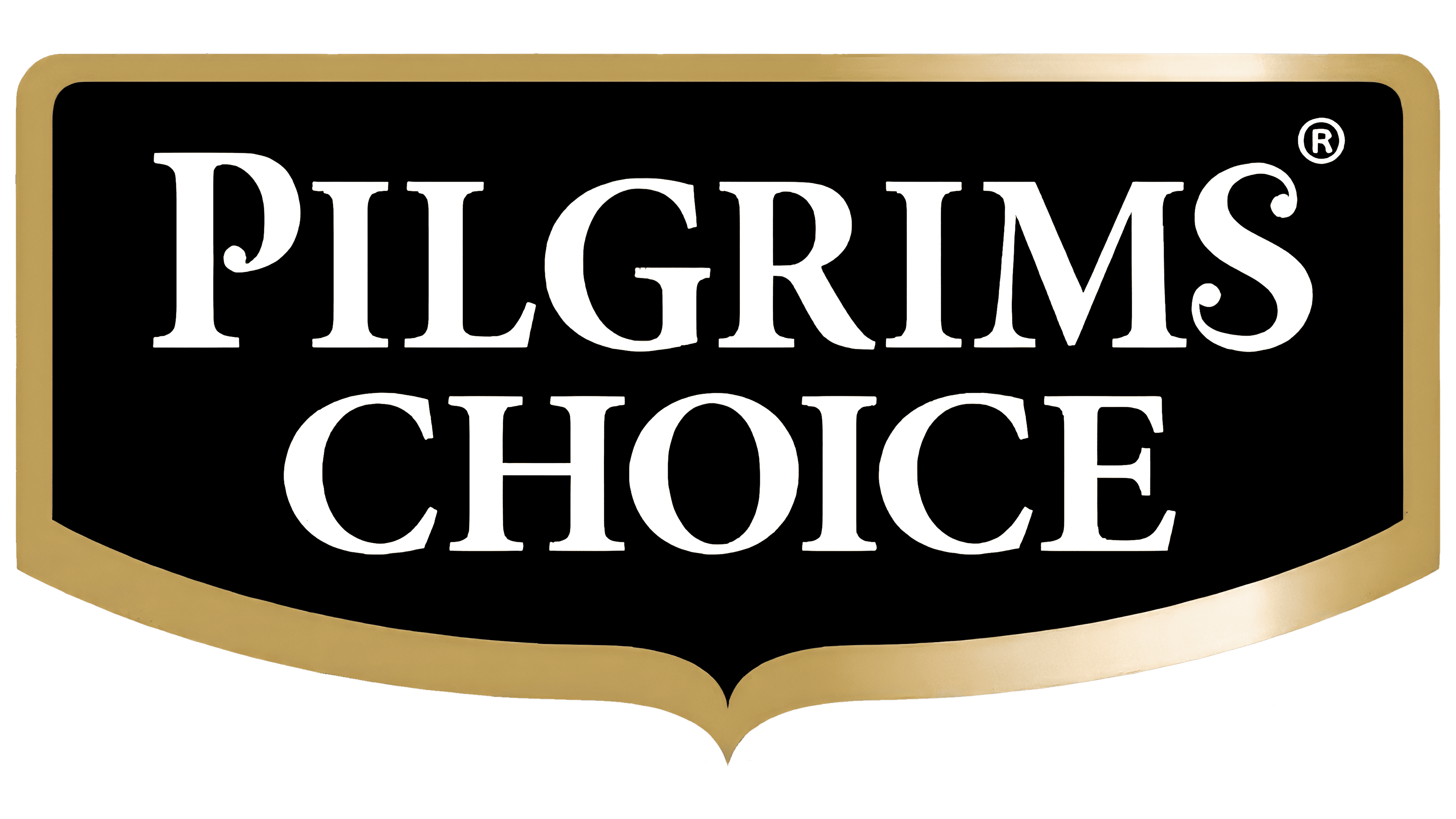
The old logo resembled the sign of a traditional shop. It included strict graphics, a classic typeface, and a gilded outline, which created an impression of reliability and respect for tradition. The mark was perceived as conservative and emphasized the link to the history of British cheesemaking. However, the market was changing, and the company needed a new language of communication to present the product more boldly.
The Brandon Consultants agency proposed a design that preserved the spirit of tradition with a modern character. The logo became cleaner and more expressive. The type grew larger and took on softer forms, while the outline was given thinner contours with a golden gradient. The new symbol came to resemble the smooth texture of cheese, while maintaining the premium status of the product.
![]()
The key concept became the idea “Dare to be Different.” It reflects the brand’s desire to declare independence and individuality. Consumer analysis revealed that people perceive Pilgrims Choice as a product that allows them to express their own taste and highlight personal preferences. The task, therefore, was to ensure that the visual system evoked an emotional response even before a person tasted the cheese.
A new style was created for the packaging. It abandoned the usual photographs and standard solutions. Textures reminiscent of the product’s structure appeared. The foundation was a combination of black and gold, which reinforced the sense of premium quality. Original, hand-drawn abstract illustrations complemented it.
A key part of the changes was the new visual presentation of the product. The photography team proposed a different angle: the cheese is shown through the play of light and shadow. The focus is on freshness and texture, enhancing the desire to try the product.
Brandon Consultants also developed brand architecture that will allow the company to conveniently expand the range. This applies to both new cheese varieties and limited editions. Unified guidelines provide partners with tools to work with the style and ensure a common language of communication.
As Ornua Foods Creative Director Justin Murtagh noted, Pilgrims Choice has transformed from a familiar product into a symbol of individuality. The visual system has made the brand dynamic and expressive, bringing it closer to an audience that values richness of flavor and boldness in choice.
The updated identity is applied in advertising campaigns, online communications, and retail settings. The brand aims to present consumers with a new perspective on familiar cheddar, thereby strengthening its position and offering a fresh experience of interacting with the product.