The Play Doh logo is the quintessence of sensation and novelty. The emblem represents a material for creative crafting that can transform into any object. This is what makes the toy so beloved by children.
Play Doh: Brand overview
Initially developed as a wallpaper cleaner in the mid-1950s, Play-Doh’s journey began in Cincinnati, Ohio, under Noah McVicker of Kutol Products Company. With the decline in popularity of rubber cement and wallpaper, the product faced slow sales.
Joe McVicker, Noah’s nephew, took the helm of the company in 1956 and transformed the wallpaper cleaner into a malleable dough for children’s play. Marketed as a toy by “Rainbow Crafts,” Play-Doh started its new chapter.
The product quickly became a hit in schools and households, particularly with families having young children. During the 1960s, Play-Doh’s advertising efforts increased, and various new colors were introduced.
In 1971, the Play-Doh brand, along with Rainbow Crafts, was acquired by the renowned toy company Kenner, further enhancing the brand’s growth over the following two decades.
The year 1991 marked another significant milestone when Hasbro acquired Kenner and, with it, Play-Doh. Under Hasbro’s stewardship, Play-Doh branched out into an extensive range of modeling compounds, complete with specialty tools and playsets. Innovations such as Play-Doh Plus also emerged during this period.
Today, Play-Doh stands as an iconic brand in the toy industry, featuring a spectrum of over 50 colors and available in more than 80 countries. Since its rebranding in 1956, over 3 billion cans of Play-Doh have been sold worldwide. Despite changes in its formula over the years, Play-Doh’s appeal to children endures.
Meaning and History
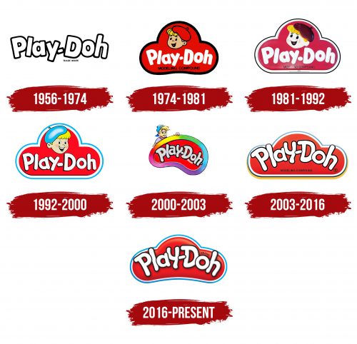
The material that forms the basis of the modeling compound was invented much earlier – in the 1930s. However, it was only in 1956 that it was released as a children’s entertainment, thanks to the efforts of Joseph McVicker. By the start of sales, the first logo was developed. Despite frequent changes to the emblem, its main elements have remained virtually unchanged since the beginning – the image of a cloud and the little boy, Pete. Another interesting feature is the gradual maturing of the mascot, which can be observed with each rebranding.
What is Play Doh?
A modeling compound resembling clay. It was invented by Noah McVicker in the 1930s as a wallpaper cleaner. The main components are completely safe: flour, water, starch, salt, and dye. Hasbro currently owns the patent. The toy has its own day, celebrated on September 18th, which is dedicated to the “perfume dough” developed by Demeter Fragrance Library.
1956 – 1974
The first emblem of the modeling compound is very light and airy. On a yellow background, creating a festive mood, the white inscription Play Doh is highlighted in a playful “dancing” format. Joseph coined the name for the product.
The yellow color indicates that the material is intended for children, while the white conveys the unique properties of the modeling compound, which does not stain hands or objects. Additionally, the first batches contained only white dough. Colors were added a bit later.
The logo demonstrates the ease and simplicity of working with the material, which is very malleable and does not require heating or kneading.
1974 – 1981
In 1965, the company producing Play Doh became the property of General Mills, which in 1971 merged it with another of its brands, Kenner Products.
The material was actively promoted in leading children’s shows. The new owners used the same type of promotion as for Kenner products – a mascot character. For the toy, this became the boy artist in a red beret named Pete.
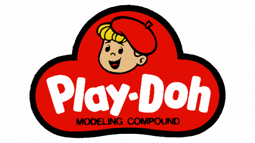
The image of Pete appeared on the emblem in 1974, at the forefront of the logo. The sign itself was designed in the form of a red cloud with a black outline and the white inscription Play Doh.
Interestingly, this was not the first mascot for the modeling compound. Initially, the mascot was named Pixie and even appeared on the boxes, but it did not make it onto the brand logo.
Below the main elements of the emblem, in small letters, was written “modeling compound,” to clarify what was inside the can.
1981 – 1992
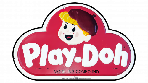
The company expanded the color range of the modeling compound to 8 shades. In support of the update in 1981, the emblem was revised. Pete’s face became rounder and more rosy, resembling a two-year-old toddler. The black outline was significantly thinned, giving way to a white contour. The changes made the sign more pleasing to the eye, with the background resembling a cloud more closely.
1992 – 2000
In 1991, the company was acquired by Hasbro, and Play Doh became part of its Playskool division. This ownership change was followed by an update in the brand’s identity.
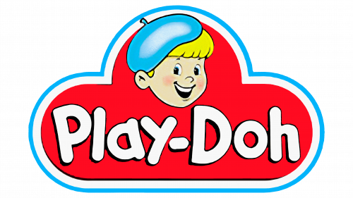
The 1992 rebranding further lightened the emblem, replacing the black color with blue. The character Pete matured, looking like a 7-year-old child. To prevent the beret from blending into the background, it was made blue.
The toy’s name received voluminous letters as if sculpted from a modeling compound.
2000 – 2003
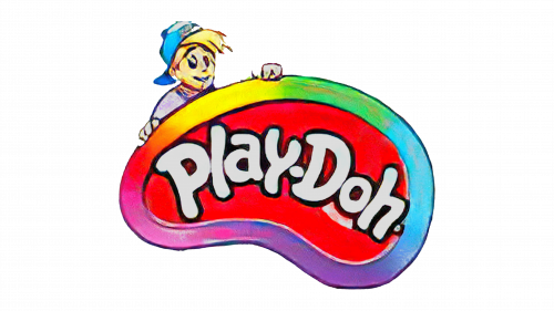
The next update added a few more years to Pete, making the boy resemble a teenager. Instead of the usual beret, a cap worn backward appeared, the chubby cheeks and rosy color disappeared, and the bangs turned into unruly, sticking-out tufts.
This time, designers aimed to make the boy’s image more realistic. Thus, he peeks out from behind the base of the emblem, holding onto it with his hands. He seems to be peeking at what the new owner of the set will sculpt from the gift.
The cloud also changed, transforming into an artist’s palette with a wide rainbow border.
2003 – 2016
In 2003, Play-Doh entered the list of toys of the century. To commemorate this event, the emblem of the modeling compound was completely transformed. Losing its familiar mascot, the sign looked more mature and serious. Only the contours of the cloud resembled the previous emblems.
2016 – today
For the brand’s 60th anniversary, the logo was updated again. The inscription “modeling compound,” which had accompanied the modeling compound for many years, disappeared from the emblem. The range of products now released under the brand is much broader than just the plastic dough. The clay is combined in sets with various items for play and squeezing the mixture. Playtables are also sold. Therefore, the inscription lost its relevance.
Font and Colors
Red and white are the main shades of the logo. The first attracts attention, indicating something interesting and engaging. White emphasizes novelty. Each time in the box, new details await the child for creativity. The dough is like a blank sheet. What the young artist will create on it is unknown.
The font of the inscription is filled with individual features, starting from the slightly uneven, as if rolled out of modeling compound glyphs of the letters, to the overlaying of symbols on each other, which is associated with the process of sculpting.
