 Portuguese Primeira Liga Logo PNG
The Portuguese Primeira Liga logo reflects the passion and diversity of Portuguese soccer, where each team plays with a distinct character. This league values emotions and playing styles over hierarchy.
The history of the Portuguese football championship dates back to 1934, when the first national league, known as the Campeonato da Liga da Primeira Divisão, was established. The club Porto became its first winner. In 1938, the league was renamed Campeonato Nacional da Primeira Divisão, becoming the country’s official championship.
Initially, the tournament included eight teams, which gradually increased to eighteen. In the 1940s, the famous “Big Three” emerged: Benfica, Sporting, and Porto. In the 1960s, Benfica brought European glory to Portugal by winning the European Cup twice under Eusébio’s leadership.
In the 1980s, Porto won their first European Cup, and in 2004, they secured the Champions League title under José Mourinho. Rare exceptions to the “Big Three” dominance were championships won by Belenenses in 1946 and Boavista in 2001.
Since 1999, the competition has been known as Primeira Liga, with its name changing annually depending on the sponsor. The modern format features 18 clubs, with promotion and relegation between the top two divisions.
Meaning and History
What is Portuguese Primeira Liga?
It is Portugal’s top soccer championship, featuring the country’s top 18 clubs. The league is recognized for high player development standards, with many becoming global stars. Three leading teams dominate, and their matches attract significant attention beyond Portugal.
1978 – 1991
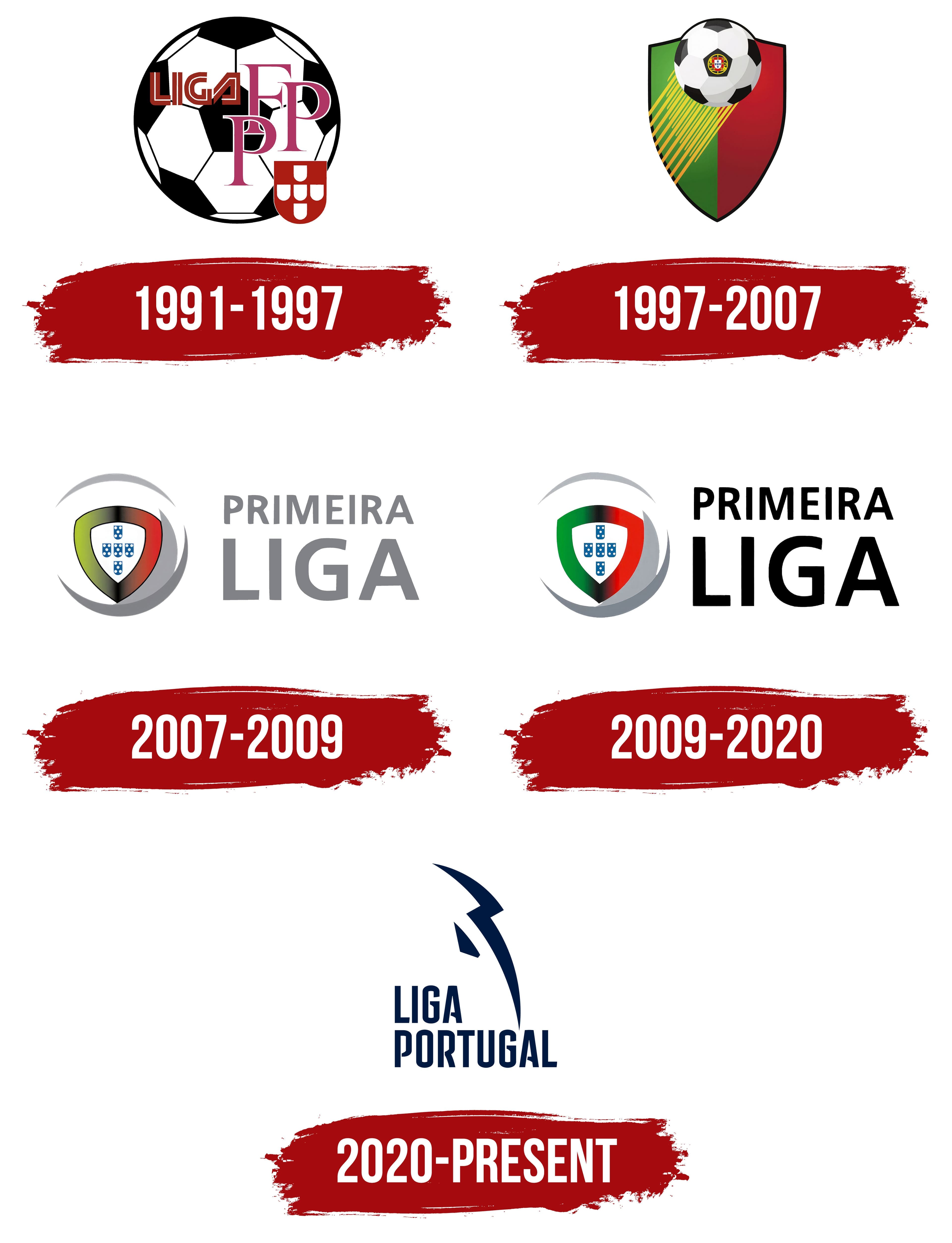
The first logo of the Portuguese professional football league was created as an official seal. The name, Liga Portuguesa dos Clubes de Futebol Profissional, smoothly wraps around the circular frame. A star at the bottom symbolizes the prestige of professional sports in Portugal.
The central composition features the intertwined letters “LPCFP,” minimalist and formal in design. The intertwined letters express the unity of the league’s clubs.
The modern style emphasizes the organization’s solidity, reflecting the clear principles and professional role in Portuguese football.
1991 – 1997
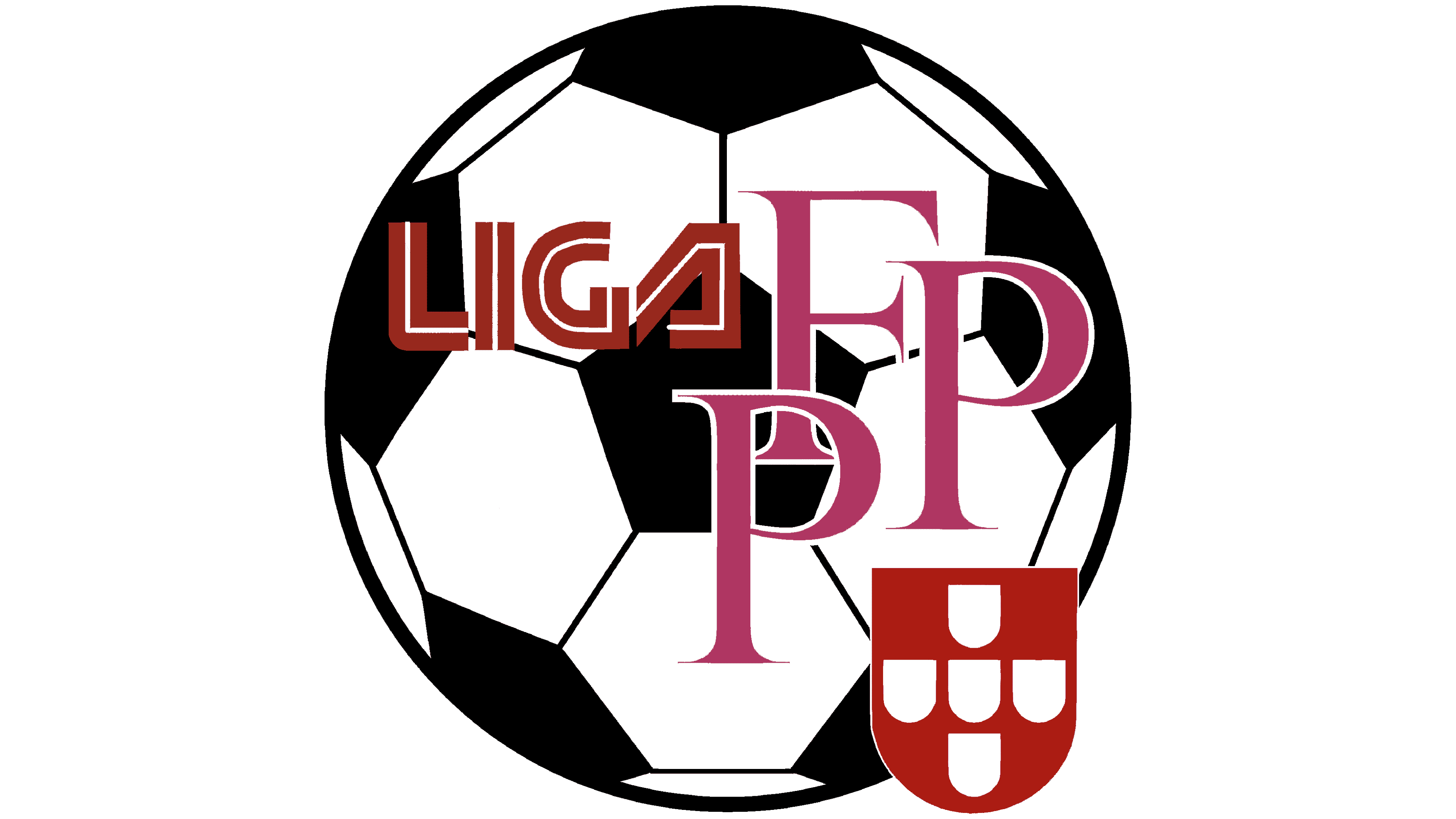
From 1991 to 1997, the Liga Portuguesa de Futebol Profissional logo embraced graphic freedom. A classic black-and-white soccer ball became the main element, directly linking the league to the game.
Unconventional typography appeared over the ball. The word “Liga,” set in bold red-and-white letters, looked futuristic, reflecting the league’s modernity in the 1990s.
Next to it were large pink letters, “FPF,” set in a serif font that signified authority and formality.
A minimalist Portuguese coat of arms appeared in the lower right corner, indicating national identity.
The diverse fonts and colors reflected the dynamic era of Portuguese football, showing openness and innovation.
1997 – 2007
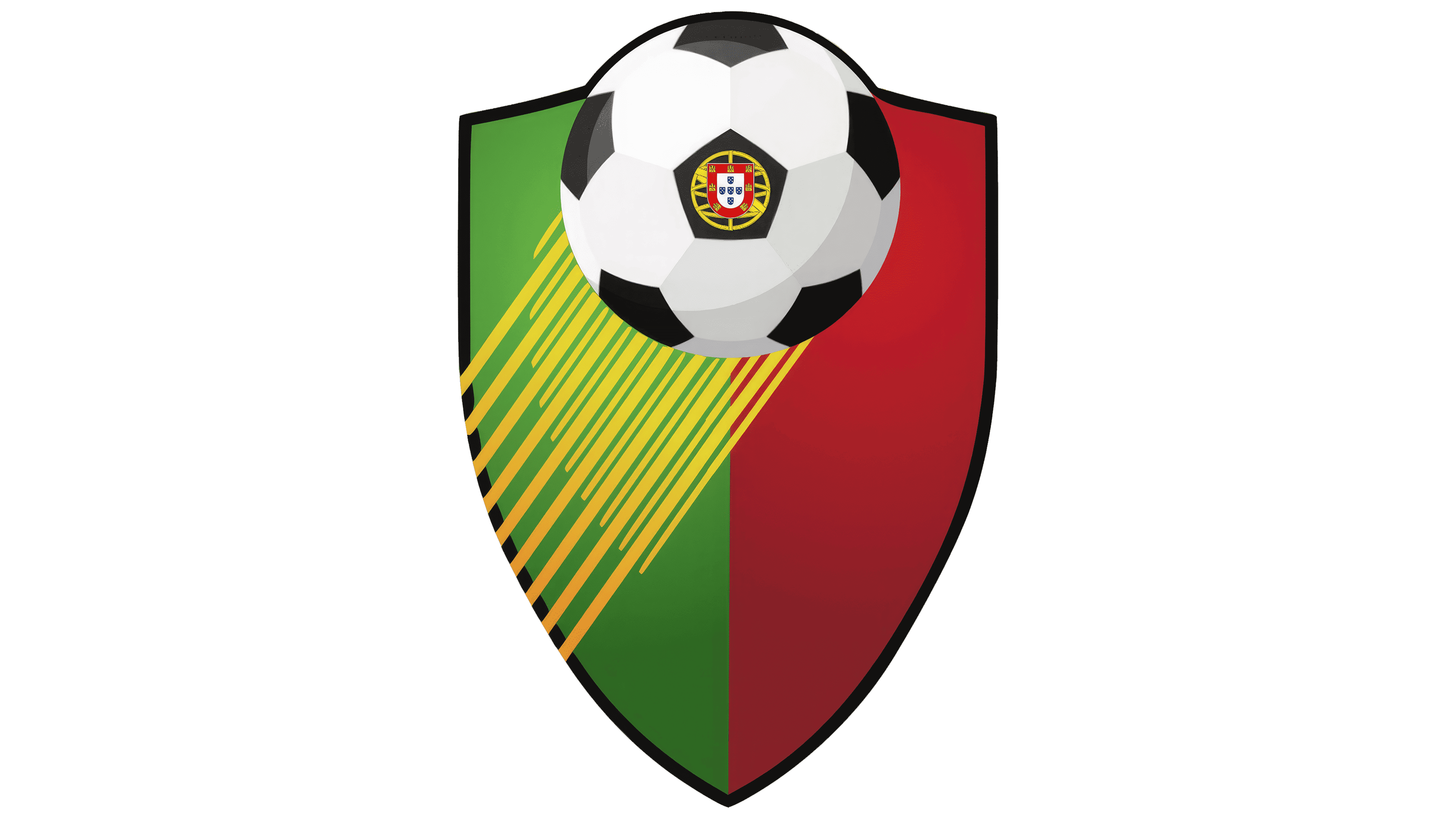
The Liga Portuguesa de Futebol Profissional adopted a medieval-inspired design. It featured a shield divided into green and red halves, reflecting the colors of the Portuguese flag.
Above it hovered a soccer ball containing a realistic Portuguese national emblem.
Diagonal yellow lines pointed toward the ball, visually depicting motion and symbolizing the game’s speed.
2007 – 2009
The logo was simplified in 2007, removing previous artistic elements. A minimalist approach centered around a shield colored green and red, complemented by a simplified Portuguese coat of arms.
Two gray crescent shapes surrounded the shield, resembling the outline of a soccer ball, hinting at movement without directly depicting it.
The “Primeira Liga” name appeared in a clear sans-serif typeface, in neutral gray, highlighting a modern style.
This simpler design met the demands of TV and digital media for clearer visuals.
2009 – 2020
In 2009, the design became richer and more energetic, aligning more closely with Portugal’s national colors. The green and red colors deepened, strongly reflecting the colors of the Portuguese flag and emphasizing pride and identity.
The league’s name appeared in black, enhancing contrast and readability. The gray crescents around the shield remained unchanged.
The Portuguese emblem within the shield was given brighter colors, accentuating its national symbolism.
2020 – today
In 2020, Liga Portugal radically changed its visual style, abandoning previous forms and traditional soccer symbolism. The new logo, created by the Portuguese agency VMLY&R Branding, reflects a shift toward minimalism and a contemporary approach to sports branding.
The main change was adding a stylized footballer symbol. The figure is conveyed through several lines and appears abstract, making it harder to interpret. Nevertheless, it emphasizes the sporting focus. The symbol evokes movement, growth, and energy.
The logo color is dark blue. It appears professional and underscores the organization’s seriousness. The inscription is arranged in two lines. The word “LIGA” is placed on top, and below it is the word “PORTUGAL.” All letters are large, capitalized, elongated upward, and without serifs. The typeface resembles Eurostile Extended Bold or Agency FB, but adds its own details in the form of small line breaks. This creates rhythm and energy, making the perception more dynamic.
The new logo positions Liga Portugal as a modern European football organization. The minimalism emphasizes the league’s intent to follow current trends in sports design while balancing a strong image with visual lightness.