 Post Consumer Brands Logo PNG
Cereal-based breakfast foods include flakes and ready-to-eat products that are part of the daily diet and require minimal preparation time. These products are produced for mass consumption and consistent taste. The Post Consumer Brands logo is associated with a company that produces cereal flakes and grain-based products for home consumption.
Post Consumer Brands dates back to 1895. That year, Charles William Post created the grain-based beverage Postum in Battle Creek and founded the Postum Cereal Company. In 1897, the product Grape-Nuts appeared. It became the first mass-produced, ready-to-eat breakfast cereal. In the early 20th century, the company developed its marketing and manufacturing operations. After the founder died in 1914, the business was led by his daughter, Marjorie Post. She transformed the company into General Foods Corporation.
In 1919, in Minnesota, miller John Campbell created the product Malt-O-Meal and founded the Campbell Cereal Company. In 1966, Malt-O-Meal introduced a new concept. Breakfast cereals began to be sold in bags instead of boxes. This reduced costs and expanded the market.
In 1971, Post launched Fruity PEBBLES and Cocoa PEBBLES. This was the first time television cartoon characters were used in advertising. In 1989, Post launched Honey Bunches of Oats.
In 2012, Post Holdings went public. In 2015, Post Foods and MOM Brands merged. The new holding company, Post Consumer Brands, was headquartered in Lakeville, Minnesota. In 2017, the company acquired Weetabix and several organic brands.
In 2021, the company expanded its portfolio by acquiring the Peter Pan brand and TreeHouse Foods’ ready-to-eat cereal business. In 2023, Post Consumer Brands entered the pet food market. It acquired the brands Rachael Ray Nutrish, 9Lives, Kibbles’ n Bits, and others, as well as the manufacturer Perfection Pet Foods.
In 2024–2025, the company focused on integrating new assets and improving production processes. Under Rob Vitale’s leadership, Post Consumer Brands strengthened its position in the growing pet food industry.
Meaning and History
What is Post Consumer Brands?
One of the largest ready-to-eat cereal producers in the United States, part of Post Holdings. The company ranks second in the country by production volume and unites the brands Honey Bunches of Oats, Pebbles, Malt-O-Meal, Bran Flakes, Grape-Nuts, Honeycomb, Waffle Crisp, and Shredded Wheat. In addition to cereals and muesli, it produces Peter Pan peanut butter, Ronzoni pasta, and pet foods, such as Rachael Ray Nutrish, Kibbles’ n Bits, 9Lives, and Gravy Train. Its headquarters are in Lakeville, Minnesota. Its main activities include producing breakfast foods, snacks, and private-label products. The products are supplied to the United States and Canada, and the brand Animated Brands is responsible for marketing.
1946 – 1955
The Post name in Post Consumer Brands traces back to Charles William Post’s family business. In 1895, he founded Postum Cereal Company in Battle Creek, Michigan. Its first product was Postum, a grain-based beverage, and two years later it introduced Grape-Nuts, a ready-to-eat cereal. After Post died in 1914, his daughter, Marjorie Merriweather Post, took over the business. The company was later renamed General Foods, while Post remained a separate product brand.
American food manufacturer Post Consumer Brands was formed in 2015 through the combination of Post Foods and MOM Brands. The name pairs the founder’s surname with “Consumer Brands” to reflect the company’s consumer-facing brands. The name links Post’s heritage to a business that encompasses several food brands.
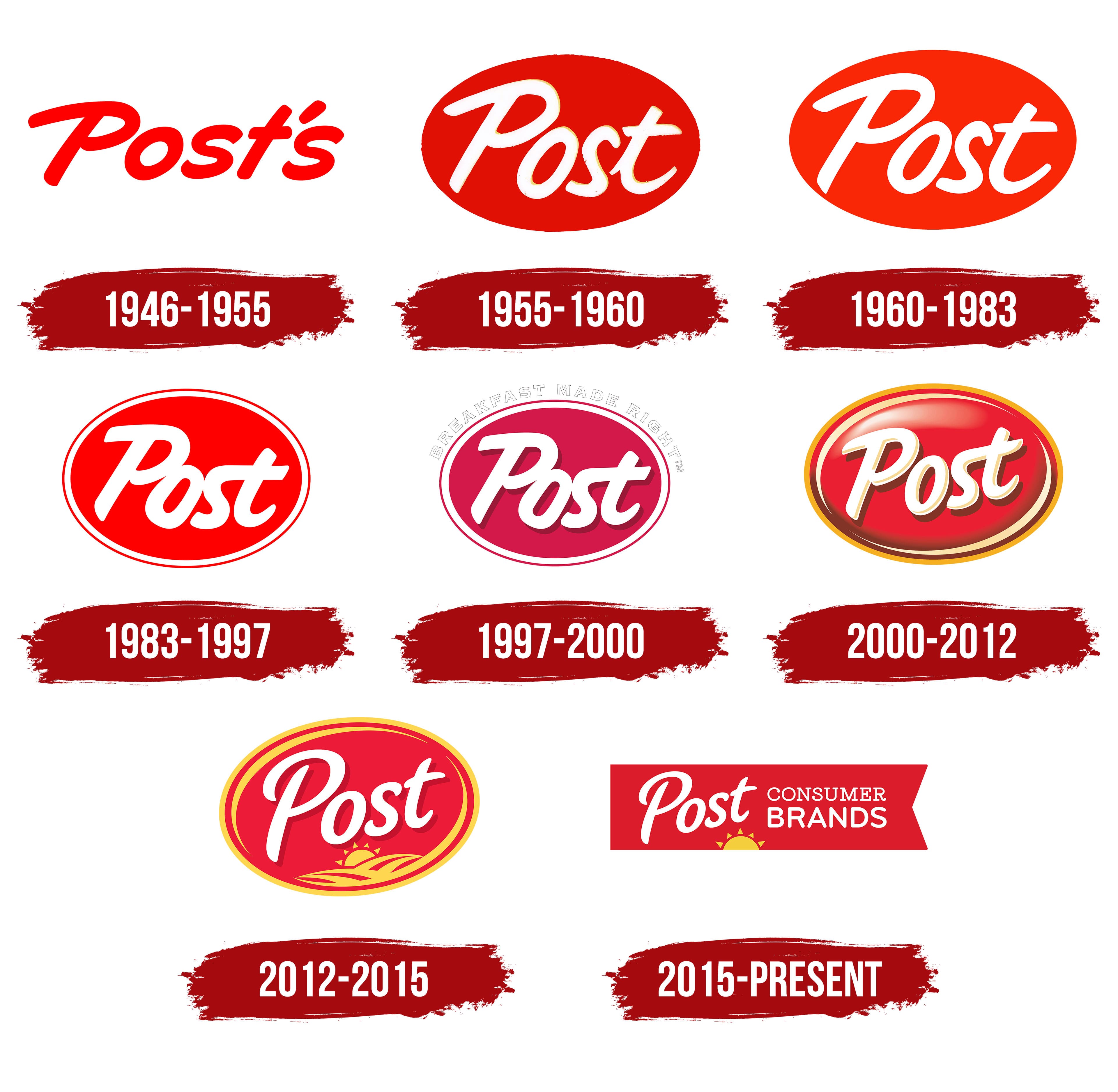
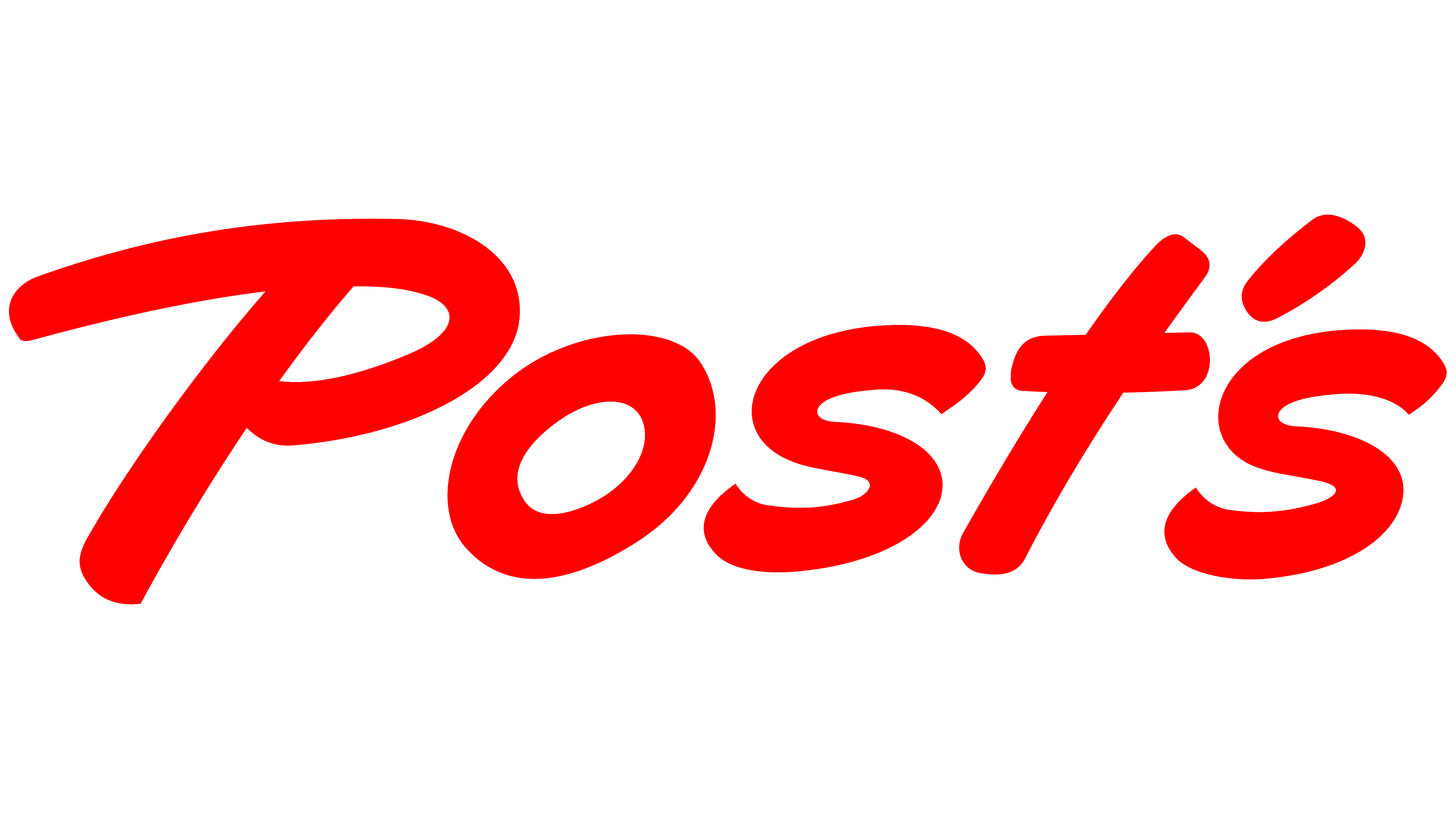
The early “Post’s” wordmark used the English possessive form to link the products to their owner. The apostrophe and final “s” conveyed that Post made the product. The name appeared on cereal packaging in 1950, alongside individual product names. The logo consisted entirely of “Post’s,” with its design built around the letterforms.
The large, broad letters were bright red and used a handwritten style with a rightward slant. An uppercase “P” began the name, followed by lowercase letters. The heavy strokes stayed consistently thick. Above the final “s” sat a short, right-tilted teardrop apostrophe. It matched the letters’ slant and color, completing the wordmark.
1955 – 1960
In the next Post logo, the name appeared inside an oval. Red moved from the lettering to the background, while the name became white with a thin yellowish outline. The possessive “Post’s” became the shorter “Post.” On packaging, the emblem appeared alongside the cereal’s name, distinguishing the manufacturer’s brand from the individual product.
Large handwritten lettering with a slight rightward slant filled the horizontal oval. The capital “P” occupied nearly its full height, while the lowercase “o,” “s,” and “t” sat lower. Broad strokes and loose curves resembled writing made with a thick brush or marker. The white word stood out against the bright red field, with a yellowish outline separating the letters from the background.
1960 – 1983
The next Post logo retained the white lettering and red oval. The background became brighter and one or two shades lighter. The relationship between the name and its surrounding shape remained unchanged.
The letter edges were refined, smoothing out irregularities in the previous version. The rest of the design stayed the same. The oval still contained the single word “Post.”
1983 – 1997
The next Post update changed the lettering and the oval’s border. The white strokes became thicker, and the gaps between the letters narrowed. The name retained its spelling and position on the red field, but the letters now sat closer together.
A double border was added around the oval. A white band surrounded the red fill, with a thin red line tracing its outer edge. The white border separated the inner field from the outer contour, adding another band around the lettering. The updated emblem retained the red background and the white Post name.
1997 – 2000
Post had used “Breakfast Made Right” since April 1996, promising a properly prepared breakfast. By the late 1990s, the phrase had become part of the logo. The tagline added a breakfast message to the brand name and changed the familiar oval arrangement.
“BREAKFAST MADE RIGHT™” curved above the emblem’s upper edge. The sans-serif capitals had gray outlines, with the background showing through. Their forms resembled Futura or Gotham. The line followed the oval’s upper curve, connecting the tagline to the emblem’s shape.
Inside, the white Post name retained its rounded letters and rightward slant. The handwritten treatment resembled casual script and brush script styles. An offset dark raspberry shadow beneath the strokes gave the lettering depth. The red field took on a raspberry tone. At the same time, a thick white border along the oval’s inner edge separated it from the surrounding background.
2000 – 2012
In 2007, Post Foods was using a glossy oval emblem with layered detailing. The tagline above the oval had been removed, while the red field and white handwritten name remained. Changes to the oval’s surface, border, and lettering made the logo look like a raised medallion.
Light and shadow gradients appeared across the red background. A highlight fading toward white sat in the upper left, near the “P.” The lower right darkened from brownish red into deeper tones. A gold border made up of several bands of different widths replaced the former white frame. Two cream-beige arcs followed the oval’s inner edge.
The white Post lettering retained its brush script style and rightward slant. Pale yellow and ochre outlines were added around the letters, with a deep shadow beneath them containing dark red and yellow-brown areas. These layers created depth and separated the word from the red surface. The oval shape, colors, and slanted lettering maintained a connection to earlier versions of the brand.
2012 – 2015
In the 2012 Post logo, a rising sun above wheat fields appeared inside the oval, beneath the brand name. Short triangular rays surrounded the sun disk, which was partly hidden behind the horizon. Curved golden bands spread to the left and right, representing cultivated fields. Their color matched the oval’s outer border.
The handwritten Post name was redrawn, keeping its white color and rightward brush-script slant. The heavy capital “P” received a rounded upper loop and a long descending stroke. The lowercase letters became thinner, with looser curves. A small, dark-red shadow remained beneath the name, separating the white strokes from the background.
Removing the large highlight gave the bright red field a more even surface. The gold frame remained, accompanied by two arcs along the inner edge. The updated version combined a red background with white lettering and yellow-gold outlines.
2015 – today
The update to Post’s oval emblem coincided with Post Holdings’ separation from Ralcorp. The new company initially consisted of the Post cereal business. Following further corporate changes, the oval continued to represent the product brand. The 2015 merger of Post Foods and MOM Brands required a separate Post Consumer Brands logo, designed for a company bringing together several consumer brands.
The corporate logo featured an elongated red rectangle with a triangular notch on the right, resembling the end of a ribbon or flag. White calligraphic “Post” lettering appeared on the left. A heavy capital “P” was paired with lowercase letters. The casual script or brush script name slanted to the right and rose slightly toward the end. A yellow-gold rising sun appeared beneath it. Its semicircle was partly hidden behind the ribbon’s lower edge, with short triangular rays extending above the edge. In the corporate version, the sun became a separate image beneath the name.
Two white lines, “CONSUMER” and “BRANDS,” appeared to the right of “Post.” The upper line used small, thin serif capitals resembling Clarendon or Merriweather. The lower line used large, upright sans-serif letters resembling Avenir or Gotham Rounded. Differences in letter size and form distinguished the two words, while the horizontal ribbon contained the company’s full name. The handwritten Post name, sun, and red, white, and gold combination connected the new identity to the product brand.
Studio Eight Hour Day and designer Kelsey Lindhorst of Brave New Media contributed to the post-merger work. Lindhorst collaborated with the studio on branding and art direction, then adapted the overall visual identity for 20 brands. The Post Consumer Brands ribbon represented the combined company, while the oval emblem continued to identify the Post cereal family.
Anniversary celebrations reflected the difference between the company’s age and the brand’s history. In 2020, the oval appeared in a design marking Post’s 125th anniversary. Above large “125” numerals sat the red emblem with white lettering, a golden sun, and fields. The anniversary was measured from Charles Post’s business, founded in 1895. In 2025, Post Consumer Brands celebrated its 10th anniversary, while the Post name marked 130 years.