The Praga logo embodies the rich heritage of the century-old brand and conveys its impressive history. The design reflects the prestige and sophistication characteristic of the company’s vehicles. The emblem symbolizes power and speed, inspiring car enthusiasts to purchase modern sports cars.
Praga: Brand overview
The company’s tale began in 1907 in the heart of Prague, the bustling capital of what is now the Czech Republic. It was a venture between the Czech company Českomoravská-Kolben and the French automobile giant Renault, starting as Praga-Renault. By 1909, the Praga V’s first car rolled out, echoing Renault’s design.
1911, the company stepped out from under Renault’s wing, crafting its unique vehicles. The 1920s saw a burst of innovation, with the company making cars, trucks, buses, and even aircraft. It wasn’t long before the company became a cornerstone of Czechoslovakian industry.
The 1930s were truly golden years. The company’s lineup expanded, featuring everything from the charming Praga Piccolo and Praga Lady passenger cars to sturdy trucks, buses, tractors, and motorcycles. These vehicles became beloved icons on the roads.
World War II brought a dark chapter. From 1939 to 1945, under Nazi occupation, the company was compelled to produce military equipment. With the war’s end, 1946 saw the company’s nationalization under Czechoslovakia’s new communist government, aligning it with many other national enterprises.
The 1950s and 1960s saw the company shift its focus to trucks and specialized equipment, leaving behind the production of passenger cars. The 1970s and 1980s were marked by international collaborations, particularly with the Soviet manufacturer KamAZ.
The fall of communism in the 1990s led to privatization and financial hurdles. In the 2000s, the company reimagined itself, turning to specialized vehicles, race cars, and go-karts.
2011 marked a bold return to passenger vehicles with the Praga R1, a supercar built for racing and track enthusiasts. By 2016, the lineup included the R1R, a street-legal variant that thrilled driving aficionados.
Today, in the 2020s, the company continues to innovate with its range of racing and sports cars alongside its go-karts and specialized vehicles. Over a century of history has seen the company transform from a broad-spectrum manufacturer to a niche player celebrated for its racing prowess and engineering excellence. The company’s evolution showcases its resilience and adaptability, from making early 20th-century cars to modern supercars and racing machines, maintaining a legacy cherished by motorsport fans worldwide.
Meaning and History
What is Praga?
It is a Czech automobile manufacturer known for producing many vehicles, including cars, trucks, and motorcycles. The company is renowned for cutting-edge technology and innovation and offers reliable, high-quality vehicles. The brand has significant experience in the automotive industry and is also involved in motorsports, producing competitive racing cars and go-karts.
1907 – 2011
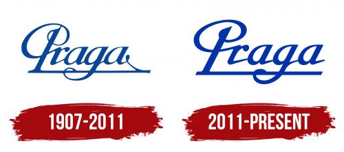
The automotive company adopted the name Praga in 1909 and incorporated it into the logo to show its connection to its home country. Designers used an old-fashioned cursive font adorned with elegant flourishes and dots at the ends of the letters, reflecting the aesthetics of the early 20th century when romanticism became fashionable. This font style was also chosen for technological reasons: many emblems of that time featured handwritten inscriptions because printing capabilities were limited.
Thanks to the handcrafted design, the logo is unique and recognizable. The top of the “P” connects to the center of an elegant spiral, making the letter resemble a fragment of an inverted treble clef. Another nod to the musical theme is the long horizontal line beneath the inscription, resembling part of a musical staff. Although the brand has no connection to music, such associations are fitting, as they impart visual lightness to the emblem. Lightness means a lot in automotive manufacturing – from impeccably refined production technologies to the ease of handling a car.
Only three letters are connected to the horizontal line: “P,” “g,” and the final “a,” which has a long downward stroke. The rest of the letters are elevated above the line, giving the brand name an ethereal appearance. The “flying” logo creates a sense of speed, perfectly capturing the company’s character, producing airplanes, trucks, and sports cars at different times. The logo is colored in a blue hue with a turquoise tint, symbolizing innovation, tranquility, and reliability.
2011 – today
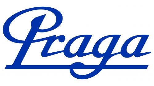
In 2011, Praga resumed operations after a long hiatus. Given that over 60 years had passed since production stopped, the company needed a new visual identity aligned with 21st-century trends. However, it retained the emblem’s unique style to show the connection between two different eras and express pride in its historical past.
The logo still features the word “Praga” in an elegant cursive font. Designers made slight modifications:
- Increased the spacing between letters
- Made the lines bolder
- Reduced the curve of the loop in “g” and the spiral part of “P”
- Removed the dot and the long tail on the final “a.”
These changes improved the legibility of the text and brought it closer to the minimalist style that became popular in the 2000s. The word is underlined by a long horizontal line with sharp diagonal cuts at the ends, symbolizing the road and speed, emphasizing the brand’s connection to sports cars. The slanted form of the letters complements this, creating a sense of motion.
The blue color, on the other hand, is associated with calmness and stability. This is important for the company, which aims to inspire trust among a wide range of consumers and emphasize the safety and quality of its vehicles.


