PSI Software introduced an updated identity. The new image reflects its focus on developing software platforms for energy, industry, logistics, and infrastructure. For a business that has worked with critical systems for more than 50 years, the update marked a shift toward cloud services and AI-powered products.
The company was founded in 1969. Today, it operates in 17 countries and has about 2,400 employees. Against a competitive backdrop, PSI is strengthening its position as an international provider of enterprise software and presenting the brand in a new way to the market, clients, and its team.
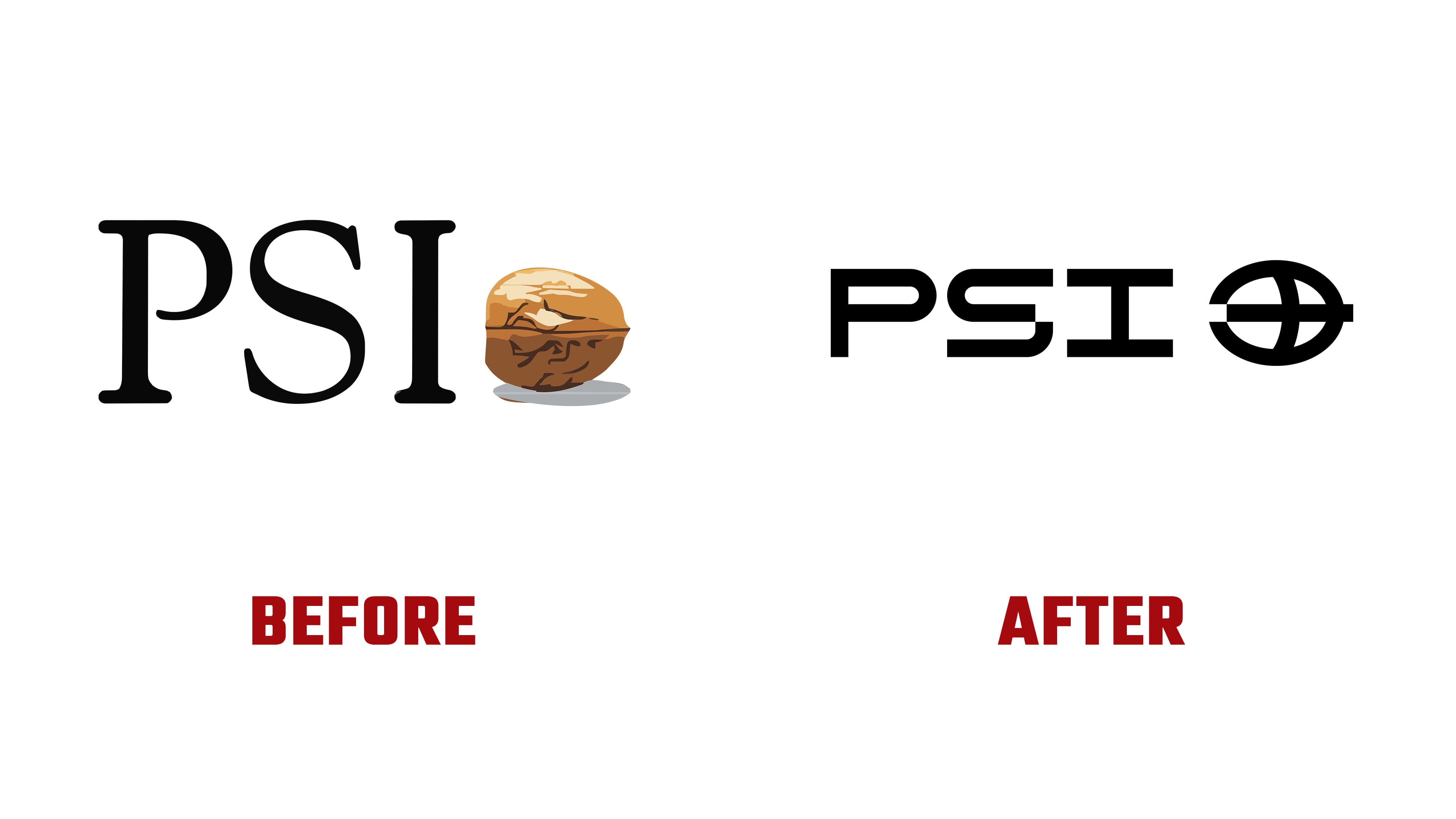
The update focused mainly on the logo. The old PSI mark had long been associated with a walnut. In the new version, the designers kept a link to the brand’s past. They reworked the familiar image into a technological symbol. The mark combines a globe motif with a redesigned walnut form in a pixel-grid structure. The logo connects the brand’s history with the digital environment, software development, and the company’s international work.

The rendering of the name changed. A strict geometric, modular mark replaced the previous combination of classic typography and a realistic image. The logo became more closely aligned with the engineering field and better communicates the company’s profile. The new version emphasizes the brand’s technological specialization.
The work began as a style update, then turned into a broader reconsideration of the brand image. The new logo shows changes inside PSI Software. It connects its experience with critical infrastructure to the image of a modern technology company. PSI presented the updated identity at E-world energy & water 2026 in Essen.