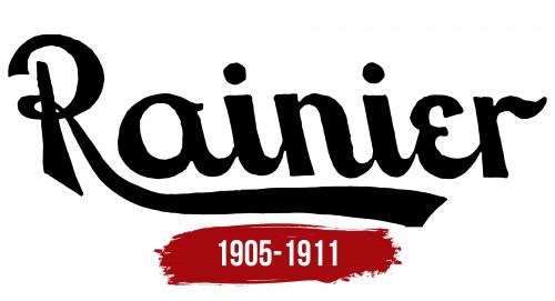
The Rainier logo is little known in the modern world because the company it represented existed for a short time. However, it made a significant impact on the automotive industry. Its emblem reminds humanity of a pioneer in the engineering of luxury cars.
Rainier: Brand overview
The Rainier Motor Car Company, founded in 1905 by the visionary John T. Rainier, carved a unique niche in the early American automotive industry. Nestled in Flushing, Queens, New York, the brand embarked on a mission to create vehicles that would stand toe-to-toe with Europe’s finest.
In its inaugural year, the brand unveiled its first models: a sleek four-cylinder car with 24 horsepower and a robust 35-horsepower variant. These vehicles quickly garnered attention for their exceptional craftsmanship and innovative design.
By 1907, the brand had pushed the envelope further by introducing a six-cylinder model boasting 50 horsepower. This groundbreaking vehicle was one of the first mass-produced six-cylinder cars in the United States, earning acclaim for its power and smooth performance.
In 1908, the brand enhanced its cars with state-of-the-art ignition systems and more efficient engine cooling mechanisms, solidifying its reputation for technological prowess.
Despite these advancements, financial challenges began to emerge in 1909. The high costs of developing and manufacturing top-tier automobiles and modest sales volumes strain the brand’s finances.
In 1910, the brand attempted to restructure and attract additional investment by launching a new range of models, including luxury and more affordable options, to appeal to a broader market.
However, these efforts were insufficient to stabilize the brand’s financial situation. By 1911, amid fierce competition in the US automotive industry and broader economic instability, the brand was forced to declare bankruptcy and cease operations.
Although its lifespan was brief, the brand left an indelible mark on the early American automotive landscape. Known for their quality, innovative engineering, and stylish design, the brand’s vehicles, particularly its pioneering six-cylinder engine, were significant technical milestones.
The brand played a role in New York City’s economic and industrial growth, providing jobs and stimulating the local economy. Today, the brand’s cars are rare and highly prized by collectors and automotive historians, serving as relics of a dynamic era in American automotive history when countless small companies vied for prominence in a burgeoning industry.
Meaning and History
What is Rainier?
It is an early 20th-century automobile brand known for producing luxury vehicles focusing on craftsmanship and innovative engineering. The brand, originating in the United States, manufactured cars that appealed to affluent customers and emphasized performance and elegance.
1905 – 1911
The luxurious logo represents luxurious cars. It embodies the spirit of innovation that the company incorporated into its products as early as the 20th century. The manufacturer took pride in its lineup of luxury cars, offering car enthusiasts the best models that met the demands of the time. Through its visual identity, the manufacturer aimed to:
- Present all products under a single sign
- Stand out among competitors
- Become well-recognized in the industry
- Advertise its branded cars
- Generate interest in its lineup
- Differentiate the brand from similar ones
- Introduce consumers to its products
However, not all these goals were achieved because the innovative automaker faced challenging problems that hindered its growth and existence. Nevertheless, its emblem remains a living reminder of the company, reflecting its concept.
The Rainier logo is based on the name and was designed in the early 20th-century retro style. The font is lowercase, neat, and reminiscent of handwritten calligraphy. The only unusual feature is the left-leaning slant, which is uncommon in handwritten text. This type of italic is rarely seen in branding, making it memorable. This approach was intended to make the young automotive brand quickly recognizable and established in the market. However, the strategy was unsuccessful due to a lack of a strong material and technical foundation.
The name is set horizontally with elegant lowercase glyphs. The bold letters indicate the car manufacturer’s persistence, tenacity, and reliability. Notably, the capital “R” stands out: it is incredibly elegant and light, consisting of curls and an elongated leg that gracefully transitions into an underline. The “e” is also interesting, as it resembles a capital letter despite being lowercase. Its retro style is visible.


