


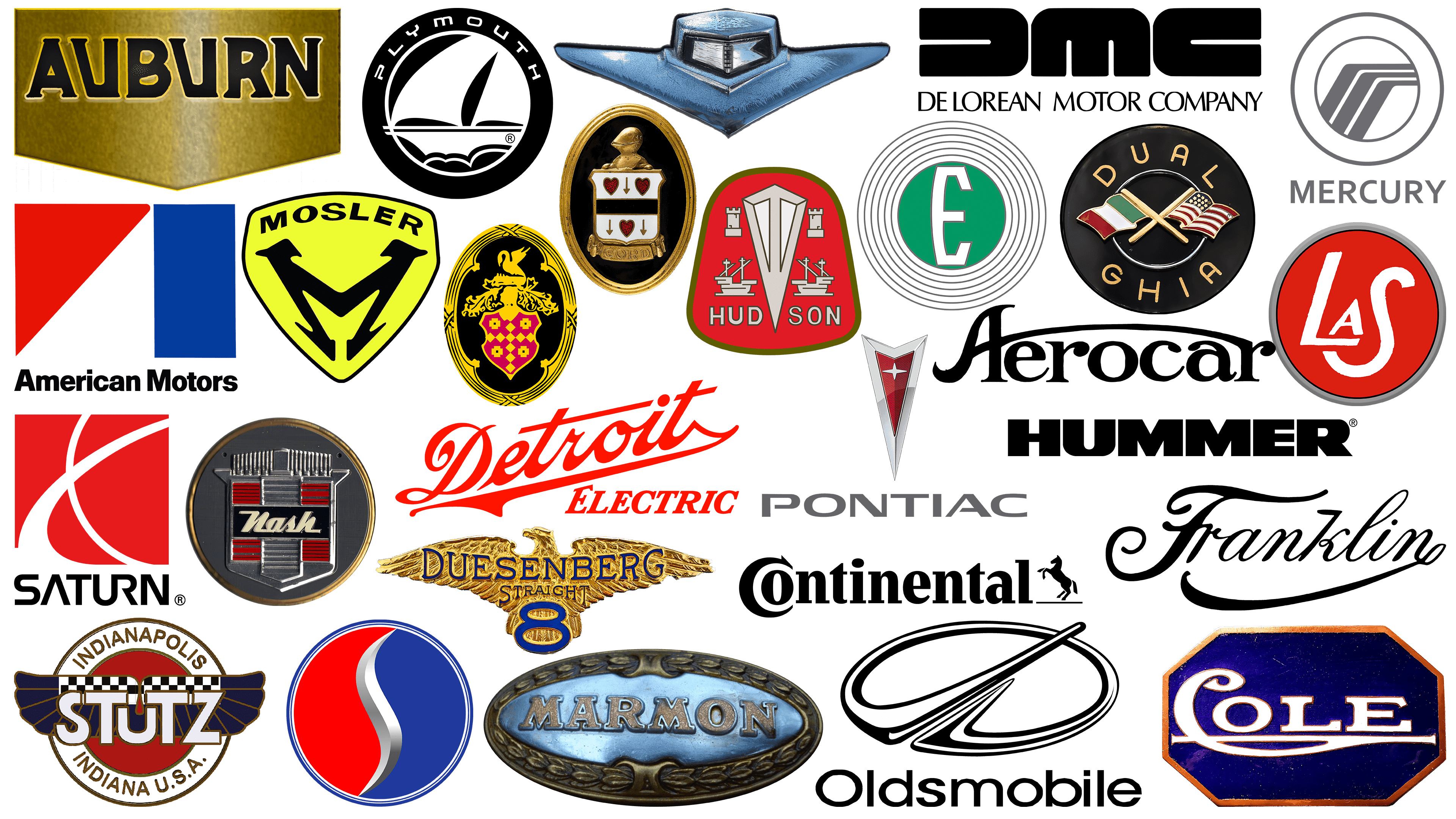
Studying past automobile emblems provides a glimpse into history. It would seem that the US automotive sector is oversaturated with numerous players, but a long list of automakers have ceased operations without realizing their potential.
Some defunct American automobile brands have ceased to exist due to insufficient funds or missed opportunities. Nevertheless, their influence on the current state of the automotive market is undeniable.
Studying these vintage American automobile brands and their distinctive logos can yield invaluable lessons. Although these brands no longer exist, their legacy is evident in the evolution of automotive technology and design.
Learning about the history of discontinued American car brands is a nostalgic journey and an educational experience that sheds light on the factors that led to success or failure in a highly competitive industry. Their intricate logos tell stories of ambition, innovation, and sometimes warnings about pitfalls to avoid.
Old car logos: what happens to bankrupt car companies?
Since 1886, the rise of the automobile has made the industry an integral part of American society. Many iconic brands emerged during this time, from industry titans like Ford and General Motors to specific models like the Corvette and Mustang.
Only a few automotive endeavors have led to lasting success. Over the decades, countless visionaries have entered the complex world of automobile engineering, striving to create the perfect American car. And while some have succeeded in making their dreams a reality, many have not.
Companies whose cars no longer drive American roads still provide valuable insight into the automotive sector. Often, these defunct brands offer more than meets the eye and serve as important case studies of industry trends. They have often been at the forefront of technological advances, even if they have not long survived.
Collectors and car enthusiasts hold many defunct American automobile companies in high esteem. Each logo represents a chapter in the annals of American automotive history, chronicling the aspirations, triumphs, and sometimes lessons of failure.
The most famous discontinued car brands
Examining the history of the automotive industry reveals several defunct car brands that have left a lasting impact. While they no longer exist, their legacies often endure among automobile fans and the general public.
AMC
![]()
American Motors Corporation, known as AMC, initially carved out a niche in the economy-car segment, competing with established giants such as Ford. AMC cars were common on American roads for some time, as the company continually produced inventive models that caught everyone’s attention.
The AMC emblem manifested the company’s patriotism. The simple emblem consisted of red, white, and blue geometric shapes. Below it was a simple word mark in a clean sans-serif font. The colors and design elements made the emblem instantly recognizable, and the straightforward layout echoed the company’s focus on practicality and efficiency.
AMC was not just a car manufacturer but a brand that sought to bring innovation and affordability to the average American driver. They challenged the big companies by offering budget cars without compromising innovation or performance. From compact cars to more spacious family vehicles, AMC has continually expanded its product lineup to meet consumer demands while maintaining its roots of economy and efficiency.
AMC has ventured into new directions, including developing all-wheel-drive models and revolutionary engine technology. These bold moves have allowed AMC to catalyze change in the automotive industry, pushing the boundaries of what economy cars can do regarding performance and functionality. Although the brand has faded into history, its legacy has left an indelible mark on the American automotive industry.
Continental
![]()
American automobile companies that have not stood the test of time include Continental, which Ford created to capture the high-end luxury car market, a segment larger than the premium Lincoln brand.
The Continental logo exuded the sophistication and elegance one would expect from a luxury brand. The logo, depicting a horse standing up on its hind legs, simultaneously conveys a sense of grace and power, perfectly in line with the brand’s positioning as a purveyor of high-performance and luxury automobiles.
Another intriguing element of the logo is the “O” inscribed in the letter “C,” an artistic choice that reflects the brand’s creative flair. This subtle touch serves an aesthetic function, adding depth to the logo design and making it visually pleasing and conceptually appealing.
Continental sought to redefine the luxury car market by offering high-performance vehicles with sleek designs and cutting-edge features. The brand has not stood the test of time. Still, its legacy is a testament to the ambition and innovation that often characterize attempts to break new ground in the automotive industry.
DeLorean
![]()
DeLorean Motor Company, commonly called DMC, became known primarily for its significant role in the Back to the Future movie series. This Hollywood connection gave the brand the recognition it enjoys today. Although the company’s name has made its way into pop culture, it has faced numerous obstacles that have prevented it from achieving long-term business success.
The DMC-12 car featured in the franchise was the only model ever produced by the company. It was a testament to the brand’s vision and ambition, but ultimately, it failed to translate these into sustained market success. The car’s iconic status was cemented in popular culture, but the brand failed to stay afloat in the business world.
Also interesting is the DMC logo, an emblem designed to embody the company’s core values. It is characterized by simplicity and elegance: printed letters with a gradient finish give the impression of sparkling in the light. The “D” and “C” logos mirror each other, symbolizing balance and unity.
The contradiction between the DeLorean Motor Company’s cultural glory and business failures makes it a subject of intrigue. The company’s only automobile, the DMC-12, has become immortalized in pop culture, becoming a relic of a time when ambitions soared high but fell back to earth due to various problems. From production problems to financial difficulties, the brand’s hardships starkly contrasted with its Hollywood glory.
Duesenberg
![]()
Duesenberg’s 24-year presence in the American automotive industry was short-lived, but it left a memorable impression. The brand, known as one of America’s most sought-after automobiles, continues to attract collectors and fans passionate about its historical significance.
The Duesenberg logo is particularly eye-catching, exuding power and elegance. The focal point is a golden eagle with wide wings, symbolizing speed and grace and evoking a sense of patriotism. The number “8” was incorporated into the logo to further emphasize the brand’s craftsmanship. This was done in recognition of the advanced eight-cylinder racing engines that were the hallmark of the company’s engineering prowess.
Duesenberg created cars that set standards for luxury and performance despite their limited lifespan. In their day, these cars were considered the epitome of automotive luxury and were made with meticulous craftsmanship and attention to detail. Their luxury was so high that owning a Duesenberg automobile became a status symbol akin to the accomplishments of the wealthy.
Hummer
![]()
From 1992 to 2010, Hummer was synonymous with powerful, muscular vehicles designed primarily for off-roading. Known for its bulky passenger cars and pickup trucks, Hummer targeted a specific consumer audience that valued sustainability and luxury in equal measure. The brand was once very popular, but after General Motors’ bid to sell it to a Chinese company fell through, a decline marked the end of Hummer’s presence in the automotive industry.
The Hummer logo is integral to the brand’s identity: bold, block-like letters signify durability and strength. These qualities weren’t just marketing gimmicks; they epitomized the engineering marvel of Hummer automobiles. Hummer vehicles were a true feat of design and engineering, known for their ability to traverse difficult terrain, from mountainous regions to muddy fields.
Various market factors did not contribute to the brand’s long-term sustainability. Rising fuel prices and environmental concerns significantly changed consumer preferences away from “gasoline trucks” like Hummer. As a result, the brand’s sales declined, prompting efforts to find a new owner who could keep it alive.
One such attempt was to negotiate a sale to a Chinese entity under General Motors’ auspices. Despite lengthy negotiations and efforts, the deal was not finalized, leading to the brand’s closure.
Mercury
![]()
Mercury, operating under the Ford Motor Company umbrella, was a distinct brand in the automotive world from 1938 until its discontinuation in 2011. The brand stood out as an upscale alternative in the Ford lineup, targeting buyers interested in more luxurious vehicles.
The emblem adopted by Mercury played a crucial role in shaping public opinion of the brand. The emblem design was subtle and sophisticated, evoking a sense of luxury similar to what buyers expect from a high-end automobile. Central to the design are the lines, which serve both functional and narrative roles. These lines mimic the shape of a winding road, symbolizing not only the open road but also the reliability and versatility of Mercury vehicles.
Vehicles produced under the Mercury brand were characterized by attractive appearance, superior performance, and stability. These vehicles were equipped with advanced features, state-of-the-art technology, and high-quality materials, which justified their slightly higher price than standard Ford models.
Although Mercury is no longer in production, its legacy lives on. The older models remain popular in the used car market, and many still admire their qualities. Collectors appreciate these cars for the combination of performance and aesthetics that the brand diligently cultivated.
Oldsmobile
![]()
After surviving for over a century and eventually facing closure, Oldsmobile remains a testament to the vicissitudes of the automobile industry. Established in 1897 as Olds Motor Vehicle Company, the brand earned its reputation for its unwavering commitment to building high-performance automobiles with innovative engine technology.
Still striking today, Oldsmobile’s visual style blended simplicity and symbolism. Its round badge with a linear element running through the center resembles a road, easily conveying the essence of travel and forward motion. This was supported by a clean wordmark in a sans-serif font that further emphasized the brand’s reliability and progressiveness.
Oldsmobile was not just an automobile manufacturer but an innovator in the industry. Among its accomplishments were key automotive innovations such as automatic transmissions and built-in air conditioning. Each new model was introduced with great enthusiasm and promise, and new features or improvements were offered that later became standard across the market.
But even a legacy as strong as Oldsmobile’s could not guarantee eternal success. Several factors converged, which ultimately led to the brand’s demise. Among them was a shift in consumer preferences toward fuel efficiency and eco-friendliness, which made Oldsmobile’s traditional offerings less competitive. Despite attempts to adapt by producing more compact and eco-friendly models, the brand never regained its footing.
Plymouth
![]()
Plymouth, launched as Chrysler’s “pass-through” brand, had a diverse lineup that included sports cars and several budget options. Initially gaining popularity among the general public, the brand faced growing problems related to high fuel consumption. This problem became an issue as gasoline prices rose, gradually declining the brand’s popularity among frugal consumers.
Plymouth’s emblem stood out in the automotive world. The emblem, depicting a ship on a round black background, went beyond traditional automotive branding norms.
Plymouth vehicles’ high fuel consumption posed a dilemma for consumers. With rising gasoline prices, purchasing a Plymouth vehicle became impractical for many, resulting in lower sales and a decline in the brand’s market share. This is a prime example of how external market factors, such as the cost of goods, can directly affect a product’s demand, regardless of its initial appeal.
Despite these challenges, the brand’s unique logo intrigued those interested in automotive history. The ship on the Plymouth logo was an unusual yet bold design choice that presented a broader view of mobility and luxury.
Pontiac
![]()
From 1926 until its discontinuation in 2010, Pontiac remained one of the pillars of the automotive industry, especially in the United States. Known for its luxury vehicles that set high standards in the market, the brand had an indelible impact on automotive culture. Pontiac achieved fame with iconic models such as the Trans Am that attracted attention for their style, comfort, and performance.
The brand’s visual style has been crucial in shaping its reputation. The Pontiac logo, depicting a bright red arrow symbolizing a shield, was not just a decoration but a statement. This element, combined with the hard sans-serif font below the arrow, captured the essence of a strong and confident brand.
Pontiac, known for setting trends rather than following them, constantly innovates technologically and updates styling. The brand has strived to offer an unrivaled driving experience by constantly updating its models with the latest technology and premium features. Whether fuel-efficient engines or luxurious interiors, Pontiac consistently exceeds consumer expectations.
Saturn
![]()
Saturn operated as a stand-alone subsidiary under General Motors, specializing in small and mid-size cars that gained considerable popularity. Despite being part of GM, Saturn created its own identity by focusing on energy-efficient vehicles, which set it apart from other corporate divisions. Unfortunately, even with loyal consumers, the brand faced problems that led to its eventual demise.
Saturn’s visual style provided insight into the brand’s values and creativity. The iconic image of the planet Saturn was created on a red cubic background using white stripes. This graphic became a calling card that instantly made the brand recognizable. Beneath the planetary motif, unique typography, including a curious connection between the letters “U” and “R,” further emphasized Saturn’s commitment to ingenuity.
One of Saturn’s hallmarks was its customer service model. The brand revolutionized the car-buying process by offering a “no-haggle” pricing strategy that eliminated the traditional pain point of negotiating. This unique business model has become a point of interest for many wanting to understand how to build a loyal customer base.
Saturn faced challenges, including the economic downturn and increasing competition from brands offering similar or even more attractive car options. Attempts were made to revitalize the brand with new models and features, but it wasn’t enough to keep it viable.
Studebaker
![]()
Studebaker, whose history dates back to the 1850s, occupies a unique place in the history of the American automotive industry as one of the oldest automobile brands. Initially, the company specialized in producing wagons designed for miners and agricultural workers. Over time, Studebaker successfully transitioned to automobile production, firmly establishing its reputation as an American automotive powerhouse.
The Studebaker emblem, carefully designed in red, white, and blue, conveyed deep patriotism. The silver “S” at the center of the logo served as an initial and signaled the brand’s penchant for sophistication and forward-thinking vision.
Despite its rich history, the company’s journey ended in 1967 when it was forced to cease operations. Although the company no longer exists, its influence is deeply embedded in the annals of American industrial history.
Stutz
![]()
The Stutz Motor Car Company, known for its luxurious and high-performance automobiles, was prominent in the American automobile market for several years. In particular, it produced one of the first sports cars in America, the Bearcat, and pioneered the most advanced engine technology.
The brand’s logo was carefully designed to reflect its core values and become the hallmark emblem of American cars. It features wings behind a creatively designed word mark, achieving a harmonious balance when mounted on the car’s hood.
Although the brand no longer exists, its legacy remains an important chapter in American automotive history, reflecting a commitment to excellence and innovation far ahead of its time.
Other American car companies that failed
The enumeration is far from exhaustive in detailing the many American car companies that have emerged and vanished from the automotive scene. The focus here is on a selection of less prominent yet significant brands that once existed.
Aerocar International
![]()
Aerocar International emerged in the late 1940s from Moulton Taylor’s idea. The company sought to break through the usual barriers by combining the functionality of automobiles and airplanes into a single, innovative product. This idea was realized in a two-person hybrid airplane car. The ability of this car to move from the road to the sky and back was innovative for its time and challenged conventional ideas about transportation.
Much attention was also paid to the company’s branding. The Aerocar trademark was created using a serif font, giving it a grace and authority that matched the brand’s avant-garde offerings. An interesting design feature was the relationship of the letters “A” and “R” in the word. This connection was far from cosmetic: it symbolized the integration of air and road travel.
The wordmark was not just a set of letters but also a conduit for conveying the company’s mission and commitment to revolutionizing transportation. The serif font gave the logo sophistication and established the brand as a force to be reckoned with in the automotive and aviation industries. By choosing such an original font style, Aerocar International set itself apart from the usual car manufacturers, making it clear that the company was in a league of its own.
By creating a dual-purpose vehicle and combining it with a carefully considered branding strategy, Aerocar International demonstrated its forward-thinking approach and its ability to break away from traditional classifications.
Auburn
![]()
Auburn Automobile, founded in Indiana in the early 1900s, quickly became a key local player in the production of luxury fashion cars. One of the defining elements that contributed to its prominence was the use of a straight eight-cylinder engine. This engine type was widely associated with the high-end luxury cars in high demand during that era.
Despite the impressive technology under the hood, Auburn Automobile’s branding was just as effective. The bold black letters of the company name, set against a rich gold background, not only emphasized the brand’s luxury and outstanding character. A distinctive feature of the logo was the unconventional shape of the letter “U,” which further individualized the brand.
Auburn Automobile wasn’t just distinguished by luxury car performance and powerful engines. The attention to detail extended to marketing materials, such as brochures and advertising, was consistent with the company’s luxury ethos and identity.
Cole
![]()
After operating in the U.S. automotive market for over 15 years, Cole Motor Car Company left an indelible mark on the country’s automotive industry. Specializing in producing high-wheeled cars, which became a symbol of the era, the company played a crucial role in introducing and popularizing these cars in the U.S. until its closure.
The eagle, a symbol deeply associated with American identity, was chosen as the emblem. The font used for the brand name further emphasizes the classic design. The colors used in the logo were black, blue, and gold, each with its connotations: black symbolized elegance, blue symbolized reliability, and gold symbolized luxury.
The design of Cole’s cars combined time-honored craftsmanship with aesthetic sensibility. They fulfilled their function and made a style statement, embodying old-world charm while meeting modern needs.
Another intriguing choice was the eagle in the logo. This powerful bird is often associated with freedom, strength, and values considered vital in American culture. Including the eagle in the logo was a gesture to evoke patriotism and national pride, in keeping with the company’s American roots.
Even after its closing, the Cole Motor Car Company is often discussed in the context of early American automotive history.
Cord
![]()
Cord, founded by Errett Lobban Cord, was closely associated with Auburn and Duesenberg and entered the market in 1929 with a single model, the L-29. Targeting the high-end market, Cord sought to incorporate state-of-the-art technology and aesthetically pleasing design into its automobiles.
Having won the attention and favor of Hollywood dignitaries, Cord sought to reflect its luxurious status in its logo. Elements such as the family shield and eagle were woven into the design to emphasize the connection to American identity and values. Gold was chosen as the dominant color in the visual elements of the Cord logo, emphasizing the luxury and sophistication the brand strives for.
Detroit Electric
![]()
Created by the Anderson Electric Car Company, Detroit Electric carved a niche in producing light electric cars. In the roughly three decades of its existence, the company produced 13,000 vehicles. This is a testament to its commercial viability and desire to promote electric cars long before they became mainstream.
For the company’s emblem, we used a typeface that exuded sophistication and traditionalism. This choice created a sense of luxury, balancing old-world charm and modern efficiency. Using an uppercase font for the word “Electric” in the emblem is no accident. This design element was applied intentionally to attract attention and make a strong impression on the target audience.
This branding style spoke to the company’s individuality. The typography created a bridge between the past and the present, convincingly showing that although the cars are cutting-edge, they are built on a foundation of proven quality and craftsmanship. Using the “Electric” typeface in capital letters was a bold statement of the company’s specialization.
With effective branding and a solid lineup of electric vehicles, Detroit Electric successfully met the challenge and delivered a model of innovation and luxury. This combination secured the company a place in the annals of automotive history, making it an object of study and admiration in the electric vehicle industry.
Dual Ghia
![]()
Appearing in American automotive history as a little-known company, Dual Ghia lasted only two years. Despite its limited time in the limelight, the company made a lasting impression with its powerful, customized convertibles. The main appeal of the Dual Ghia cars lies in their distinctive body design, complemented by luxury elements that cater to a specific niche of automotive enthusiasts.
The brand’s identity is reflected in its logo, which pays homage to the company’s founder and reflects its unique character. The wordmark was set in a simple gold font, enclosed in a circular shape. This design approach was typical of automobile companies of the era. The circular shape was particularly effective when placed on the car’s hood as a visual magnet to draw attention to the brand name.
Dual Ghia aligned with modern and timeless design trends by choosing a round shape for its logo. The simplicity of the shape and the choice of a golden hue for the font conveyed a sense of understated luxury, which Dual Ghia cars possessed to the fullest.
Although the company failed to compete in the competitive automotive industry, it left behind an intriguing legacy. Its uniquely designed, high-performance convertibles have entered the annals of automotive curiosities.
Edsel
![]()
For a brief period from 1956 to 1959. Edsel was a division of Ford Motor Company and set out to make a difference in an increasingly competitive automotive sector. Despite grand ambitions, Edsel cars were met, at best, with disapproval, resulting in the brand failing to meet expectations.
The Edsel logo is remarkable for its simplicity: a large white letter “E” set against a round green background. The choice of green was probably made intentionally to symbolize prosperity, the aspiration the Edsel brand sought. The green circle is accompanied by silver lines girdling the inner perimeter, perhaps an artistic representation of the brand’s anticipated growth and expansion.
The design of Edsel cars, as well as their pricing policies, also contributed to their failure. Focused on the middle price range, the brand was sandwiched between established brands that offered cheaper and more luxurious options. In a sense, Edsel found itself in a “no man’s land” of price and value, contributing to its eventual decline.
The logo remains a symbolic element of the branding story. The choice of colors and design elements reflects Ford Motor Company’s high hopes and considerable ambition for Edsel.
Franklin
![]()
The Franklin Company has been a leading figure in the annals of American automotive history for over thirty years. Known for its avant-garde air-cooled-engine cars, the company served as a catalyst, encouraging future manufacturers to follow a similar technological path.
Franklin’s brief but notable presence in the automotive market led to the creation of a range of vehicles with air-cooled engines, a new concept for the time. This pioneering step set Franklin apart from its contemporaries and helped pave the way for future technological advances in engine cooling. Many consider this achievement one of the company’s most significant contributions to the industry.
The stylistic features of the Franklin logo were far from accidental. The circular frame was a traditional yet effective design solution that encapsulated and emphasized the core brand name. The underlined element beneath the wordmark in the emblem also played a nontrivial role in conveying the company’s values.
In a world where branding can make or break a company, Franklin’s logo and product design choices have proven remarkably consistent. The logo echoes the products it represents, reinforcing them and creating a unified corporate identity.
Hudson
![]()
The Hudson Car Company, once a leader in the American automobile industry, left an indelible mark during its more than 40 years in business. The company eventually went out of business, but not before cementing its legacy. That legacy lives on today, thanks partly to a community of collectors who continue to cherish the various Hudson models.
Branding has played a key role in Hudson’s enduring reputation. The company chose a visually appealing, symbol-laden emblem. At the center of the emblem was a pointed shield surrounded by a semicircular red badge. The shield was elaborate, featuring elements such as castle fragments and images of seafaring vessels. These symbols were not arbitrary; they emphasized Hudson’s historical ties and relationship to military traditions.
The emblem acted as a narrative, reflecting the company’s history and principles. The castle elements imply a commitment to strength and stability. At the same time, the ship elements evoke thoughts of travel and exploration – qualities that resonated with car buyers of the time.
Hudson’s focus on building rugged and reliable vehicles was well-known in the industry. The military theme in the company’s emblem added another layer to its reputation for reliability. This visual branding tool effectively cemented the company’s place in the historical narrative of the American automobile industry.
Kaiser-Frazer
![]()
Founded in Ohio, Kaiser-Frazer became a manufacturer of affordable, reliable automobiles for consumers seeking economical options. Despite promising prospects, the company ran into financial difficulties and eventually declared bankruptcy, resulting in a limited lifespan of a few years.
Kaiser-Frazer took an unconventional approach to branding. The company’s emblem differed from the norms of its era: it had no text or wordmark. Instead, the emblem was a set of geometric shapes, foreshadowing what would become common practice in modern car branding.
This avant-garde design strategy set Kaiser-Frazer apart in a market that mostly used logos with a lot of text. The decision to use a geometric design without words was a bold move, a departure from the norm that gave the brand a unique place in the market despite its short lifespan.
Even after his passing, Kaiser-Frazer left an indelible mark, especially in branding and logo design. Although the Kaiser-Frazer company did not last long, it significantly influenced design norms, anticipating how automobile companies would present themselves.
La Salle
![]()
La Salle, created by General Motors to fill the market void between Cadillac’s luxury and Buick’s affordability, was born out of a significant investment in eye-catching design and high-tech features. Despite these efforts, the brand did not achieve the success it had hoped for.
The La Salle logo was an elaborate visual identity element enclosed in a bright red circle. It features only the brand name’s initials, “La” by La Salle, presented so they appear interconnected.
The color scheme and materials used in the cars’ interiors were carefully considered, emphasizing La Salle’s commitment to quality and luxury. The cars were equipped with some of the most advanced technology of the time, designed to provide potential buyers with comfort and performance.
Despite the infusion of capital and creativity, La Salle struggled to capitalize on its intended niche. This was partly due to the rapidly evolving automobile market and growing competition. Over time, the brand’s inability to capture sufficient market share led to its discontinuation, cementing its status as one of General Motors’ notable but unsuccessful endeavors.
Marmon
![]()
In 1902, Indianapolis-based Marmon quickly carved out a niche as a reputable luxury car manufacturer. Beyond creating elegant exteriors, the company also pursued engineering innovation by introducing engine types V2, V4, V6, and V8. These advanced engines made Marmon cars very maneuverable and powerful, making them serious competitors on the race tracks of the era.
But the company didn’t just claim its status through mechanical advancements. Glancing at the Marmon logo is enough to realize the brand’s high standards. The logo is designed in a symbolic style and represents the company name in capital letters on a golden background. It has a timeless sophistication, carefully crafted to convey authority and elegance.
The intricate border, reminiscent of an official state seal, adds extra zest to the logo. This detail gives the logo visual appeal and emphasizes the brand’s seriousness and commitment to unsurpassed quality.
Marmon became a testament to the American automobile industry and an example of effective branding. Powerful engines demonstrated that Marmon was not just a luxury car manufacturer but also a significant player in racing. These aspects combined to position Marmon as a multi-dimensional brand that excels in technological innovation and brand presentation.
Mosler
![]()
During a short period of active operations in the United States, Mosler entered the sports car niche. Warren Mosler founded a company that created a select lineup of cars specifically designed for high-speed racing. Later, the company merged with Rossion Automotive, marking the end of its independent existence.
The Mosler emblem became a model of modern branding principles. Built around a bright yellow shield, it contained a word inscription in the center. The font chosen for the text blended seamlessly with the bright yellow background, making the word mark an integral part of the overall design scheme.
A sense of urgency and dynamism permeates the design of Mosler vehicles, echoing the bright yellow hue of the logo. Yellow often symbolizes excitement and energy, qualities associated with the high-octane world of sports cars.
Mosler’s focus on producing a limited line of high-performance cars has influenced many aspects of the corporate identity. The bright yellow shield was deliberately chosen to reflect the brand’s essence—dynamic, impressive, and out of the ordinary. The wordmark in bold type was equally eye-catching, giving the logo a sense of presence and modernity.
The merger with Rossion Automotive ultimately led to Mosler’s transformation, but its influence as a manufacturer of unique sports cars remains. Not only has the company produced high-performance cars, but it has also successfully captured the essence of speed and thrills in its branding.
Even after the company ceases to operate independently, its legacy in American sports car manufacturing endures, thanks in no small part to its carefully crafted image.
Nash Motors
![]()
Nash Cars, founded in 1916, became known not only for the affordability of its automobiles but also for its innovative contributions to the industry. Before merging with Hudson and finally ceasing production in 1954, the company was noted for its innovation, creating advanced vehicle ventilation systems and avant-garde design. With these innovations, Nash Motors is remembered by car enthusiasts and everyday drivers alike.
Nash Motors’ corporate identity was carefully designed to match its reputation. The company logo echoed the common emblem style of the time but was distinguished by unique elements. The color scheme evoked a sense of patriotism, aligning with the American spirit and subtly conveying the car’s domestic origins and commitment to national values.
Another attractive design element was the choice of typeface for the Nash Motors word mark. Unlike typical fonts, the Nash Motors font had a distinctive rightward slant. This slant was a stylistic decision and symbolized forward movement, which fits well with the company’s focus on innovation and progress.
Nash Motors was not content with producing affordable cars. It strived to innovate and bring new ideas to the automotive field. From developing advanced ventilation systems to creating modern designs, Nash Motors constantly pushed the boundaries of what was possible.
This company epitomized affordability, technological advancement, and a commitment to quality on a budget. Nash Motors’ legacy lives on even after it left the industry, embodied in its innovative models and evocative logo.
Packard
![]()
Packard, established in Detroit as a manufacturer of expensive high-end automobiles, was often seen as the leading name in the luxury car market before World War II.
Packard’s emblem occupied an important place in its corporate identity. As a coat of arms enclosed in a silver or gold oval, the emblem was intended to signify the brand’s pedigree and its dominant position in the automobile industry.
The Detroit-based company prioritized advanced engineering technology to create cars that were not only attractive but also had outstanding performance. Engineers have worked hard to ensure that every element, down to the last bolt, lives up to the brand’s reputation for luxury and high quality. State-of-the-art technology enhanced the driving experience to meet customers’ tastes and expectations.
The interiors of Packard cars displayed no less skill. The finest leather, custom stitching, and an array of amenities all contribute to the cabin’s premium comfort. This attention to detail further enhanced the brand’s appeal, making it preferred by those who viewed their automobile as an extension of their style and status.
Throughout its history, Packard has become synonymous with the luxury and prestige sought by high-end buyers, leaving an indelible mark on automotive history.
The Legacy of Defunct Car Brands Through Their Logos
A retrospective look at defunct automobile companies and their emblems provides valuable insight into the automotive industry’s historical development. Although these ancient brands are no longer in operation, they played a critical role in shaping industry perceptions and technological trends.
Studying past automobile companies and their emblems allows us to trace the cultural and design evolution of the automotive sector. Logos, as the face of a brand, often reflected the prevailing societal attitudes or technological breakthroughs of the time. Whether minimalism reflects economy or intricate details symbolizing luxury and opulence, these symbols are markers of specific eras and the dominant styles. They are an intriguing anthology of design that reflects changes in public taste, the economic climate, and advances in production technology.
The logo designs of now-defunct automobile companies are interesting because they reveal much about consumer expectations and market trends during their years of operation. The colors, shapes, and typeface used in the emblems often echo the era in which they were designed. The mid-century’s bold colors and bright wordmarks speak of an era of optimism and rapid growth. At the same time, more subdued designs can signify periods of austerity or significant changes in public sentiment.
A deep dive into these companies’ histories reveals how each has contributed to the automotive manufacturing ecosystem. In some cases, their technological innovations, marketing strategies, and design solutions served as models for subsequent companies. Although these companies have ceased to exist, their influence is still felt in the industry today, reflected in the strategies and designs of today’s brands.