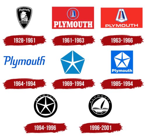
The Plymouth logo is like sailing into the future. The emblem conveys the American spirit of the company and shows that its cars are fused with the dusty roads of the states and have become part of the culture.
Plymouth: Brand overview
| Founded: | July 7, 1928 – June 29, 2001 |
| Founder: | Chrysler Corporation |
| Headquarters: | United States |
Plymouth is the car-making division of Chrysler, which was closed in 2001. Production facilities were in Michigan. The Voyager, Neon, and Prowler are still produced from the lineup under the Dodge and Chrysler brands.
Meaning and History
The brand logo is inextricably linked to the parent company, its goals, and its slogans. They are so close that for some time, Plymouth repeated the symbol of its founder. This shows the tight stewardship of the brand’s destiny and direction. Another important feature of the logo is the connection to the history of the country of production. A deep respect for its roots and patriotism permeates the cars’ identities.
What is Plymouth?
Chrysler’s brand of inexpensive cars blossomed in the 1950s and ’70s of the 20th century. The first factory opened in Detroit in 1928. The last car was released in 2001.
1928 – 1961
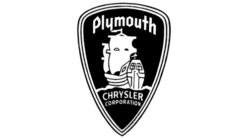
The first logo was a triangular shield with a picture of a ship, the brand name on top, and the Chrysler name on the bottom.
The idea for the name belonged to the head of the parent company Joseph W. Frazer. The brand creators wanted the brand to represent all American and indigenous, evoking the association with reliability, strength, and consistency. Therefore, the word Plymouth seemed quite appropriate.
The name dates back to the beginning of U.S. history when in the 17th century, the British came ashore and founded the colony, which was named Plymouth. And the rock at which they moored became known as Plymouth Rock, after the English town in Devon County where the colonists set sail.
With such a choice, the founders connected their brand with the country’s birth, making it ancient and purely American.
When the brand appeared, twine from Plymouth Cordage Company was common, so the word was associated with strength and endurance among the workers and farmers for whom the machines were designed, which they also found useful for forming the brand.
Not surprisingly, the center of the logo’s composition was the same ship that docked off the coast of America in 1620 and brought the founders of New England. It was a wooden merchant ship called the “Mayflower.”
The ship was small and designed for “middle” class travelers, like the first Plymouth cars. The ship’s rocking on the waves hinted at a floating engine. The brand was one of the first to attach the engine to rubber straps that dampened its vibrations, increasing travel comfort.
1961 – 1963
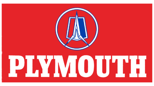
The concept of the sign changed completely, and the logo began to resemble a rocket due to the design of the body based on the new internal combustion gas turbine engine. The design resembled a rocket nozzle. It was an experimental development, which could become a new word in automobile construction. The turbine was notable for its smooth operation, durability, and ability to run on different fuel types.
The rocket symbol was placed on a badge with a red, white, and blue stripe as a tribute to the American flag. The entire design was inscribed in a circle and was on a red rectangular cloth with large white lettering Plymouth.
The circle symbolizes wheels and indicates harmony and completeness. In the ’60s, compact cars came into vogue, and the Plymouth Valiant of this series was very popular.
The background embodied advanced ideas and sales leadership. The brand belonged at number 4 in the U.S. rankings.
1963 – 1966
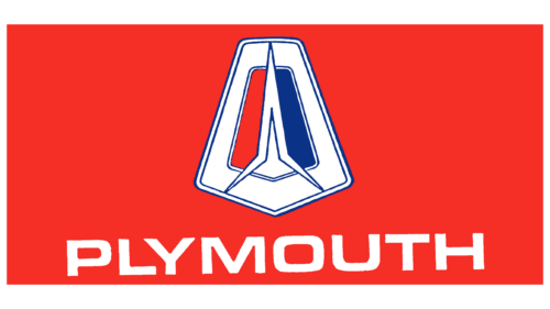
The rocket theme continued into 1963. In these three years, a custom experiment took place. Finished cars were given to drivers for testing. Having assessed their advantages and disadvantages in operation, the company terminated the program, and in 1966 all but nine specimens were destroyed and preserved in museums.
The new logo had a rocket inside a pentagonal sign, resembling the parking lights. The brand name was reduced in size, and the font was made more streamlined and modern. The changes indicated the running-in of the prototypes, studying their behavior on the road.
1964 – 1994
In 1964, the company’s uncharacteristic logo appeared, showing the search for self and a new development direction. The emblem consisted of the company’s name and had no pictorial addition. The upper lengthening of the first and last letters increased the harmony and proportionality of the inscription. Everything in the sign spoke about the search for the ideal future hit, which became Plymouth Barracuda.
1969 – 1994
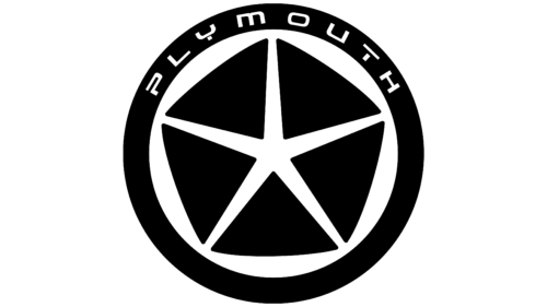
The brand logo completely replicated the visual mark of the parent company. And even after Chrysler replaced it in ’80, Plymouth continued to use variations of it until 1996. They came up with their name for the logo – Pentastar because it represents a star inscribed in a pentagon.
The image looks like this:
- an opening flower whose petals have opened and show a bright light shining from the depths;
- five triangles diverging to the sides, like the fragments of a whole figure torn apart by a star bursting to the surface.
As the original sign, created by Chrysler director Lynn Townsend, represented all the company-owned brands, the Plymouth logo showed that the brand is one of them. The rising star underscores the rise of the brand, which ranks third in U.S. sales and sells 700,000 cars a year.
The element embodies the perfection of engineering and shows the technical ideal and perfection of machine parts. At the same time, no font was used in the emblem to be understandable for customers from different countries.
1985 – 1994
In 1985, Chrysler began cooperation with the Japanese corporation, and based on losing its position brand, Plymouth produced Asian models Champ and Colt.
Therefore, the logo of the brand revives. A division identity is added to the Pentastar. The symbol is placed on a blue rectangle with: Plymouth added at the bottom. The emblem resembles road maintenance signs, hinting at the transformation of cars and joint Chrysler and Mitsubishi models.
1994 – 1996
The company returns to its designs, and a new Plymouth Neon car appears. The logo is updated again to reflect the brand’s independence.
The Pentastar becomes black and inscribed in a circle. The rim reads Plymouth in futuristic letters. The emblem communicated: the brand’s engineer-designed model stood on its wheels. The black color demonstrates the power and gaining strength. The placement of the parent company’s sign inside conveys Plymouth’s claim to a leadership position among all the giant brands.
1996 – 2001
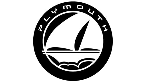
In search of its identity, the firm returned to its initial association with the ship. The latest logo is a circle with the Mayflower sailing inside it. The brand has come a long way. And its journey has come to an end. The emblem foretold the closure of the brand. The new Daimler-Chrysler executives announced their decision in 1999. The choice of image communicated: the company left a mark on history, as did the famous ship.
Font and Colors
The main colors of the emblem are blue, white, and black. They tell about the movement toward the dream and the constant search for new technologies and useful solutions. The brand’s engineers were not afraid to experiment and, for a while, were considered to be a trendsetter in the American car industry. Black conveys leadership and being ahead of the competition.
The Plymouth logo has been used for several decades and has used different fonts at different times. However, the most common typeface that has been used in the Plymouth logo is “Plymouth,” which is based on the Gill Sans typeface.
Gill Sans was created by British designer Eric Gill in 1926. It is a sans-serif typeface that is characterized by clean lines and proportional letters. It became very popular in the UK in the 1930s and is still a popular typeface for logos and graphic design use.
The font used in the 1990s Plymouth logo had a bolder and heavier look than regular Gill Sans but retained the main features of that font. However, this is not an exact match as the font has most likely been modified or redrawn to match the emblem’s requirements better.
Plymouth color codes
| Black | Hex color: | #000000 |
|---|---|---|
| RGB: | 0 0 0 | |
| CMYK: | 0 0 0 100 | |
| Pantone: | PMS Process Black C |

