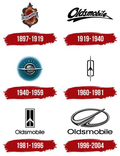
The Oldsmobile logo is progressive and futuristic. It shows new developments and popular and in-demand models. The logo is concise. It reads beyond the conventional, representing the brand as a trendsetter in the automotive industry.
Oldsmobile: Brand overview
| Founded: | August 21, 1897 – April 29, 2004 |
| Founder: | Ransom E. Olds |
| Headquarters: | Lansing, Michigan, U.S. |
Meaning and History
The logo represents striving forward and technical progress, encoded in the rocket image, which underwent gradual changes in the signs. The Oldsmobile star shone in the early and mid-20th century. It holds the primacy of the U.S. in creating large-scale car production, the appearance of cars with front-wheel drive, automatic transmission, and Rocket V8 engines. Their model Cutlass by the middle of the 70-s is recognized as the best-selling in America. All these achievements underlay the concept of the visual sign, introducing Oldsmobile as significantly ahead of the competition, a modern company.
What is Oldsmobile?
An iconic American car brand from the 1950s and ’80s. It was ranked third in sales after Chevrolet and Ford. It was put out of production in 2004, 107 years after its foundation. During its existence, it produced 29 models, the most popular of which was considered the Cutlass.
1897 – 1919
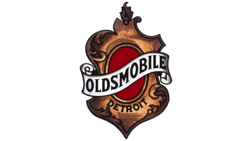
The first logo is consistent with the spirit of the 19th century. It looks like a mirror or shield decorated with a wide border of oak leaves. The style of the noble houses and knight’s tournaments conveyed the nobility of the brand and its celebrity. A heraldic ribbon with the name of the brand surrounded the shield. And below the shield, the place of the opening was shown.
The name Oldsmobile means “Olds cars” after the founder Ransom E. Olds. This was the fourth name of the company, which opened in 1892. The founder himself was engaged in his creation not long, and in 1904, he sold his part of the shares, having founded another company. But the name originally was the nickname of the first car, Curved Dash, which had stuck and remained for years, even after the purchase of a business by the giant General Motors in 1908.
1919 – 1940
The new owners revised the concept of the brand several times. Initially, they tried to produce very expensive and luxurious cars. However, gradually they were replaced by compact and modern ones.
The emblem of this period reflected the reduction in size and price for greater demand. The logo consists of the Oldsmobile inscription, with the letters gradually decreasing. The name is slightly curved, raising the far edge. From the last letter, an underline extends to the letter O. It resembles an arrow showing forward aspiration.
1940 – 1959
Oldsmobile became the first company to offer semi-automatic and fully automatic transmissions. This greatly facilitated driving cars and spurred the development of travel by auto for long distances.
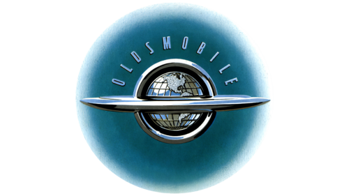
Therefore, the new logo consisted of a globe with a ring like Jupiter as the car’s bumper. In the upper half of the sign, the dome was located Oldsmobile inscription in thin capital letters.
The emblem showed that the company patronized travel. Its cars were known all over the world and were suitable for long drives.
1960 – 1981
The entire ’60s logo looks upward. It tells the story of introducing technological innovations that marked the brand.
Oldsmobile produced the first car in America with a front-wheel drive turbo engine and offered a glass roof allowing one to admire the panorama.
All inventions pushed the brand forward, increasing its popularity. The growth in orders was comparable to the launch of a rocket. The whitetail representing the flame shows that the rise is due to new developments. The brand no longer competes with competitors on the ground; it hovers higher in the sky.
The new logo was very symbolic, reflecting the company’s products. By the late ’50s, an engine called the Rocket was introduced, it made the cars the fastest in the U.S. at the time, and the new elongated body of the cars resembled the look of a rocket. The speed boost also alluded to the Toronado sports car that came off the assembly line.
1981 – 1996
The company’s sales rose to 1 million cars annually, moving it into third place in America. To celebrate the success, the logo was updated. The idea of a rocket did not disappear from the logo, but it was played differently.
The space shuttle was enclosed in a rectangle, pulled up, and placed on a black background. The composition looked like a window or an open door through which you could see space. The reception showed what heights Oldsmobile had reached, indicating a level of technology that was comparable to going into outer space.
The rocket no longer had a visible end, making it clear that observers could see only part of the corporation’s capabilities.
All elements of the image stretched upward, conveying sales achievements. General Motors made the subsidiary the top exporter among all its brands after the Aurora model.
In a rounded, thin font, the brand name is placed below. Unlike the past two logos, the name’s appearance emphasized the desire for fame.
1996 – 2004
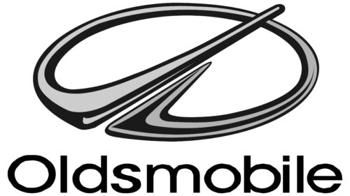
The latest company logo became futuristic and three-dimensional. An incomplete oval, tilted to the horizon, its unequal ends bent inward, pointing toward the tilt and slightly to the right.
The composition represents:
- Car wipers. Elements of the design tell the direction of the firm.
- Innovation and development. The road going in a circle is pierced by an arrow running forward, indicating an exit from the usual framework and stereotypes, the development of new models, and non-standard solutions.
- A stylized letter O flying up into the sky, heading into the future.
- A rocket. The image of the past logos was modified and transformed into a figurative sign, emphasizing the desire to maintain a leadership position.
The logo looks like it is cast in metal. The concept echoes the emblem of Opel, Nissan, Hyundai, Mahindra, and many other famous brands using the crossed circle as a symbol.
The sign, released to commemorate the brand’s centennial, ironically predicted the end of its history and its departure over the horizon. The closure was gradual. The last 500 cars received a special color and inscription; all employees signed the last car.
Font and Colors
The main colors of the logo are black and metallic gray. Shades show power, strength, and speed. They reinforce the impression of a brand that is beyond competition and has surged ahead. The colors indicate the technique, parts, engines, and roads.
The lettering is simple and austere, Widy Extra Light.
Oldsmobile color codes
| Black | Hex color: | #000000 |
|---|---|---|
| RGB: | 0 0 0 | |
| CMYK: | 0 0 0 100 | |
| Pantone: | PMS Process Black C |


