


 Reading Rainbow Logo PNG
The Reading Rainbow logo is associated with captivating books featured in episodes of the children’s television series. The colorful emblem creates an atmosphere of fun, joy, and inspiration because each story is an exciting journey into a world of limitless possibilities.
Reading Rainbow began in 1983 as a joint project of PBS Educational Television, Nebraska ETV, and WNED-TV. Before its national debut, the program was tested in Buffalo, New York, and Nebraska, where educators and viewers responded positively. The official premiere aired on July 11, 1983, with LeVar Burton as host. Each episode centered on one book and connected its themes with everyday life.
From 1983 to 1990, the producers refined the format while the song “Butterfly in the Sky,” written by Steve Hofer and Dennis Neil Kleinman, became closely linked with the series. Between 1990 and 1995, Reading Rainbow expanded into schools through teacher guides, student workbooks, library visits, and educational events.
From 1995 to 2005, newer filming methods, special effects, web material, and DVD collections widened access. The “Book Reviews” segment let young viewers recommend favorite titles. Episodes were filmed across the United States and abroad, covering history, science fiction, international cultures, and space exploration. Books by authors from different cultural and ethnic backgrounds received regular attention.
The final original episode aired on November 10, 2006, ending 23 years of production. Reruns continued through 2009 and remained in classroom use. Special episodes in 2005 and 2006 explored cultures and space. During its run, Reading Rainbow received a Peabody Award and more than 26 Emmy Awards, while its format influenced later educational television for children.
Meaning and History
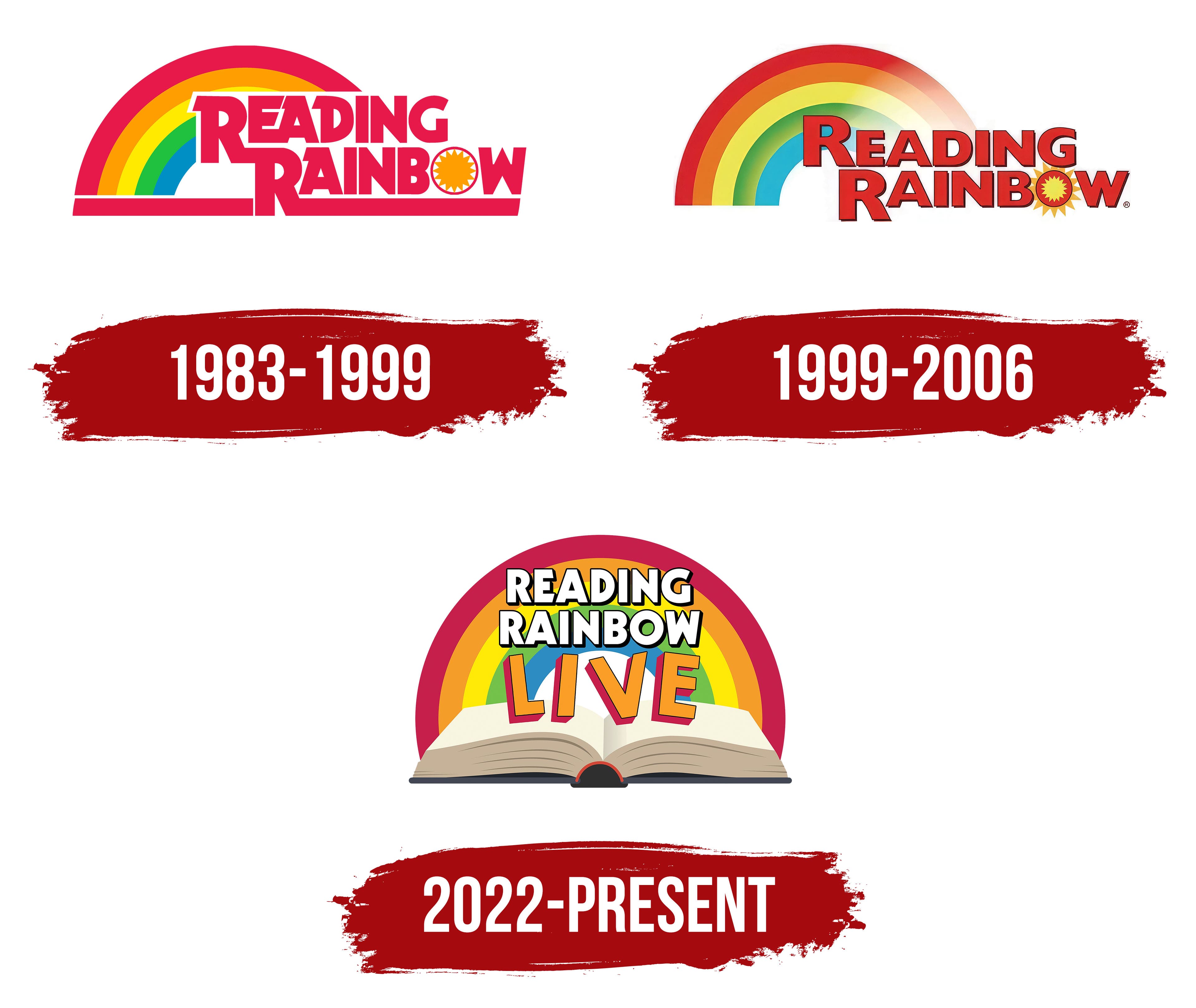
What is Reading Rainbow?
This educational program helps children develop a love for reading through engaging storytelling and animated book presentations. The hosts turn books into captivating stories, complemented by real-life excursions and interactive activities. The program is also available in a digital format, offering interactive books and educational materials. Its goal is to inspire children to explore the world through literature, connecting what they read with real-life experiences.
1983 – 1999
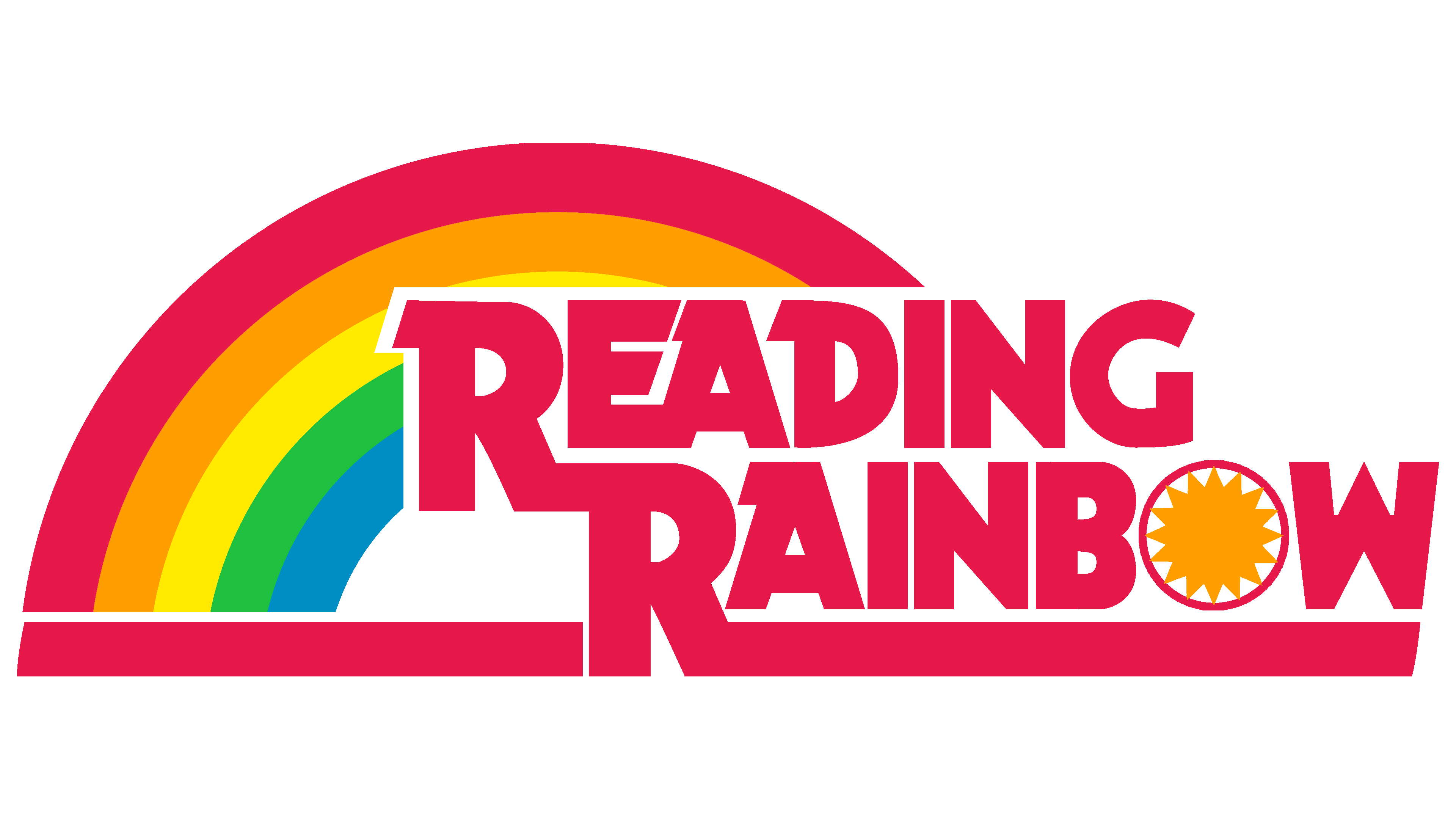
This Reading Rainbow logo is the most nostalgic, as it debuted in 1983, when the program first aired on PBS. The intro sequence from that time features a unique rainbow of five stripes. Each arc has its own color:
- Red-magenta
- Orange
- Yellow
- Green
- Light blue
The shades appear cheerful yet not overly bright, giving the emblem a calm, colorful atmosphere. This color choice reflects the television program’s goal of fostering a love for reading in children. The rainbow symbolizes a path leading to new knowledge and discoveries.
The ” READING RAINBOW ” text covers most of the right side of the multicolored arc. The bold, large font with diagonal cuts looks energetic, as though the words are pushing forward. The exaggeratedly thick lines seem heavy, but the unique serifs add a sense of dynamism. Some letters are connected by horizontal bars, creating a feeling of warmth and friendliness.
The thinnest part of the logo is the “O,” which contains a stylized sun: a large orange circle with triangular rays. It symbolizes light, which is associated with new knowledge. Below the logo, a wide, straight line merges with the lower “R.” This element adds stability and a sense of completeness to the design.
1999 – 2006
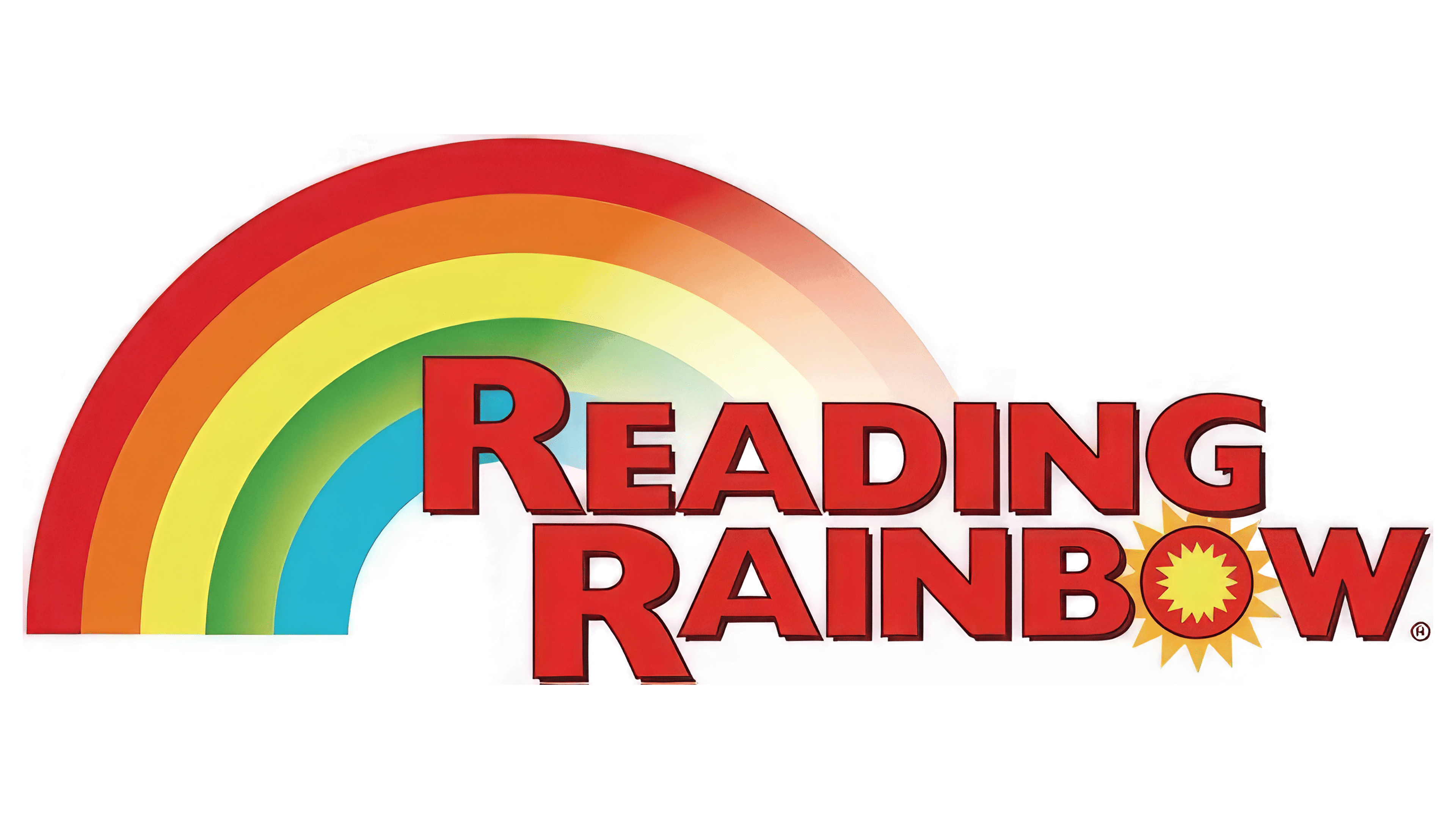
In 1999, the Reading Rainbow logo adopted a simpler and more modern design, aligning with the spirit of the children’s show. The rainbow now appears softer, with a partial gradient that blends the colors seamlessly into one another. The red lost its magenta tone, and the other colors became paler. The right side of the arc fades into white space, adding lightness and weightlessness that offset the emblem’s visual bulk.
The bold “READING RAINBOW” text remains but now features refined proportions. The designers reduced the letter size and shifted it downward to reveal the background design. The new font is entirely different from the old one, with no serifs or diagonal cuts at the ends of the glyphs. Instead, the inner spaces of the letters are wider, and the strokes have balanced thickness.
While the font still includes many angles, it no longer feels sharp. This style creates a sense of freshness and makes the text more legible, which is important for a young audience. At the same time, the logo has retained its former energy: each letter is outlined with thin dark contours, giving the “Reading Rainbow” name a three-dimensional effect. This 3D appearance is another attempt to capture the attention of young viewers.
The sun inside the “O” has grown, with its triangular rays extending beyond the letter’s boundaries. It shines from within the text, radiating warmth and light to draw children’s attention to exciting books.
2022 – today
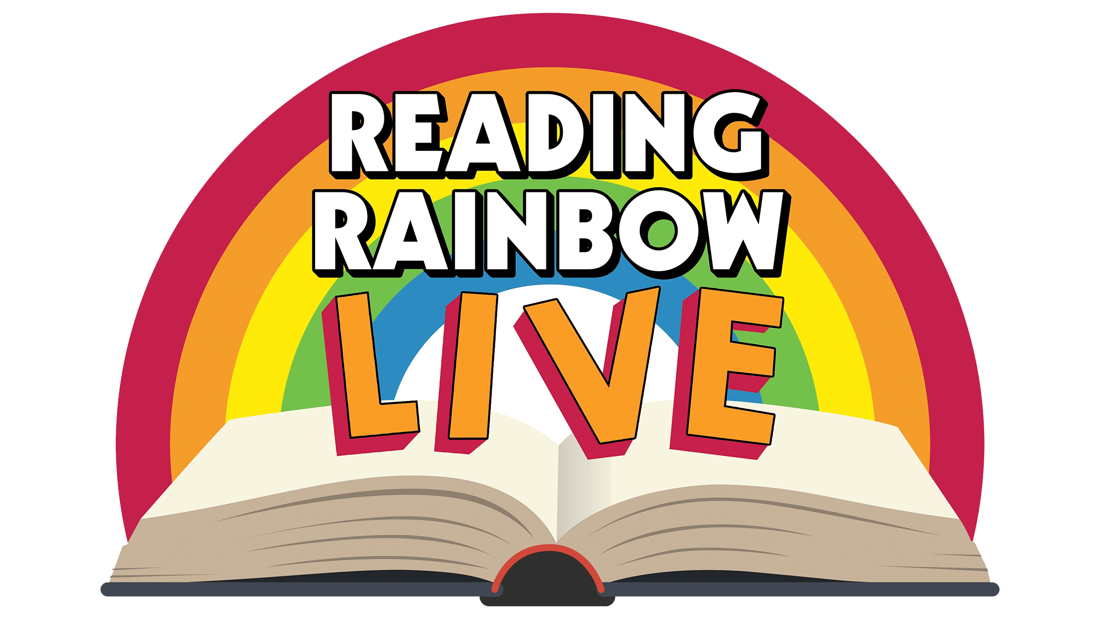
The TV show ended in 2006, but in 2022, the creators relaunched it under Reading Rainbow Live. This phrase is at the center of the new logo, unveiled before the premiere. It reflects the essence of the entertainment project, which is broadcast live online: children watch the program on the streaming platform Looped and can even join the broadcast as guest participants.
The text loosely resembles the 1983 Reading Rainbow wordmark. It seems the designers simply removed the serifs, separated the letters, reduced the line thickness, and altered the diagonal cuts to modernize the font. However, the old and new versions still share many similarities, particularly noticeable in the letter “W,” which looks exactly like an upside-down “M.”
The first two words are white and feature bold black shadows that make them stand out against the rainbow background. Meanwhile, “LIVE” occupies a separate line composed of bright orange letters with thick red outlines. The letters are tilted in various directions, giving the impression that they are bouncing. This abstract design conveys the joy of a beloved show. The creators emphasized the “live” format of interaction with viewers, recognizing that children increasingly watch programs online rather than on traditional television.
The background still features a rainbow, but now it fits entirely within the logo. The colorful arc comprises five stripes: red-magenta, orange, yellow, green, and blue. The vibrant colors catch children’s attention, creating an excellent backdrop for the white text. The rainbow is a magical symbol of imagination, inspiration, childhood, and wonder, elements that feel scarce today.
A new element appears at the bottom of the emblem: a large open book. It represents Reading Rainbow’s mission to inspire a love of reading in children and captivate them with exciting stories. The word “LIVE” seems to burst from the pages, hinting that all the excitement comes from within the book.
The logo’s composition intentionally evokes a stage: the new program is positioned as an entertainment event, with each episode featuring dancing, games, music, and songs. It’s an interactive experience that viewers can join, making the stage an essential element.