 Red Hat Logo PNG
The Red Hat logo reflects openness and innovative approaches in the software industry. It’s a symbol of a community built on principles of freedom, knowledge sharing, and transparent technical solutions.
Red Hat’s history began in 1993 when Marc Ewing and Bob Young combined their efforts to create their version of the Linux operating system. Marc previously worked at IBM and was passionate about software development, while Bob handled sales and technology distribution.
The company’s name originated from Ewing’s red hat, which he wore during his student days. The first product, Red Hat Software Linux, was released on CD, accompanied by a personal letter from its creators.
From the late 1990s, Red Hat became one of the first companies to successfully commercialize Linux. Its shares were listed on the stock exchange in 1999, with IBM, Intel, and Oracle becoming partners and investors. Soon after, the company launched the enterprise platform, Red Hat Enterprise Linux (RHEL), which major hardware manufacturers, including IBM, supported.
In 2006, Red Hat acquired JBoss, thereby expanding its presence in the enterprise applications market. Later, it released OpenShift, a platform for managing containers and Kubernetes, becoming popular in hybrid clouds. In 2019, IBM acquired Red Hat for a record $34 billion, keeping it as an independent subsidiary.
Meaning and History
What is Red Hat?
It is a company providing paid support for free Linux-based software. It offers certified operating system versions and enterprise support services. Its main product is widely used in data centers and supercomputers. Red Hat is part of a large IT corporation but maintains its open-source development strategy.
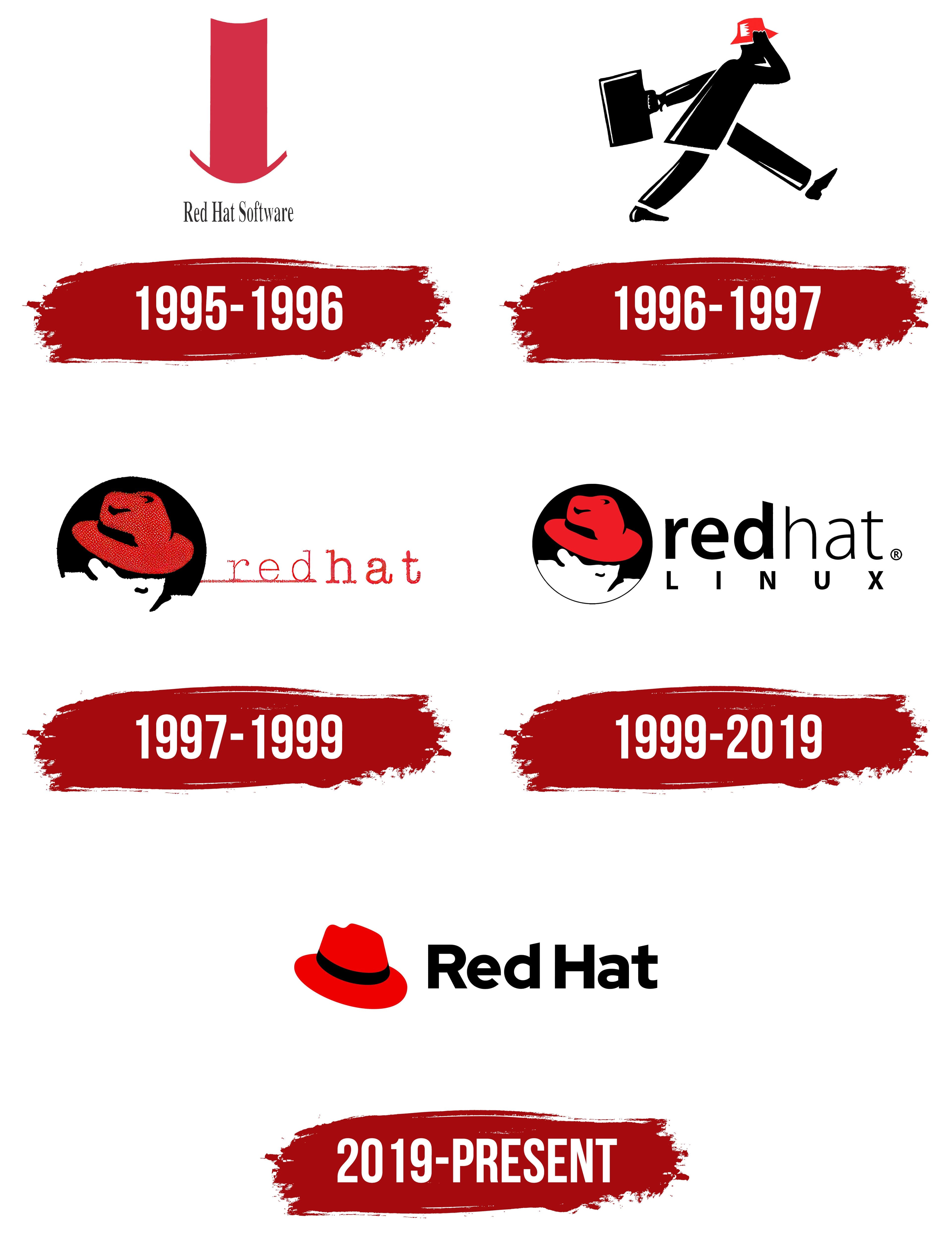
1995 – 1996

The original Red Hat logo featured a tall, elongated red top hat, simple yet symbolic. It represented a programmer tradition of wearing unique accessories at tech conferences.
The company name appeared under the hat, using a narrow, horizontally compressed typeface. Its black color contrasted with the bright hat, reflecting the brand’s technical nature.
The top hat became a recognizable symbol, representing openness, boldness, and the free software movement.
The distinctive shade known as “Red Hat Red” became the official brand color.
1996 – 1997

A new logo introduced a human figure in motion. The company depicted openness in software communities by showing a man in a red hat walking forward to symbolize progress.
Black combined with bright red made the design more vivid. The hat was inspired by founder Marc Ewing, whose iconic red hat became a symbol within the community.
A strict, restrained typeface was used across company materials to emphasize its open-source identity.
The dynamic figure was used for just a year, but reinforced the brand’s ideas of innovation and freedom.
1997 – 1999

A stamped hat image replaced the moving figure. Styled like an engraving, it evoked a sense of craftsmanship.
The text “red hat” appeared deliberately uneven, enhancing authenticity and a handcrafted feel. A thin underline beneath the name implied continuous brand development.
The hat retained its intense “Red Hat Red” shade, standing out against a black background.
The design expressed a sense of community simplicity, openness to experimentation, and programmers’ creative solutions.
1999 – 2019

In 1999, the visual concept underwent a significant redesign, focusing on a clear red-white contrast and removing unnecessary details.
The hat became the central emblem, highlighted in deep red. The human figure transformed into a minimalistic, recognizable silhouette.
The typeface changed to a modern style and became larger. The wordmark used the digital-friendly typeface Overpass, commissioned by Red Hat and inspired by American road signs.
“Linux” appeared below the main name, reflecting the company’s importance in the open-source software industry. The design became iconic, defining simplicity, recognition, and professionalism for two decades.
2019 – today
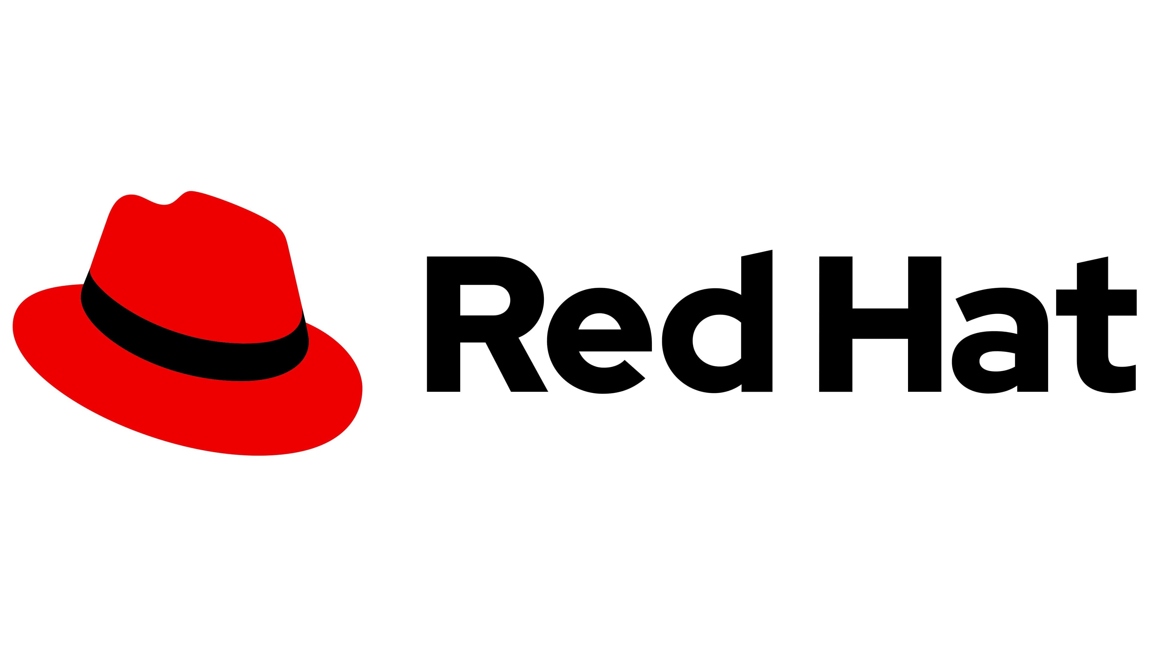
In 2019, Red Hat revised its style and introduced an updated logo created in collaboration with the agency Pentagram. The new image became simpler, clearer, and more in line with contemporary digital aesthetics, moving away from the previous symbol featuring a human silhouette in favor of a single bright red fedora, which had been part of the brand’s emblem.
The hat image is rendered concisely, with a wide crown and brim. A black band is placed on the hat, depicted with simple lines that create a sense of volume. The felt hat uses a vibrant, rich shade of the company’s signature red, known as Red Hat Red.
To the right is the inscription Red Hat, set in the custom Red Hat Display typeface. It was developed jointly with Pentagram specifically for the company and belongs to the geometric sans-serif typeface category. The font is bold, dense, and simple. The brand name is written as two words, with the letters R and H capitalized.
As a result of the changes, the Red Hat logo became easier to perceive.