 Redis Logo PNG
The Redis logo symbolizes efficiency and simplicity in software solutions for handling memory and data. It highlights ease and speed, making Redis a popular tool among developers.
Redis began in 2009 with Italian programmer Salvatore Sanfilippo, known online as Antirez. Initially, Redis emerged as a solution to the scaling issues faced by the web service LLOOGG, which traditional databases couldn’t handle. Salvatore first created Redis in Tcl but soon rewrote it in C, adding key data types, including lists.
With its open-source nature, Redis quickly resonated with developers. Early major users included GitHub, Twitter, and Snapchat. In 2010, VMware supported the project, hiring Sanfilippo and his colleague Pieter Noordhuis to further develop Redis.
In 2011, Redis Labs (now known as Redis) was founded, making the product commercially successful through Redis Enterprise, a platform for managing Redis both in the cloud and locally. The company actively expanded Redis’s functionality by introducing Lua scripting, modularity, and new data types, such as sorted sets and hashes.
In 2020, Sanfilippo temporarily stepped away from project management but returned in late 2024, introducing support for vector data types. In 2025, Redis adopted the open AGPLv3 license, reaffirming its commitment to open standards. Today, Redis is widely used for caching, real-time data processing, analytics, and machine learning.
Meaning and History
What is Redis?
It is a high-speed, in-memory database designed for rapid data storage and retrieval. It is used for caching, message queues, and user sessions. The system supports various data types and is used by numerous major online platforms due to its high performance and capability to persist data on disk.
2009 – 2024

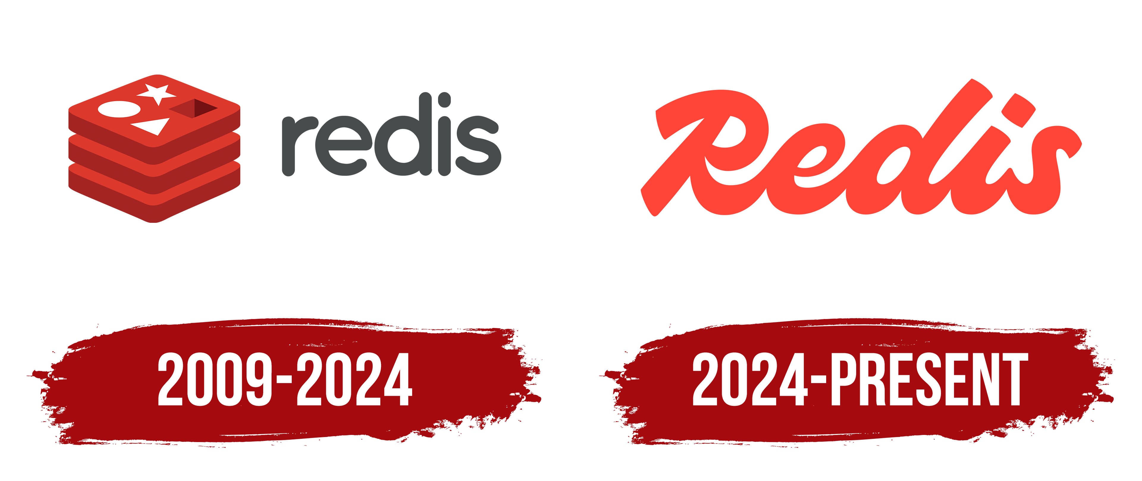
The Redis logo was created by Italian programmer Salvatore Sanfilippo, who designed it as a symbol of high-performance database solutions.
The red icon, resembling a stack of squares, illustrates the data storage structure typical of Redis, a fast in-memory database. Each square represents abstract layers of data.
The top square contains four shapes: a circle, a star, a triangle, and a square. Each shape corresponds to one or more Redis data types, including lists, sets, sorted sets, and hash tables.
The gray wordmark utilizes a soft, simple, geometric sans-serif font, similar to popular typefaces such as VAG Rounded or Comfortaa. It emphasizes ease of use and accessibility.
The color palette, with deep red and neutral gray, conveys high performance, reliability, and professionalism.
2024 – today

When Redis decided to update its logo, the agency VSA Partners, which worked on the project, proposed a different style than the previous version. Instead of the complex geometric shapes and dimensional elements for which the earlier symbol was known, the agency team offered a version consisting of a single, concise word written in a handwritten style. It enabled the brand to be presented as a simple, open system that is convenient for users.
The main emphasis is placed on the name Redis. The word is written in a single stroke, forming a continuous ribbon as the letters flow smoothly into one another. The soft, right-slanting italic and the symbol’s rounded forms make it look light, natural, and friendly. The absence of sharp angles enhances the impression of accessibility, emphasizing user interaction and human communication, which is important for a brand working with open source.
The typeface used in the name has increased weight and uniform strokes. In form, it resembles popular script fonts such as Lobster or Pacifico.
The agency moved from classic red to a rich, dark scarlet. The new color added brightness and liveliness to the inscription, emphasizing the energy, development, and innovation embedded in the Redis brand image.