


 Rip Curl Logo PNG
The Rip Curl logo vividly reflects a passion for surfing and a spirit of freedom and constant motion. It has a unique style, with each letter and element individualized. The modern version of the logo combines many meanings while staying true to tradition. The brand name has always played a key role at every stage of the identity’s development, giving the logo special appeal. Carefully selected color schemes in each emblem version have always been marked by harmony and uniqueness.
Today’s version of the logo looks elegant and restrained, using only two colors, black and white. The brand name is highlighted, with a large wave depicted next to it, symbolizing strength and dynamism. Despite its simplicity, the logo remains stylish and original. However, such minimalism was not always characteristic of Rip Curl. The company’s history has undergone many transformations, reflecting different ideas of creativity and the brand’s uniqueness.
The current version of the logo emphasizes the company’s confidence and maturity, striking the perfect balance between traditional and modern design.
Rip Curl began in 1969 in Torquay, Victoria, when surfers Doug Warbrick and Brian Singer started making boards in Warbrick’s garage. The name referred to the ideal wave sought by surfers. They tested shapes and materials for local conditions, building a customer base among nearby riders. In 1970, the company entered wetsuits after the founders found existing models poorly suited to surfing, and The Bells Suit became its first major product in the category.
During the 1970s, Rip Curl refined wetsuit construction and added clothing and surf accessories. International expansion followed in the 1980s, with the first European store opening in France in 1981 and the first US store in California in 1984. Sponsorship of professional surfers and competitions supported growth outside Australia.
In the 1990s, the company introduced surf watches and expanded into casual clothing. The Search campaign launched in 1995 and became a long-running part of its advertising. During the 2000s, Rip Curl developed Flash Bomb quick-dry wetsuit technology and entered snowboarding in 2003 with a separate equipment range.
A GPS surf watch arrived in 2012, and the company marked its 45th anniversary in 2015. Kathmandu Holdings acquired Rip Curl for A$350 million in 2019. In 2020 and 2021, the business expanded digital marketing and e-commerce, followed by new product lines in 2022. By 2023, its catalog included surfboards, wetsuits, watches, clothing, accessories, and snowboarding equipment.
Meaning and History
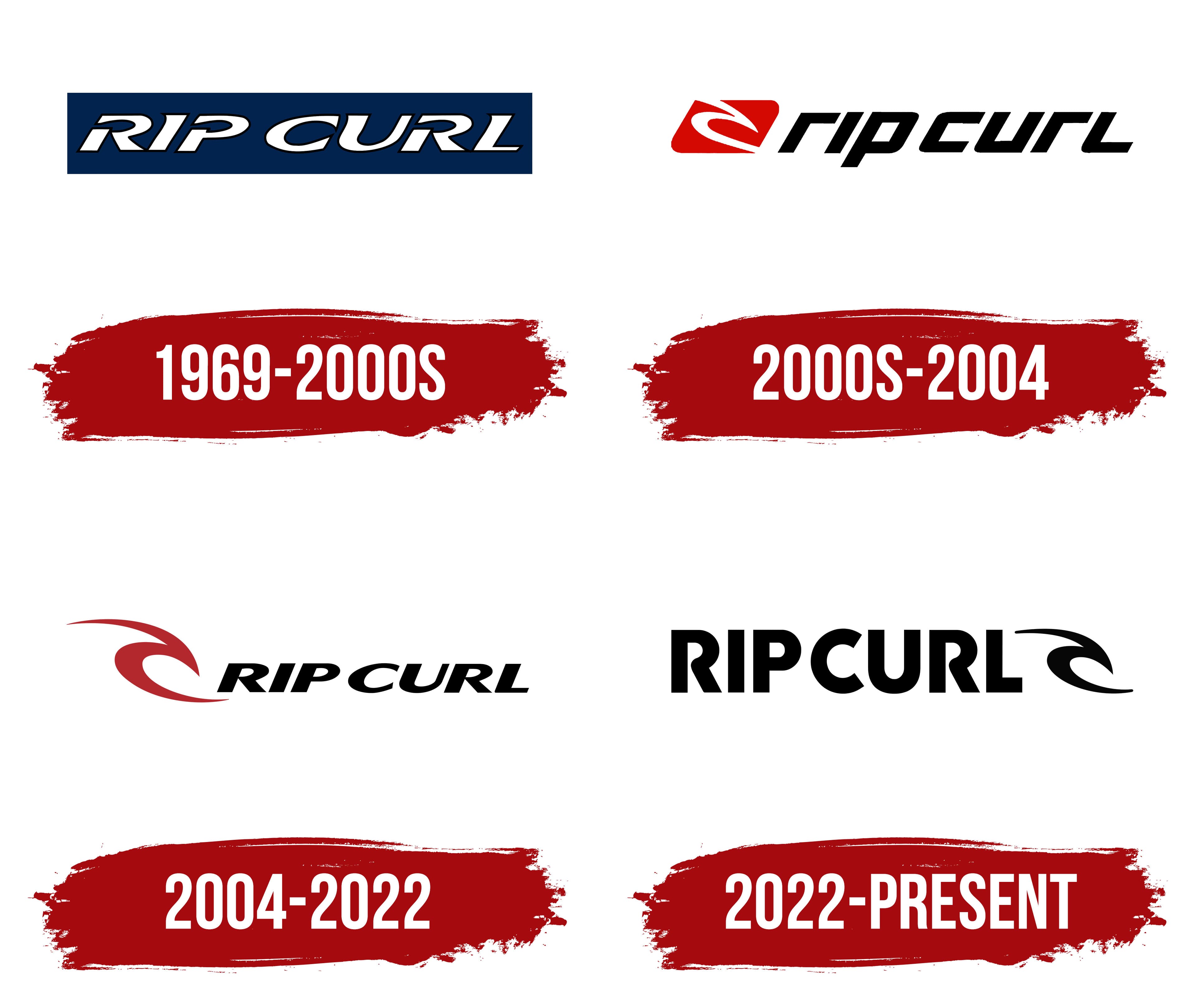
What is Rip Curl?
This Australian manufacturer of clothing and equipment for surfing began operations thanks to the enthusiasm of two Victoria-based surfing enthusiasts. The brand grew from a small surfboard production company into a global surfing clothing and equipment company. The company’s high-quality wetsuits have been recognized by some of the world’s best surfers. In addition to surfing gear, the company also offers watches, casual clothing, and winter sports equipment, all with a distinctive beach style that has become synonymous with the brand.
1969 – 2000s
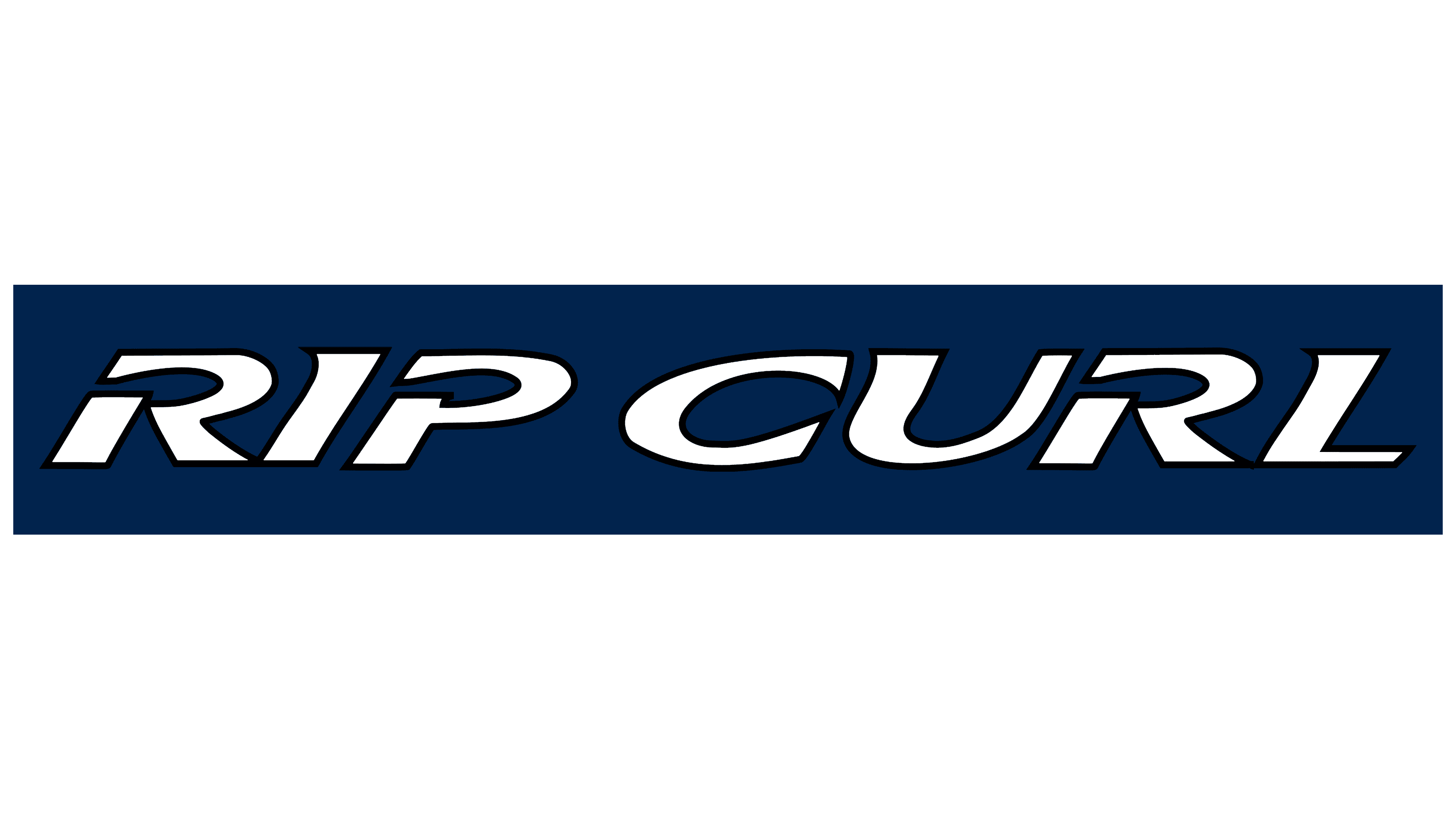
The company “Rip Curl” is one of the most well-known in the world, having earned its reputation through years of development and competitive advantages. Its first logo, introduced in the same year, was considered memorable but quite complex in structure. This description is not accidental, as the first logo included many meaningful elements, setting it apart from all subsequent versions.
This original logo was rich in color and stood out through its use of contrast. A blue background clarified the white letters, giving the emblem scale and dimensionality. To achieve harmony between the text and the background, white was chosen to fill all the inner spaces of the letters, making them easily readable. The serif font and dynamic italics gave the logo energy and movement, perfectly aligning with the brand’s philosophy of active recreation. All the letters were large, uppercase, and arranged horizontally symmetrically, emphasizing their importance and significance.
Three letters, in particular, deserved special attention, each having breaks in its structure. These gaps added a sense of romance and lightness to the logo, making it visually interesting and memorable.
2000s – 2004
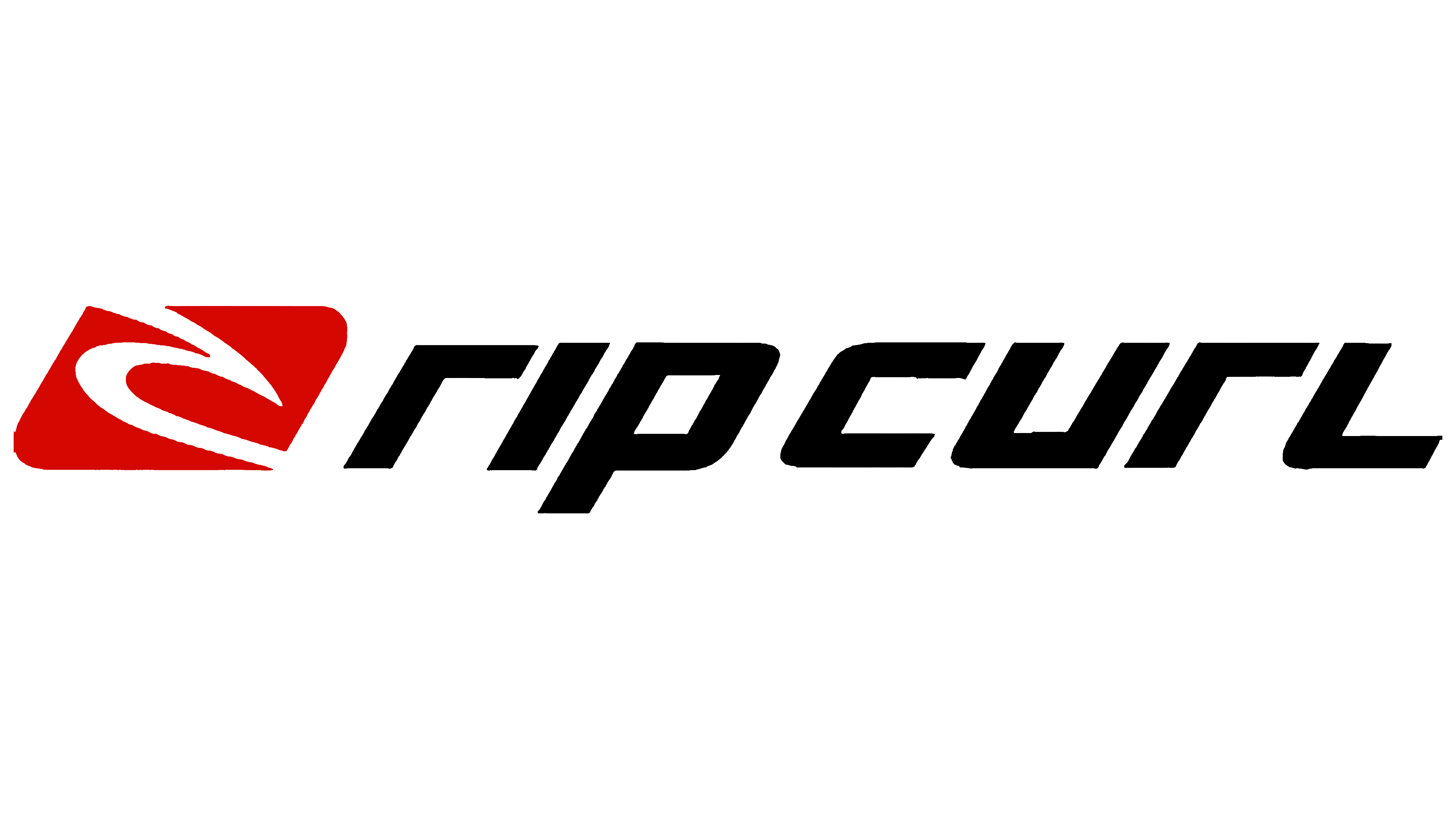
After 2000, the Rip Curl logo underwent significant changes, losing some of its previous features. It was completely redesigned to reflect a new stage in the brand’s development, which had already secured a strong position in the market. The logo needed to convey a fresh perspective and emphasize different, more relevant points.
Now, the brand name and its iconic element are positioned side by side. The color palette and style in the updated version were markedly different from those in the previous version. On the left, centered within a square, was a vertical wave, a symbol linking the brand’s identity to water. Against a bright red background, this infinite wave appeared striking, with its dynamism highlighted by the lack of clear contours. Parts of the image extended beyond the figure, creating a sense of infinity and drawing attention to the symbol itself, making it the visual centerpiece of the logo.
To the right of the geometric figure was the brand name, consisting of seven letters. These letters, written in black italics, appeared large and prominent. The font gave the name a sense of motion, evoking associations with the energy and fluidity of water. Particular attention was drawn to the letters “R” and “L,” which stood out with their mirrored opposition. They seemed to exist in different dimensions, adding layers and depth to the logo and reinforcing the philosophy of movement and freedom that has always been at the core of the Rip Curl brand.
2004 – 2022
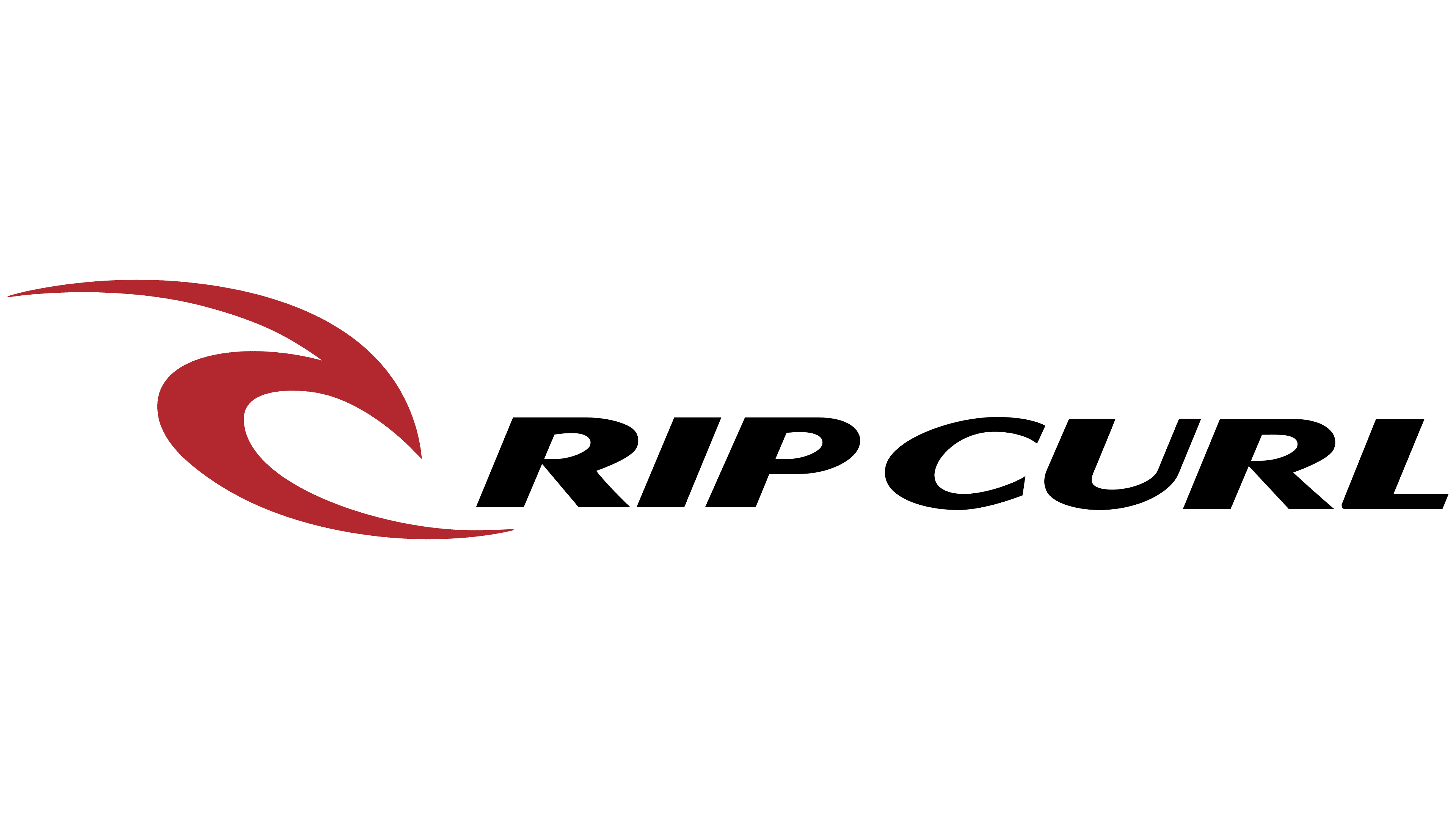
By early 2004, the company’s identity underwent significant and critical changes. Although some elements of the previous version were retained in the new design, the new identity became brighter and more multifaceted. Its appeal lay in the absence of strict contours and frames, creating a sense of freedom as if the elements of the logo were travelers journeying through open spaces. Visually, this was expressed through the image of a wave, resembling a surfer conquering the ocean. This approach emphasized the Rip Curl philosophy: creating clothing that offers protection, comfort, and freedom of movement.
Against a smooth, elegant white background, a bright red wave was complemented by black letters. The logo combined classic motifs through the well-chosen color scheme. With its sharp and graceful edges, the graphic wave symbolized the pursuit of thrill and adventure. It appeared as an independent element but harmonized perfectly with the text, creating a cohesive effect. The color combination and original font highlighted the brand’s dynamic nature.
The logo’s letters are set in italics, with non-uniform line thicknesses across the characters, which added an element of movement and energy, perfectly reflecting the essence of the Rip Curl brand.
2022 – today
The Rip Curl logo, updated in 2022, embodies the idea of minimalism and strength. The era of bright colors and intricate details is over. The brand has firmly established itself and no longer needs flashy elements to make a statement. Now, the logo is presented in a classic black-and-white design, where black symbolizes power, confidence, and energy, while the white background emphasizes purity and simplicity.
The brand name “Rip Curl” takes center stage, rendered in a bold, sans-serif font. This font choice underscores the solidity and seriousness of a company that has remained true to its principles for decades. The clean, powerful letters convey a spirit of freedom and independence, qualities always associated with surfing and the brand’s focus on those unafraid of waves and adventure.
A stylized wave plays a crucial role, positioned to the right of the brand name. This element is a key part of the brand’s visual identity. The wave represents the essence of the company’s surfing, the ocean, and movement. It adds a sense of dynamism and energy to the logo, as if to emphasize that the brand is always in motion, always riding the wave, just like its customers. The smooth curves of the wave create a feeling of fluidity and harmony, while its finish gives the logo a sense of completeness.
In 2022, the company decided its market position and recognition were strong enough to replace bright, complex elements with more streamlined forms. This reflects the brand’s maturity and confidence in its reputation. The black-and-white palette signifies that Rip Curl is no longer just a brand for surfers but also a symbol of strength, reliability, and continuous forward movement.