


![]() Robin Logo PNG
Robin Logo PNG
Designers have proposed a superhero-style Robin logo for the collective image. And rightfully so, as he is a superhero, Batman’s sidekick, as defined by his creators’ concept. Therefore, the emblem is bright but minimalist. Thanks to the sharp angles, crisp lines, and diagonal oval, a hidden dynamism is felt.
Robin debuted in April 1940 in Detective Comics #38, one year after Batman. Bill Finger, Bob Kane, and Jerry Robinson created him for DC Comics as a younger partner who could soften Batman’s darker image and draw younger readers. The plan worked, and Robin doubled sales of Batman stories.
The name and medieval costume referred to Robin Hood and the American robin, echoing Batman’s winged theme. The first Robin was Dick Grayson, a circus acrobat whose parents, the Flying Graysons, died before his eyes. Bruce Wayne took him in and trained him as Batman’s partner. From 1947 to 1952, Robin had a solo run in Star Spangled Comics #65-#130. In 1984, Dick left the role and became Nightwing, created by Marv Wolfman and George Pérez.
Jason Todd became the second Robin after debuting in Batman #357 in 1983. Readers rejected the character, and in 1988, DC let fans decide his fate by phone vote. The Joker killed Jason, a rare case of lasting consequence in superhero comics. The move contrasted with Marvel Comics, where Avengers and X-Men stories often reversed character deaths.
Tim Drake entered in 1989 after identifying Batman’s secret identity and became Robin in a redesigned suit. Robin received a limited series in 1991 and a monthly title in 1993, which ran until 2009. Frank Miller introduced Carrie Kelley in The Dark Knight Returns in 1986, outside the main continuity. Stephanie Brown briefly became Robin in 2004. In 2009, Damian Wayne, Bruce Wayne’s son, took the role. After The New 52 in 2011 and DC Rebirth in 2016, Dick was Nightwing, Jason was Red Hood, Tim was Red Robin, and Damian remained Robin.
Meaning and History
![]()
To maintain interest in comics, publishers decided to introduce new images without removing the old ones. This would allow them to maintain readers’ attention across two age groups at once. As a result, in the 38th issue of DC Comics (in April), Batman’s junior colleague first appeared and also served as his assistant. He received positive feedback from experts and doubled sales.
From the very beginning, the new character had a bright sign in contrasting colors on his chest. It attracted attention and conveyed a positive image to readers. Despite their similarities, they all wore costumes bearing the same symbol.
What is Robin?
Robin is the pseudonym of a group of DC Comics superheroes. The first of them debuted in the April 1940 issue (the 38th) and was created as Batman’s sidekick. Together, they form the Caped Crusaders. Two artists (Bob Kane and Jerry Robinson) and one writer (Bill Finger) worked on the image.
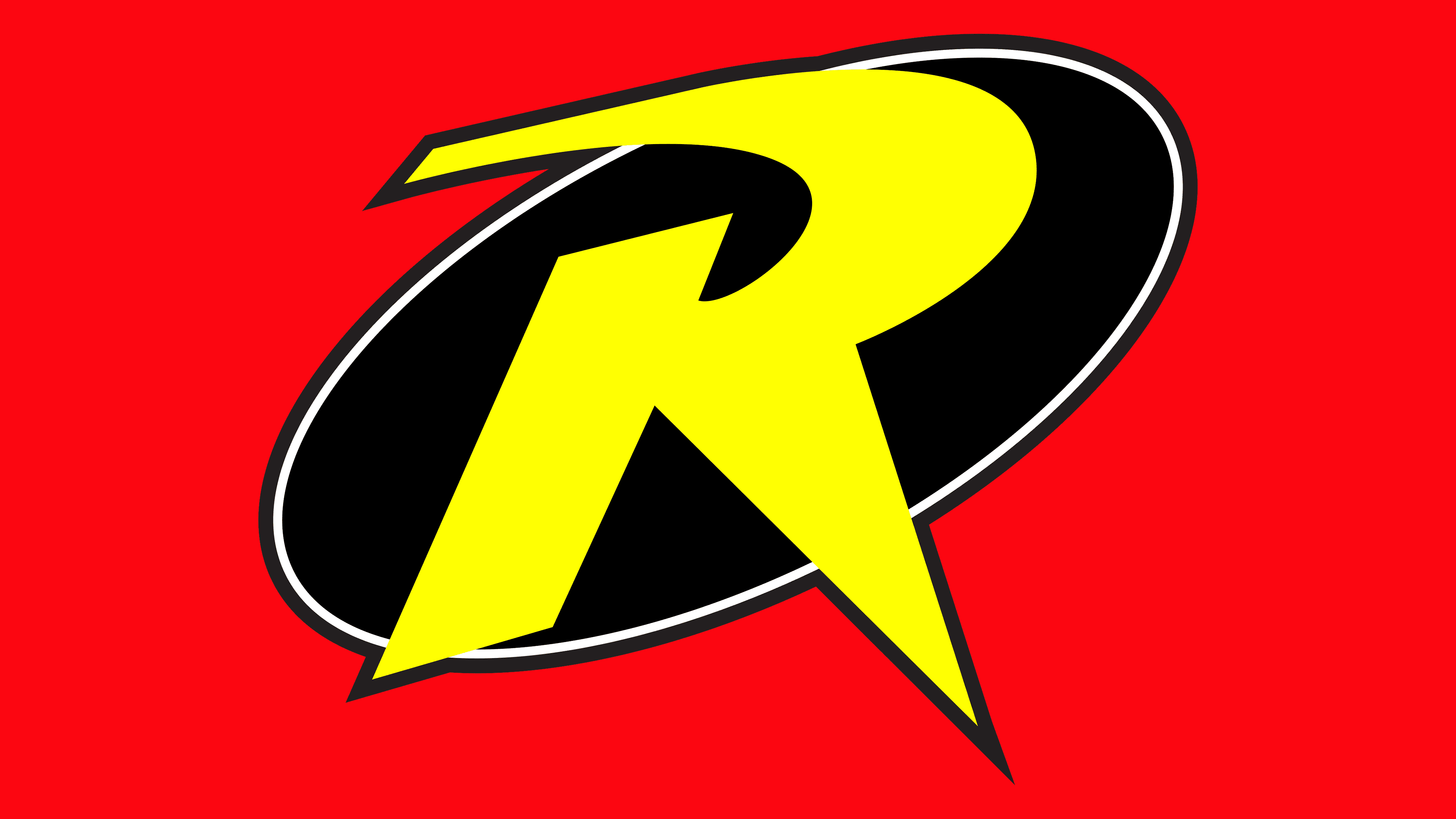
The Robin logo is graphic. There is no text in it, as it conveys no information about the plot. It merely denotes the character, as evidenced by the large “R” located in the center of the first letter of the superhero’s name. The glyph is massive, bold, and uppercase. It has no serifs; on the contrary, the ends of the legs are not widened but narrowed. They represent sharp spikes, especially at the bottom-right. There is only a smooth stroke at the top element, which is always rounded.
The background for the letter with a black outline is a dark oval. To keep the colors from blending and to keep them bright and easily visible, the artists used contrast techniques. As a result, the neon shade of yellow does indeed look impressive on a black background. The ellipse is placed at an angle. Therefore, the diagonal adds dynamics and internal energy to the symbol, which is very important for superhero comic characters. A double border frames the oval’s edge.
The peculiarity of this logo is its unity. It serves as a designation for several characters who have one common name. However, the pseudonym is not used in full; it is used only as an initial. Moreover, the artists turned the letter into a graphic element, adding sharpness.
Font and Colors
The “R” in Robin’s emblem is done in a custom-designed font. It is more closely related to drawing than to typography, so it resembles a lightning bolt. The palette is saturated, bright, and contrasting to attract readers’ attention and instill fear in negative characters. The main colors are neon yellow and black. White is used as a background.