


Ronald McDonald House is updating its image around two simple symbols of its mission, a house and a heart. The organization was founded in 1974 and helps families with sick or injured children stay close to their child during treatment. Through a network of more than 250 independent chapters in more than 60 countries and regions, it provides housing, services, resources, and support. The goal is to ease some of the everyday burdens during a difficult time for a family.
The rebrand was developed by Interbrand together with TBWA\Chiat\Day. The team needed to bring a fragmented global system together under a single name and mark. In the past, different markets often used the abbreviation “RMHC.” The full name, Ronald McDonald House, is easier to connect with support for families and better explains the organization’s purpose to donors, partners, and new audiences.
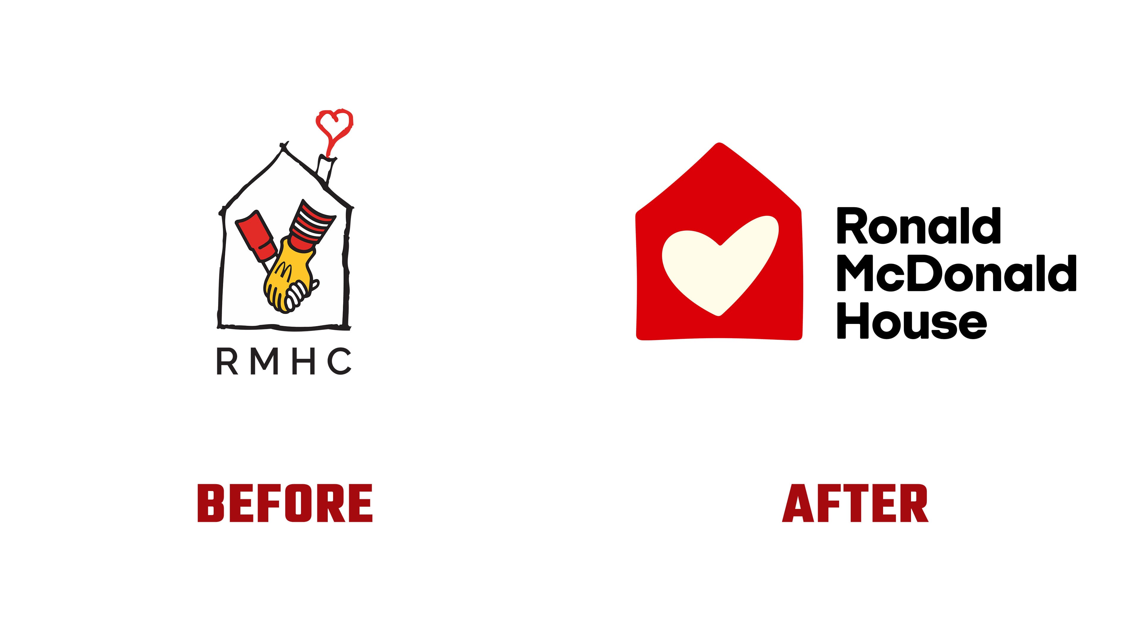
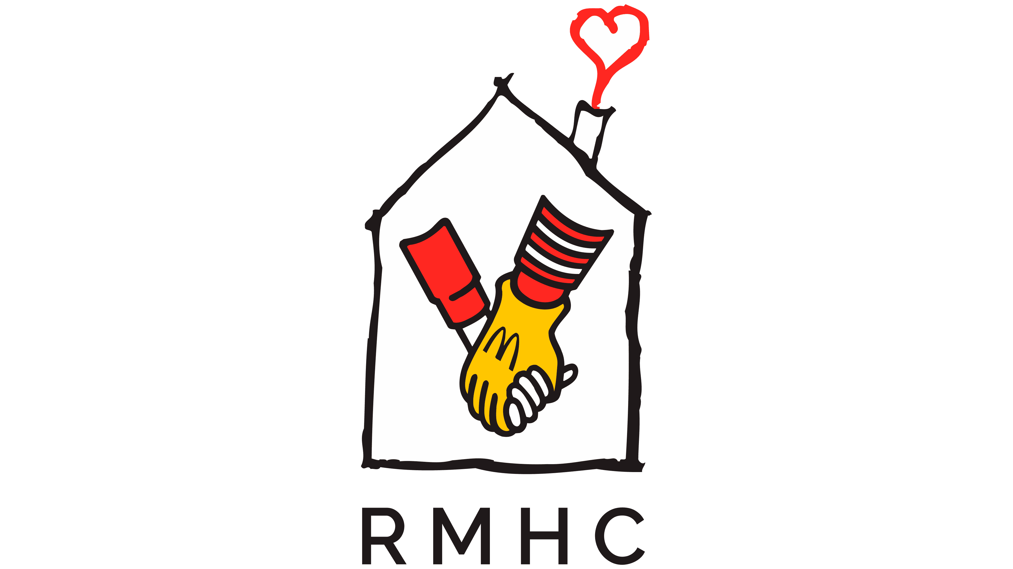
The old logo combined Ronald McDonald’s hand, a child, a house, and a heart. In the 1970s, that set of images conveyed care and kindness. Over time, the mark became overloaded. The abbreviation “RMHC” also made the task harder because it required an explanation.
The new logo keeps the core idea, a house near care and a heart as a sign of support. Interbrand removed the extra imagery and created a warm, open symbol. The house looks slightly handmade and human. The heart inside conveys help, care, and involvement. The symbol is easy to understand: a family receives a place to stay, support, and the ability to be near their child.

For Ronald McDonald House, the new symbol became a shared emblem for hundreds of chapters. Despite the form’s simplicity, the mark maintains the gentle tone of a charitable organization. The connection to McDonald’s remains through the name and color, while the focus is now on the mission, rather than on the mascot or corporate origin.
The wordmark was created using a typeface developed in collaboration with A2-TYPE. A sans serif with slight rounding combines the scale of an international network with the soft tone of family support. The letters look calm and open, without childish naïveté. Paired with the house and heart, the typeface makes the brand cohesive, warm, and suitable for different markets.
The new Ronald McDonald House identity turns a large global network into a clearer brand. The logo is no longer overloaded with characters and extra storylines. For the organization, the new logo helps convey its mission more quickly, builds trust with future donors, and maintains a connection to its history.