


![]() Russia 1 Logo PNG
Russia 1 Logo PNG
The Russia 1 logo is a recognizable image of a TV channel that has become a main source of information and entertainment. Over the years, it has become a platform for news, analytics, popular shows, series, and live broadcasts of key events, bringing together millions of viewers.
Russia 1 began its history on May 13, 1991, initially as Russian Television (RTR) during the final months of the Soviet Union. Oleg Poptsov led this effort, becoming the first chairman and helping establish the channel as an alternative broadcaster. From the start, it introduced its signature news program, Vesti, which remains its central news broadcast today. The network quickly expanded, launching new entertainment and analytical programs and upgrading its infrastructure to enhance broadcast quality. A major rebranding came when RTR became Rossiya TV, updating its programming and visual style.
The channel focused on regional coverage, significantly increasing the amount of locally produced content. Later, adopting digital technology enabled better picture and sound quality, preparing the station for the high-definition era. Another rebranding established the current name, Russia 1, clearly distinguishing it within the expanding VGTRK network. The channel introduced new television series and program formats, becoming a leader in both news and entertainment. Technological advancements and diverse content offerings have continued to grow, enhancing viewer engagement. As of early 2024, Russia 1 remains one of Russia’s largest broadcasters, continually developing programs and embracing innovation.
Meaning and History
![]()
What is Russia 1?
It is one of the largest television channels in Russia, covering almost the entire territory. News, political talk shows, entertainment programs, feature films, and TV series are aired daily. Among the popular programs are news releases, analytical shows, and programs hosted by famous personalities. The channel is a vital source of information and entertainment for millions of viewers, offering both federal and regional editions tailored to different parts of the country.
1991
![]()
In 1991, a new Russian television channel, RTV, emerged. Launching in May, the channel introduced itself with an original logo built around a unique symbol inspired by the Slavic letter “Р.”
The logo is a black figure composed of smooth, thick lines that curve upward, conveying a sense of lightness and dynamism. Although unusual in shape, the symbol is perceived as a stylized letter “Р.” Two clear, bold letters are positioned slightly below and to the right of the symbol’s highest point: “ТВ.” They are written in a simple, sans-serif font with straight, geometric lines. The dark color ensures maximum contrast.
RTV was among the first Russian TV channels to begin broadcasting after the country transitioned to a new era of television. The choice of the Slavic letter reflected national character and a desire to highlight a fresh, distinctly Russian identity in the media landscape.
The simple, clear designation “ТВ” (TV) indicated the channel’s nature: mass viewership and diverse programming, from news to entertainment.
1991
![]()
When RTV became RTR in 1991, the name change was accompanied by a new logo that was distinctly different from its predecessor. Designers adopted a strict and confident style, eliminating curves and rounded shapes.
The emblem consists of three letters “РТР” rendered in a bold, stable font. The letters stand closely together, forming a unified, monolithic composition. Running through each letter is a horizontal stripe colored in the shades of the Russian flag: white at the top, blue in the center, and red at the bottom. These stripes neatly pass through each character. Using the country’s official colors, the logo emphasized the channel’s nationwide scope and all-Russian status.
The color scheme is strict, with black letters that contrast with the bright flag lines.
RTR became one of the first federal TV channels to air after the fall of the Soviet Union, establishing itself as a leader in Russian broadcasting.
The logo’s bold, geometric font underscored the channel’s reputation as a reliable source of information and entertainment.
1992 – 1993
![]()
In 1992, RTR unveiled a completely different logo style that distinctly stood out from the previous version. The emblem adopted a vertical format, becoming brighter and clearer while retaining national symbolism.
The logo’s primary visual symbol was a stylized quarter-circle divided into three curved segments, each in one of the Russian tricolor’s shades: red on the left, then blue, with white in the outer segment. The curved dividing lines between color segments extend downward toward the corresponding letters “РТР,” visually connecting the upper symbol with the text.
The figure’s shape resembles a radio wave, evoking associations with signal transmission or broadcasting. A black background allows the colored segments to stand out vividly.
At the bottom are the letters “РТР.” Rendered in a bold, sans-serif font with strict geometric contours, these letters occupy a central position at the bottom of the composition. Each letter has its color: the first “Р” is red, the “Т” is blue, and the final “Р” is white.
The logo change reflected a new stage in RTR’s development, as the channel actively expanded its audience and strengthened its position in the Russian media market. The image of a radio wave symbolically highlighted a shift toward a more technologically advanced, modern approach to broadcasting.
1993 – 1998
![]()
In 1993, the RTR channel again altered its visual style, proposing a different approach to its logo. The emblem became even more graphic and simplified.
The main image of the logo consists of three stylized letters: “РТР.” They consist of geometrically precise, clear lines. The symbols represent a graphic interplay in which letters share common elements and smoothly transition into one another, creating a harmonious, unified composition.
The right side of the composition is complemented by curved lines resembling television or radio signal waves. These radial arcs balance the heavier left side, visually easing the logo and making it comfortable to perceive.
All lines and symbols are executed exclusively in black, making the design precise and strict. The new logo captured the spirit of the times: minimalism, austerity, and conciseness typical of the media culture of that period.
1998 – 2001
![]()
The new RTR logo features three letters placed within strict square shapes. The design conveys order and precision due to clear lines and uniform dimensions. The three blocks lie in a single plane.
The letters are not in a standard font but are specially designed for the logo, resembling cutouts on colored tiles. Each letter consists of only two separate lines. In the letters “Р” and” Т”, there is a vertical stem and a curved line connected on the right, while the letter “Т” consists of a horizontal bar and a vertical line that do not touch each other. This emphasizes the form’s openness, enhancing the logo’s overall minimalism.
The colors are restrained and connected to the Russian television and radio company. The gray shade on the left symbolizes neutrality and objectivity in news. The central blue represents television’s traditional stability and professionalism. The saturated dark red on the right represents the bright, emotional aspects of broadcast programs, shows, and movies that fill the channel’s airtime.
This logo symbolized the channel’s relaunch and renewal, marking its effort to move away from former Soviet traditions toward a modern, international broadcasting approach.
2001 – 2002
![]()
In the early 2000s, RTR decided to refresh its image, abandoning strict geometry in favor of a lighter, more dynamic composition. The new logo was executed differently, distinct from the company’s previous designs.
The main concept combines the channel’s letters with a symbol resembling the Russian flag and a stylized wing curve. The symbol is divided into three flowing bands of different colors, each varying in size and curvature. The lower red stripe is the longest and widest of the three. Above it, slightly shorter and mirroring its contour, is the middle blue stripe. The top white stripe is the narrowest and shortest, outlined by a thin black contour. The symbol is placed in the upper-right part of the logo and appears airy.
The company name “РТР” is set in a traditional serif typeface. The letters are large and bold, with proper proportions and pronounced serifs reminiscent of classical typographic styles. The letters are positioned separately from the symbol in the lower-left part of the logo. The difference in size between the letters and the symbol creates visual contrast and balance.
2002 – 2008
![]()
In September 2002, the television channel RTR changed its name to Rossiya. The logo was updated to match the new name, making it visually lighter than the previous version.
The logo has a horizontal layout, dividing space into text and symbolic parts. On the left is the name “РОССИЯ” (“ROSSIYA”) in large letters, with the neat inscription “ТЕЛЕКАНАЛ” (“TELEKANAL”) beneath it. The entire text is executed in blue, a neutral, strict color typical of television at the time, associated with reliable information and calm broadcasting. The channel’s name is written in a simple, modern sans-serif font with straight, geometric letters. In the lower line, “ТЕЛЕКАНАЛ,” the inter-letter intervals are increased, and the font is thinner, visually separating the semantic levels.
On the right is a symbol that retained the general shape of the previous version but acquired a new, softer style. Three lines gently curve to the right, resembling stylized, curved triangles. The red stripe is the longest and widest, followed by a slightly smaller blue one. It concludes with a smaller, less saturated gray element. Visually, the symbol appears to emanate from a single point, then expand and diverge, symbolizing the diversity of Rossiya’s content.
The symbol’s colors follow the traditional national palette used on Russian television: red, blue, and gray, rather than the previous white. Gray added restraint and modernity to the logo, emphasizing the channel’s transition from bright visuals to a calmer and more structured design style.
2008 – 2009
![]()
In 2008, Rossiya channel updated its logo, adopting a calmer, more restrained design that gradually shifted from saturated, bright tones to softer shades and clean lines.
The name “РОССИЯ” (“ROSSIYA”) is written in uppercase letters using a modern, sans-serif font with thin lines of equal thickness and clear shapes. The letter color changed from deep blue to neutral gray. The word “ТЕЛЕКАНАЛ” (“TELEKANAL”), positioned beneath the name, is set in an even thinner font, left-aligned, without the increased letter spacing that had appeared previously. As a result, the text looks harmonious and minimalistic.
The symbol retained its familiar form, though its proportions and shades were slightly altered. It consists of three curved stripes that start almost at the same point and diverge to the right. The top stripe took on a soft gray shade, the middle became light blue rather than the previous saturated blue, and the lower stripe remained bright red, maintaining its connection to Russian symbolism. Due to these color changes, the symbol appeared less contrasting but preserved its dynamism and lightness.
2010 – 2012
![]()
In 2010, the “Rossiya” TV channel was renamed “Rossiya 1” and became part of Russia’s first digital television package. At the same time, the logo was updated. Its soft design was replaced by a vivid, high-contrast style featuring simple geometry and saturated colors.
The logo consists of two differently shaped parts: on the left, a long blue rectangle containing the word “РОССИЯ” (“ROSSIYA”) written in large white letters. A red square on the right contains a white numeral, “1.” The two blocks are separated without overlapping elements, maintaining a clear border that gives the logo a neat, strict appearance.
The channel’s name is set in a dense, sans-serif font; the letters are uppercase, straight, and large, without curves or rounded edges. There is almost no spacing between letters, so the text appears as a unified block. In contrast, the numeral “1” on the red background is stylistically divided into two parts: an upper short line and a lower line. The numeral’s angles are sharp, giving it visually rigid forms.
The logo’s color scheme matches the Russian tricolor, but instead of calm gray and soft blue, it uses saturated hues. The blue rectangle uses a gradient fill that smoothly transitions from light to dark, creating a sense of depth. The red square is bright and contrasting, emphasizing the channel’s digital identity and its position among other national TV channels.
The logo change coincided with the transition of “Rossiya 1” to digital broadcasting in the first multiplex. At that time, the channel’s programming became more diverse: news and informational programming increased, many series and entertainment shows were added, and the channel began actively competing for viewers in the new digital environment.
2012 – today
![]()
Since 2012, the “Rossiya 1” TV channel has retained its previous logo structure but made slight design adjustments.
The primary changes affected the text. The letters of the word “РОССИЯ” (“ROSSIYA”) became larger and slightly elongated vertically. This gave the inscription a sense of solidity and stability, as if to highlight the channel’s status among the leading federal broadcasters. The font kept its sans-serif style, the letter lines remained bold and straight, and the letters continued to sit closely together.
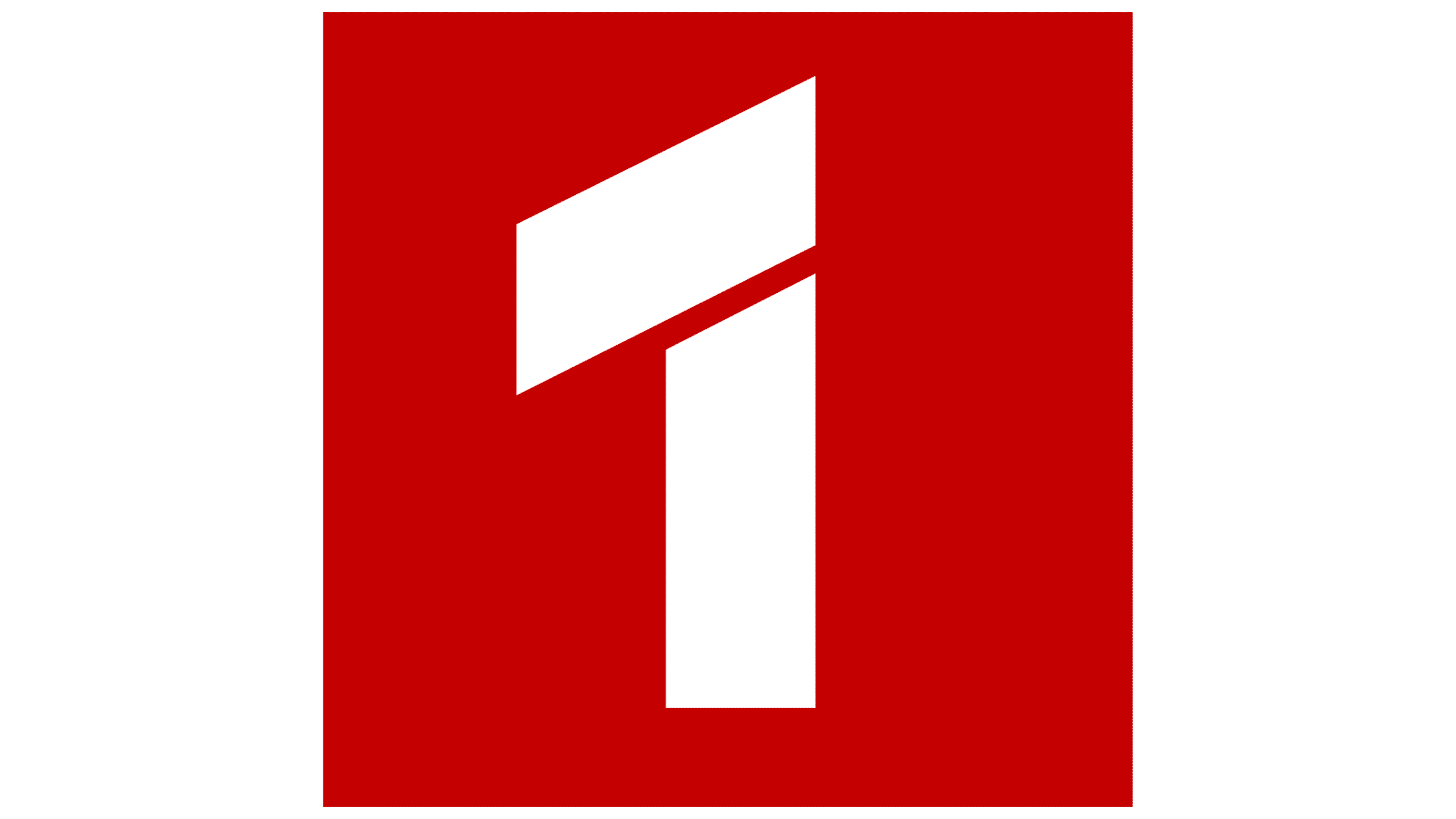
The red square containing the white numeral “1” remained in place, but its shade had darkened slightly. This more saturated red contrasts with the rectangle’s bright blue background. The numeral “1” retained its distinctive style, with sharp angles and division into two lines.
![]() Russia 1 logo English
Russia 1 logo English