 RWE Logo PNG
The electric power industry encompasses a range of sources, from traditional power plants to wind and solar projects. The transition between them occurs through infrastructure development and the modernization of existing facilities, where old and new technologies operate within a single system. The RWE logo represents an energy company that generates electricity and develops renewable energy sources, including wind and solar power plants.
RWE was founded on April 25, 1898, in Essen. The company’s full name is Rheinisch-Westfälisches Elektrizitätswerk. It was established to supply electricity to the Ruhr region. The first plant had a capacity of about 1200 kilowatts. It provided power to factories and city lighting. By 1914, the company operated dozens of plants, supplying electricity to more than two hundred cities.
In the 1920s, RWE began building large coal-fired power plants. The company developed lignite deposits in the Rhine basin. After World War II, it restored infrastructure. In the 1950s and 1960s, it built new lignite power plants. In 1960, the company listed part of its shares on the Frankfurt Stock Exchange.
In the 1970s, the company entered the nuclear power sector. The Biblis A and B nuclear plants were commissioned. After Germany’s reunification, RWE acquired assets in the country’s eastern part. In 2000, the company entered the international market. It acquired Thames Water and American Water Works.
By the mid-2000s, RWE had sold its water business and shifted its focus to energy. After the Fukushima accident in 2011, Germany announced a complete nuclear phase-out. In response, the company began to close nuclear plants early.
In 2016, the company created a separate structure named Innogy. It included renewable energy and retail activities. In 2019, the company carried out an asset exchange with E.ON. As a result, RWE received wind and solar capacity and became one of Europe’s largest green-energy producers.
Since 2020, RWE has been investing in offshore wind farms, solar plants, and hydrogen technologies. In 2023, the company closed its last nuclear plant, Emsland.
The company manages a portfolio with about 15 gigawatts of capacity. It includes wind, solar, and hydroelectric plants in Europe, North America, and Asia. It retains part of its gas and lignite capacities. RWE plans to phase out coal completely by 2030.
Meaning and History
What is RWE?
One of Europe’s largest energy corporations, headquartered in Germany. The company operates in the retail, wholesale, and production segments of electricity and gas, managing coal, gas, nuclear, hydro, and biomass power plants, as well as wind and solar installations. Through subsidiaries, it controls energy and gas distribution networks. Its assets are located in Germany, the United Kingdom, the Netherlands, the Benelux countries, and Eastern and Southern Europe. The corporation owns coal mines and gas storage facilities and ranks second in Germany in gas sales.
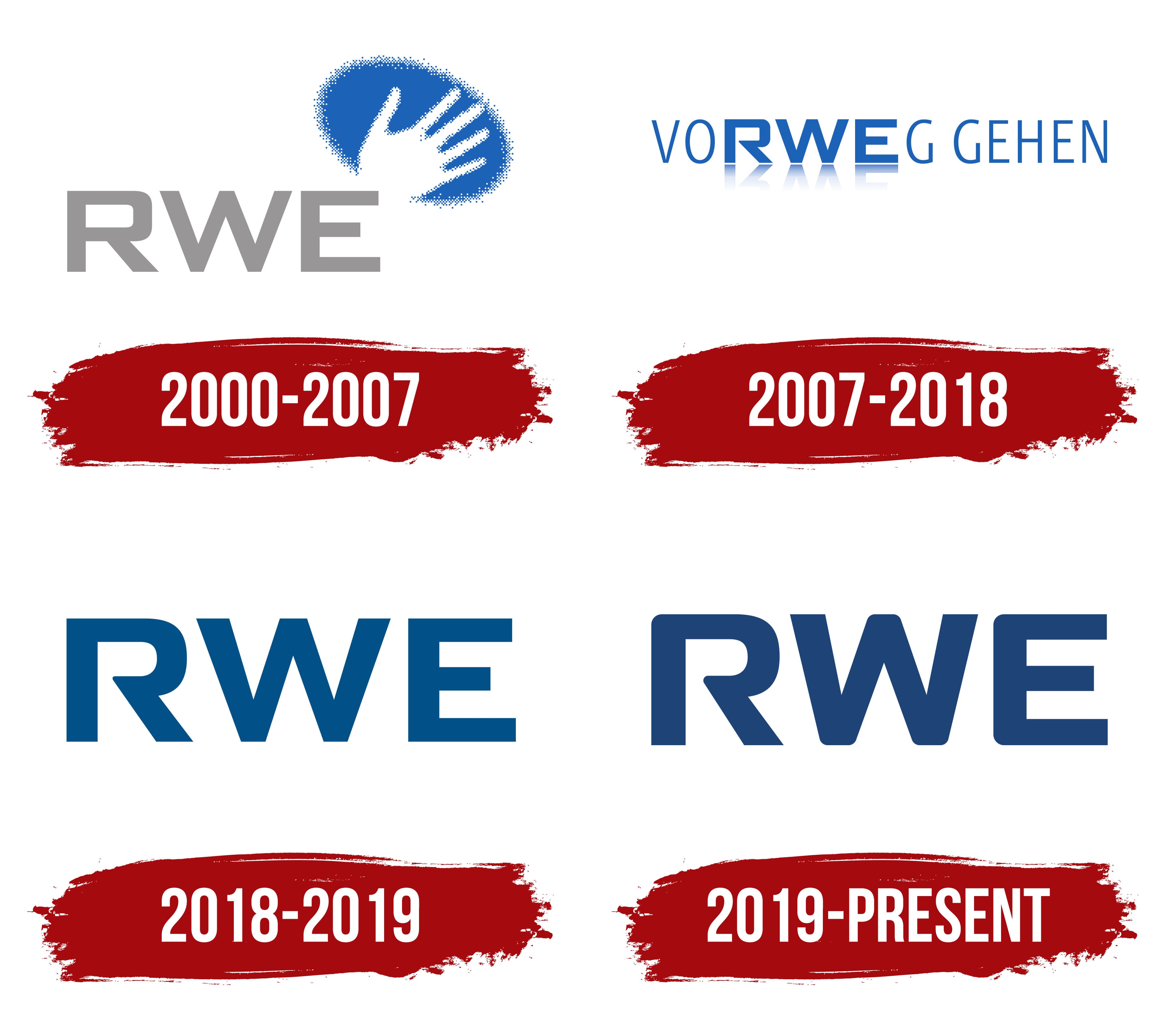
2000 – 2007
RWE began operating in Essen on April 25, 1898. Elektrizitäts-Actien-Gesellschaft vormals W. Lahmeyer & Co. was founded after receiving a municipal contract to provide electricity. The first power station opened in 1900. With a capacity of approximately 1,200 kilowatts, it supplied businesses, streetcars, and street lighting.
The full name Rheinisch-Westfälisches Elektrizitätswerk Aktiengesellschaft translates as “Rhenish-Westphalian Electric Power Company.” It combined the geography of the Rhineland and Westphalia with a reference to a power station. The initial letters of Rheinisch, Westfälisch, and Elektrizitätswerk formed RWE. During the 20th century, the abbreviation became the primary commercial name and the basis for early wordmarks. In 1990, the company adopted the legal name RWE AG.
The 2000 identity update accompanied the merger with Vereinigte Elektrizitätswerke Westfalen, known as VEW. The supervisory boards approved the combination in February. The new identity was unveiled on August 21, and the combined group began operating as RWE AG on October 1.
By then, RWE had grown from a municipal electricity supplier into a diversified group. The open hand in the new logo represented 5 service areas. Its fingers corresponded to electricity, gas, water, waste disposal, and services. The phrase “Alles aus einer Hand,” meaning “everything from a single source,” united them under a shared promise to customers. The gesture conveyed accessibility, a human touch, and a willingness to help. The group also included an oil business. The additional phrase “One Group. Multi Utilities.” explained the combination of several utility businesses under one name.
Landor Associates won the project after a competition with Interbrand Zintzmeyer & Lux and another German consultancy. The project covered the logo, division names, business documents, interior branding, and internal communications. Landor coordinated RWE’s advertising and consulting contractors in different countries, helping implement shared guidelines after the merger.
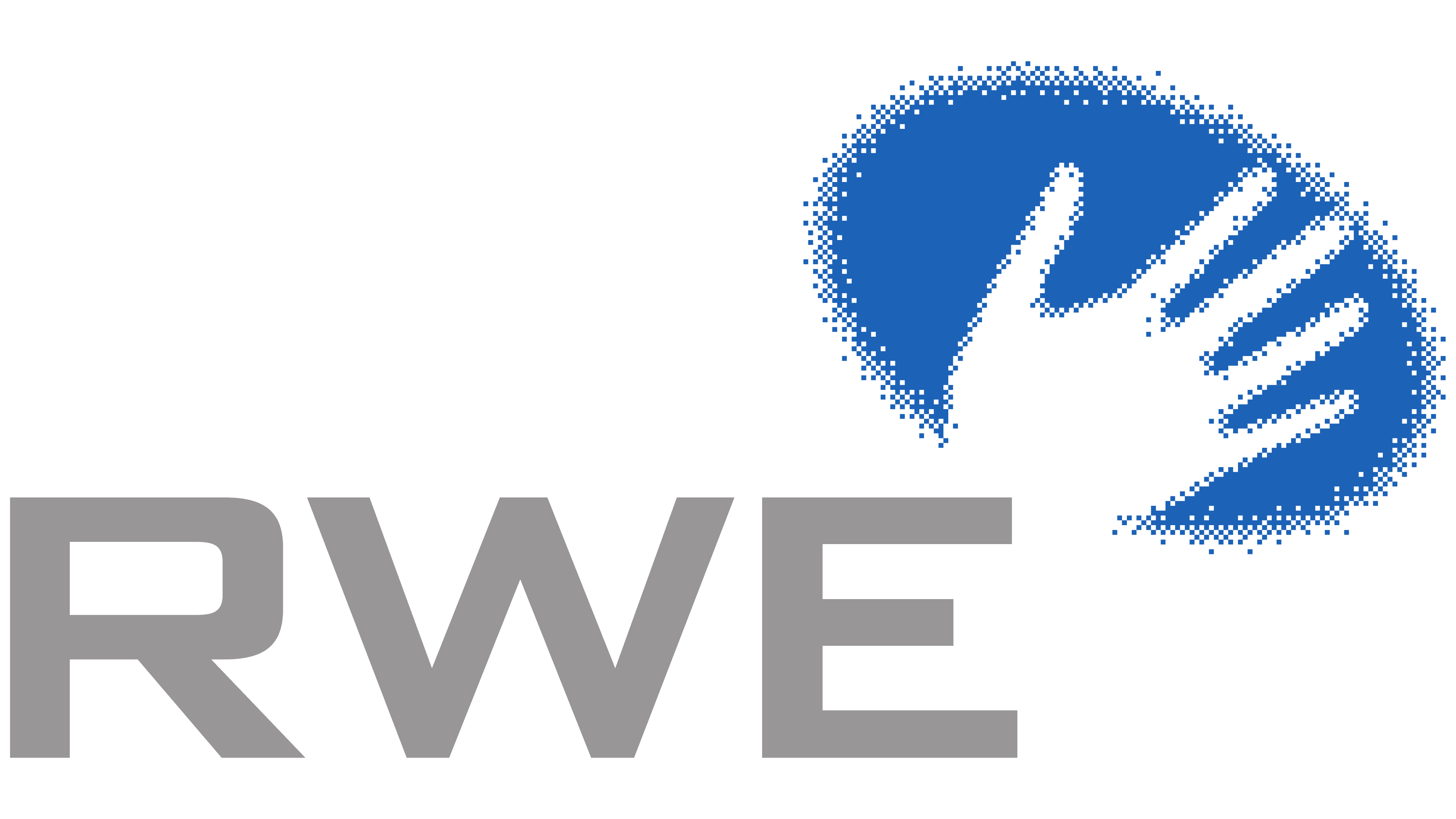
Large gray uppercase sans-serif “RWE” lettering occupied the lower portion of the logo. A blue oval field containing a white hand appeared above the “E” on the right. White areas within the colored shape formed the hand’s silhouette. A dense dotted texture became sparser toward the edges, breaking into small square particles. This treatment affected the contours of both the oval and the hand, connecting the human gesture with digital technology. The heavy wordmark was paired with the emblem’s fragmented design.
Gray was used for the name, blue for the field surrounding the hand, and white for its silhouette. Blue connected the group’s identity to the Avanza consumer electricity brand and helped distinguish RWE from competitors following the liberalization of Germany’s energy market.
The shared system covered RWE Plus, RWE Gas, RWE Net, RWE Umwelt, RWE Trading, RWE Power, Rheinbraun, and RWE Systems. BBDO helped launch the print campaign. Soccer coach Christoph Daum became one of the brand’s representatives.
2007 – 2018
By the mid-2000s, RWE had focused on electricity and gas. The group exited waste processing and began selling its water assets. Thames Water was sold to a new owner, followed by the start of the American Water sale. These changes required an updated corporate identity. The five-fingered hand and the promise of “everything from a single source” belonged to the previous Multi Utilities model, which combined several utility businesses.
In its new positioning, RWE emphasized technological development and responsibility. Jung von Matt/Brand Identity created the tagline “VoRWEg gehen.” It was introduced on April 17, 2008, at the annual shareholders’ meeting in Essen. Bungalow Brand Lab developed the accompanying campaign.
The German word “vorweggehen” conveys leadership and a willingness to lead the way. The word “vorweg” contains the letter sequence RWE, allowing the designers to integrate the company’s name into a complete phrase. The abbreviation continued to be used independently while also becoming part of the tagline. Group CEO Jürgen Grossmann used the phrase when discussing reductions in carbon dioxide emissions, renewable energy, smart meters, and new services. The English phrase “The energy to lead” was used for international communications.
“VORWEG GEHEN” appeared on a single line. The opening “VO” and the closing “G GEHEN” were set in thin letters. Between them, large “RWE” lettering stood out through its heavy strokes. The narrow uppercase sans-serif letters remained upright. Differences in size and stroke weight helped distinguish the corporate name within the German expression.
Blue united the entire phrase, while a darker shade highlighted “RWE.” A light mirrored reflection appeared beneath the abbreviation. It faded into the background as it extended away from the main line. This treatment, common in late-2000s digital design, created an impression of depth. The reflection appeared only beneath the company name’s 3 letters.
2018 – 2019
RWE’s reorganization began in 2016, when networks, retail energy supply, and renewable energy operations were transferred to the new company innogy. RWE retained large power stations and trading operations. Separating the businesses required reviewing the parent company’s identity to distinguish it from the spun-off business.
In 2017, RWE discontinued the slogan “VoRWEg gehen.” It replaced it with “ZUKUNFT.SICHER.MACHEN.”, a message about creating a secure future. Periods divided the phrase into 3 short parts, giving each word independent meaning. The main logo was reduced to the company’s name, removing the words surrounding the abbreviation and the mirrored reflection beneath it.
By 2018, the logo consisted of dark blue “RWE” lettering. Three large uppercase letters stood on a single line. They used a heavy sans-serif style with uniformly thick vertical strokes. The single-color wordmark relied on the combination of letterforms and open spaces between them. Compared with the previous version, the identity became simpler, and the name occupied the entire logo.
The next stage of restructuring took shape in March 2018. RWE and E.ON announced an asset swap under which RWE would acquire the renewable energy businesses of E.ON and innogy. E.ON would receive the networks and retail operations. The short RWE wordmark accompanied preparations to expand energy production, preserving a shared company name for the changing portfolio of businesses.
2019 – today
On September 30, 2019, RWE unveiled an updated identity developed by “Scholz & Friends Identify”. The changes accompanied the business restructuring. The company focused on power generation and acquired a large international portfolio of wind, solar, and hydropower projects. Its historic name needed to connect to the new asset portfolio and its energy plans.
Head of Corporate Communications Stefanie Schunck described the objective as combining RWE’s heritage with technological development and openness. The three-letter name was retained, while its visual treatment was revised. The main work concerned the letters’ shapes, proportions, and color.
The outer corners and internal transitions of the “R,” “W,” and “E” were rounded. Their proportions were made consistent, and the spaces between them were reduced. The wordmark became more compact, while the smooth contours softened its appearance. The logo still consisted of the abbreviation. The blue shade was darkened compared with the 2018 version, retaining the single-color treatment.
For supporting materials, Scholz & Friends Identify added green and gray. They replaced previous secondary colors with lighter versions. The expanded range of shades added variety around the dark logo. It provided shared guidelines across different parts of the company.