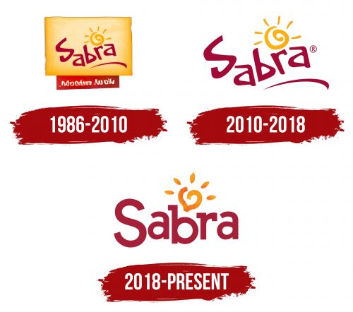
The Sabra logo is beautiful and gentle, attracting attention with its bright colors and contrasts. Its unique style underscores the company’s authority, and it’s hard to imagine a more creative logo that so accurately reflects the brand’s overall concept.
Sabra: Brand overview
Sabra’s history started in Queens, New York, in 1986. A group of Israeli immigrants started the business after observing the rising popularity of Middle Eastern food, especially hummus, in the United States. The creators wanted to establish a company that sold genuine Middle Eastern goods modified for the US market.
At first, the company produced a limited selection of goods offered in neighborhood shops and eateries in New York, such as hummus and baba ghanoush. The business immediately established a reputation for producing mouthwatering and superior Middle Eastern delicacies.
Beginning in the 1990s, the company grew outside of New York—the business invested in new machinery and technology, enabling higher production levels and better product quality. The firm also began experimenting with various hummus tastes to appeal to a wider market.
By the early 2000s, the brand was acknowledged as the industry leader in the US hummus market. In 2005, the business attracted the interest of significant investors. By acquiring a majority position in Sabra, the Israeli food business Strauss Group created new avenues for expansion and brand enhancement.
A significant turning point in the company’s history occurred in 2007. One of the world’s biggest food and beverage companies, PepsiCo, and the enterprise signed a joint venture deal. This agreement greatly increased the firm’s marketing and distribution capacities.
In 2010, the company inaugurated a new, cutting-edge factory in Virginia that became the biggest hummus production plant globally. This action enabled the company to launch new production technologies and satisfy increasing product demand.
The brand persisted in taste and packaging innovation in the 2010s. The firm started making additional Middle Eastern delicacies like sauces and dips and launched several new hummus variants, including sweet and spicy ones.
The company introduced a significant marketing effort in 2013 called “Dip Life to the Fullest,” which contributed to raising brand awareness and hummus’s popularity among American consumers.
The Sabra Culinary Innovation Center opened its doors in Richmond, Virginia, in 2016. This facility became a focal point for investigating food trends and creating new goods.
In 2017, the brand launched a new line of organic hummus to broaden its product offering. This project demonstrated the company’s dedication to employing high-quality ingredients while meeting the growing demand from consumers for organic products.
In 2018, the cutting-edge Sabra Wellness range was introduced. This series of hummus included superfood additions, including seaweed and turmeric, reflecting consumers’ increased interest in functional meals.
The company took a big stride in the direction of sustainability in 2019. The corporation declared that by 2025, all of its packaging would be recyclable. A program to cut down on food waste during production was also started.
In 2020, the brand saw many advancements in digital technology. The company greatly increased its online presence by introducing a new website with interactive recipes and informative content about the advantages of hummus and other plant-based products.
The firm launched a new product line, Sabra Snack Kits, in 2021. These kits, which included hummus and various dipping foods, were made in response to the rising need for portable, wholesome snacks.
The company’s production capacities will increase in 2022. The enterprise invested in modernizing its Virginia factory and introducing new technologies to improve manufacturing efficiency and product quality.
The brand started the “Spread the World” global campaign in 2023 to highlight the benefits of hummus and other plant-based foods as components of a balanced diet. Popular chefs and dietitians collaborated to develop creative meals incorporating Sabra products as part of the promotion.
The firm began to enter new worldwide markets in 2024. The business started aggressively extending its reach throughout Europe and Asia, customizing its offerings to suit regional tastes.
The company continually broadens its product line to bolster its position as the industry leader in hummus and other plant-based snacks.
Meaning and History
Using one multifaceted element and short text content, the brand has won the hearts of its customers. Sabra’s sauces quickly became favorites, indispensable to friendly gatherings and family dinners.
The products rapidly spread across all states in America, proving their superiority over many similar items. The logo with the sun shaped like a heart conveys love and boundless respect for its customers. The single word “Sabra” indicates that the brand’s Mediterranean sauces and other products are trustworthy.
What is Sabra?
It is a brand specializing in the production of Mediterranean dips and spreads, primarily hummus. The company is a joint venture between PepsiCo and Strauss Group. It offers a wide variety of hummus flavors, including classic, with searing red pepper and garlic, as well as other products such as guacamole and tzatziki. Known for its quality and flavors, Copania uses fresh ingredients to create flavorful and convenient snack options. The brand’s products are available in supermarkets, grocery stores, and online retailers.
1986 – 2010
The first logo lasted longer than any of the others, over 20 years, allowing customers to quickly find their favorite products on store shelves. During this extended period, it conveyed friendliness to the American target audience, demonstrating the simplicity of the text elements and graphics while presenting the products in the best possible way.
The chosen color palette increasingly leaned towards natural shades. According to the designers’ intent, the colors were meant to indicate the quality and naturalness of the products. Brightness and contrast were not dominant; subdued colors became Sabra’s hallmark.
The identity used two shades of red. This choice was deliberate, as red has the maximum presentational effect. The brand name was written in playful, fairly large letters and stood out against a yellow background in the shape of a square, which focused attention on the word “Sabra.”
At the bottom of the logo was a small rectangle with a red background and light text. The phrase “Authentic Delights” served as a mark of the product’s authenticity.
The original sun, drawn as if by a child’s hand, symbolized the energy of nature, life, and strength.
2010 – 2018
The new format of the second Sabra logo has changed significantly. Each detail now has key importance, with minimal additions to the identity. Interestingly, many elements have evolved: they existed before but have taken on a new form, maintaining their beauty.
Modern trends dictate their own rules, and historical events impose certain changes. This is reflected in the logo’s transformations. Backgrounds and limiting frames were removed, making the design more open.
The brand name is now placed on a white background and written in red letters, making it instantly noticeable. The font has become less aristocratic but more energetic, with simple, rounded letters.
The sun, rising above the brand name, is now larger and shines brighter, symbolizing the company’s stability, growth, and rapid development.
The word “Sabra” on the logo seamlessly connects with a smooth, rounded line that emphasizes the text. This graphic element highlights the company’s reliability.
2018 – today
The new logo’s meaning remains unchanged: traditions form the foundation of the present. This is why the elements are updated and stylized without radical transformations.
The font acquires a unique shade, and the brand name is now instantly recognizable. Each letter in the word “Sabra” shimmers in dark tones with light highlights. The rounded letters appear three-dimensional, creating a sense of depth. Against a white background, they stand out impressively, like a rainbow after the rain.
The sun now resembles a slightly messy heart. The multifaceted design evokes nature and love. The perception of the element reminds one of the naturalness and quality of the product. The sun symbolizes warmth, and in this case, it brings gastronomic pleasure to everyone.
