


 Salomon Logo PNG
The Salomon logo stands out uniquely and reflects the brand’s character. Its originality distinguishes it and skillfully conveys the company’s philosophy while remaining true to the traditions established in previous versions of its identity. The emblem is rich in information, yet its content is harmoniously balanced; it is not overloaded with unnecessary details and remains easy to perceive.
Salomon’s identity possesses many distinctive features but does not seek to draw attention with excessive visual effects or bright colors. The classic color palette gives the logo a sense of restraint and elegance, making it one of the most successful versions in the brand’s history. Thanks to its simplicity and aesthetic appeal, this logo has every chance of lasting much longer than its predecessors, maintaining relevance and originality in the future.
In 1947, François Salomon founded Salomon in Annecy, France, starting with a small family workshop where he, his wife, and his son produced wood saws and ski edges. The company soon focused on ski equipment, especially ski bindings, using the experience of the Alpine region to develop products for winter sports.
In 1955, Salomon introduced automatic release ski bindings, followed by the Le Lift bindings in 1962, which became widely used in the ski industry. During the 1970s, the company expanded its product range by producing ski boots. It became the world’s largest ski binding manufacturer by the end of the decade. In 1984, Salomon entered the hiking market with its first outdoor boots, SX90.
During the 1990s, Salomon expanded into snowboards, skis, and winter sports clothing. The brand launched its first snowboard in 1992 and its first skis in 1994. In 1997, Adidas acquired Salomon for $1.4 billion, giving the company access to a global distribution network. In 2005, Adidas sold Salomon and other assets to Finnish company Amer Sports for €485 million.
In the 2000s and 2010s, Salomon developed products for trail running and outdoor activities, including Speedcross and S/Lab Sense footwear lines. The company introduced technologies such as Custom Shell for ski boots and expanded into urban footwear and apparel. In 2019, Amer Sports was acquired by a group led by Anta Sports. By 2023, Salomon remained focused on outdoor equipment, trail running footwear, and winter sports products.
Meaning and History
What is Salomon?
This brand was born in the French Alps and is closely associated with mountain sports, especially trail running and alpine skiing. The company is widely known for its high-performance skis, bindings, and boots, which numerous Olympic champions have used. In addition, the brand offers a variety of outdoor products, including hiking boots, trail running shoes, and technical outerwear. The company’s products stand out for their creative design, often incorporating modern materials and technologies that enhance performance in extreme conditions.
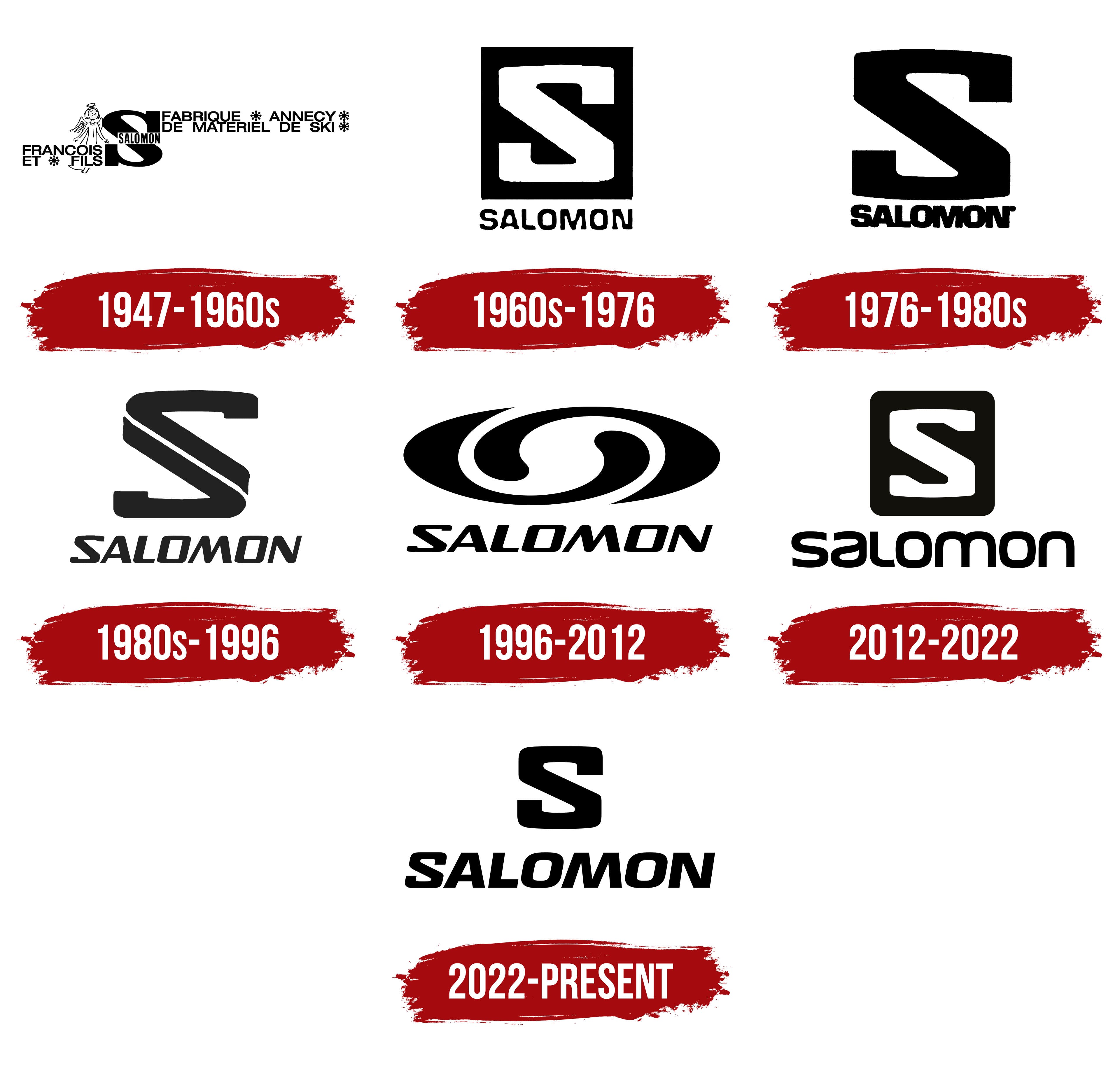
1947 – 1960s
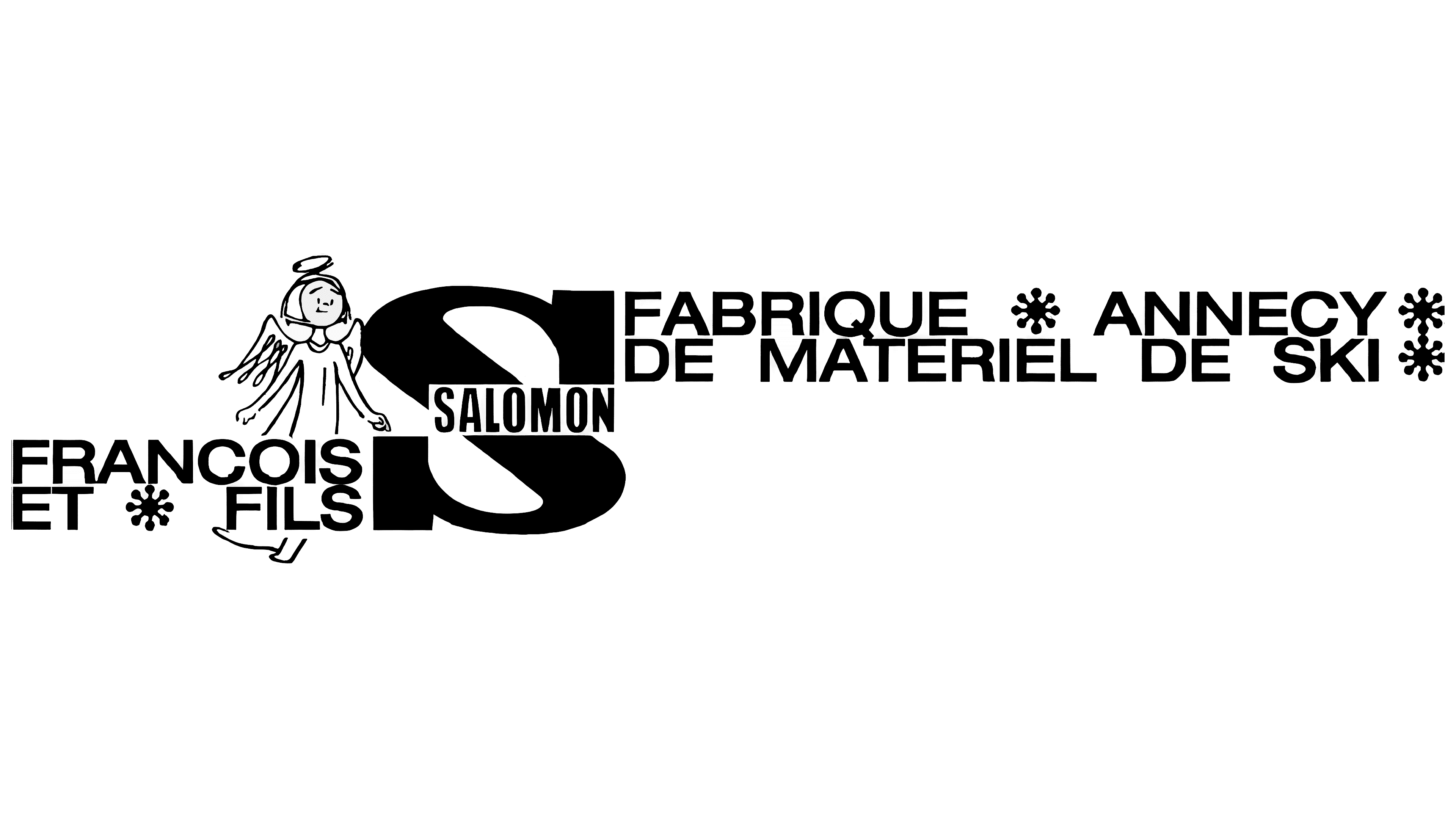
The company’s first logo can be considered one of the most complex. This level of detail was crucial during the brand’s market debut. After all, the company was just starting, and its primary goal was to establish itself and solidify its presence in consumers’ minds through carefully crafted elements. The desire to become one of the most successful and recognizable companies was the foundation for selecting each graphic and text element.
The logo’s creators achieved the desired effect; the graphic elements and text attracted attention. On the right side of the logo, an angel was depicted in simple, concise lines. This figure symbolizes protection and reliability, representing the quality of the innovative French brand’s sporting equipment. Despite its simplicity, the angel’s image evoked feelings of kindness and calm, adding a friendly tone to the logo. Its comic nature was part of its charm, making the image memorable and pleasant to the viewer.
Although the angel illustration wasn’t large, it appeared proportionate to the main element, the letter “S.” This letter, which became the brand’s key symbol for many years, first appeared in this emblem. It was rendered in bold black, later becoming a primary color in the brand’s identity. All elements, letters, symbols, and drawings were depicted against a clean white background in this tone.
The logo’s text component was quite extensive. In addition to the word “Salomon,” the emblem also featured words and phrases describing the quality and features of the sporting equipment offered. Illustrated in an unconventional black color, four snowflakes were scattered across the logo in a seemingly random arrangement. These snowflakes added visual dynamism, maintaining a balance between complexity and simplicity.
1960s – 1976
The next version of the logo gained individuality but lost its former complexity. All illustrations were removed, and the text elements were reduced to a single keyword, “Salomon.” Given the company’s success, no other word or phrase could convey more than the brand name itself. This decision proved effective: the black square with the white letter “S” created an impressive visual effect. The brand name, placed at the bottom of the logo, stood out thanks to the unique font, which gave it added expressiveness. This logo thus became the foundation for all subsequent transformations in the brand’s identity.
Special attention should be given to the letter “S,” which is perceived more as a graphic symbol than a standard typographic character. It is rendered in a graphic style that combines elegance and strength. This symbol conveys confidence and stability, emphasizing the brand’s reliability and durability. The logo seems to communicate to consumers that the products are trustworthy, as they represent quality. Additionally, the sense of dynamism and motion is also conveyed through the visual design. Thanks to the carefully selected color palette, the word appears light, almost weightless, as if it is floating in space, adding even more sophistication and appeal to the logo.
1976 – 1980s
In the updated logo, the square geometric shape was removed because it no longer carried significant informational weight. This decision made the identity more concise and focused on the core elements. The color palette shifted entirely to contrast: black letters and the symbolic mark stood out against a white background. At the center of the logo sat a large, bold letter “S.” Its straight lines and curves created the illusion of depth, giving the symbol a sense of solidity and representing the brand’s stability and confidence.
By this time, the brand, with its French roots, had achieved significant success, and the letter “S” remained an integral part of its logo, holding its place and importance across several generations. It had evolved, changing its shapes and proportions, but always remained recognizable.
Below the massive “S” was the brand name “Salomon.” The added weight and scale to each character drew attention to the word as a whole. The bold letters emphasized the brand’s unity and strength. For the first time, the spaces between the letters were minimized, highlighting the harmonious integration of all elements. The rounded shapes of each letter transformed them into smooth, aesthetic lines. Completing the composition was a period after the letter “N,” placed not at the bottom, as punctuation rules dictate, but in the upper right corner, giving the emblem a sense of completeness and unique elegance.
1980s – 1996
The update to the “Salomon” logo reflects modern trends in brand identity. The goal was to maintain its informational value and recognizability while enhancing the graphics to emphasize the brand’s individuality and relevance. As a result, the letter “S” took on a unique design, becoming the key element that captures attention and resonates positively with the audience.
The duality of the “S” shape significantly increased the logo’s recognition and strengthened the brand’s reputation. The large symbol, rendered in black, stood out, but its defining feature was the white line running through its center. This line created a sense of depth, giving the logo volume and elegance. Moreover, how it extended beyond the letter’s contours evoked the idea of “infinity,” and some interpreted this element as a road marking. This graphic choice made the logo dynamic and full of movement and energy.
The brand name, set in italics, further emphasizes speed and motion, linking the logo to athletic activity. This design choice perfectly embodies the brand’s spirit, representing the excitement and joy of active outdoor pursuits. In the new identity, sport and brand are unified into a harmonious concept, with dynamism and modernity at the forefront.
1996 – 2012
The brand’s new logo reflected professionalism and a drive for success. A monochrome color scheme, clear graphics, and stylized elements created a unique version of the identity while staying true to classic principles. Black and white dominated, giving the logo a refined elegance. The brand name was rendered in elegant italics, with black superscript letters arranged in a continuous line, like links in a chain. Each letter conveyed confidence, creating a sense of dynamism and strength, emphasized by its large size and harmony with the symbol.
The stylized element, reminiscent of a whirlwind, a gust of wind, or a powerful wave, became the key feature of the new logo. The familiar letter “S” could be seen within this geometric pattern. Now positioned horizontally, it added a sense of uniqueness and a subtle mystery to the design. This element symbolized movement and strength, highlighting the brand’s individuality and fearless character.
2012 – 2022
In 2012, the brand returned to one of its classic logos, where the square first appeared, and it is now again taking center stage in its identity. This element represents a solid geometric figure that symbolizes stability and confidence. The square’s interior is traditionally filled with black, serving as a background for the key symbol, the letter “S.” Despite being slightly smaller in proportion to the square, the letter is strategically positioned to avoid touching the edges, creating a visually balanced composition.
The letter “S” in the logo stands out with its elegance and stylish design, accentuated by smooth curves and sharp lines. Its design conveys the brand’s strength and dynamism, which are crucial for a company that produces high-quality sporting equipment.
Below the square symbol, the company name is displayed. This element deserves special attention due to its unique font. Each letter is crafted with an individual approach, giving the logo a creative distinctiveness. The unconventional letter shapes highlight the brand’s originality and aim to stand out from competitors while maintaining its identity and high status.
2022 – today
In 2013, the Salomon brand transitioned to a simpler, more minimalist logo, retaining only the key elements that highlight its professionalism and reliability. This step created a visually concise yet impactful identity that conveys the company’s strength and stability.
The letter “S,” now the central element of the new logo, gained a unique foundation. It appears static and impressive, drawing attention with its commanding presence. The white background emphasizes its boldness, making it the focal point of the design. “S” now serves as the primary symbol of the logo, and its central placement underscores its significance.
The brand name remains at the bottom of the logo, but it is now written in italics. The gentle slant of the letters, positioned closely in a straight line, gives the text a sense of flow and elegance. The soft rounding of the characters adds a friendly and approachable touch to the identity. The new emblem exudes confidence and reliability, reflecting the brand’s power. The interaction of each element forms an overall perception of Salomon as a trustworthy company.