 Seattle Aquarium Logo PNG
The Seattle Aquarium logo invites you to explore the beauty and diversity of the underwater world to better understand its mysteries. Moreover, visual appeal is not the only strength of the emblem. It contains many symbolic details that reveal the institution’s values and mission.
The Seattle Aquarium grew from proposals made by local enthusiasts and businesses in the 1960s. In 1971, the Seattle City Council approved its construction as part of the waterfront redevelopment. Work began in 1975 on the site of a former fish market after voters backed bonds for the $6.5 million project.
The aquarium opened on May 21, 1977, and received more than 10,000 visitors on its first day. The original 29,000-square-foot complex included the Underwater Dome, where visitors could observe marine life from inside a large plastic structure. Educational tours with local schools soon became part of its regular work. A marine mammal exhibit with seals and sea otters opened in 1984.
Research expanded during the 1990s, including a sea otter rescue program launched in 1995. In 2007, the aquarium marked its 30th anniversary with a $41 million expansion, adding 18,000 square feet and the 120,000-gallon Window on Washington Waters exhibit. A sea star research and conservation initiative followed in 2011, while a new development plan was introduced in 2016.
Planning for the Ocean Pavilion began in 2018, followed by an expansion project in 2019 that included a 325,000-gallon habitat. Sea otters were rehabilitated and released in 2020, and the Ocean for All education program started in 2021. Scientists published research on climate change in Puget Sound in 2022. Construction of the $113 million Ocean Pavilion began in 2023.
Meaning and History
What is the Seattle Aquarium?
It is a public aquarium located on the waterfront of Seattle, Washington. It features a wide variety of marine life and exhibits designed to educate and inspire visitors to learn about the diverse aquatic ecosystems of the Pacific Northwest and beyond. The Aquarium offers interactive displays, touch pools, and educational programs for visitors of all ages. Highlights include exhibits featuring native marine life, such as sea otters, seals, and various fish, as well as tropical coral-reef habitats. The Seattle Aquarium is dedicated to marine conservation, research, and education, striving to better understand and appreciate the ocean and its inhabitants.
1977 – today
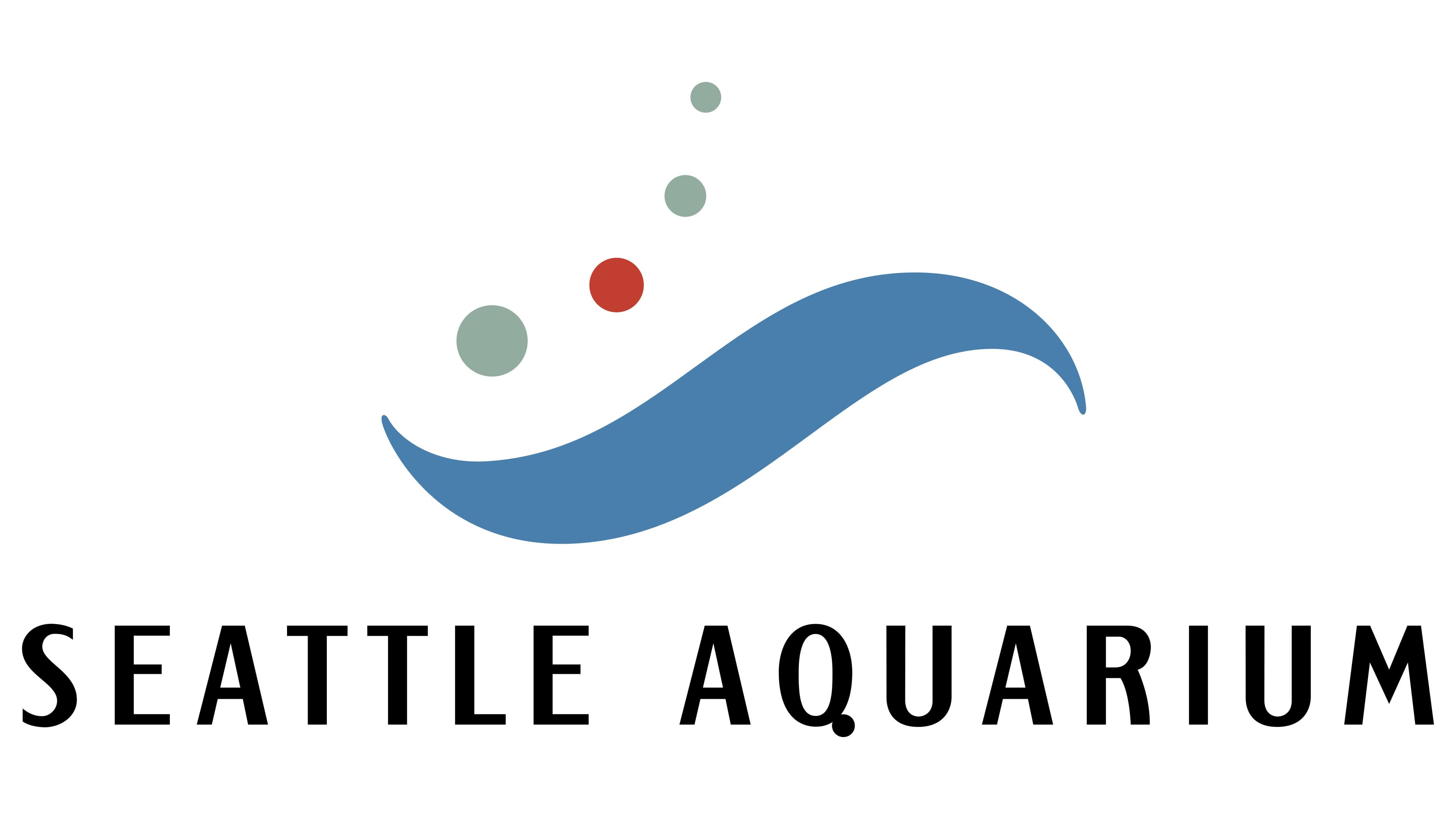
One of the main elements of the Seattle Aquarium logo is a large blue stripe resembling a tilde with pointed ends. However, this is not just a curved line but a swift wave, ready to engulf anyone who wants to dive into the amazing realm of sharks, rays, otters, turtles, and other aquatic inhabitants. Despite the visual energy, the line does not seem threatening. On the contrary, its smoothness and fluidity evoke the tranquility of the underwater world, where even time flows more slowly than on the surface.
The flexible shape symbolizes infinity, which doesn’t quite align with the brand concept, as the giant tanks have boundaries that maintain the stability of the ecosystem. While the Seattle Aquarium itself is associated with a closed habitat, the wavy stripe conveys the dynamics of life in the open ocean, which is the institution’s goal to introduce people to the unexplored parts of nature.
The muted blue reinforces associations with the water, where exotic deep-sea creatures live. At the same time, it creates an atmosphere of contemplation, as if inviting you to calmly observe marine mammals, fish, and birds in their natural habitat. After all, one of the main goals of the Seattle Aquarium is to study animals from a distance to better understand how to preserve their population in the wild.
The logo is filled with air bubbles that seem to rise from the bottom to the surface. They look like ordinary circles, but even that is enough to add lightness and playfulness to the image. There are only four: three gray and one red. The gray color is slightly bluish, so it is associated with seaweed. Red is used for emotional impact, drawing attention to the underwater world. The bright accent adds contrast and livens up the palette, guiding the eye to follow the rising bubbles.
The circles form an arc that echoes the shape of the wavy stripe, making the emblem dynamic. Moreover, the bubbles are arranged in descending order by size from the largest (at the bottom) to the smallest (at the top), further enhancing the sense of movement. They convey the smooth flow of water as if inviting you to dive into the world of oceanic depths.
Another bubble, the fifth, adorns the lower part of the letter “Q.” It is placed exactly where the short diagonal line should be, turning “O” into “Q.” The designers integrated this emblem element into the wordmark to unite them. Even so, the “SEATTLE AQUARIUM” inscription stands out with its reserved black color and simple font, which is characterized by:
- absence of serifs;
- a raised central stroke on the letter “E”;
- contrasting line thickness;
- clear shapes;
- numerous angles.
The strict font, free of unnecessary details, evokes clarity and confidence, emphasizing the aquarium’s educational role. Its modern style corresponds with the image of a serious institution that has become a guide to the world of oceanographic research. Yet, it does not distract from the main elements of the logo, the smooth wave and rising air bubbles. This helps create a unified visual space where everything is interconnected, like in a separate ecosystem.