The Secret logo is full of freshness and lightness. It conveys the delicacy of the scent, the ease of application, and the imperceptibility of the product on the skin. The logo is associated with a dream, conveying the idea of the ideal product to meet the deodorant requirements of customers.
Secret: Brand overview
| Founded: | 1956 |
| Founder: | Procter & Gamble |
| Headquarters: | United States |
| Website: | secret.com |
The secret is a deodorant brand favored by 22 million Americans. It is distributed in North and South America. It was founded in 1956 and is owned by Procter & Gamble.
Meaning and History
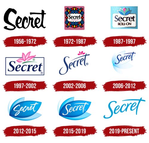
All the changes in the company’s logo are related to its evolution: new developments and offerings. The logos are a direct embodiment of the fragrance. Each one uses elements associated with scent. The signs use delicate images and floral motifs to appeal to a female audience. Each incarnation of the brand is very harmonious and thoughtful.
What’s Secret?
A Procter & Gamble brand that makes deodorants and antiperspirants for women. The range includes aerosols and sticks on a solid and gel base. Capable of wearing for up to 48 hours.
1956 – 1972
The first product logo appeared in 1956 when the deodorant was presented to the public, although work on it was still underway from 1945. It was written in black, with slightly angled lettering, an unusually widened S-shaped top hinge, and an elongated t-bar.
Each of the lettering changes hinted at a new product. The curve of the capital letter resembled an armpit. The glyph t resembled a strip of cosmetics drawn with a finger. It was all about the fact that the first deodorant was released as a cream and had to be applied with the fingers.
1972 – 1987
The brand went beyond the U.S. and was sold overseas. A more feminine and bright logo was invented for the popular product. It represented the name surrounded by a motley dense carpet of leaves. Below the brand name was an explanation: “deodorant.”
The leaves conjured up associations with freshness, and the multi-colored coloring with floral fragrances. The tight closure of the ring showed how the product offsets unpleasant odors.
The presence of curls was remotely reminiscent of an armpit. And the overall design of the leaf part resembled the globe from afar, telling of the product’s international expansion.
1987 – 1997
The brand became the leading brand among women’s deodorants and began a partnership with the Miss America pageant. The logo’s collaboration with the most beautiful models and the famous pageant is conveyed by the gold trim on all logo elements.
On the white rectangle is the name in black font, and below is the caption, “roll on.” The badge is reminiscent of the deodorant itself, and the petals represent the roller from which the fragrant product comes out.
1997 – 2002
An advertising project aimed at teenage girls and their parents has been launched. The logo of this period is very fresh and delicate. Quite appropriate for young female customers.
The name of the brand was taken in a light, thin dark blue frame with rounded corners. The clear shape testified to the harmony, beauty, and self-confidence that deodorant use gave.
The name was written in the same color with serif letters, showing the brand’s exclusivity.
And above in the center of the frame is the highlight of the logo: casually drawn four pink flower petals and a green underline representing the leaves and stem.
The tenderness of the petals conveyed young age, virgin beauty, and blossoming femininity. The use of only part of the petals and their upward direction as if showing the spread of a pleasant fragrance. And the green feature spoke of health and freshness.
2002 – 2006
A transparent deodorant in the form of a gel was released. The logo was noted for lightening the composition. The usual frame was removed, and the font was made light and soaring up. The lintel of the letter t is like a disappearing line drawn with the new medium; it barely leaves a visible mark. But after it, you can feel the trail of scent well, which is indicated by flower petals above the jumper.
2006 – 2012
An antiperspirant that protects against perspiration secretion has been developed, as shown by the transformation of the emblem. The flower petals were moved, making them the base of the image. They acquired a slightly bluish transparent color, showing fragrance and water. At the top of the petals is written the name of the brand. The sign shows that Secret prevents getting wet and sweat production.
2012 – 2015
In 2012, protection against sweat became more powerful. The company offers a deodorant that works for up to 48 hours. This is reflected in the emblem by the color intensification. The petals of the flower become four. And they increase the intensity of the color from the lower to the upper. The main one is as full as possible, clearly visible, and in blue. We have the brand name in white capital letters. The lettering shows the action retention over time, and the width and color of the petal show maximum and long-lasting protection.
2015 – 2019
The company presents itself at a large-scale night party, where more than 135,000 people could get acquainted with the 48-hour protection concept. The emblem for the show was prepared and slightly improved. The font was softer and more rounded, radiating harmony while maintaining the overall concept and composition. So the brand showed that the action of deodorant lifts the mood and helps a woman to get a more perfect image.
2019 – today
In 2019, a collection of deodorants with essential oils came out. They suggest an even greater lightness and airiness, as seen in the new logo. The backing has been completely removed. The upward-flowing lettering is done in a light blue hue, showing how quickly the pleasant fragrance spreads when applied.
Font and Colors
The main color of the logo is light blue. It corresponds to the name of the first product by the brand, Secret Ice Blue. It hints at the rich history of the company. The shade is fresh and airy, as a real woman’s deodorant should be. Blue is associated with ice and cold, canceling out the heat and sweat. It transmits the color and the wind vibe, indicating sprays. Shows the ease of spreading essential scents in the brand’s latest collection.
The font is unique, with subtle connections between the letters, showing subtle strokes that refresh the skin.
Secret color codes
| Spanish Sky Blue | Hex color: | #009ed8 |
|---|---|---|
| RGB: | 0 158 216 | |
| CMYK: | 100 27 0 15 | |
| Pantone: | PMS 801 C |
