 Serta Logo PNG
The Serta logo proves that even the simplest graphic elements can convey a sense of safety, care, and comfort. This is very important for a company that offers comprehensive sleep solutions, as its assortment includes mattresses and all necessary bedding accessories.
Serta began in 1931 during the Great Depression, when 13 mattress makers in Illinois formed Sleeper, Inc. to share production and survive weak demand. They aimed to sell reliable mattresses at affordable prices. In 1933, the business became Serta Associates, Inc., with the name selected from a telephone book. Military contracts during World War II expanded capacity, and a national advertising campaign followed in 1950.
The Perfect Sleeper arrived in 1964 after cooperation with orthopedic specialists on back support. During the 1970s, Serta introduced a continuous-coil spring system designed to distribute support across the mattress. Manufacturing expanded into Canada and Europe in the 1980s, while memory-foam products were developed during the 1990s.
The iComfort range launched in 2004 with materials intended to regulate sleeping temperature. Hilton Worldwide Hotels selected Serta as an official mattress supplier in 2005. In 2010, a merger with Simmons Bedding Company created Serta Simmons Bedding, LLC, described in the source history as North America’s largest mattress producer.
Later releases included iComfort TempActiv in 2015, an online selection tool using machine-learning algorithms in 2018, and a $100 million technology investment announced in 2019. Carbon-fiber memory foam entered iComfort in 2020, Arctic cooling mattresses followed in 2021, recycled-material models appeared in 2022, and Perfect Sleeper received updated comfort and support technology in 2023.
Meaning and History
What is Serta?
It is an American brand known for manufacturing mattresses and sleep products. The company offers a wide range of mattresses, including innerspring, memory foam, and hybrid models designed to provide comfort and support for a sound sleep. Serta is known for its innovative sleep technologies, such as the iComfort and Perfect Sleeper lines, which utilize advanced materials and construction to improve sleep quality. In addition to mattresses, Serta manufactures pillows, bedding, and other sleep accessories. The brand is committed to improving sleep quality and ensuring customer satisfaction through its durable and comfortable products.
1931 – 1970

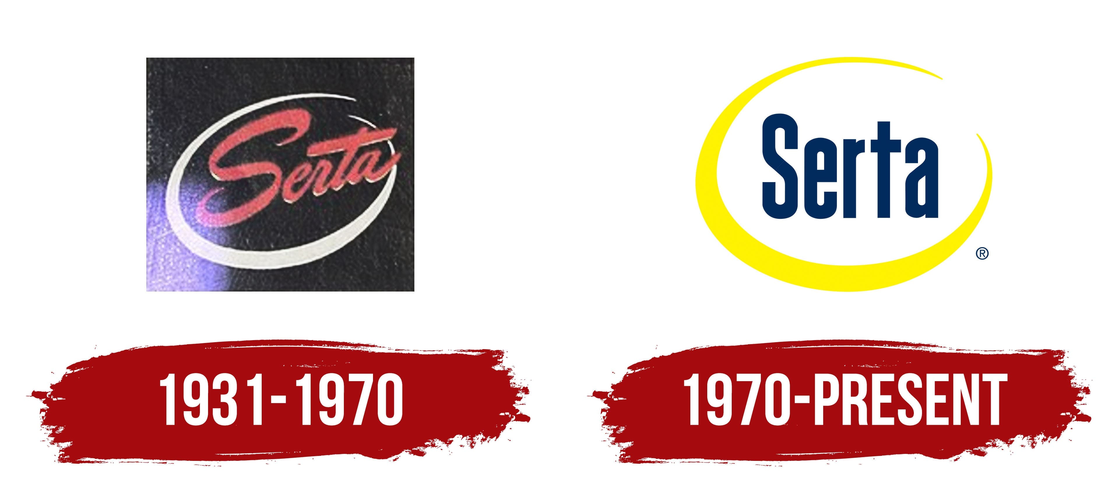
The Serta company hasn’t always had a bright and optimistic emblem. Its old logo looked gloomy due to an unfortunate color choice: a solid black background contrasted with white and red elements, which were lost against the dark backdrop. Perhaps the brand was trying to draw attention at the time, as it wasn’t yet as popular and was willing to take bold risks in search of its identity.
However, the shapes were chosen more effectively; no visual aggression was felt in the color combination. For a mattress manufacturer, the main goal was to convey a sense of comfort so that a glance at the emblem would evoke warmth and coziness. This was partially achieved using an open white oval at the center. The company imbued it with several meanings:
- The smooth curve of the stripe was associated with softness and safety.
- The pointed ends hinted at innovative technologies.
- The openness symbolized the brand’s readiness to grow and evolve.
- The oval shape represented standard mattress springs.
Combining pointed ends with a thicker middle created a sense of perspective, giving the simple two-dimensional logo depth. Inside the oval was the red word “Serta,” which added another important role to the curved line, visually highlighting the company name and emphasizing its prominence. The right side of the inscription was slightly elevated as if it were about to take off. This created a sense of lightness, which was associated with the comfort of the mattresses.
The text used a handwritten font with unique letters. The designers gave the “S” a dynamic shape, adding sharper curves that made it resemble a bouncing spring. On the other hand, the “t” appeared sturdy and static due to its straight, long strokes. It symbolized the reliability of Serta products. The red color looked aggressive, but it was the only way for the newly established brand to attract attention to its name.
1970 – today
The company focused on innovation and began utilizing many new technologies to produce mattresses with memory foam, gel inserts, and hybrid systems. The logo evolved alongside the expanding product range to reflect the manufacturer’s growing ambitions. However, the overall structure of the emblem remained almost unchanged, as the brand wanted to stay recognizable to its loyal customers.
The main identifying feature of Serta remains the long line forming an open oval. It was initially designed as part of a spring mattress, as the company originally specialized in spring mattresses. Now, this stripe symbolizes the product range’s expansion, covering everything needed for a complete night’s sleep, from adjustable bed frames to bedding sets.
The rounded shape creates a sense of softness and indicates the enhanced comfort of mattresses that can adapt to the contours of the human body. The oval’s uneven thickness, combined with its pointed ends, makes the logo dynamic. This reflects the speed with which the company grows and embraces new technologies to satisfy a wide range of consumers.
One side of the oval remains open, representing the brand’s vast potential. The open shape symbolizes a lack of boundaries, as Serta sees no obstacles when developing innovative sleep solutions. The yellow color enhances the emblem’s dynamism and adds optimism through its association with the bright sun. It evokes a sense of softness and warmth, aligning with the mattresses’ core qualities.
While the yellow stripe radiates joy, the dark blue (almost black) inscription conveys confidence. Its restrained color reflects the businesslike approach of a company that adheres to strict standards for consumer safety and comfort. The font also looks solid, as the glyphs consist of clear, uniform strokes. The absence of a diagonal slant emphasizes the brand’s seriousness, and the letters’ visual stability symbolizes the durability of the mattresses and bedding.
The word “Serta ” is dominated by vertical lines, the only feature that makes the inscription unique. The company’s name seems to strive upward as if attempting to break free from the oval frame. The combination of strictness and dynamism is an interesting blend that embodies the union of tradition and modern technology.