 Yellow Pages Logo PNG
The Yellow Pages logo is metaphorical, playful, and friendly. It demonstrates the ease of using phone directories that list information about well-known service-sector companies. The emblem has become recognizable worldwide and serves its function as a marketing tool perfectly.
Yellow Pages began in 1883 in Cheyenne, Wyoming, when a printer producing a telephone directory ran out of white paper and used yellow paper for the business advertising section. In 1886, Ransom E. Betts, who worked in advertising for a Wyoming telephone company, proposed using the Yellow Pages format to separate commercial listings from ordinary phone numbers.
The idea spread across the United States in the 1890s as telephone companies began adding dedicated business sections to their directories. By the 1910s, the format had become familiar, with yellow pages for companies and white pages for private subscribers. In the 1920s and 1930s, the directory became a major marketing tool for small and medium-sized businesses.
After World War II, the service grew quickly in the 1940s and 1950s as more companies paid for directory advertising. In the 1960s, Henry Alexander created the “Walking Fingers” logo for a New England directory, giving Yellow Pages one of its best-known symbols. The 1970s and 1980s became the strongest era for printed directories, when many firms treated them as a regular part of their advertising budgets.
Digital change started in the 1990s with CD-ROM editions and online access. In the 2000s and 2010s, search engines, web directories, and mobile apps pushed the business away from print. Canada’s group became Yellow Media Inc. in 2011, Yellow Pages Limited restructured in the United States in 2012, and Hibu restructured in 2013. Sensis sold 70% to Platinum Equity in 2016, leaving 30% for Telstra. By 2024, many Yellow Pages companies focused on AI search, CRM tools, digital marketing, and online support for small businesses.
Meaning and History
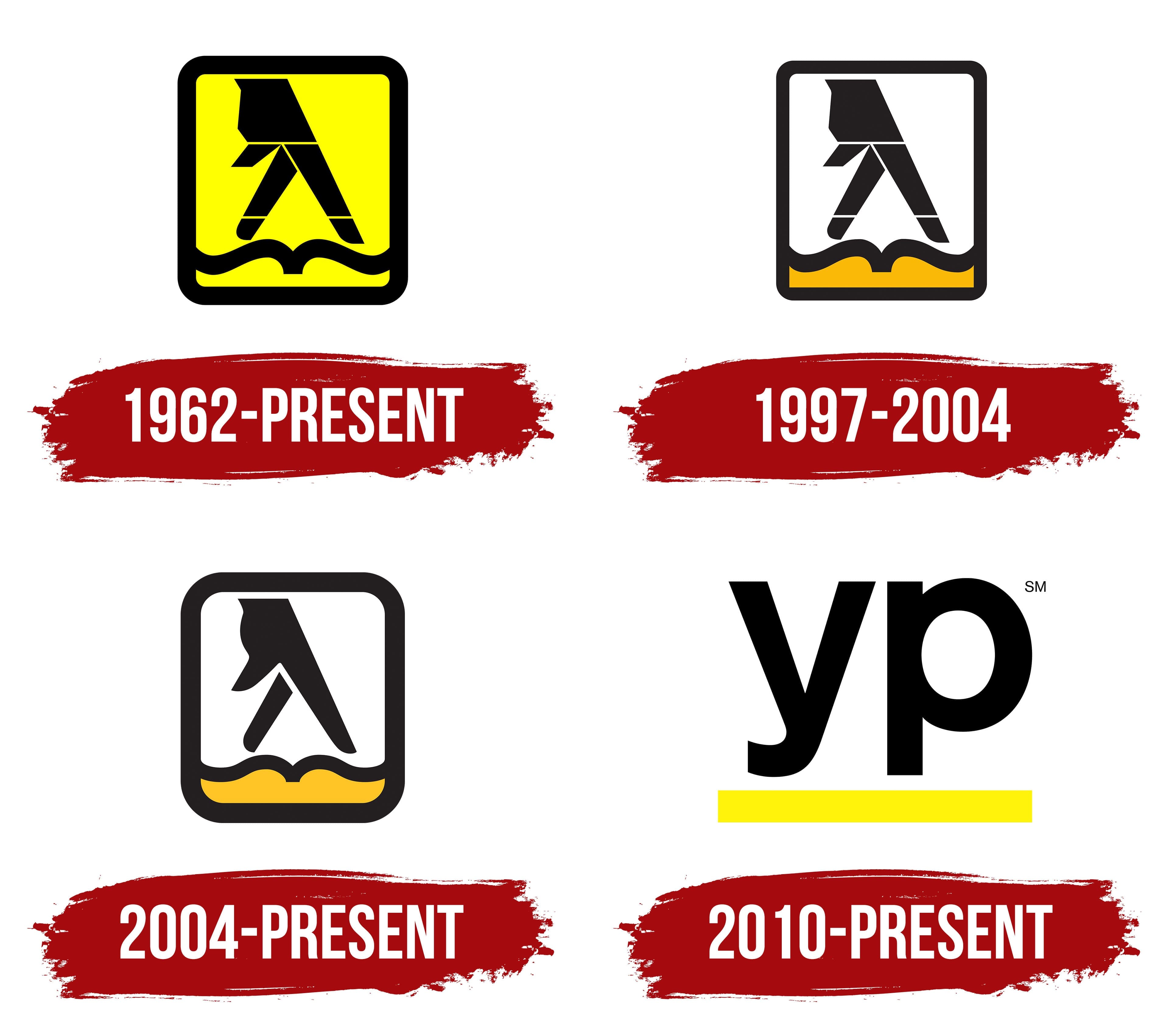
What are Yellow Pages?
It is a traditional directory that lists businesses and their contact information, usually grouped by category. Originally, directories were published as large printed books with yellow-colored pages and distributed to residents and businesses, providing a convenient way to find local plumbing, electrical, and restaurant services. With the advent of the Internet, directories moved to digital formats, offering online directories and search services accessible through websites and mobile apps.
1962 – today

Of course, the Yellow Pages emblem contains the color yellow, as without it, the visual identity of a company producing phone directories would be incomplete. Yellow is considered the key element and plays a crucial role in branding, as it is tied to the origins of these printed publications, which first appeared in 1886. At that time, they began printing on cheap yellow paper to reduce costs.
Since then, “Yellow Pages” has been permanently associated with such directories. The designers added black to balance the excessive yellow, convey seriousness, and emphasize the brand’s professional nature, which perfectly offsets the neon brightness. At the same time, it highlights the yellow, making it stand out vividly against the dark background.
The yellow color is used for the base of a rectangular geometric shape, stretched vertically, outlined with a wide, rounded border. When viewed from above, looking straight at the cover, its shape resembles a real phone directory. At the bottom, two wavy lines meet in the middle, representing a stylized open book with a dark hand “walking” across it. Essentially, two fingers are “walking” along the book, hinting at the ease of finding information.
The walking hand, dubbed the Walking Fingers, emerged naturally. First and foremost, it involves flipping through the directory’s pages to find the desired organization’s phone number. Thin lines run along the hand in two places, dividing the emblem into three sections. They are so narrow that they are barely noticeable against the light background. Meanwhile, the black-on-yellow looks striking, as it now colors the book’s cover, not just the paper on which it is printed.
1997 – 2004

As an experiment during this period, a new Yellow Pages logo format was used, featuring a reduced rectangle on a white background. In this case, the visual identity benefited from an exact match between the name and the book’s color, which became yellow. In all other respects, however, a visual cacophony emerged. The white space not only clashes with the concept but also limits the logo’s use, as it can no longer be placed on a yellow phone directory cover; it now requires a white background, which disrupts the overall design.
Another inconvenience is the depiction of the hand with two fingers “walking” through the pages, which creates a segmented impression, almost like a cubist drawing. The hand appears divided into several geometric shapes, mostly rectangles and trapezoids.
Overall, the innovations stand out, making it difficult to determine the necessary number. For example, the frame has been made thinner, but the thickness of the wavy lines remained the same, making them appear fat and worm-like compared to the delicate outline. The color of the directory was also changed: it was darkened by several shades, bringing it closer to a mustard tone. As a result, only the lower part of the Yellow Pages emblem remained colored.
2004 – today

This version of the Yellow Pages logo is almost identical to the previous one. The keyword here is “almost” because significant changes have been made. The emblem’s composition, shape, structure, and concept remain unchanged.
- The vertical rectangle is now shorter and wider, making it appear stable and reliable, hinting at the brand’s longevity.
- The frame is once again bold and thick, with more rounded corners, reflecting a shift toward flexibility and a softer business approach.
- The narrow stripes on the walking hand have been removed, making it solid and unsegmented.
- The outline of the wavy line, representing the open phone directory, has become slightly thinner and more elegant.
- The lower part of the rectangle is colored in a light yellow pastel shade, giving it a pleasant and non-aggressive appearance.
Overall, the emblem has transformed positively, becoming more welcoming, friendly, clearer, lighter, and logical. This is due to the removal of the thin lines that previously divided the fingers and hand into separate segments; now they are perceived as as natural and harmonious as possible.
The designers maintained the Walking Fingers concept, so the emblem continues to symbolize the ease of finding information in the phone directory. The black-and-yellow palette helps capture users’ attention through contrast. Combining these colors is always a winning choice: they work exceptionally well together. The vitality and sunny energy perfectly balance the depth of the night’s darkness, leaving a positive impression of the logo.
2010 – today

The owner decided to redesign the Yellow Pages logo to modernize it, resulting in a radical change in its appearance. The walking fingers disappeared from the visual identity, becoming a simple, smooth symbol that looks good on screens at any scale.
The only element retained from the previous version was the color; everything else was removed. Now, the key element of the emblem is the abbreviation. However, it is barely recognizable because lowercase letters were used instead of uppercase ones. The “yp” inscription takes up a separate line and looks very impressive despite being in lowercase. The large glyphs grab attention and highlight the directory’s enormous significance, which contains phone numbers for current companies offering a wide range of services.
The smooth symbols create an impression of strictness and professionalism. They are even grotesque, with a balanced combination of curves and angles. The smooth curves in the middle of the strokes harmoniously complement the sharp cuts at the ends, and the large internal letter spacing ensures good text readability. In this way, the designer conveyed the openness of a book in which the necessary information is structured.
A wide horizontal strip provides a stylized platform for the name. It is a single, lemon-yellow stripe symbolizing the directory (as if viewed from the side). The new shade looks very fresh and modern, as it is bright enough but not harsh like neon.