SharpLink updated its identity after launching its ETH treasury in June. The brand worked with Studio Freight on the new image. The main task was to shift from the old B2B image to a company focused on Ethereum, a treasury model, and digital-asset infrastructure.
The previous logo looked closed off. The hexagon with the letter “S” inside recalled marks from cybersecurity, corporate software, or network services. The uppercase SHARPLINK strengthened the strict technical tone.
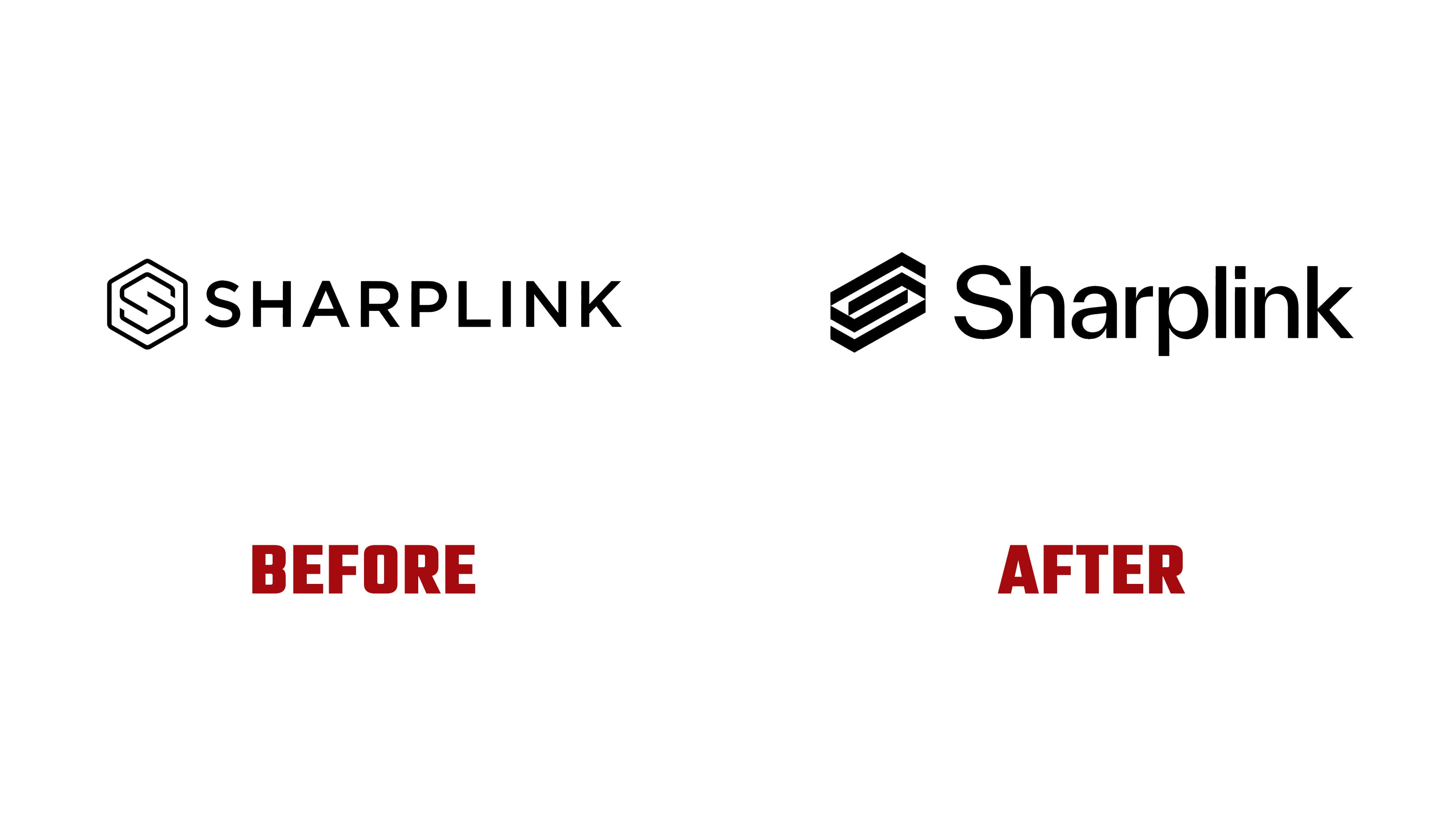
In the new version, the monogram kept a link to the previous foundation and became lighter. Instead of the letter “S” inside a frame, the brand now uses a mark made from parallel diagonal lines. It recalls a flow of data, network layers, and digital architecture. The letter “S” can be read through the overall outline and direction of the lines.
The wordmark changed along with the symbol. SharpLink is now written with a capital letter followed by lowercase letters. Because of this presentation, the name feels calmer and closer to a platform format than to corporate labeling.
The update reflects the company’s new direction. SharpLink aims to look like a structure built for long-term work around ETH, the treasury model, and digital asset infrastructure. The logo conveys order, connections between layers, and work with an asset in a more composed technological environment.
After launching the ETH treasury, the brand needed a mark for its new focus. Studio Freight kept the link to the old monogram and moved the image into a more open system. As a result, SharpLink received the look of a technology platform for Ethereum infrastructure, with a lighter form and an emphasis on networks, data, and long-term work with ETH.