


 Shortrunposters Logo PNG
The Shortrunposters logo represents a service that opened the world of poster printing to everyone: artists, photographers, teachers, and collectors. The idea is simple: anyone can order a high-quality poster in any quantity, even one copy, without compromising quality or color reproduction.
Shortrunposters.com’s history began in 1972 in Nashville, Tennessee, when a small copy shop called Copies Unlimited opened. The company introduced one of the region’s first public Xerox copying services, letting customers make copies at an affordable price when office copying technology was still developing.
Over the following decades, the business expanded its printing services and adopted new technologies. In the mid-1990s, the company acquired a Heidelberg QM DI press, one of the early digital offset printing machines. As its service range grew, Copies Unlimited changed its name to Midtown Printing, reflecting its location in Nashville’s Midtown district.
A major change came in 2005 when Midtown Printing installed a Xeikon 5000 digital web press. The equipment allowed the company to explore a new market between large traditional print runs and expensive single-copy poster production. In spring 2006, Shortrunposters.com launched, allowing customers to order posters without a minimum quantity requirement, including single-piece orders.
The service quickly expanded its product range with popular formats such as 24×36 inch posters, fixed shipping prices, and additional options including foam board mounting and framing. Shortrunposters.com attracted photographers, artists, exhibition organizers, and corporate clients who needed small poster runs. The company operated alongside services such as PosterBurner, focusing on affordable short-run poster printing.
Meaning and History
What is Shortrunposters?
This printing house specializes in printing posters in small print runs. Artists, designers, and anyone who wants to express their creativity can order high-quality posters with no quantity restrictions. Modern technologies and high-quality materials achieve image clarity and color saturation. The services are used by professionals and by those who want to decorate their spaces with original prints.
2006 – today
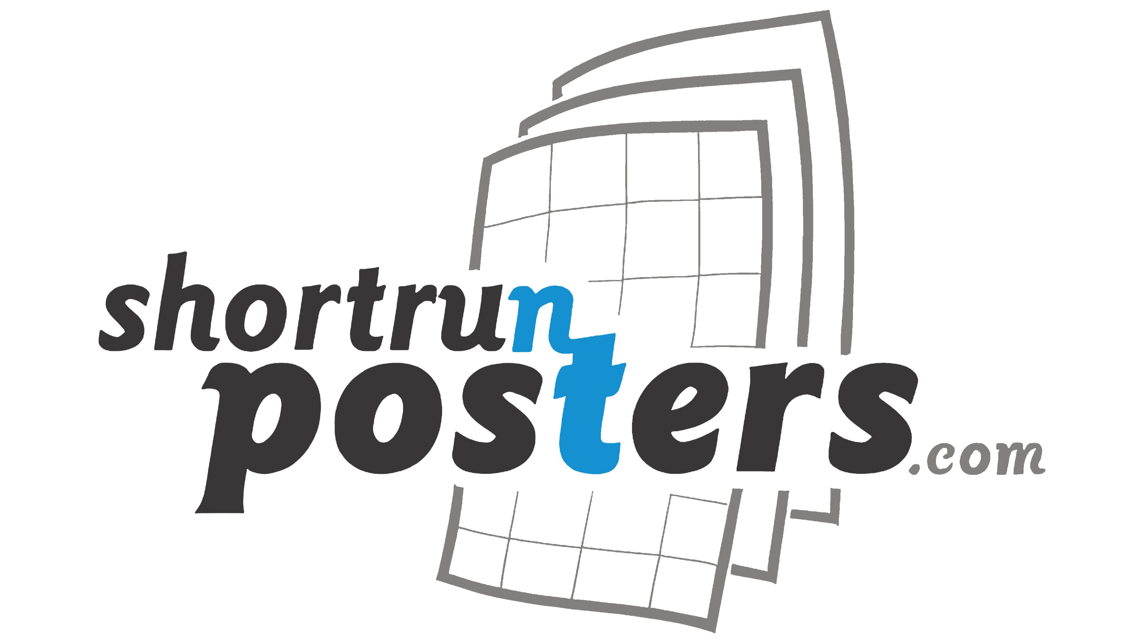
The shortrunposters.com logo is designed clearly to communicate poster printing. The main focus is on the text, positioned over a symbol depicting a stack of paper sheets in the background. The sheets are drawn with thin gray lines and covered by a grid pattern, resembling layouts or posters prepared for printing, stacked on top of one another.
The text is written in a modern, bold, slightly italicized sans-serif font leaning to the right. The name is divided into two parts: “shortrun” is slightly thinner, and “posters” is bolder, emphasizing the company’s main specialization. The letters “n” and “t” in the middle of the word stand out interestingly; they are slightly larger than the others and highlighted in bright blue. This accent adds uniqueness and catches the eye.
Completing the logo is a small and neutral “.com” in gray, underscoring that the brand operates online. The color palette of black, gray, and blue is balanced and calm, aligning with the company’s goals of printing small runs of custom posters in various formats, from compact to large, including design and installation.
The logo clearly and calmly describes the company’s entire line of work, with an individual emphasis.