


Sigma Kappa updated its identity with Pivot Brands. Before the rebrand, the team conducted research and gathered opinions from members of different ages, new members, and alumnae. The materials helped the team understand how the community is perceived through personal growth, support, friendship, and different life paths.
The main theme became the idea “with heart.” It connects to Sigma Kappa’s history, traditions, service, and the role of the women who founded the organization. The heart gained a leading role in the updated system and became part of the logo.
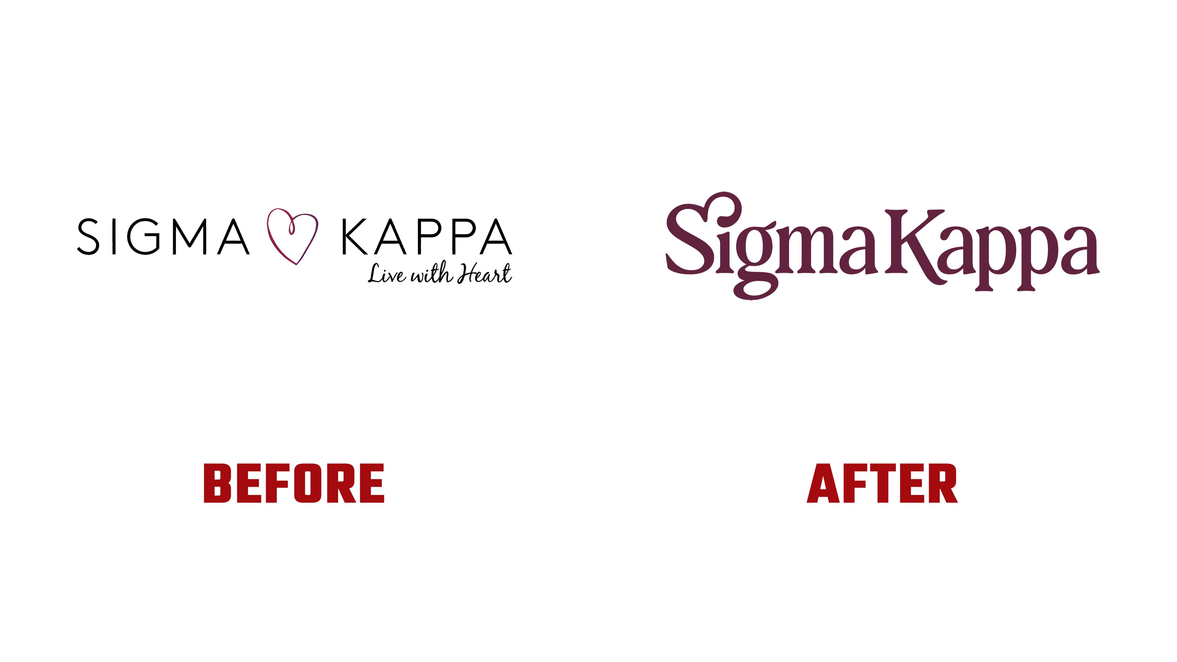
The key change involved the mark. The previous version used light modern typography, a separate heart, and the motto “Live with Heart.” The new logo turns to the organization’s heritage. The name is set in a custom serif typeface. The serifs give the image solidity and a connection to a long history.
The heart remains central to the identity and takes on a new role. Earlier, the heart symbol stood separately and served as an emotional accent. After the rebrand, the heart was built into the letter “S.” It is now connected with the organization’s name. It reads as part of the overall image.
Removing the previous tagline next to the logo changed how the brand is perceived. The updated system relies on the mark and the Sigma Kappa name. The logo’s form and heart convey meaning and connect to support, sisterhood, service, and personal growth.
We prepared several logo versions for different formats and chapters. The system includes the updated heart and the Greek letters Sigma Kappa. They preserve the connection to the sorority’s history and help the identity work across different needs.

The rebrand is tied to the idea “Looking Ahead, Honoring Our Legacy.” It brings together respect for the past and the organization’s continued development. The new logo shows continuity across generations of members and the connection to the principles on which the community has worked since the late nineteenth century.
The updated identity reflects a modern organization in a calm form. As a result, the organization gained a unified image that brings heritage, support, and a view toward the future into a single system.