The SkyWest logo reflects the power and reliability of one of the largest carriers in the USA. Each symbol in the emblem seems to embody the aspiration for excellence and emphasizes the unity of a team of professionals dedicated to providing quality service to passengers.
SkyWest: Brand overview
SkyWest Airlines, a respected regional carrier in the United States, first took to the skies in 1972. The airline originally operated under SkyWest Airlines and was founded on April 26, 1972, in St. George, Utah. In its early days, the airline had a modest fleet of turboprop airplanes operating in Utah.
Over time, SkyWest expanded its reach to destinations throughout the western United States. In the 1980s and 1990s, the airline underwent a significant change as it began using larger regional jets to operate codeshare flights on behalf of major U.S. airlines.
SkyWest’s partnerships with major carriers such as Delta, United, Alaska, and American allowed it to provide many regional flights nationwide, ferrying passengers to the major airlines’ hubs. Between 2000 and 2010, SkyWest experienced significant growth, absorbing other regional carriers, including Atlantic Southeast Airlines, and cementing its status as one of the nation’s largest regional airlines.
SkyWest has an extensive domestic and regional network serving more than 250 destinations throughout North America. A diverse fleet of more than 450 regional aircraft validates the company’s role as a critical regional feeder for several leading airlines.
In its half-century of operation, SkyWest is one of the most successful and sustainable regional carriers in the United States.
Meaning and History
What is SkyWest?
It is a regional airline in the United States, headquartered in St. George, Utah. It flies on behalf of major airlines such as Delta Air Lines, United Airlines, American Airlines, and Alaska Airlines under their respective regional brands (e.g., Delta Connection, United Express, American Eagle, and Alaska SkyWest). Known for its extensive network and reliable service, the company connects smaller cities and regional destinations to major hubs throughout North America. The airline operates a fleet of regional jets, including Embraer and Bombardier aircraft.
1972 – 2001
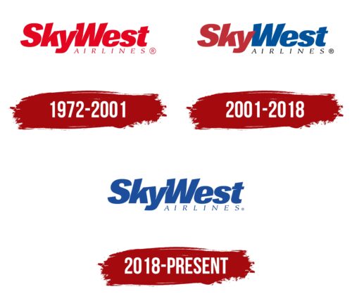
SkyWest, an airline founded in 1972 in Utah, USA, used a wordmark logo with deep meaning and symbolism. This logo reflected the nature of the company’s business and its geographical origins.
The name “SkyWest” was carefully chosen. “Sky” directly relates to the company’s aviation focus, and “West” indicates the region where the brand was established, highlighting its roots in the western part of the US. This name effectively communicates the company’s mission and strategic focus on serving regional routes.
The logo design was thoughtfully developed to align with the brand’s identity. The unique font features slanted characters, each tilted so that one side of every glyph appears elevated, giving the logo a dynamic and upward-moving appearance. This visual element symbolizes the company’s aspirations for growth and development and is associated with the fundamental concept of aviation takeoff.
Additionally, the logo is outlined in white, adding a sense of lightness and airiness to the words. This detail emphasizes key attributes of air travel—ease and freedom of movement through the air. The emblem’s red color, full of energy and strength, highlights SkyWest’s ambitious plans for growth and readiness to actively move forward, overcoming challenges and reaching new heights in the aviation industry.
2001 – 2018
The main change in the design of the new SkyWest logo pertains to its color scheme, which has significantly refreshed its visual perception. The core concept of dividing the name into two parts, “Sky” and “West,” is now articulated through contrasting colors: dark red for “Sky” and blue for “West.” This color choice distinctively highlights each part of the name and symbolizes the dual aspects of the company’s operations.
The dark red color of “Sky” reflects the direction of the company’s aviation activities and its energetic approach to flight services. The blue color for “West” represents the geographic ties to the western states of the USA, where the company holds strong positions. These colors reflect SkyWest’s collaboration with other brands to operate short flights, emphasizing the company’s ability to adapt to the diverse demands of partners and the market.
Darker shades in the logo underscore the company’s experience and reliability as a leading regional carrier. These colors add seriousness and professionalism to the company’s image, which is particularly important in the aviation industry, where safety and passenger trust play key roles.
Additionally, the logo features subtle light slits in the letters, reminiscent of sharp arrows. These elements symbolize determination, business acumen, and the rapidity of SkyWest’s flights. They lend dynamism to the logo design, emphasizing the company’s ambitious aspirations and ability to achieve set goals quickly.
2018 – today
The Sky West logo used to be a two-color logo, but after the redesign, it became all-blue. The shade used is reminiscent of the deep color of the sky and is associated with limitless space, freedom, and permanence. The main part of the emblem is occupied by the inscription “SkyWest.” The designers eliminated the space between the two words and partially superimposed the letter “y” on the letter “W.” The bold italic font has an interesting feature: the letters have oblique cuts and indentations. The lower right corner has a barely visible word, “AIRLINES,” typed in a thin font with serifs and a slight slope.
Making the logo monochrome is seen as a move towards simplification, making it more easily recognizable. The juxtaposition of the letters “y” and “W” gives the logo a unique feel, suggesting unity or interconnectedness. The bold italic font with slanted cuts and indentations adds dynamism, conveying movement and progress. The understated “AIRLINES” in the corner balances the dominant main text, clarifying and not overpowering the central design elements.
