


 Sparco Logo PNG
The Sparco logo stands out for its modernity. It progressively represents the automotive accessories brand, demonstrating customer loyalty, high standards, and professionalism. The emblem conveys that the manufacturer is ready to share its technological innovations with buyers to improve driver comfort.
Sparco was founded in 1977 in Turin, Italy, by Enrico Glorioso and Antonio Parisi, two motorsport supporters who saw driver safety as a practical problem in racing. At the time, much of the available equipment offered limited fire protection. The company began with racing suits, testing materials that could resist heat while still allowing drivers to move during competition.
In 1978, Sparco released its first fire-resistant racing suit. In the early 1980s, it added shoes and gloves, building a fuller set of protective gear for drivers. In 1984, the company entered the racing-seat market after studying how seating affected safety and control inside a car. In 1988, Sparco opened its first foreign branch in the United States, which helped it serve the growing American motorsport scene.
During the 1990s, Sparco invested in research, lighter fabrics, improved fire protection, and new equipment formats. In 1995, it introduced tuning accessories such as gear levers, pedals, and steering wheels, reaching customers outside professional racing. In 2000, the company worked with Ferrari and Lamborghini on custom products. In 2002, it launched a line of casual clothing inspired by racing. In 2007, it opened a new production facility in Italy to mark its 30th anniversary.
In 2010, Sparco developed carbon-fiber racing seats with reduced weight and strong protection. In 2015, it became an official equipment supplier for several Formula 1 teams. From 2017 to 2022, the brand expanded into esports by introducing simulator seats and accessories, introducing FIA-approved racing seats, updating fire-resistant clothing, opening an online customization portal, and adding simulator pedal sets for virtual racing.
Meaning and History
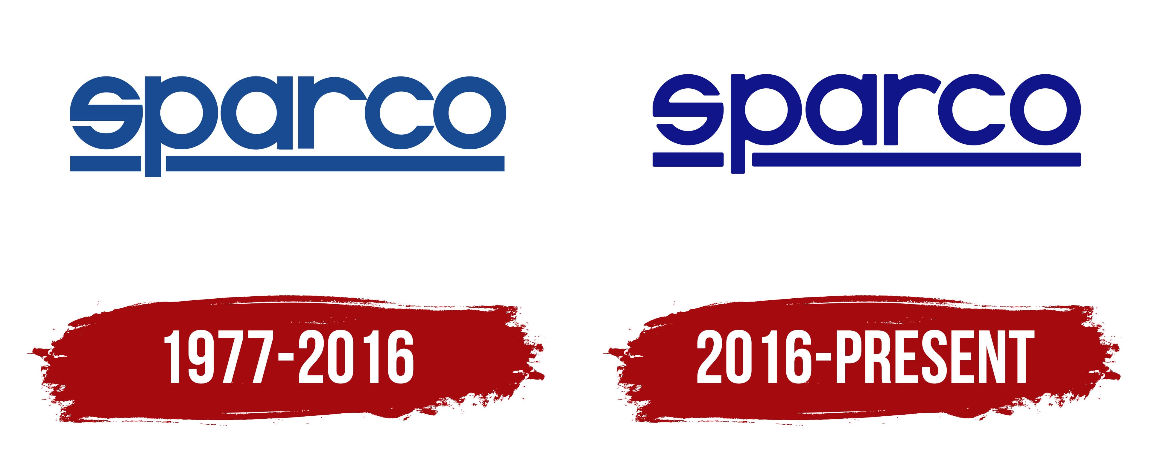
What is Sparco?
It is an Italian company specializing in designing and manufacturing automotive parts and accessories, particularly for motorsports. The company is known for racing seats, steering wheels, seat belts, and racing apparel, including suits, gloves, and shoes. It manufactures safety equipment, including chocks and fire suppression systems. The brand is known for its safety quality, making it a trusted name in the automotive industry and motorsports. Professional racing teams and enthusiasts around the world use the products.
1977 – 2016

The style of the Sparco logo is strict, honest, and businesslike. It communicates the high capabilities of the automotive accessories manufacturer through several key factors:
- The shape of the letters
- The style of the lettering
- The color of the emblem
The original font uses unique glyphs not found elsewhere, as they are adapted to the individual style. Notably, the letter “s” has a non-standard appearance. It is so heavily rounded that its usual shape is barely recognizable. This makes Sparco’s visual identity bold, dynamic, and modern.
The standard glyph is packed with tremendous energy, giving the impression that it is about to spring straight up. This design technique shapes the right image for a brand associated with technological innovations for cars.
The lettering’s style is equally intriguing. It blends traditional print text with a modern sans-serif font. The former inherits massiveness, extra boldness, and smoothness; the latter adopts horizontal cuts at the ends of the letters, deep roundings, and an underline interrupted by the stroke of the “p.” The glyphs are so precise that they convey a sense of high demand and meticulousness, which is crucial in manufacturing, where accuracy is paramount.
Another factor demonstrating the company’s enhanced capabilities is color. It plays a significant role by supporting the concept of reliability, stability, movement, and forward momentum. This palette is subtle and natural. It evokes the innate desire for safety and comfort, as well as the boundless spaces that can be conquered in a comfortable setting. It is a color of hope, calmness, stability, and a relaxed atmosphere.
All these factors create the right brand image, making any other elements in the Sparco logo unnecessary. It effectively conveys the concept and message of high reliability and impeccable product quality.
2016 – today
After the redesign, the emblem received softer features, with all letter ends smoothed. Now, there is neither sharpness nor rigidity. This showcased the company’s customer-centric approach, friendliness, and readiness to consider customer wishes. However, the lines have not lost their boldness and confidence; they remain dynamic, intense, and purposeful. The lettering now has more fluidity and lightness.
Although the font-weight has been reduced, it is still far from being semi-bold. The glyphs are still in lowercase and sans-serif. This maintains a soft image and creates a positive impression for customers. The main element of the Sparco wordmark is the letter “s,” which looks like an “o” with a crossbar. Its ends are elongated and curved, resembling two arcs. The rounded outline and internal angles add dynamism to the logo, as the stylized symbol resembles a wheel or a car wheel disk in motion. The two side cuts create this impression.

Another adjustment involves increasing the gap between the stem of the “p” and the underline. Previously, the distance between them on the left side was minimal, but now it exactly matches the gap on the right. Changes also affected the color palette: the new emblem uses an intense, deep, rich blue color. It creates a positive aura, representing calmness and confidence. The same feeling is evoked by the stripe running beneath the word “sparco.” It looks like a reliable platform that supports the automotive accessory manufacturer and its customers.