 Pearson Logo PNG
Educational materials include textbooks, digital courses, and assessment systems used in schools, universities, and vocational training. These resources help learners master new subjects and validate their qualifications. The Pearson logo represents a company that develops educational products and provides learning and testing solutions.
Samuel Pearson founded Pearson on August 1, 1844, in Huddersfield. In 1856, his son George joined the management. The firm S Pearson & Son specialized in building water supply and sewer systems. In the 1880s, the company expanded internationally. It carried out projects in Egypt, the United States, Canada, and Mexico. At the beginning of the twentieth century, under Whitman Pearson’s leadership, the company acquired oil assets in Mexico. In 1908, it established a publishing division called Westminster Press.
In 1917, Pearson was granted the title Viscount Cowdray. After World War II, the company’s industrial business was nationalized. By the 1950s, Pearson focused on publishing and financial activities. In 1957, the company acquired Financial News Ltd., the publisher of the Financial Times. In 1963, Pearson purchased Château Latour in France. In 1968, it acquired the publishing house, Longman. In 1970, the company purchased Penguin Books. In 1978, Pearson bought Madame Tussauds. In 1984, the company officially became Pearson plc.
By the end of the 1980s, Pearson strengthened its publishing operations by acquiring Viking Press and Addison-Wesley. In 1989, the company sold Château Latour. In 1998, it sold Madame Tussauds. In 1999, the company sold its stake in Lazard Bank. In 1998, it purchased Simon & Schuster’s educational assets for $4.6 billion. On that basis, Pearson Education was founded and became the world’s largest educational publisher.
In the 2000s, the company invested in digital and online learning. In 2015, Pearson sold the Financial Times and its stake in The Economist for 882 million pounds. That same year, it sold a 22 percent stake in Penguin Random House for $1 billion. In 2016, the company reported a 2.6 billion-pound loss and began large-scale restructuring. Between 2017 and 2019, it sold TutorVista, Edurite, and Wall Street English.
In 2023, pre-tax profit rose to £493 million on revenue of £3.674 billion. A year earlier, profit was 32£ 3 million. In 2024, operating profit was projected at £ 621 million, with revenue growth of 3.7 percent. As a FTSE 100 company, it reached a market capitalization of £6.5 billion.
Meaning and History
What is Pearson?
A British corporation based in London that began in construction and became a global leader in education and publishing, with revenue of about £ 4.9 billion. It grew by acquiring publishers such as Viking Press, Longman, Penguin Books, Addison-Wesley, and Dorling Kindersley, as well as Simon & Schuster’s assets. After selling the Financial Times and its stake in The Economist, the company focused on educational services. Its main areas include examinations and testing (Edexcel), digital resources, online learning, English language programs, and professional development.
1982 – 1983
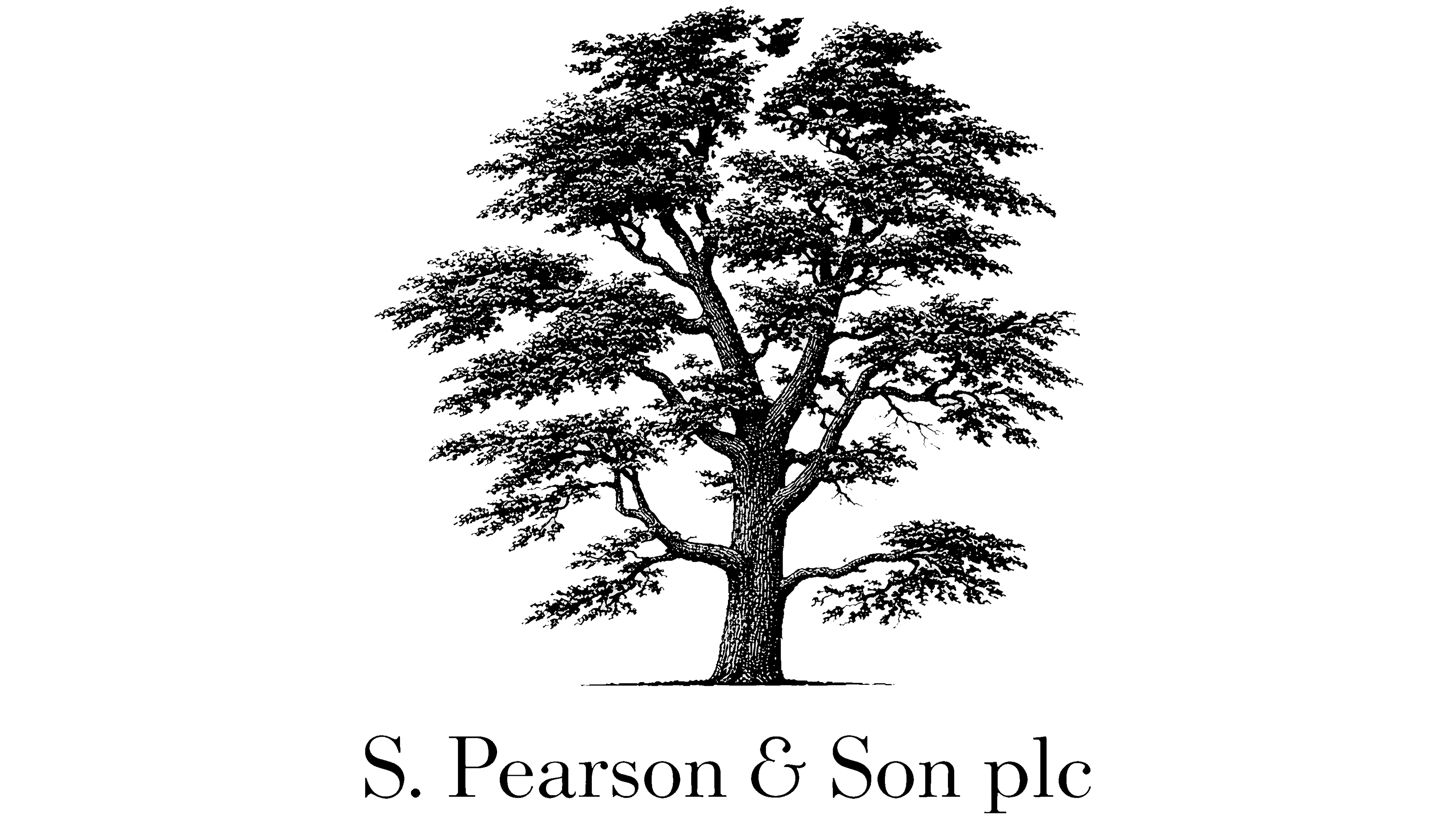
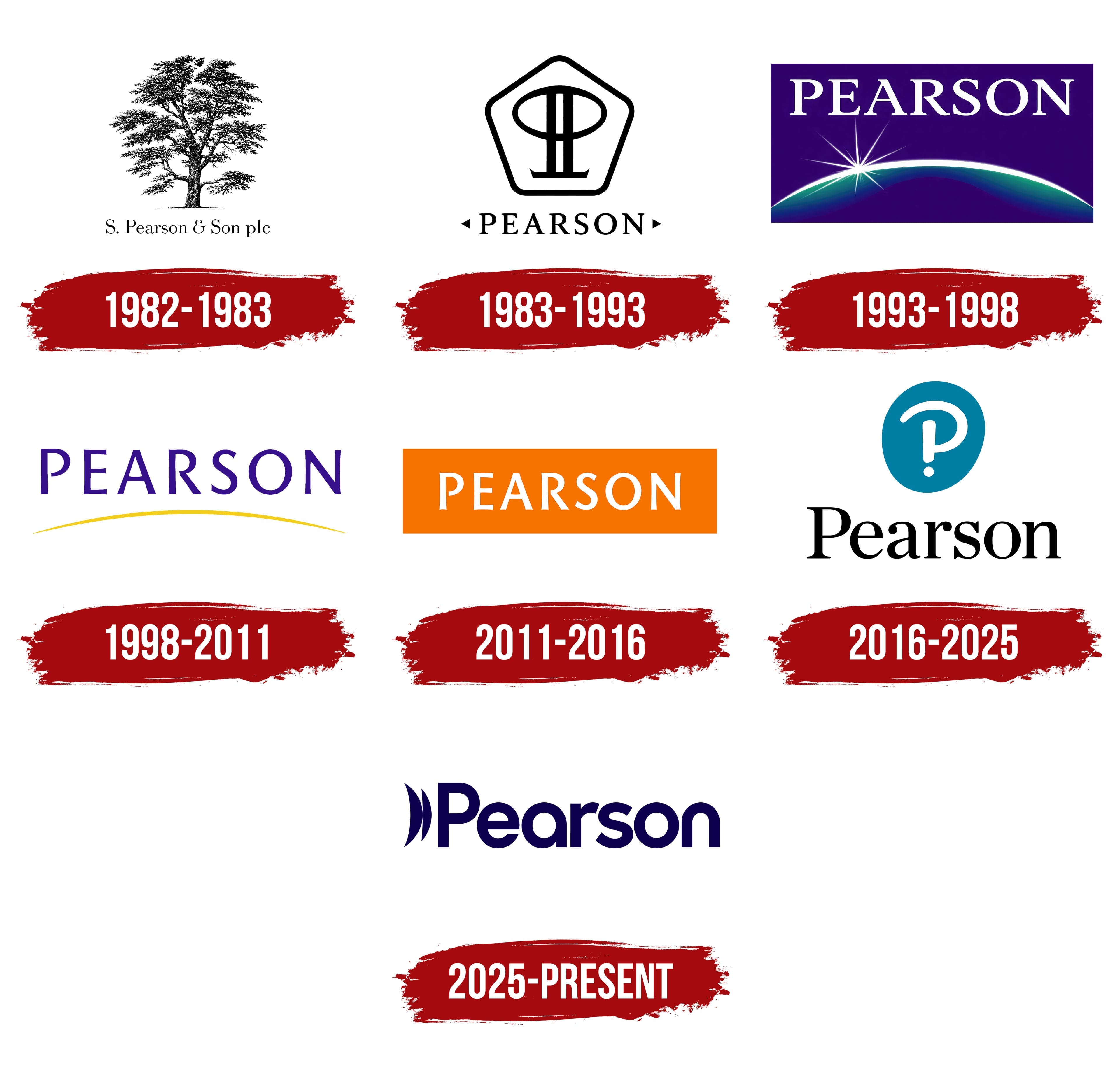
A tree dominated Pearson’s early corporate emblem. Its branching trunk and dense canopy were rendered in black and white, in a style reminiscent of a book engraving. Fine strokes depicted the leaves, interwoven branches, and bark texture. A short line at the base represented the ground. Beneath the illustration, the full name S. Pearson & Son plc appeared in serif lettering, completing the stacked design.
The name S. Pearson & Son preserved the company’s family origins. It carried the surname of Samuel Pearson, who founded the business in Yorkshire in 1844. Its early operations centered on construction. The firm manufactured bricks, roof tiles, and pipes, and did contracting work. It later expanded beyond the United Kingdom, building tunnels, ports, and railroads.
During the 20th century, Pearson acquired the Financial Times, Longman, and Penguin, accompanying its gradual shift into publishing. The historic surname remained as the business changed its focus. Today, the company develops learning materials and digital education products and creates exams and assessment systems.
1983 – 1993
The next emblem shortened the full family name to PEARSON. In 1984, the company changed its legal name to Pearson plc. A geometric monogram within a pentagonal border appeared above the lettering.
The border had rounded corners. Inside it was a symmetrical design made up of a horizontal oval, 2 vertical strokes, and a shared base with pointed ends. The rounded upper section contrasted with the monogram’s angular lower portion.
PEARSON appeared beneath the border in serif capitals. Small triangles at either end of the word pointed outward. The black-and-white treatment stacked the name, border, and inner design together.
1993 – 1998
The Earth’s horizon and a rising star represented Pearson’s international reach and the prospects of its media business. These images became part of the corporate identity Luxon Carr developed in 1995. The update accompanied the holding company’s transition from a collection of diverse businesses into a media group.
PEARSON appeared at the top of a deep blue-violet rectangular field. White serif capitals sat above a glowing arc. The corporate blue remained, while green and light blue gradients appeared along the horizon.
In the lower portion of the design, the arc represented Earth’s curvature. Thin rays from a rising star spread outward above it on the left. The glowing gradients and white lettering stood out against the dark background, connecting the name to the horizon image.
1998 – 2011
Pearson’s next logo used 2 colors. A yellow arc accompanied the dark purple name, replacing the detailed depiction of the Earth’s horizon. The star, gradients, and rectangular field gave way to underlined lettering.
PEARSON appeared in capital letters with open forms and slightly flared stroke endings. The lettering resembled classic typefaces such as Garamond or Times New Roman. A thin, bright yellow arc extended across almost the full width of the name. It rose toward the middle and tapered at the ends, retaining the horizon motif in a simplified form.
2011 – 2016
Pearson’s logo came in 4 equally valid color versions. They also used purple, green, and blue versions. For books and digital products, designers could select the bar’s color to suit a particular title’s design. All versions retained the white name and the phrase “Always Learning.”
Interbrand developed the identity, and Pearson had put it into use by 2011. The update was intended to bring the group’s numerous brands together under a shared name and strengthen its presence. The slogan linked the company’s different businesses through continuous learning.
PEARSON appeared inside a horizontal rectangle that replaced the yellow arc. The white sans-serif capitals were upright and uniform in height. “Always Learning” appeared at the opposite end of the bar. In 2012, the project won gold in the overall visual identity category at the Transform Awards.
2016 – 2025
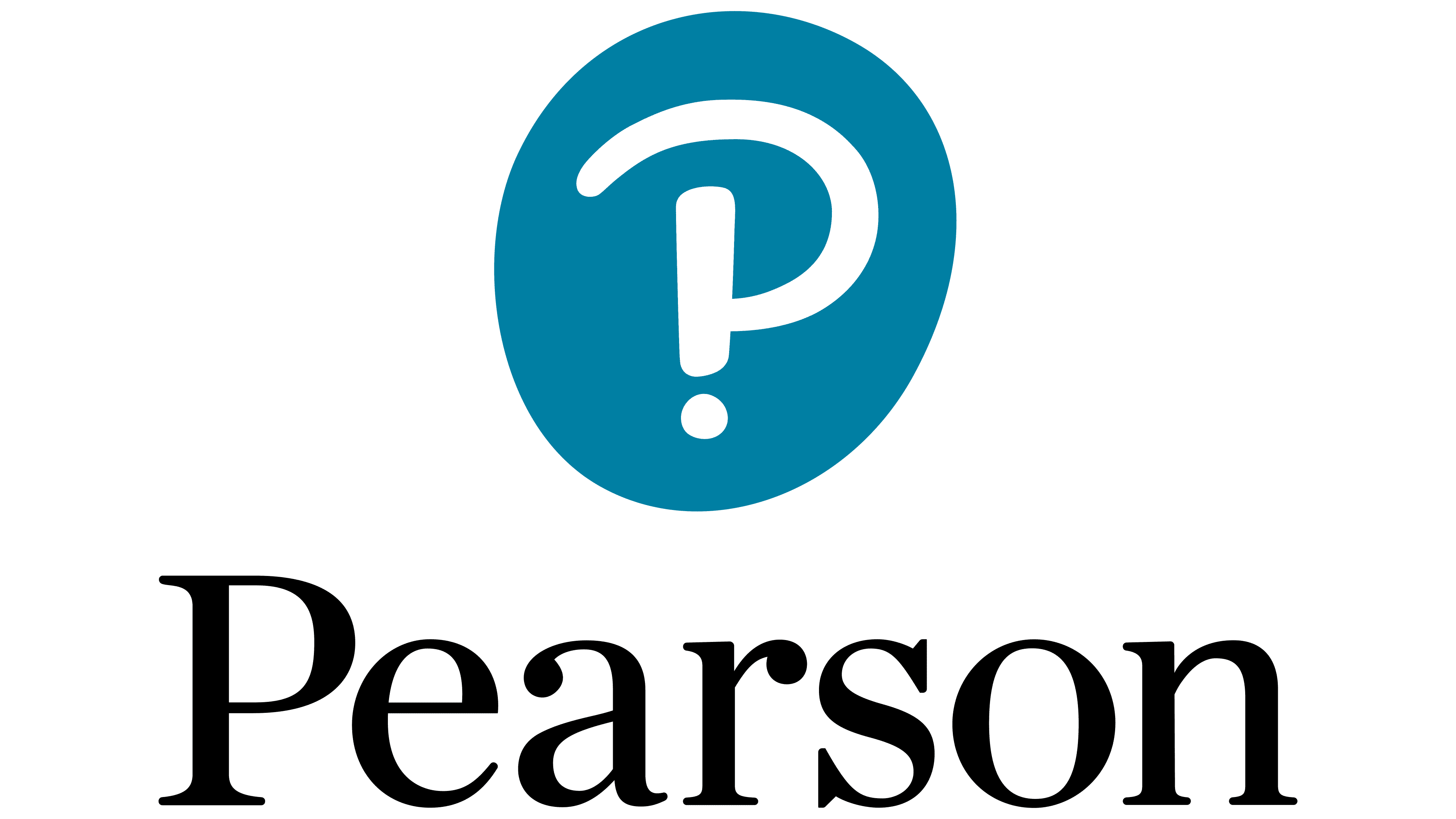
Pearson’s logo, introduced on January 6, 2016, brought together a question mark and an exclamation point to represent two sides of learning. The question mark represented curiosity and the desire to discover something new. At the same time, the exclamation point expressed the enjoyment of learning. Their combination, an interrobang, became the emblem as the company shifted from printed educational publications to digital learning products and services.
Freemavens developed the interrobang idea and symbol. Together Design served as the lead creative partner and created the overall identity system. The white figure appeared inside a dark teal rounded shape resembling a thumbprint. The thumbprint reference represented each learner’s individuality and a people-first focus.
The inner design resembled the initial “P” in Pearson. A broad arc with rounded ends formed the upper portion, while a vertical stroke and a teardrop-shaped dot made up the lower section. A single figure combined the name’s first letter with a punctuation mark associated with learning.
Black Pearson lettering in Chronicle Display appeared beneath the emblem. A large capital “P” was followed by upright lowercase letters. The serifs connected to the company’s publishing heritage and experience. A horizontal version, with the name beside the symbol, was provided for narrow spaces. On dark backgrounds, the lettering appeared in white.
Lettering specialist Rob Clarke worked with Together Design to develop the logo system for Pearson’s products and services. He refined the letterforms, spacing, and arrangements for print and digital use.
2025 – today
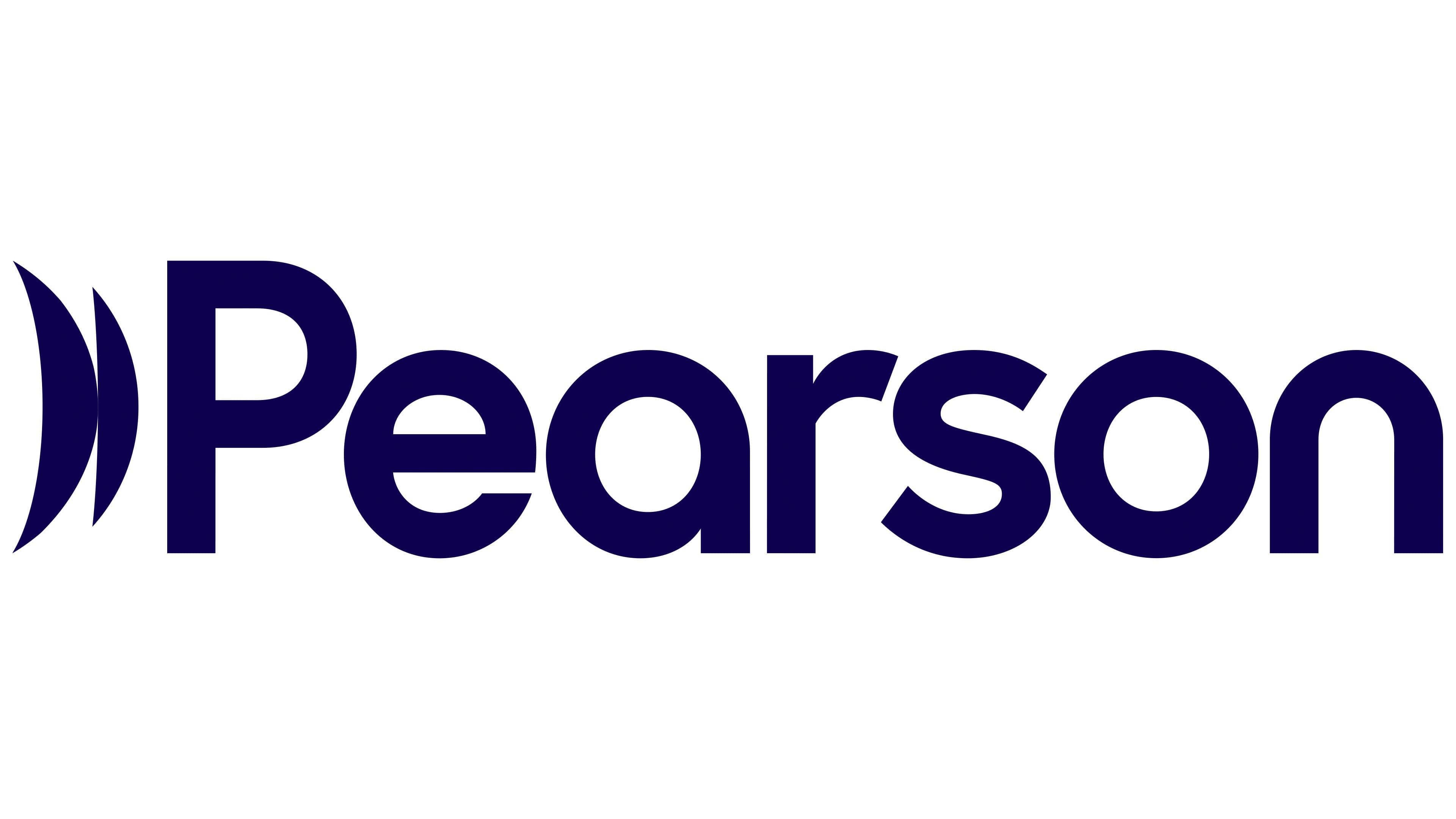
Learning influences careers, everyday life, and society. Pearson expressed this ripple effect through a wave in its logo, introduced on April 7, 2025. Landor Executive Creative Director Graham Sykes explained that it represented learning’s impact beyond education itself.
The update was intended to broaden perceptions of Pearson. Alongside school textbooks, the company wanted its identity to reflect professional education, workplace skills development, and lifelong learning. Landor was appointed following a competitive selection process. Its London and New York teams developed the logo and overall identity.
The wave replaced the interrobang and appeared to the left of the name. It consists of 2 vertically elongated curved shapes with pointed ends, resembling parentheses. The inner shape is narrower than the outer one. Both use a deep purple that matches the lettering. The shade is close to ink purple and was intended to convey trust in Pearson.
Landor’s typography team in Milan created the name in custom lettering. The opening “P” remained uppercase, followed by lowercase letters. The rounded sans-serif lettering uses substantial forms and consistent stroke widths. Its shapes resemble Neo Sans or Avenir Next Rounded. The soft curves were meant to give the name a friendly look and convey accessible education.